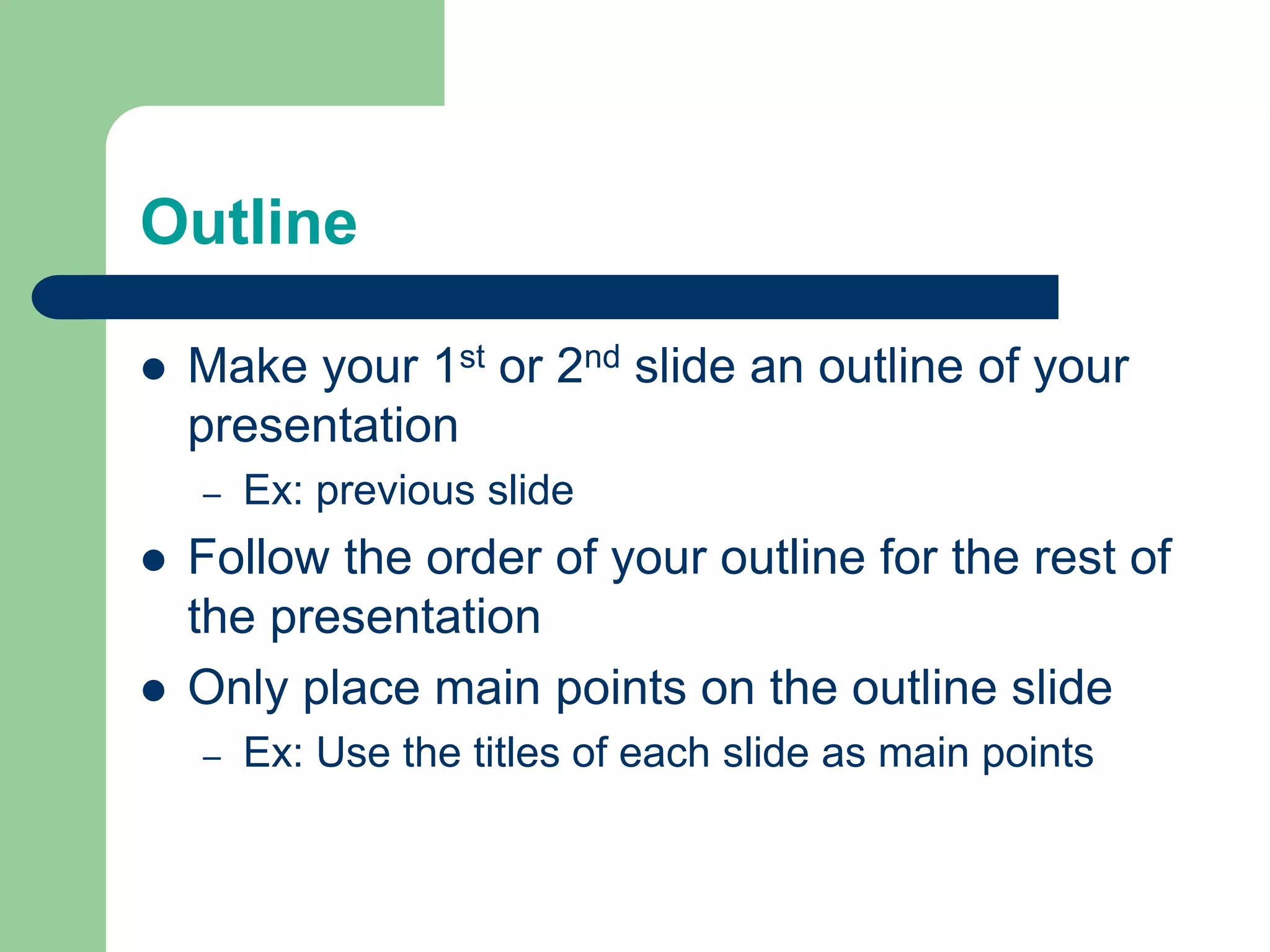
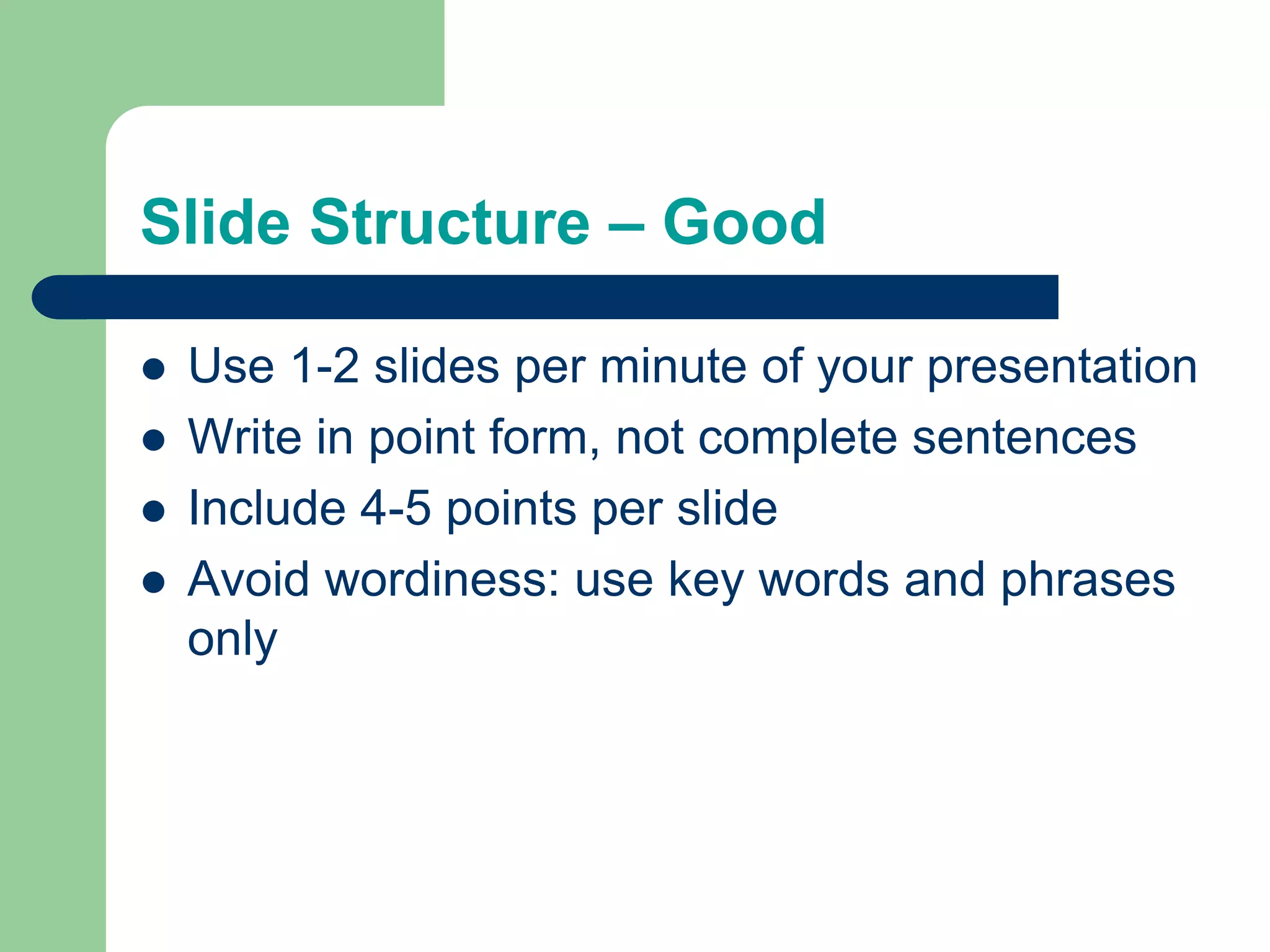
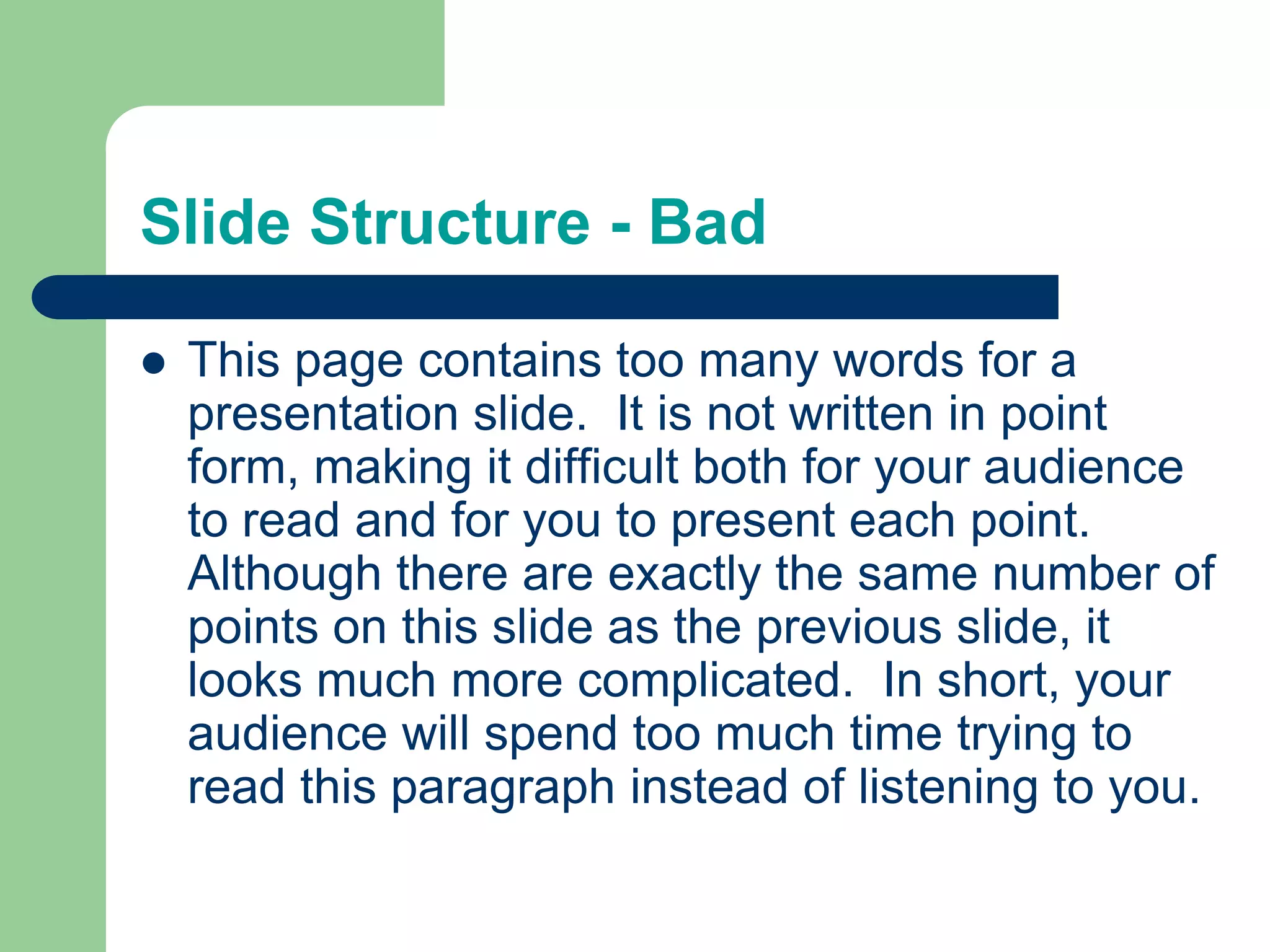
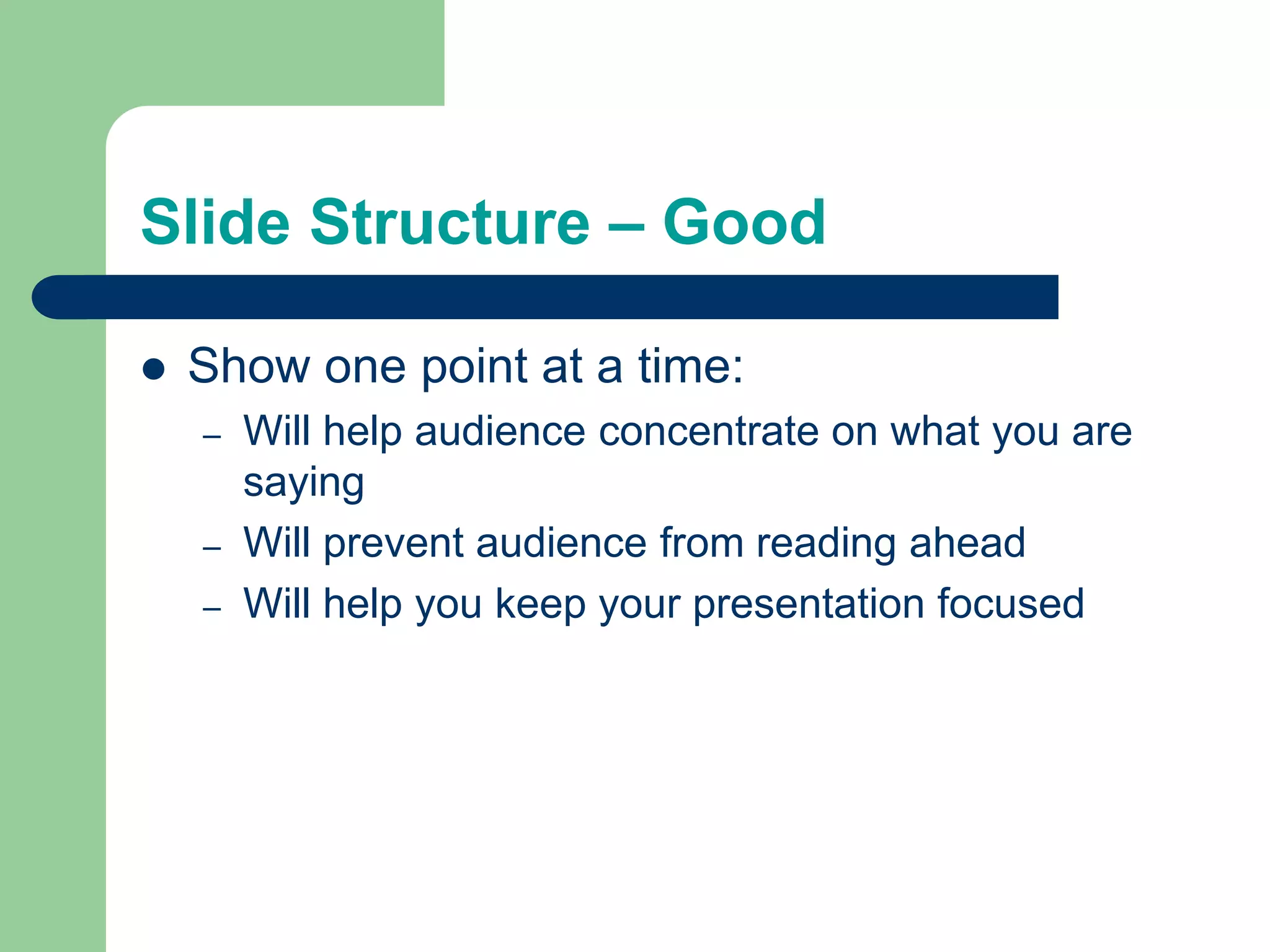
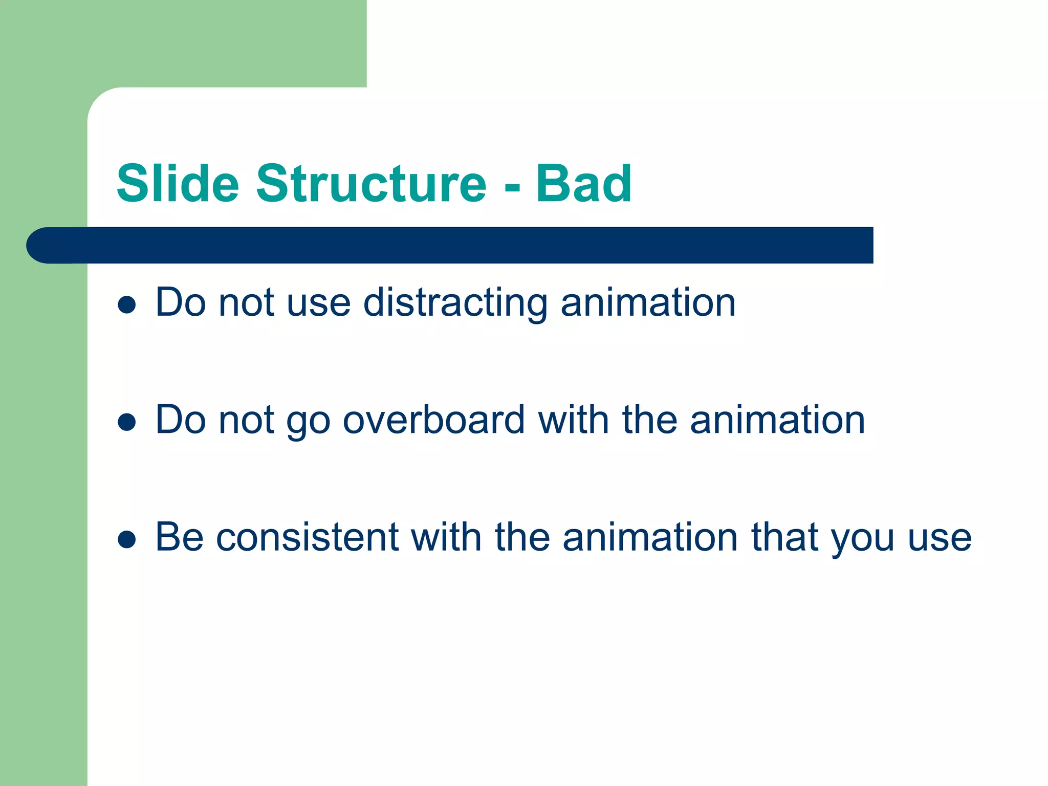
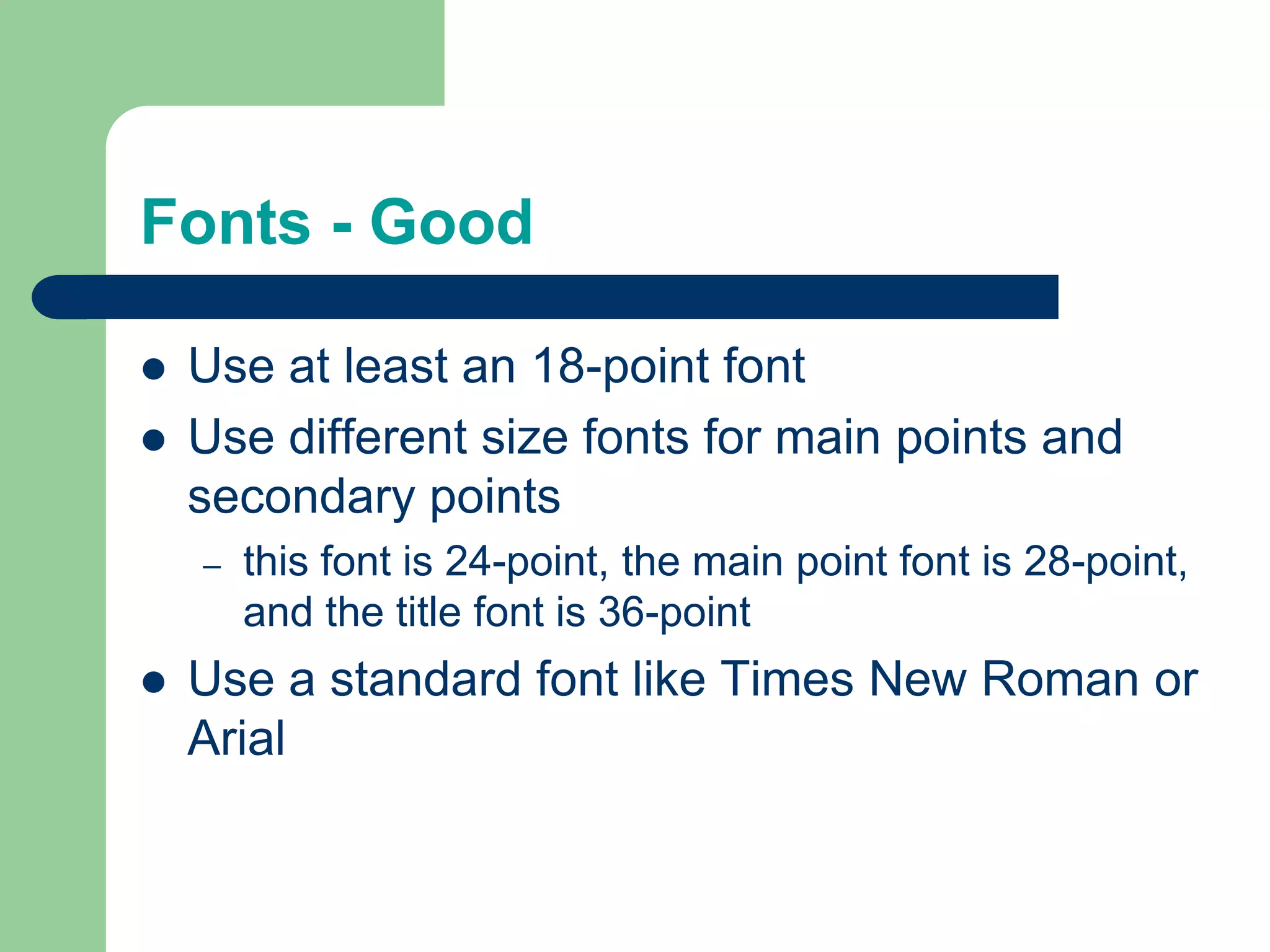
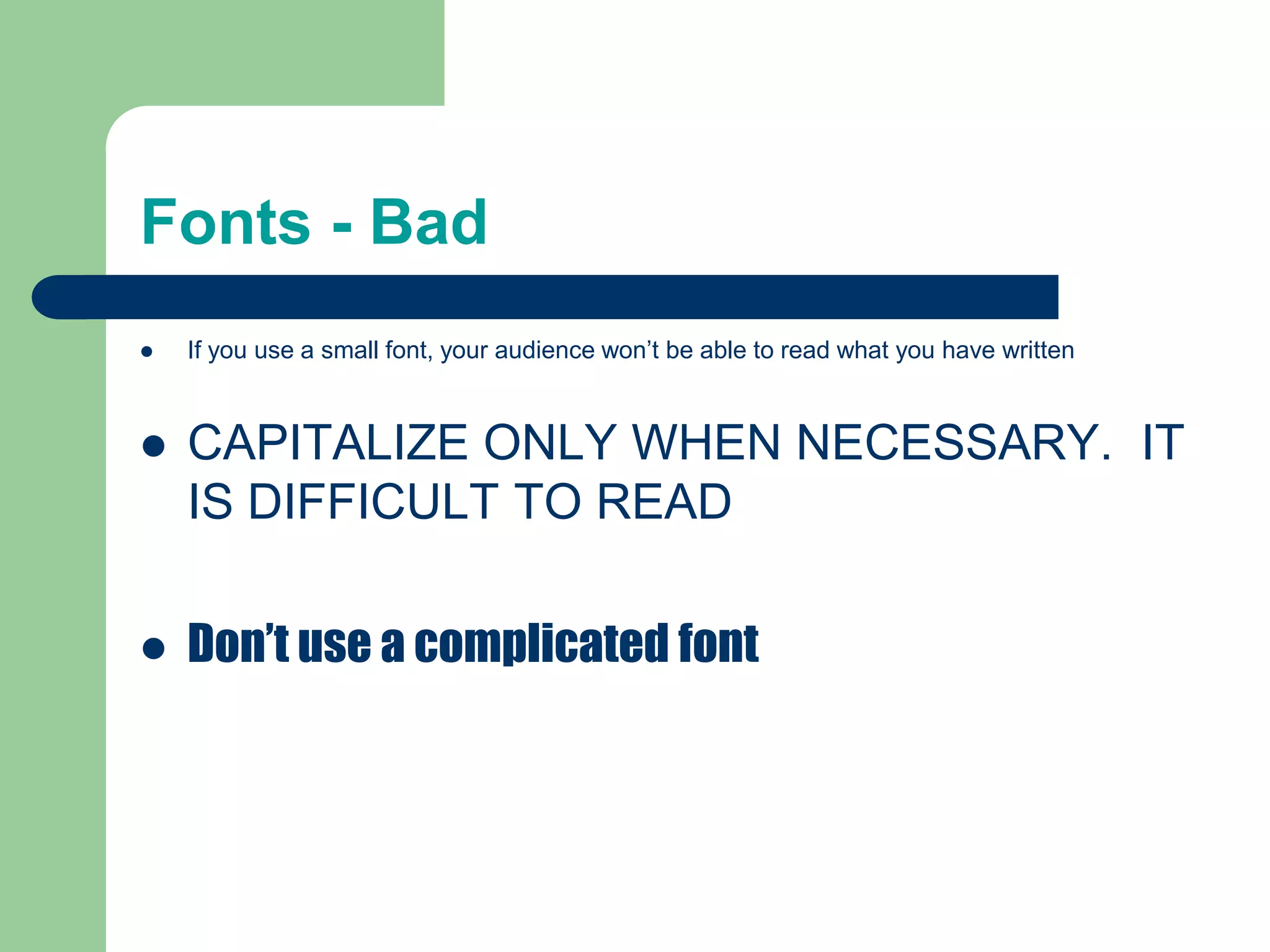
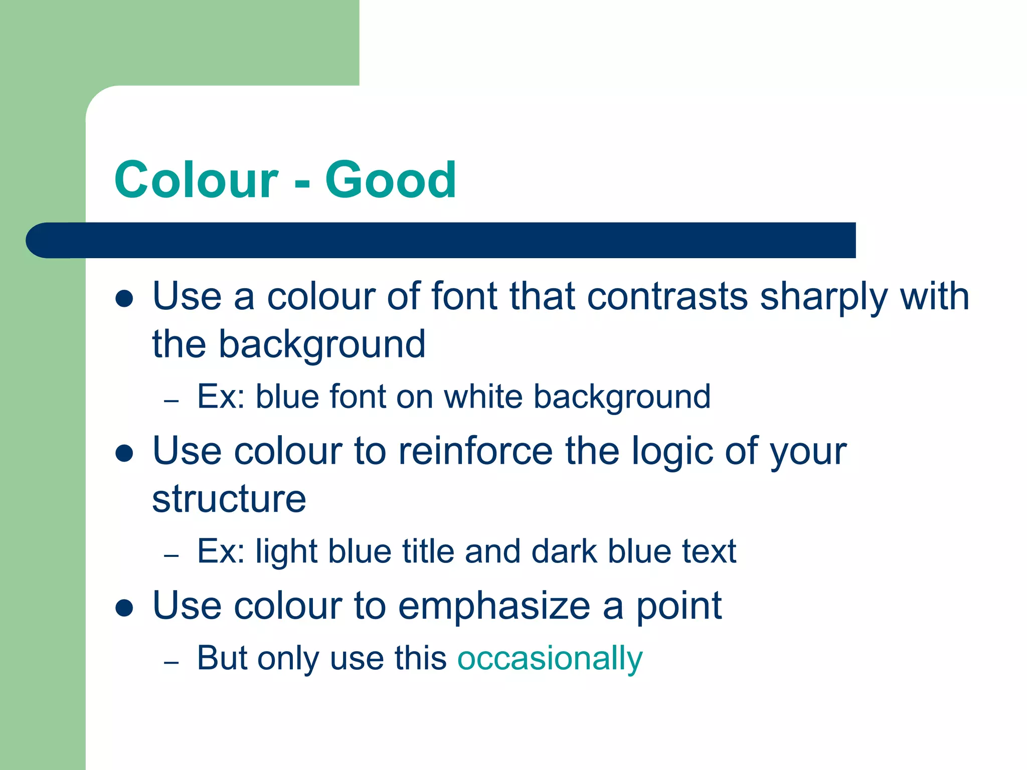
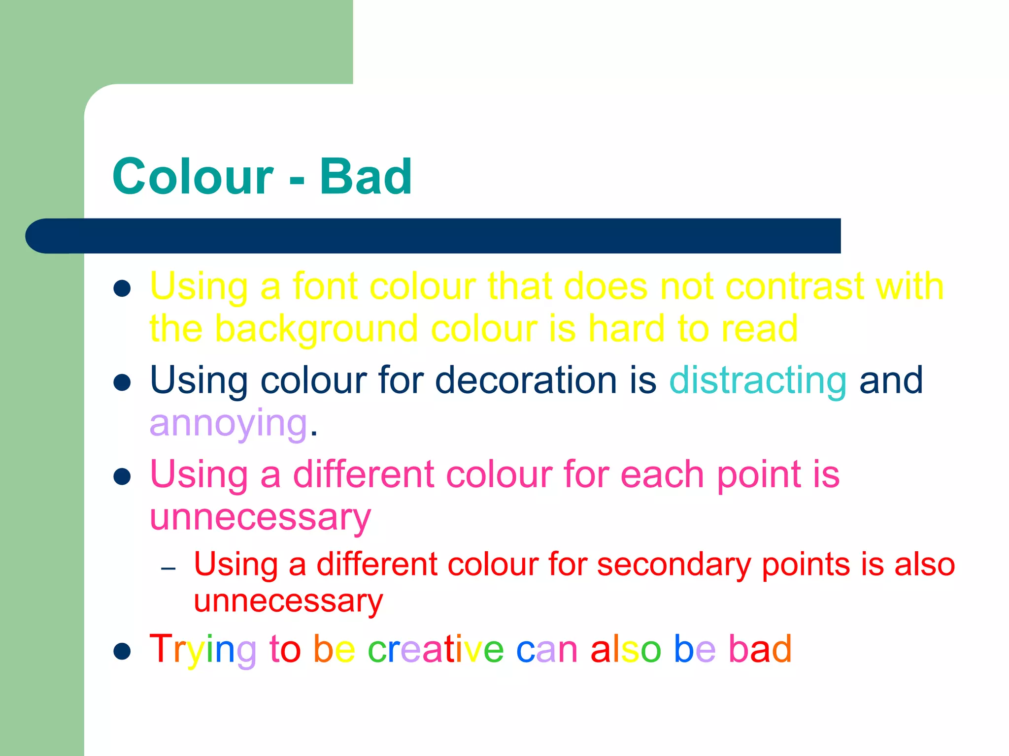
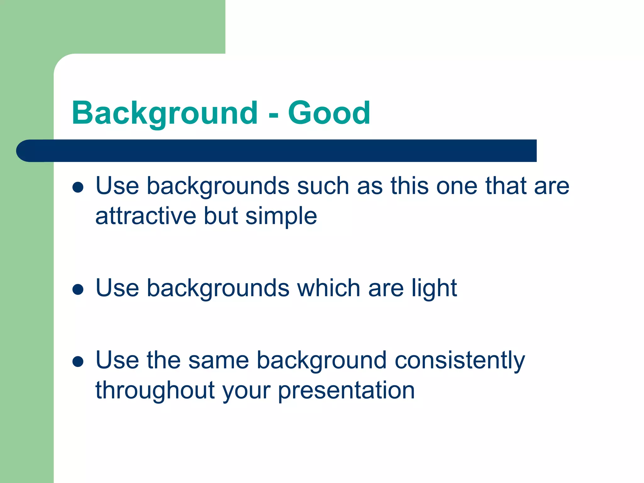
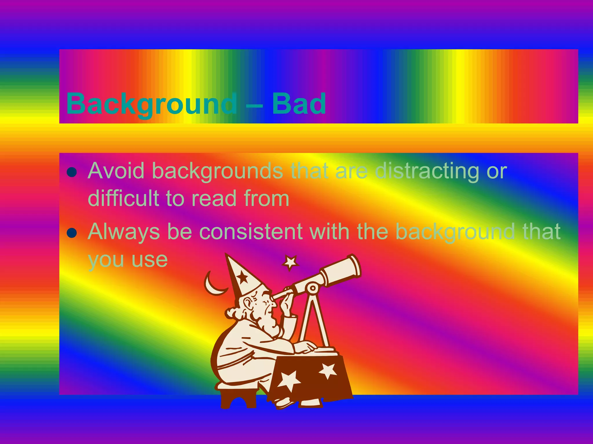
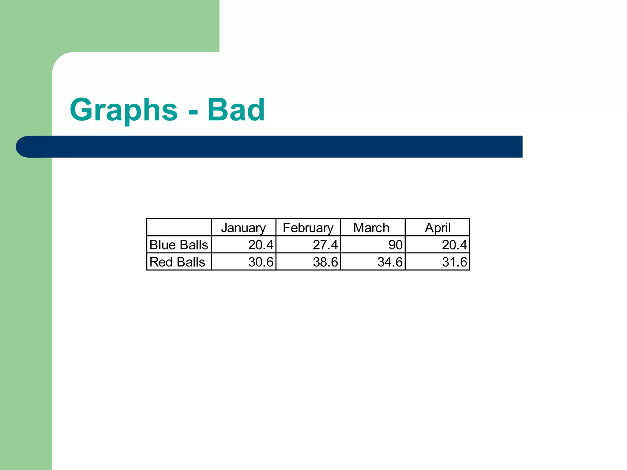
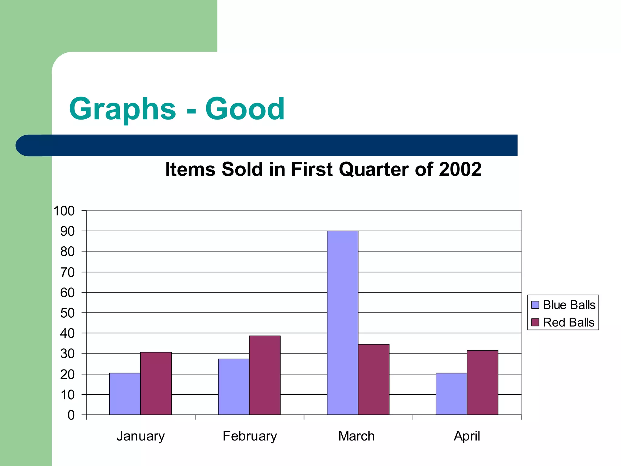
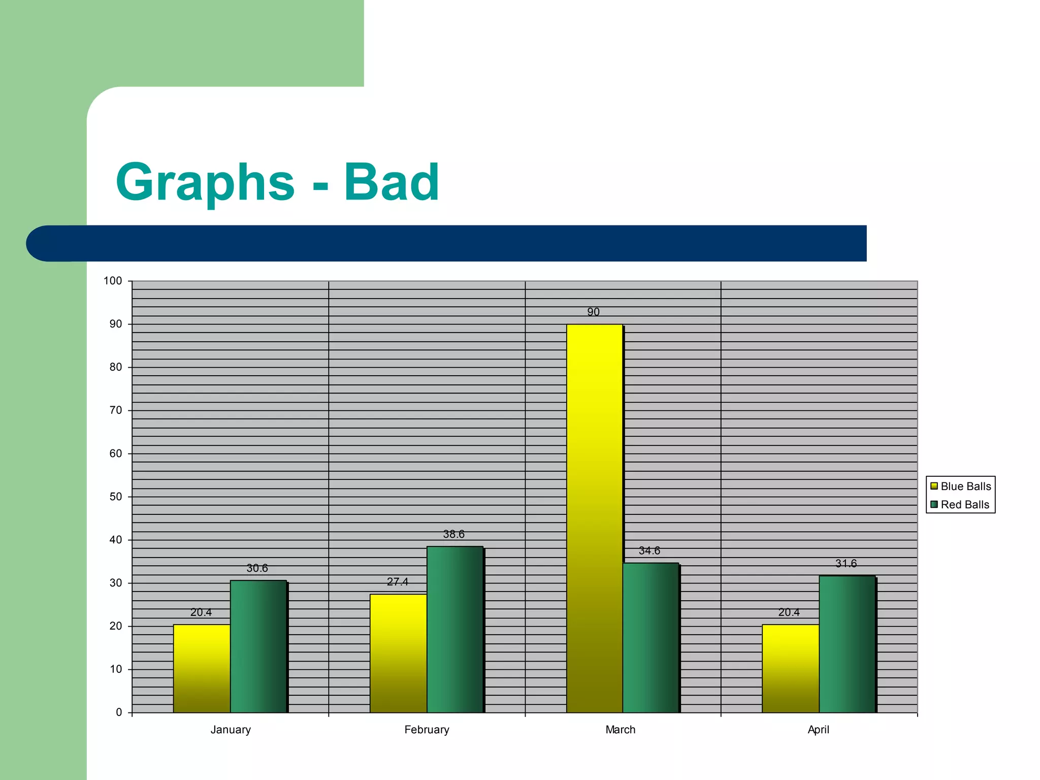
Making PowerPoint SlidesAvoiding the Pitfalls of Bad Slides
Tips to be CoveredOutlinesSlide StructureFontsColourBackgroundGraphsSpelling and GrammarConclusionsQuestions
Outline	Make your 1st or 2nd slide an outline of your presentationEx: previous slideFollow the order of your outline for the rest of the presentationOnly place main points on the outline slideEx: Use the titles of each slide as main points
Slide Structure – GoodUse 1-2 slides per minute of your presentationWrite in point form, not complete sentencesInclude 4-5 points per slideAvoid wordiness: use key words and phrases only
Slide Structure - BadThis page contains too many words for a presentation slide.  It is not written in point form, making it difficult both for your audience to read and for you to present each point. Although there are exactly the same number of points on this slide as the previous slide, it looks much more complicated.  In short, your audience will spend too much time trying to read this paragraph instead of listening to you.
Slide Structure – GoodShow one point at a time:Will help audience concentrate on what you are sayingWill prevent audience from reading aheadWill help you keep your presentation focused
Slide Structure - BadDo not use distracting animationDo not go overboard with the animationBe consistent with the animation that you use
Fonts - GoodUse at least an 18-point fontUse different size fonts for main points and secondary pointsthis font is 24-point, the main point font is 28-point, and the title font is 36-pointUse a standard font like Times New Roman or Arial
Fonts - BadIf you use a small font, your audience won’t be able to read what you have writtenCAPITALIZE ONLY WHEN NECESSARY.  IT IS DIFFICULT TO READDon’t use a complicated font
Colour - GoodUse a colour of font that contrasts sharply with the backgroundEx: blue font on white backgroundUse colour to reinforce the logic of your structureEx: light blue title and dark blue textUse colour to emphasize a pointBut only use this occasionally
Colour - BadUsing a font colour that does not contrast with the background colour is hard to read Using colour for decoration is distracting and annoying.Using a different colour for each point is unnecessaryUsing a different colour for secondary points is also unnecessaryTrying tobe creativecan alsobe bad
Background - GoodUse backgrounds such as this one that are attractive but simpleUse backgrounds which are lightUse the same background consistently throughout your presentation
Background – BadAvoid backgrounds that are distracting or difficult to read fromAlways be consistent with the background that you use
Graphs - GoodUse graphs rather than just charts and wordsData in graphs is easier to comprehend & retain than is raw dataTrends are easier to visualize in graph formAlways title your graphs
Graphs - Bad
Graphs - Good
Graphs - Bad
Graphs - BadMinor gridlines are unnecessaryFont is too smallColours are illogicalTitle is missingShading is distracting
Spelling and GrammarProof your slides for:speling mistakesthe use of of repeated wordsgrammatical errors you might have make If English is not your first language, please have someone else check your presentation!
ConclusionUse an effective and strong closingYour audience is likely to remember your last wordsUse a conclusion slide to:Summarize the main points of your presentationSuggest future avenues of research
Questions??End your presentation with a simple question slide to:Invite your audience to ask questionsProvide a visual aid during question periodAvoid ending a presentation abruptly

Presentations tips

  • 1.
    Making PowerPoint SlidesAvoidingthe Pitfalls of Bad Slides
  • 2.
    Tips to beCoveredOutlinesSlide StructureFontsColourBackgroundGraphsSpelling and GrammarConclusionsQuestions
  • 3.
    Outline Make your 1stor 2nd slide an outline of your presentationEx: previous slideFollow the order of your outline for the rest of the presentationOnly place main points on the outline slideEx: Use the titles of each slide as main points
  • 4.
    Slide Structure –GoodUse 1-2 slides per minute of your presentationWrite in point form, not complete sentencesInclude 4-5 points per slideAvoid wordiness: use key words and phrases only
  • 5.
    Slide Structure -BadThis page contains too many words for a presentation slide. It is not written in point form, making it difficult both for your audience to read and for you to present each point. Although there are exactly the same number of points on this slide as the previous slide, it looks much more complicated. In short, your audience will spend too much time trying to read this paragraph instead of listening to you.
  • 6.
    Slide Structure –GoodShow one point at a time:Will help audience concentrate on what you are sayingWill prevent audience from reading aheadWill help you keep your presentation focused
  • 7.
    Slide Structure -BadDo not use distracting animationDo not go overboard with the animationBe consistent with the animation that you use
  • 8.
    Fonts - GoodUseat least an 18-point fontUse different size fonts for main points and secondary pointsthis font is 24-point, the main point font is 28-point, and the title font is 36-pointUse a standard font like Times New Roman or Arial
  • 9.
    Fonts - BadIfyou use a small font, your audience won’t be able to read what you have writtenCAPITALIZE ONLY WHEN NECESSARY. IT IS DIFFICULT TO READDon’t use a complicated font
  • 10.
    Colour - GoodUsea colour of font that contrasts sharply with the backgroundEx: blue font on white backgroundUse colour to reinforce the logic of your structureEx: light blue title and dark blue textUse colour to emphasize a pointBut only use this occasionally
  • 11.
    Colour - BadUsinga font colour that does not contrast with the background colour is hard to read Using colour for decoration is distracting and annoying.Using a different colour for each point is unnecessaryUsing a different colour for secondary points is also unnecessaryTrying tobe creativecan alsobe bad
  • 12.
    Background - GoodUsebackgrounds such as this one that are attractive but simpleUse backgrounds which are lightUse the same background consistently throughout your presentation
  • 13.
    Background – BadAvoidbackgrounds that are distracting or difficult to read fromAlways be consistent with the background that you use
  • 14.
    Graphs - GoodUsegraphs rather than just charts and wordsData in graphs is easier to comprehend & retain than is raw dataTrends are easier to visualize in graph formAlways title your graphs
  • 15.
  • 16.
  • 17.
  • 18.
    Graphs - BadMinorgridlines are unnecessaryFont is too smallColours are illogicalTitle is missingShading is distracting
  • 19.
    Spelling and GrammarProofyour slides for:speling mistakesthe use of of repeated wordsgrammatical errors you might have make If English is not your first language, please have someone else check your presentation!
  • 20.
    ConclusionUse an effectiveand strong closingYour audience is likely to remember your last wordsUse a conclusion slide to:Summarize the main points of your presentationSuggest future avenues of research
  • 21.
    Questions??End your presentationwith a simple question slide to:Invite your audience to ask questionsProvide a visual aid during question periodAvoid ending a presentation abruptly