Downloaded 873 times


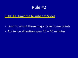


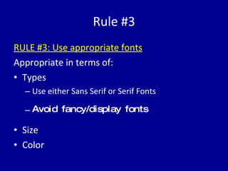


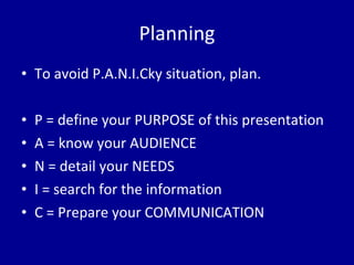


The document discusses the common issues with PowerPoint presentations, highlighting the importance of clear communication between the presenter and audience. It suggests three key rules for creating effective slides: keeping slides simple (the K.I.S.S. principle), limiting the number of slides, and using appropriate fonts and colors. Additionally, it emphasizes careful planning to enhance audience engagement and comprehension.


![Neuropsychiatry [2017]](https://cdn.slidesharecdn.com/ss_thumbnails/neuropsychiatricmanifestationofcommonneurologicaldisorders-171001003940-thumbnail.jpg?width=640&height=640&fit=bounds)
![Psychoses [2002]](https://cdn.slidesharecdn.com/ss_thumbnails/uupsychoses-170814005654-thumbnail.jpg?width=640&height=640&fit=bounds)


