Creating Effective Visual
Aids
Visual Aids Should…
 Outline, explain, support main
points
 Serve audience’s needs, not
speaker’s
 Be simple and clear
 Supplement and support…
NOT DOMINATE!...
the presentation
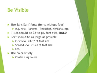
Be Visible
 Use Sans Serif fonts (fonts without feet)
 e.g. Arial, Tahoma, Trebuchet, Verdana, etc.
 Titles should be 32-44 pt. font size, BOLD
 Text should be as large as possible
 First level 24-32 pt font size
 Second level 20-28 pt font size
 Etc.
 Use color wisely
 Contrasting colors
Red/Blue Conflict
Red letters on blue background
creates “flicker effect”
Blue letters on red background
just as bad
Low Contrast
White on yellow Yellow on white
Black on blue Blue on black
Avoid These Combinations
 Examples:
Green on Blue
Dark Yellow on Green
Purple on Blue
Orange on Green
Red on Green
Don’t !
Colors
 White on dark background should not be
used if audience is more than 20 ft away.
 This set of slides is a good example.
 You can read the slides up close.
 The further away you get, the harder it is to
read.
 This is a good color combination if viewed on a
computer.
 A dark background on a computer screen
reduces glare.
Colorss
Large Hall Events
Avoid White Backgrounds
The white screen can be blinding
in a dark room
Dark Slides with Light Colored
Text Work Best
Don’t !
The Color Wheel
• Colors separated by
another color are
contrasting colors
(complementary)
• Adjacent colors harmonize
with one another (Green
and Yellow)
• Colors directly opposite one
another are said to CLASH
• Clashing colors provide
readability
– Orange on Blue
Do !
Colour - Good
 Use a colour of font that contrasts sharply with the
background
 Ex: blue font on white background
 Use colour to reinforce the logic of your structure
 Ex: light blue title and dark blue text
 Use colour to emphasize a point
 But only use this occasionally
Colour - Bad
 Using a font colour that does not contrast with the
background colour is hard to read
 Using colour for decoration is distracting and annoying.
 Using a different colour for each point is unnecessary
 Using a different colour for secondary points is also
unnecessary
 Trying to be creative can also be bad
This is a good mix of
colors. Readable!
Background Colors
Remember: Readability! Readability! Readability!
This is a bad mix of
colors. Low contrast.
Unreadable!
This is a good mix of
colors. Readable!
This is a bad mix of
colors. Avoid bright
colors on white.
Unreadable!
Background - Good
 Use backgrounds such as this one that are attractive but
simple
 Use backgrounds which are light
 Use the same background consistently throughout your
presentation
Background – Bad
 Avoid backgrounds that are distracting or difficult to read
from
 Always be consistent with the background that you use
Graphs and Charts
Make sure the audience can
read them!
Avoid using graphics that are difficult to read. In this example, the bright
colors on a white background and the small font make the graph hard to
read. It would be very difficult to see, especially in the back of a room.
8
Don’t !
Graphics and Charts
This graph contains too much information in an
unreadable format.
10
Don’t !
These are examples of
good graphs, with nice
line widths and good
colors.
Good Graph
Do !
Charts and Graphs
0
10
20
30
40
50
60
70
80
North America Europe Austrailia
Mode A
Mode B
Mode C
Don’t
Charts and Graphs
0
10
20
30
40
50
60
70
80
North
America
Europe Australia
Mode A
Mode B
Mode C
Do !
This is a good, readable table. Tables, especially large ones,
should be placed on a separate slide.
4/19 Fri 109 NICMOS restarted, Ne-loop control
continues
4/22 Mon 112 Change to mounting cup control
4/23 Tue 134 Return to Ne control, Filter wheel test
begins
4/24 Wed 155 Increase control temperature to allow
for +2 K variations
4/25 Thur 165 Begin darks every 3rd orbit
4/26 Fri 174 DQE test visit 1; Control temp +0.5 K
Do !
Graphs - Good
 Use graphs rather than just charts and words
 Data in graphs is easier to comprehend & retain than is raw
data
 Trends are easier to visualize in graph form
 Always title your graphs
Graphs - Bad
January February March April
Blue Balls 20.4 27.4 90 20.4
Red Balls 30.6 38.6 34.6 31.6
Graphs - Good
Items Sold in First Quarter of 2002
0
10
20
30
40
50
60
70
80
90
100
January February March April
Blue Balls
Red Balls
Graphs - Bad
20.4
27.4
90
20.4
30.6
38.6
34.6
31.6
0
10
20
30
40
50
60
70
80
90
100
January February March April
Blue Balls
Red Balls
Graphs - Bad
 Minor gridlines are unnecessary
 Font is too small
 Colours are illogical
 Title is missing
 Shading is distracting
• Upper left
• Upper right
• Lower left
• Lower right
Eye Movement
The “Z” Rule
Illustrations
 Use only when needed, otherwise they
become distracters instead of communicators
 They should relate to the message and help
make a point
 Ask yourself if it makes the message clearer
 Simple diagrams are great communicators
Do !
Don’t !
Preparation - Slides
Use Images & Graphics
Relevant images communicate,
and maintain interest
Displaying Visuals: Tips
 Select visuals purposefully
 What visuals illustrate a point? Make
a claim? Help to prove an argument?
 Design easy-to-read visuals
 Are the visuals easy to read by all members of your audience?
 Draw attention to aspects of visuals
 How will you draw attention to certain features of the visual?
31
Displaying Visuals
 Insert needed visuals
 Use color
 Resize appropriately
 Draw attention
32
That was purely
gratuitous!
Choose Color Carefully
33
Similar intensities
draw attention but make
details hard to see.
Strong, clean contrast
draws attention, makes
details easy to see
Simplify and Draw Attention
34
Animating: Tips
 Custom animation allows you to animate text, visuals, or line work
 Custom animation should be used purposefully (and sparingly!)
 Animating should help audience comprehend
your message
 Don’t animate solely for aesthetic purposes
35
Limit Each Slide to One Idea
• Use Bullet Points to Cover
Components of Each Idea
Bullets
 Keep each bullet to 1 line, 2 at the most
 Limit the number of bullets in a screen to 6, 4
if there is a large title, logo, picture, etc.
 This is known as “cueing”
 You want to “cue” the audience on what you’re going to say
 Cues are a a brief “preview”
 Gives the audience a “framework” to build upon
Bullets (con.)
 If you crowd too much text, the audience won’t read it
 Too much text looks busy and is hard to read
 Why read it, when you’re going to tell them what it
says?
 Our reading speed does not match our listening
speed; hence, they confuse instead of reinforce
Points to Remember
 Limit each slide to 1 idea
 Limit each bullet point to only a few words to avoid
long sentences that go on and on!
 Limit animation – Too much animation can be
distracting. Be consistent with animation and
have all text and photos appear on the screen the
same way each time. There are many animation
modes to choose from, but it is best to use just
one throughout.
Do not do this!
Limit Bullet Points
To a few words
Points to Remember
Keep bullet points brief
Use the same background for
each slide
Use dark slides with light colored
text in large hall events
Do !
Avoid the “All Word” Slide
Another thing to avoid is the use of a large
block paragraph to introduce your
information. Attendees do not like to have
what is on the screen, read to them
verbatim. So, please use short, bulleted
statements and avoid typing out your whole
presentation on to the slides. Also, it is
difficult for some to listen and read a large
amount of text at the same time.
Don’t
Limit Animation
 Use the same animation throughout the entire presentation
 Using more than one can be very distracting
 The audience will only see the animation and not the message you’re trying
to get across
!
Bam!
Don’t
Limit Animation
 Use the same animation throughout the entire presentation
 Using more than one can be very distracting
 The audience will only see the animation and not the message you’re trying
to get across
!
Do !
YOU
 Do not use the media to hide you
 The audience came to SEE you
 The media should ENHANCE the presentation,
not BE the presentation
 If you’re only going to read from the slides, then
just send them the slides!
 Remember, only you can prevent
“Death by PowerPoint”

Visual aids

  • 1.
  • 2.
    Visual Aids Should… Outline, explain, support main points  Serve audience’s needs, not speaker’s  Be simple and clear  Supplement and support… NOT DOMINATE!... the presentation
  • 3.
    Be Visible  UseSans Serif fonts (fonts without feet)  e.g. Arial, Tahoma, Trebuchet, Verdana, etc.  Titles should be 32-44 pt. font size, BOLD  Text should be as large as possible  First level 24-32 pt font size  Second level 20-28 pt font size  Etc.  Use color wisely  Contrasting colors
  • 4.
    Red/Blue Conflict Red letterson blue background creates “flicker effect” Blue letters on red background just as bad
  • 5.
    Low Contrast White onyellow Yellow on white Black on blue Blue on black
  • 6.
    Avoid These Combinations Examples: Green on Blue Dark Yellow on Green Purple on Blue Orange on Green Red on Green Don’t !
  • 7.
    Colors  White ondark background should not be used if audience is more than 20 ft away.  This set of slides is a good example.  You can read the slides up close.  The further away you get, the harder it is to read.  This is a good color combination if viewed on a computer.  A dark background on a computer screen reduces glare.
  • 8.
    Colorss Large Hall Events AvoidWhite Backgrounds The white screen can be blinding in a dark room Dark Slides with Light Colored Text Work Best Don’t !
  • 9.
    The Color Wheel •Colors separated by another color are contrasting colors (complementary) • Adjacent colors harmonize with one another (Green and Yellow) • Colors directly opposite one another are said to CLASH • Clashing colors provide readability – Orange on Blue Do !
  • 10.
    Colour - Good Use a colour of font that contrasts sharply with the background  Ex: blue font on white background  Use colour to reinforce the logic of your structure  Ex: light blue title and dark blue text  Use colour to emphasize a point  But only use this occasionally
  • 11.
    Colour - Bad Using a font colour that does not contrast with the background colour is hard to read  Using colour for decoration is distracting and annoying.  Using a different colour for each point is unnecessary  Using a different colour for secondary points is also unnecessary  Trying to be creative can also be bad
  • 12.
    This is agood mix of colors. Readable! Background Colors Remember: Readability! Readability! Readability! This is a bad mix of colors. Low contrast. Unreadable! This is a good mix of colors. Readable! This is a bad mix of colors. Avoid bright colors on white. Unreadable!
  • 13.
    Background - Good Use backgrounds such as this one that are attractive but simple  Use backgrounds which are light  Use the same background consistently throughout your presentation
  • 14.
    Background – Bad Avoid backgrounds that are distracting or difficult to read from  Always be consistent with the background that you use
  • 15.
    Graphs and Charts Makesure the audience can read them!
  • 16.
    Avoid using graphicsthat are difficult to read. In this example, the bright colors on a white background and the small font make the graph hard to read. It would be very difficult to see, especially in the back of a room. 8 Don’t ! Graphics and Charts
  • 17.
    This graph containstoo much information in an unreadable format. 10 Don’t !
  • 18.
    These are examplesof good graphs, with nice line widths and good colors. Good Graph Do !
  • 19.
    Charts and Graphs 0 10 20 30 40 50 60 70 80 NorthAmerica Europe Austrailia Mode A Mode B Mode C Don’t
  • 20.
  • 21.
    This is agood, readable table. Tables, especially large ones, should be placed on a separate slide. 4/19 Fri 109 NICMOS restarted, Ne-loop control continues 4/22 Mon 112 Change to mounting cup control 4/23 Tue 134 Return to Ne control, Filter wheel test begins 4/24 Wed 155 Increase control temperature to allow for +2 K variations 4/25 Thur 165 Begin darks every 3rd orbit 4/26 Fri 174 DQE test visit 1; Control temp +0.5 K Do !
  • 22.
    Graphs - Good Use graphs rather than just charts and words  Data in graphs is easier to comprehend & retain than is raw data  Trends are easier to visualize in graph form  Always title your graphs
  • 23.
    Graphs - Bad JanuaryFebruary March April Blue Balls 20.4 27.4 90 20.4 Red Balls 30.6 38.6 34.6 31.6
  • 24.
    Graphs - Good ItemsSold in First Quarter of 2002 0 10 20 30 40 50 60 70 80 90 100 January February March April Blue Balls Red Balls
  • 25.
  • 26.
    Graphs - Bad Minor gridlines are unnecessary  Font is too small  Colours are illogical  Title is missing  Shading is distracting
  • 27.
    • Upper left •Upper right • Lower left • Lower right Eye Movement The “Z” Rule
  • 28.
    Illustrations  Use onlywhen needed, otherwise they become distracters instead of communicators  They should relate to the message and help make a point  Ask yourself if it makes the message clearer  Simple diagrams are great communicators Do !
  • 29.
  • 30.
    Preparation - Slides UseImages & Graphics Relevant images communicate, and maintain interest
  • 31.
    Displaying Visuals: Tips Select visuals purposefully  What visuals illustrate a point? Make a claim? Help to prove an argument?  Design easy-to-read visuals  Are the visuals easy to read by all members of your audience?  Draw attention to aspects of visuals  How will you draw attention to certain features of the visual? 31
  • 32.
    Displaying Visuals  Insertneeded visuals  Use color  Resize appropriately  Draw attention 32 That was purely gratuitous!
  • 33.
    Choose Color Carefully 33 Similarintensities draw attention but make details hard to see. Strong, clean contrast draws attention, makes details easy to see
  • 34.
    Simplify and DrawAttention 34
  • 35.
    Animating: Tips  Customanimation allows you to animate text, visuals, or line work  Custom animation should be used purposefully (and sparingly!)  Animating should help audience comprehend your message  Don’t animate solely for aesthetic purposes 35
  • 36.
    Limit Each Slideto One Idea • Use Bullet Points to Cover Components of Each Idea
  • 37.
    Bullets  Keep eachbullet to 1 line, 2 at the most  Limit the number of bullets in a screen to 6, 4 if there is a large title, logo, picture, etc.  This is known as “cueing”  You want to “cue” the audience on what you’re going to say  Cues are a a brief “preview”  Gives the audience a “framework” to build upon
  • 38.
    Bullets (con.)  Ifyou crowd too much text, the audience won’t read it  Too much text looks busy and is hard to read  Why read it, when you’re going to tell them what it says?  Our reading speed does not match our listening speed; hence, they confuse instead of reinforce
  • 39.
    Points to Remember Limit each slide to 1 idea  Limit each bullet point to only a few words to avoid long sentences that go on and on!  Limit animation – Too much animation can be distracting. Be consistent with animation and have all text and photos appear on the screen the same way each time. There are many animation modes to choose from, but it is best to use just one throughout. Do not do this! Limit Bullet Points To a few words
  • 40.
    Points to Remember Keepbullet points brief Use the same background for each slide Use dark slides with light colored text in large hall events Do !
  • 41.
    Avoid the “AllWord” Slide Another thing to avoid is the use of a large block paragraph to introduce your information. Attendees do not like to have what is on the screen, read to them verbatim. So, please use short, bulleted statements and avoid typing out your whole presentation on to the slides. Also, it is difficult for some to listen and read a large amount of text at the same time. Don’t
  • 42.
    Limit Animation  Usethe same animation throughout the entire presentation  Using more than one can be very distracting  The audience will only see the animation and not the message you’re trying to get across ! Bam! Don’t
  • 43.
    Limit Animation  Usethe same animation throughout the entire presentation  Using more than one can be very distracting  The audience will only see the animation and not the message you’re trying to get across ! Do !
  • 44.
    YOU  Do notuse the media to hide you  The audience came to SEE you  The media should ENHANCE the presentation, not BE the presentation  If you’re only going to read from the slides, then just send them the slides!  Remember, only you can prevent “Death by PowerPoint”