Downloaded 44 times


This document outlines the fundamentals of effective presentation skills, emphasizing the importance of preparation, understanding the audience, and the strategic use of visual aids. It provides practical tips on content delivery, design elements such as font and color choices, and the use of microphones. Additionally, it highlights common mistakes presenters make and strategies to improve confidence and engagement during presentations.
Introduction and contact details of the presenter, Md. Aminul Islam Shahin.
Indicators (5, 4, 3) possibly marking parts or slides in the presentation.
Initiating the presentation with a warm welcome to the audience.
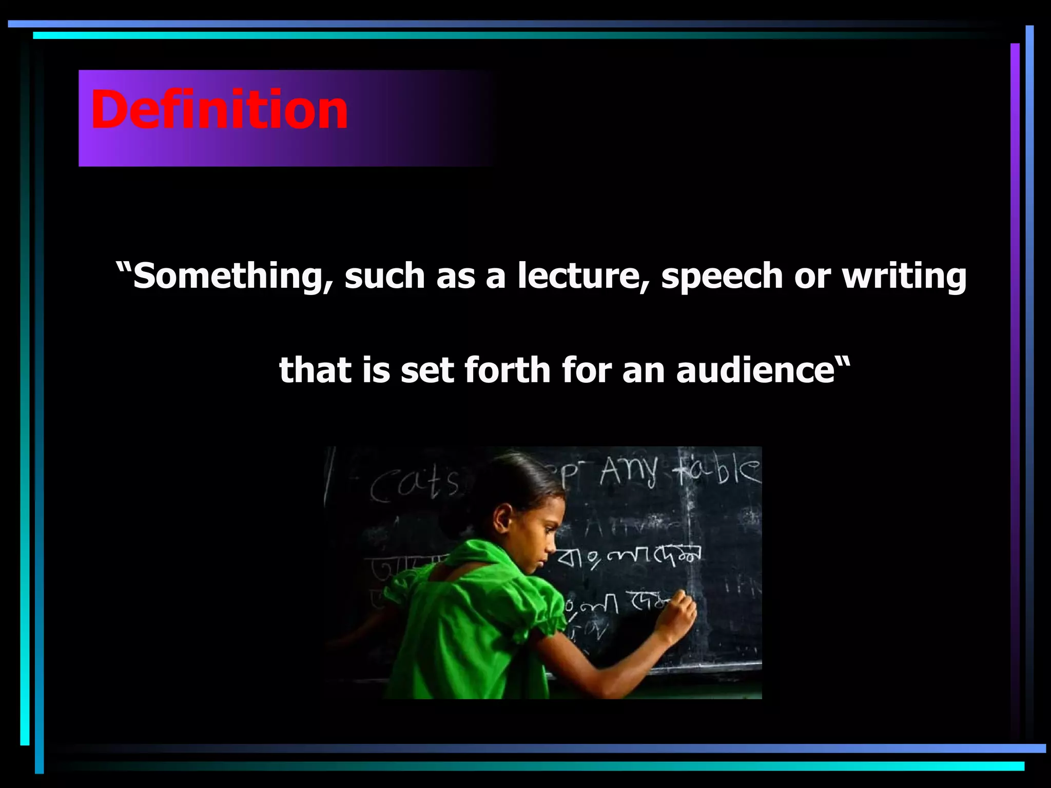
Defining presentations as speeches or written works aimed at an audience.
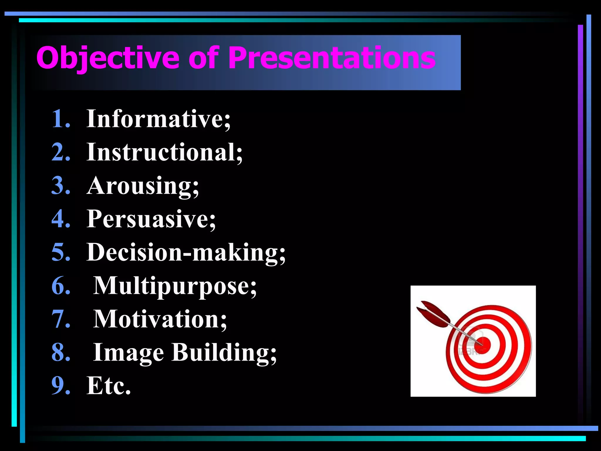
Discusses various motives for presentations including informative, persuasive, and motivational agendas.
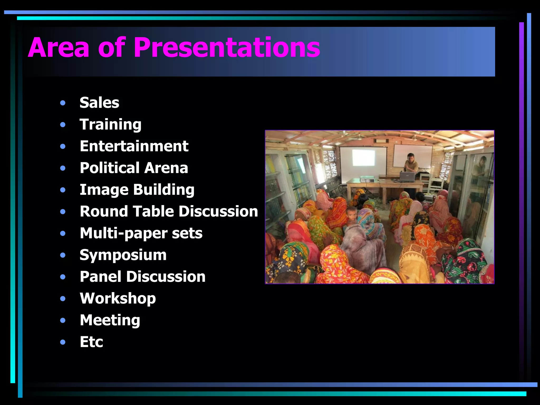
Listing different contexts for presentations: sales training, political settings, workshops, and discussions.
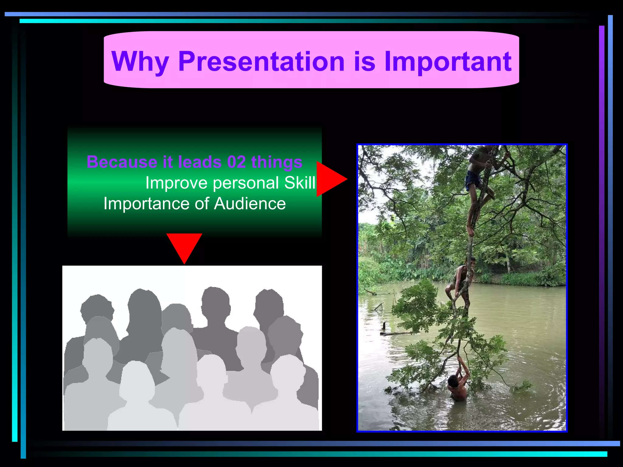
Emphasizes personal skill enhancement and audience engagement as key benefits of effective presentations.
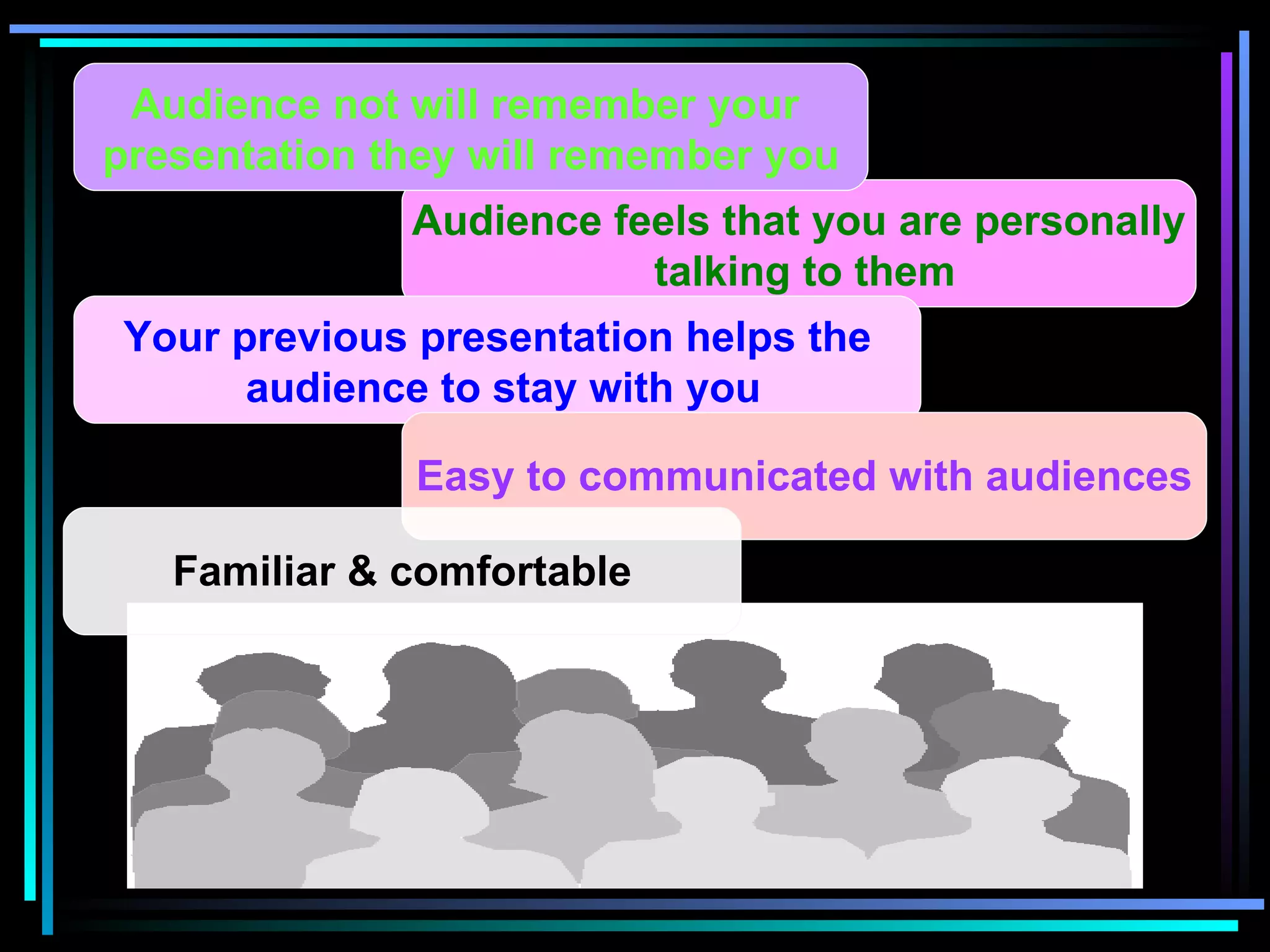
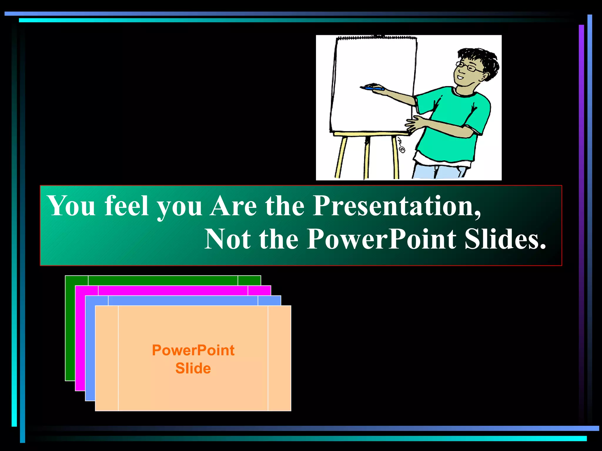
Strategies for connecting with the audience personally, ensuring communication clarity and retention.
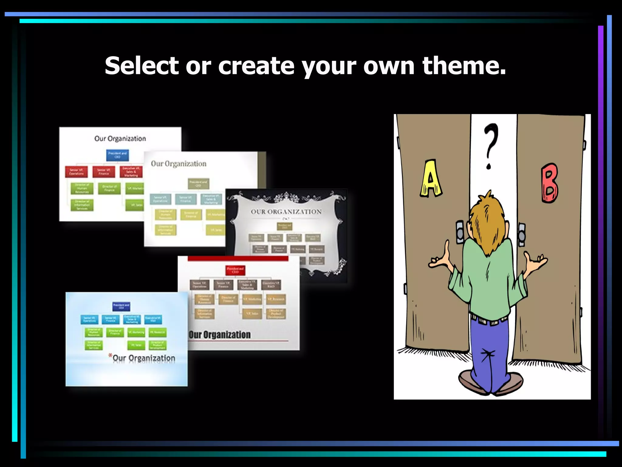
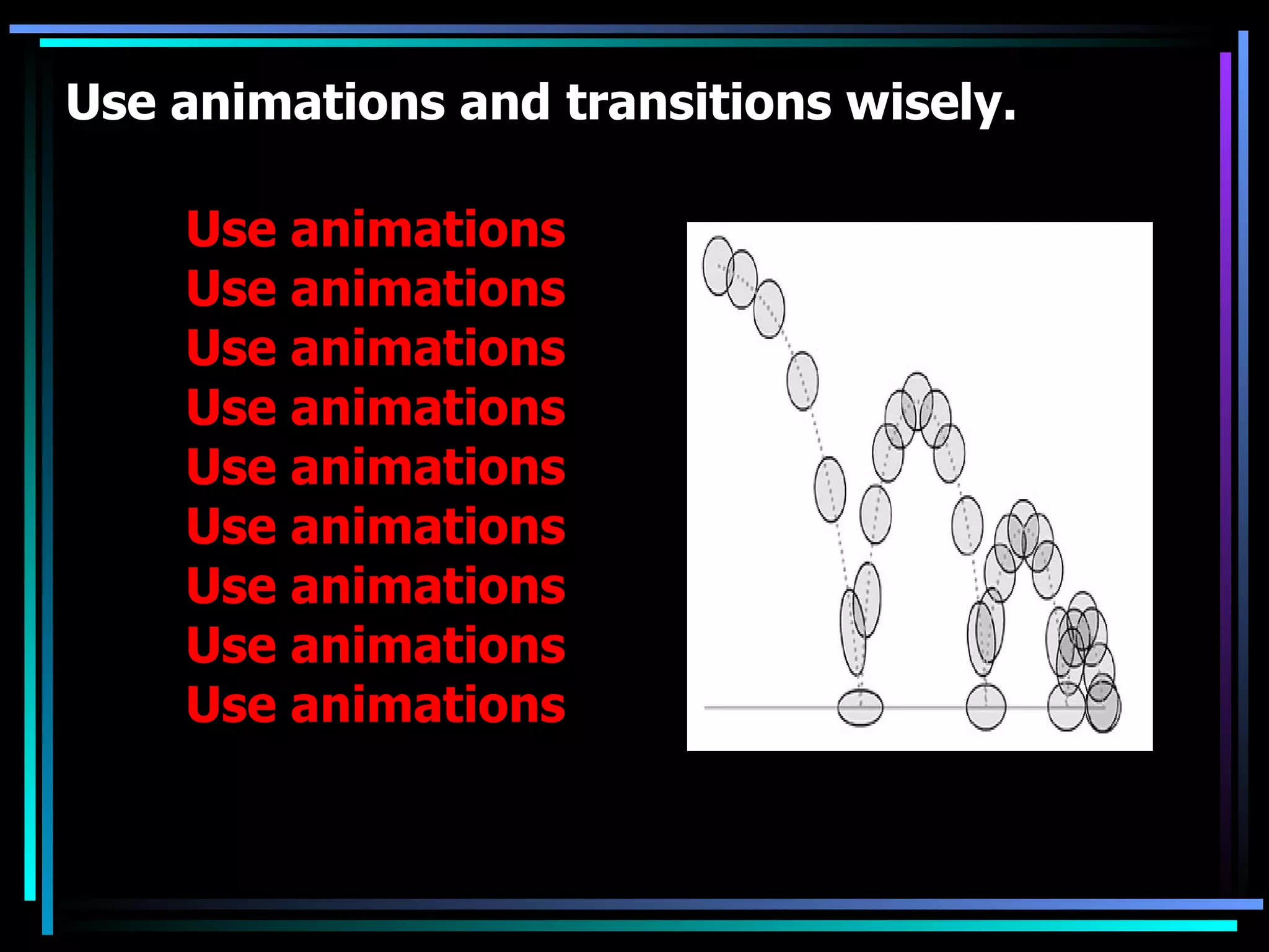
Best practices in using visuals, themes, audio/visual elements, and graphics to convey messages.
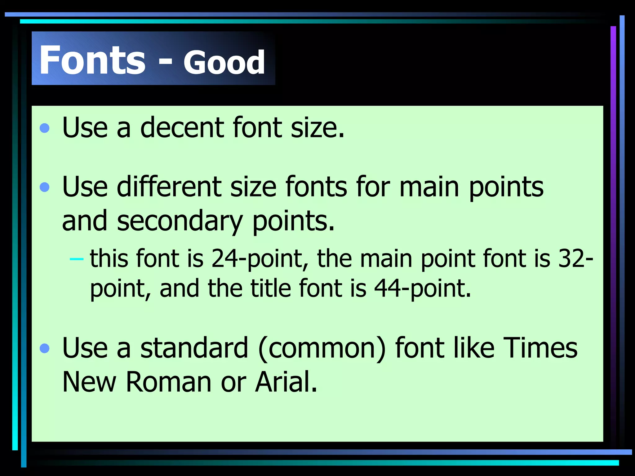
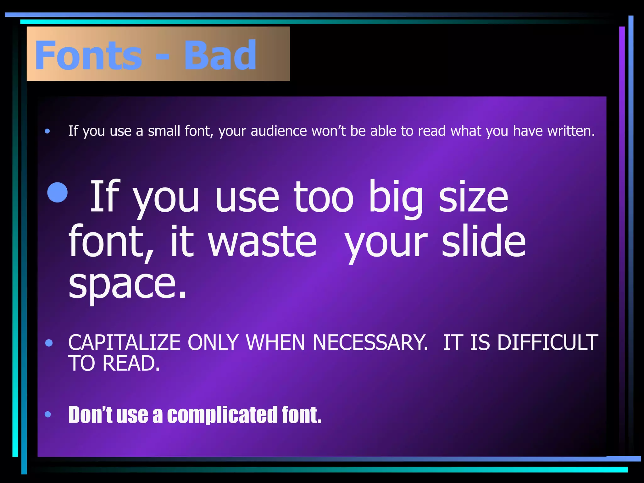
Guidelines for selecting readable fonts, font sizes, and styles to enhance visual communication.
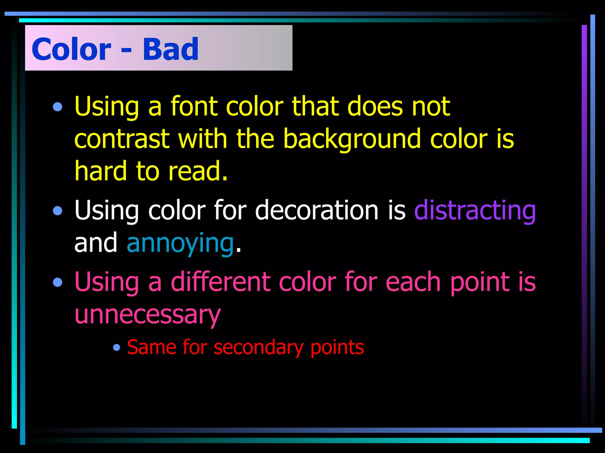
Advice on using contrasting colors for better readability and relevant color application.
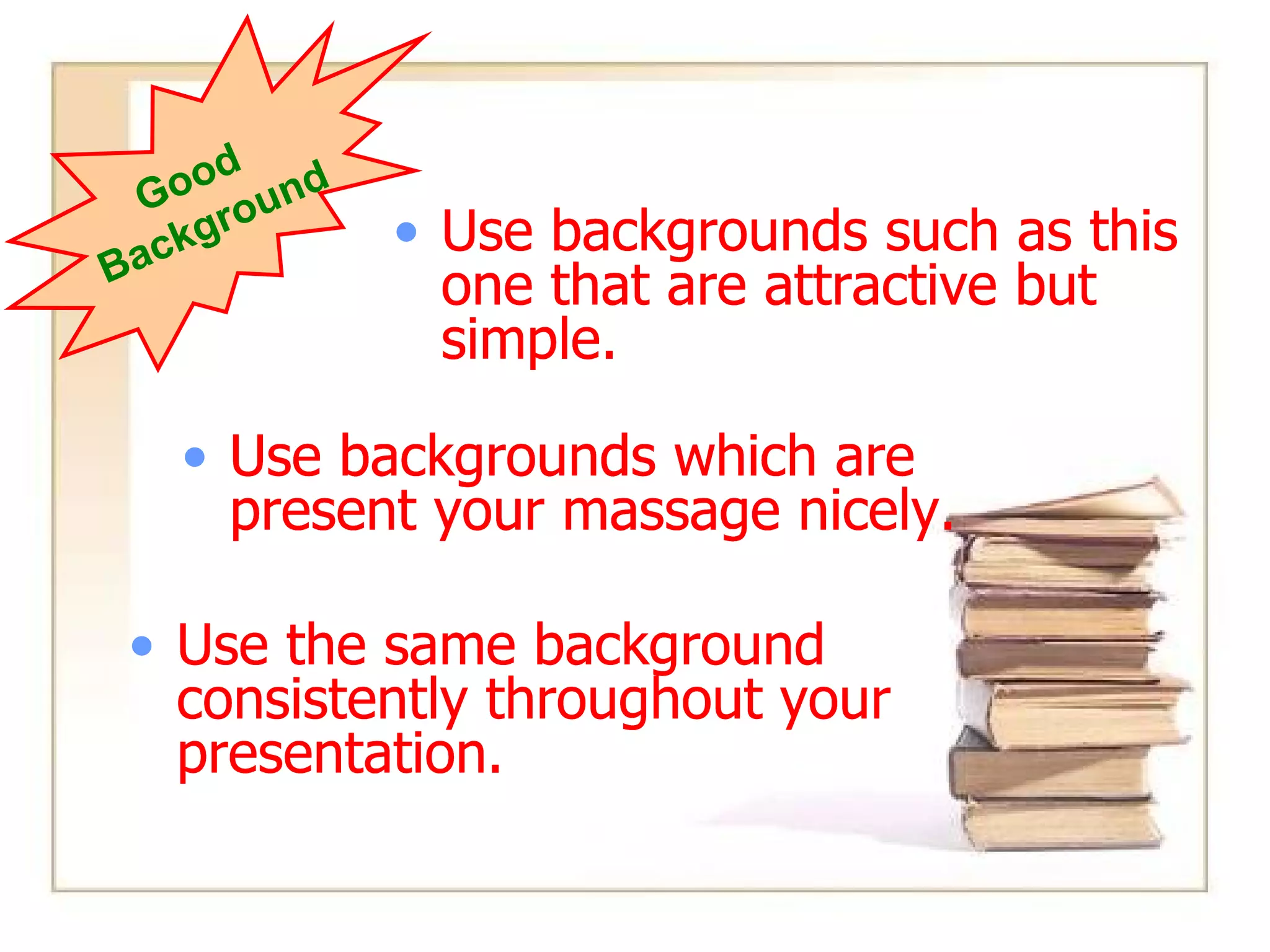
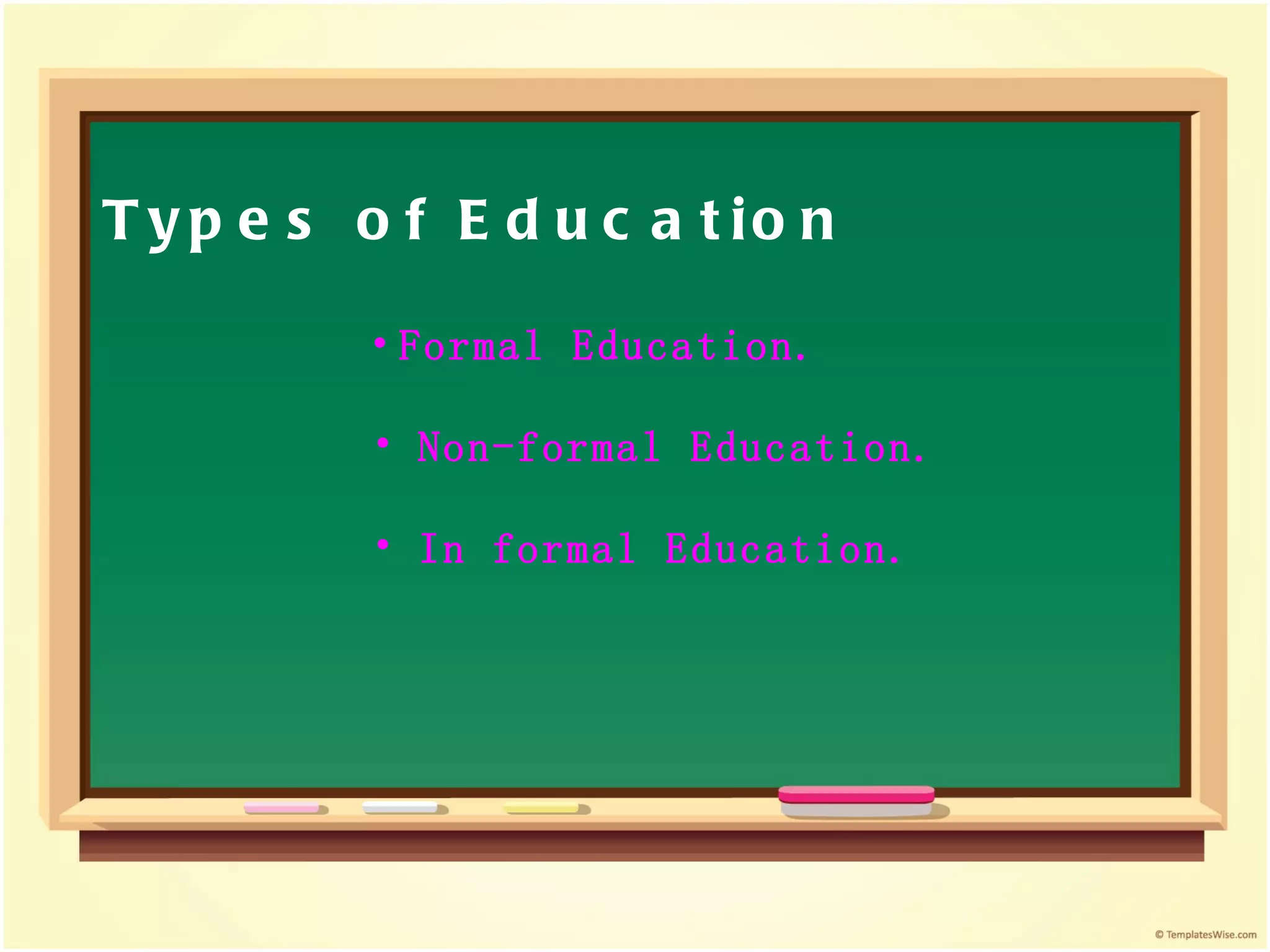
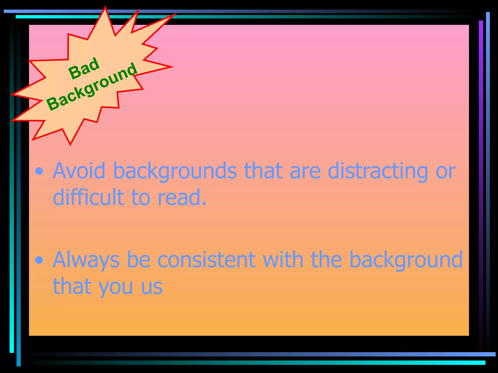
Tips for choosing simple, consistent backgrounds that support message clarity and visual appeal. Classifying different educational approaches: formal, non-formal, and informal education.
Strategies for balancing time, managing file sizes, and utilizing practical notes effectively.
Recommendations for using tools and materials such as printouts to enhance effectiveness.
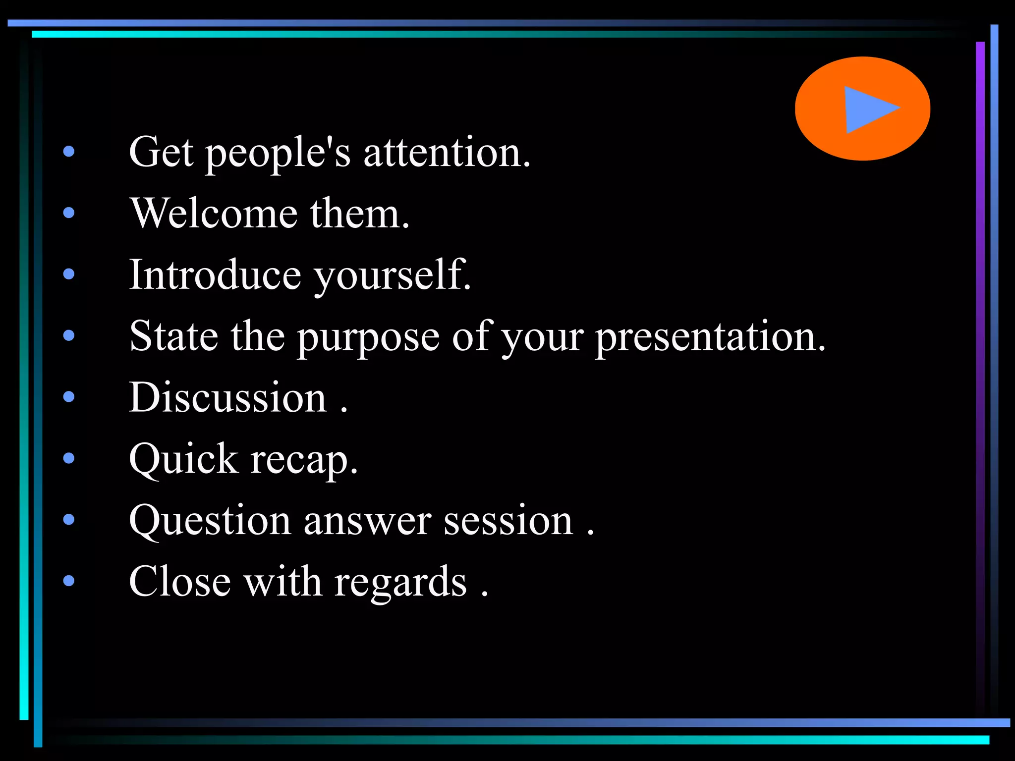
Key elements for initiating presentations, including attention grabbing and microphone use.
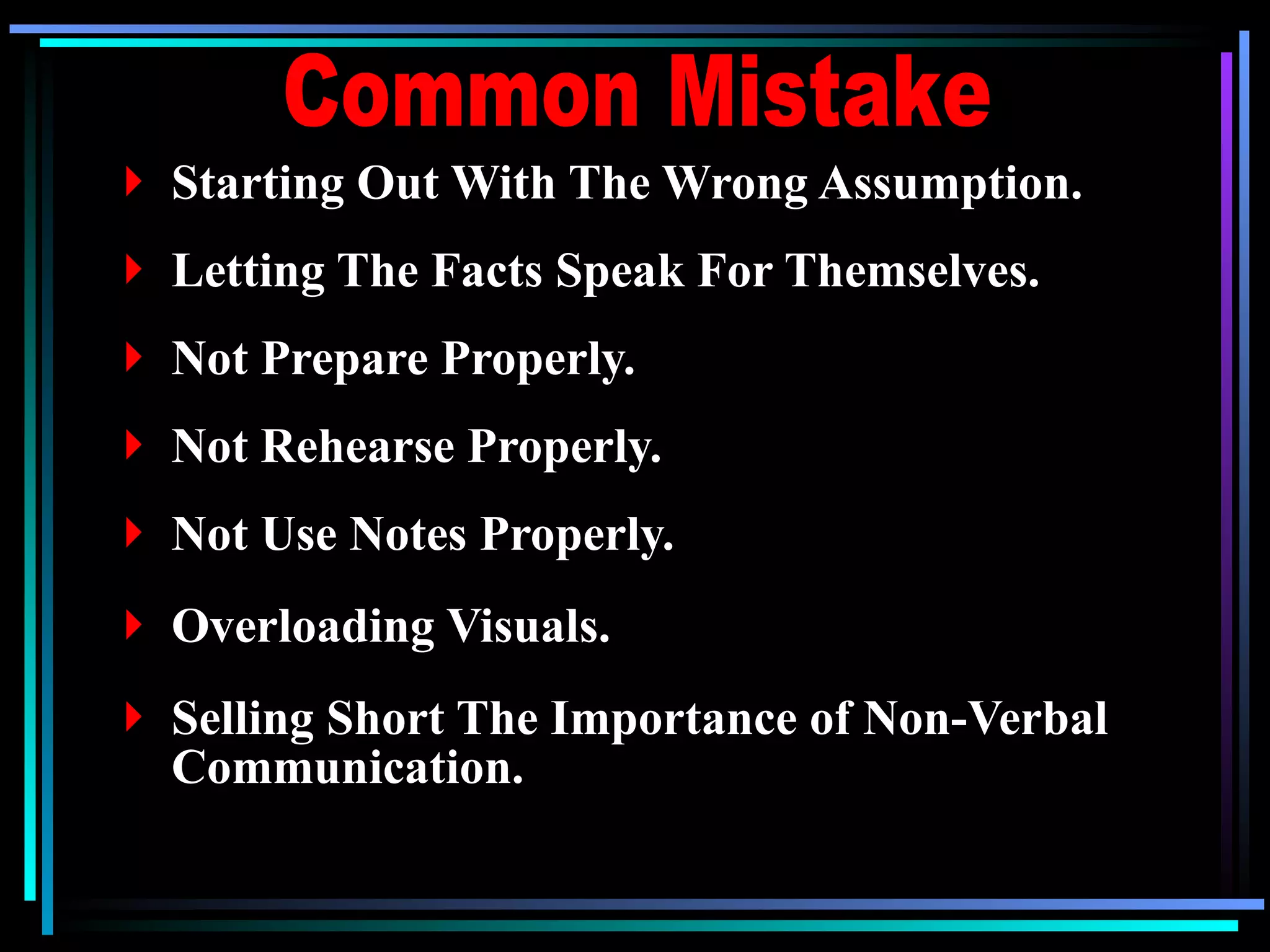
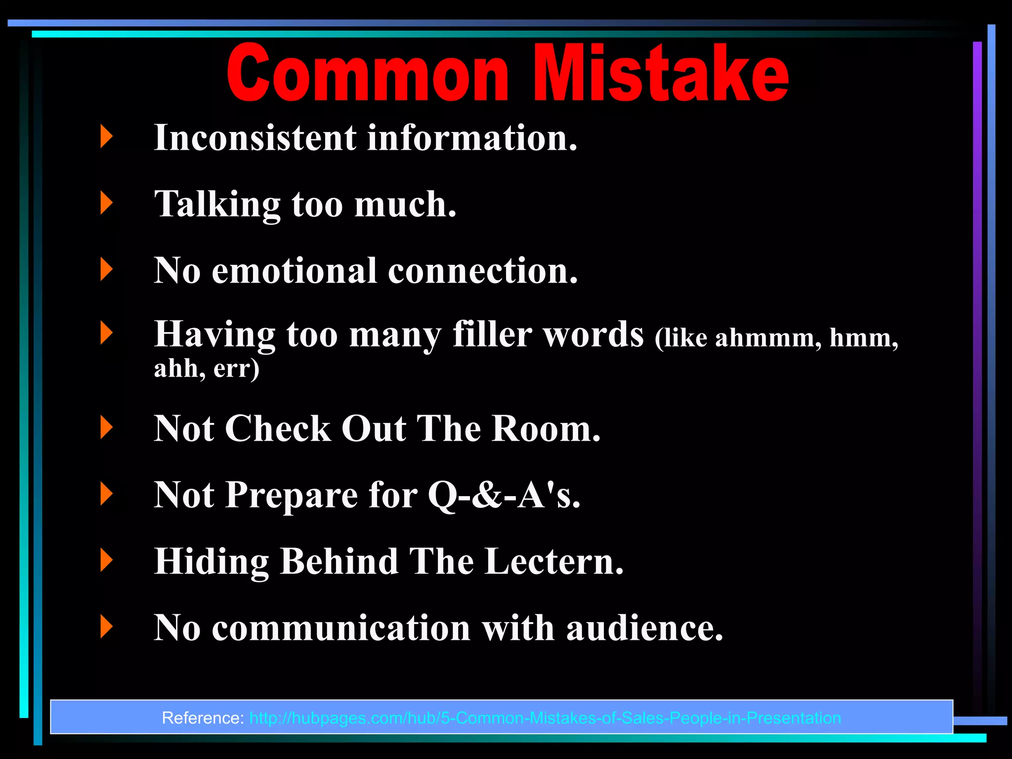
Identifying frequent pitfalls in presentations, such as poor preparations and communication issues.
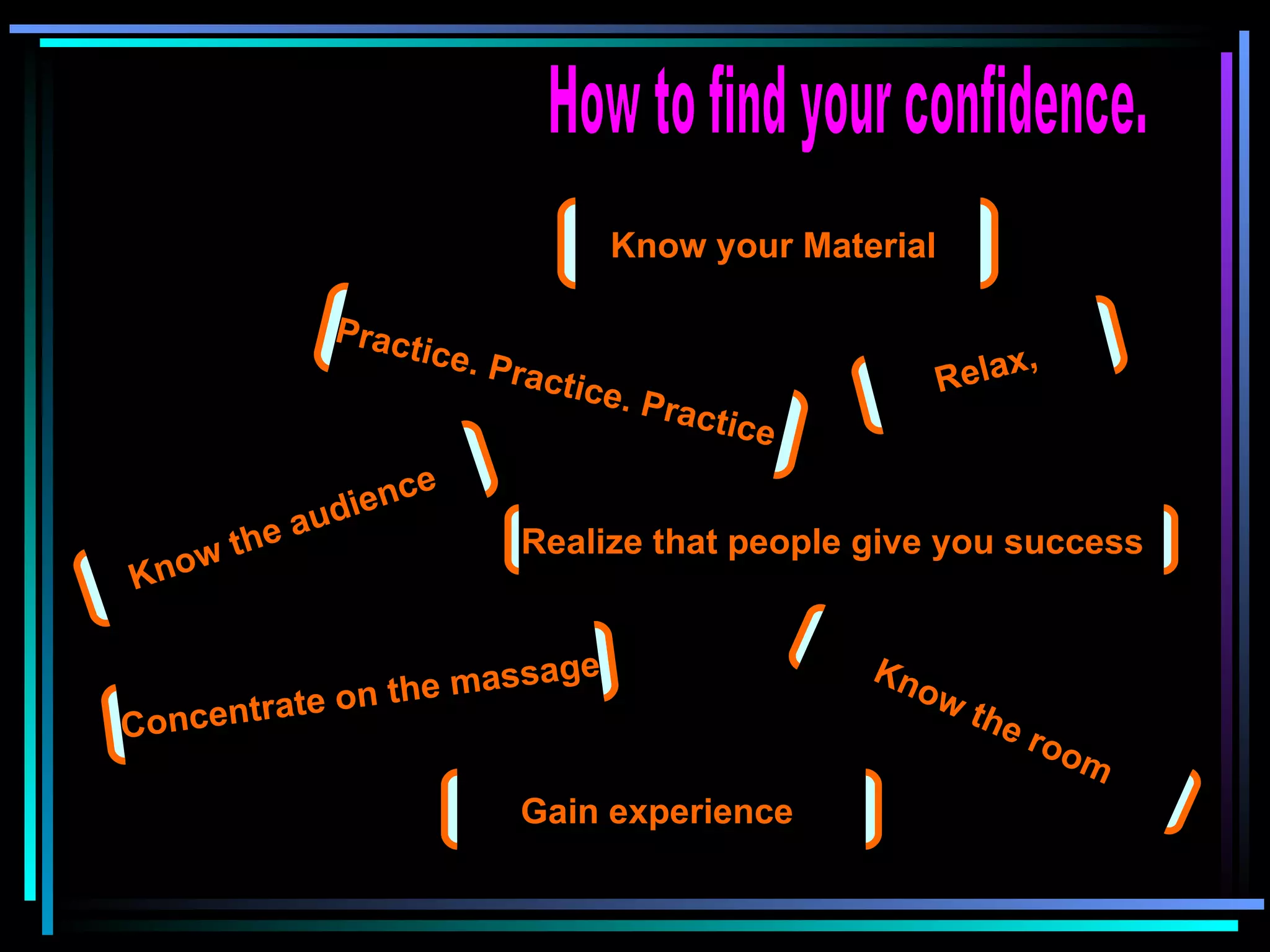
Tips for gaining confidence, knowing material, practicing, and connecting with the audience.
Links to self-assessment tools and resources for evaluating presentation skills.
Concluding the presentation with a thank you note to the audience.


![Creating a powerful_presentation[1]](https://cdn.slidesharecdn.com/ss_thumbnails/creatingapowerfulpresentation1-100604185446-phpapp01-thumbnail.jpg?width=640&height=640&fit=bounds)


