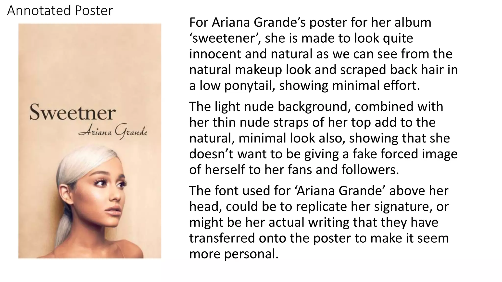
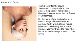
Annotated Poster
For Ariana Grande’s poster for her album
‘sweetener’, she is made to look quite
innocent and natural as we can see from the
natural makeup look and scraped back hair in
a low ponytail, showing minimal effort.
The light nude background, combined with
her thin nude straps of her top add to the
natural, minimal look also, showing that she
doesn’t want to be giving a fake forced image
of herself to her fans and followers.
The font used for ‘Ariana Grande’ above her
head, could be to replicate her signature, or
might be her actual writing that they have
transferred onto the poster to make it seem
more personal.
Annotated Poster
The CD cover for the album
‘sweetener’ is very similar to the
poster. The photo of her is upside
down which could symbolize confusion
or unclearness.
It’s the same photo that replicates a
neutral image of herself and isn’t
anything flashy which almost makes
you drawn to listening to the music
more, as you’re intrigued to hear what
her music and message is based on the
cover.
These are my font ideas and the names of
the fonts, I got all my font samples off da
font.
My Favourite one is ‘Dreamer’ because it
looks similar to handwriting and I want
that idea so come across on my artists
album and poster as if they’ve hand
written it themselves. I also like it because
it has a slight messy look to it, and I like
that the letters overlap slightly.
My Plans for taking images
Digipak Sketch
Production Schedule

Ihdak

  • 1.
    Annotated Poster For ArianaGrande’s poster for her album ‘sweetener’, she is made to look quite innocent and natural as we can see from the natural makeup look and scraped back hair in a low ponytail, showing minimal effort. The light nude background, combined with her thin nude straps of her top add to the natural, minimal look also, showing that she doesn’t want to be giving a fake forced image of herself to her fans and followers. The font used for ‘Ariana Grande’ above her head, could be to replicate her signature, or might be her actual writing that they have transferred onto the poster to make it seem more personal.
  • 2.
    Annotated Poster The CDcover for the album ‘sweetener’ is very similar to the poster. The photo of her is upside down which could symbolize confusion or unclearness. It’s the same photo that replicates a neutral image of herself and isn’t anything flashy which almost makes you drawn to listening to the music more, as you’re intrigued to hear what her music and message is based on the cover.
  • 3.
    These are myfont ideas and the names of the fonts, I got all my font samples off da font. My Favourite one is ‘Dreamer’ because it looks similar to handwriting and I want that idea so come across on my artists album and poster as if they’ve hand written it themselves. I also like it because it has a slight messy look to it, and I like that the letters overlap slightly.
  • 4.
    My Plans fortaking images
  • 5.
  • 6.