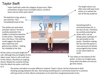
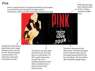
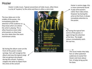
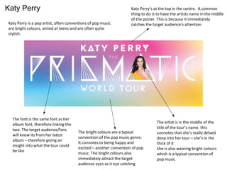
Ancillary Task - Posters
Megan Murphy
Taylor Swift
Taylor Swift falls under the category of pop music. Often
conventions of pop music are bright colours, aimed at
teens and are often quite stylish.
Tour dates on the bottom of the
poster, so fans can straight away
know when the dates are and can
get their tickets.
The bold font is big, which is
eye catching – fans
immediately know its her.
Something Swift is
commonly known for, is
her love of cats. Therefore
by carefully selecting her
shoes with a cat ear
design, gives a glimpse of
her personality on the
poster. Therefore making
the fans feel the poster is
more personal and will be
encouraged to buy tickets
as she seems down to
earth.
The poster and album are quite different, however Taylor’s classic red lip is featured on both.
Showing synergy between the two. Also having something she is commonly known for is common
with pop artists on their albums and posters as its what fans recognise/associate to her.
The bright colours are
often seen with pop music
artists as it catches the
eye of the key audience.
All the colours are quite bright but
soft. Although they are brighter to the
album cover, there is still a soft tone
to the colours, therefore an ongoing
theme. Maybe this could be hinting
that this album has quite a soft tone
to it.
The clothes are quite basic
and plain colours. Yet she is
carefully selected in the
middle, to bring the attention
to the centre – showing that
she is the focus. The clothing
could suggest she doesn’t
wear expensive and
glamourous clothes – making
her relatable to her fans
P!nk
P!nk is a pop/rock artist. So typical conventions you’d expect
to see from this particular genre is bright colours,
mainstream, stylish and often artists like to follow the crowd
P!NK’s generic logo,
fans instantly know
its her. It draws
attention straight
away
The font is the same on the
album front. Therefore this gives
a hint to the fans that most of
the songs featured will be from
her new album. Her fans will be
able to identify straight away.
The colours are quite dark,
with bits of red. The main
focus is on the letters “P!
NK” as well as the artist
herself. The ‘red’ is
carefully selected as red is
often connoted to love –
which carries on this
theme of love
Usually the artists picture
would take centre stage,
however pink is more to
the left, therefore being
unconventional. This
makes the artist seem
more down to earth.
Hozier
Hozier is indie music. Typical conventions of indie music, often there
is a lot of ‘mystery’ to the artist and there is often a retro look
Hozier is centre stage, this
is more commonly found
in pop artist posters
rather than indie artists.
However by having the
artist at the front, it draws
immediate attention to
the poster.
By having the typical font
centre of the poster, it
again brings the attention
of the fans. The bright
colours immediately catch
the eye too.
The social media links help
fans or other potential
audiences to easily find
Hozier and more about
him. It helps bring up the
fan base.
The tour dates are in the
middle of the poster, this
immediately grabs the
attention of the audience so
they know when are where
the artist is playing. This is
often found on more indie
artist posters as they have
less tour dates then the more
mainstream artists
By having the album cover on the
front of the poster creates
synergy. Fans will recognise the
album and now the typical songs
that are going to be played
during this concert. It gives a
snippet into what to expect from
the artist at the concert
Katy Perry
Katy Perry is a pop artist, often conventions of pop music
are bright colours, aimed at teens and are often quite
stylish.
Katy Perry’s at the top in the centre. A common
thing to do is to have the artists name in the middle
of the poster. This is because it immediately
catches the target audience’s attention
The artist is in the middle of the
title of the tour’s name. this
connotes that she’s really delved
deep into her tour – she’s in the
thick of it
She is also wearing bright colours
which is a typical convention of
pop music
The bright colours are a typical
convention of the pop music genre.
It connotes to being happy and
excited – another convention of pop
music. The bright colours also
immediately attract the target
audience eyes as it eye catching
The font is the same font as her
album font, therefore linking the
two. The target audience/fans
will know its from her latest
album – therefore giving an
insight into what the tour could
be like

Ancillary task posters

  • 1.
    Ancillary Task -Posters Megan Murphy
  • 2.
    Taylor Swift Taylor Swiftfalls under the category of pop music. Often conventions of pop music are bright colours, aimed at teens and are often quite stylish. Tour dates on the bottom of the poster, so fans can straight away know when the dates are and can get their tickets. The bold font is big, which is eye catching – fans immediately know its her. Something Swift is commonly known for, is her love of cats. Therefore by carefully selecting her shoes with a cat ear design, gives a glimpse of her personality on the poster. Therefore making the fans feel the poster is more personal and will be encouraged to buy tickets as she seems down to earth. The poster and album are quite different, however Taylor’s classic red lip is featured on both. Showing synergy between the two. Also having something she is commonly known for is common with pop artists on their albums and posters as its what fans recognise/associate to her. The bright colours are often seen with pop music artists as it catches the eye of the key audience. All the colours are quite bright but soft. Although they are brighter to the album cover, there is still a soft tone to the colours, therefore an ongoing theme. Maybe this could be hinting that this album has quite a soft tone to it. The clothes are quite basic and plain colours. Yet she is carefully selected in the middle, to bring the attention to the centre – showing that she is the focus. The clothing could suggest she doesn’t wear expensive and glamourous clothes – making her relatable to her fans
  • 3.
    P!nk P!nk is apop/rock artist. So typical conventions you’d expect to see from this particular genre is bright colours, mainstream, stylish and often artists like to follow the crowd P!NK’s generic logo, fans instantly know its her. It draws attention straight away The font is the same on the album front. Therefore this gives a hint to the fans that most of the songs featured will be from her new album. Her fans will be able to identify straight away. The colours are quite dark, with bits of red. The main focus is on the letters “P! NK” as well as the artist herself. The ‘red’ is carefully selected as red is often connoted to love – which carries on this theme of love Usually the artists picture would take centre stage, however pink is more to the left, therefore being unconventional. This makes the artist seem more down to earth.
  • 4.
    Hozier Hozier is indiemusic. Typical conventions of indie music, often there is a lot of ‘mystery’ to the artist and there is often a retro look Hozier is centre stage, this is more commonly found in pop artist posters rather than indie artists. However by having the artist at the front, it draws immediate attention to the poster. By having the typical font centre of the poster, it again brings the attention of the fans. The bright colours immediately catch the eye too. The social media links help fans or other potential audiences to easily find Hozier and more about him. It helps bring up the fan base. The tour dates are in the middle of the poster, this immediately grabs the attention of the audience so they know when are where the artist is playing. This is often found on more indie artist posters as they have less tour dates then the more mainstream artists By having the album cover on the front of the poster creates synergy. Fans will recognise the album and now the typical songs that are going to be played during this concert. It gives a snippet into what to expect from the artist at the concert
  • 5.
    Katy Perry Katy Perryis a pop artist, often conventions of pop music are bright colours, aimed at teens and are often quite stylish. Katy Perry’s at the top in the centre. A common thing to do is to have the artists name in the middle of the poster. This is because it immediately catches the target audience’s attention The artist is in the middle of the title of the tour’s name. this connotes that she’s really delved deep into her tour – she’s in the thick of it She is also wearing bright colours which is a typical convention of pop music The bright colours are a typical convention of the pop music genre. It connotes to being happy and excited – another convention of pop music. The bright colours also immediately attract the target audience eyes as it eye catching The font is the same font as her album font, therefore linking the two. The target audience/fans will know its from her latest album – therefore giving an insight into what the tour could be like
  • 6.
    Katy Perry Katy Perryis a pop artist, often conventions of pop music are bright colours, aimed at teens and are often quite stylish. Katy Perry’s at the top in the centre. A common thing to do is to have the artists name in the middle of the poster. This is because it immediately catches the target audience’s attention The artist is in the middle of the title of the tour’s name. this connotes that she’s really delved deep into her tour – she’s in the thick of it She is also wearing bright colours which is a typical convention of pop music The bright colours are a typical convention of the pop music genre. It connotes to being happy and excited – another convention of pop music. The bright colours also immediately attract the target audience eyes as it eye catching The font is the same font as her album font, therefore linking the two. The target audience/fans will know its from her latest album – therefore giving an insight into what the tour could be like