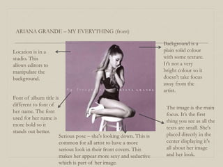
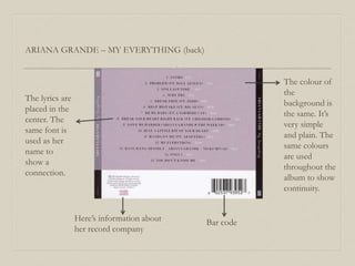
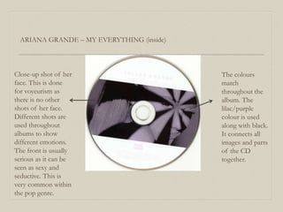
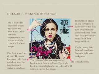
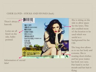
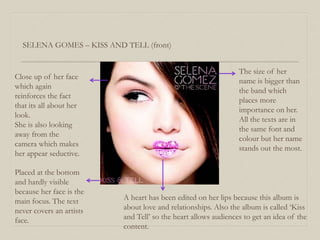
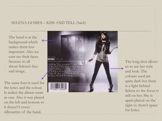
Analysis of CD covers
Nabila Naznin
ARIANA GRANDE – MY EVERYTHING (front)
Background is a
plain solid colour
with some texture.
It’s not a very
bright colour so it
doesn’t take focus
away from the
artist.
The image is the main
focus. It’s the first
thing you see as all the
texts are small. She's
placed directly in the
center displaying it's
all about her image
and her look.
Font of album title is
different to font of
her name. The font
used for her name is
more bold so it
stands out better.
Serious pose – she's looking down. This is
common for all artist to have a more
serious look in their front covers. This
makes her appear more sexy and seductive
which is part of her image.
Location is in a
studio. This
allows editors to
manipulate the
background.
ARIANA GRANDE – MY EVERYTHING (back)
The lyrics are
placed in the
center. The
same font is
used as her
name to
show a
connection.
Here’s information about
her record company
Bar code
The colour of
the
background is
the same. It’s
very simple
and plain. The
same colours
are used
throughout the
album to show
continuity.
ARIANA GRANDE – MY EVERYTHING (inside)
Close-up shot of her
face. This is done
for voyeurism as
there is no other
shots of her face.
Different shots are
used throughout
albums to show
different emotions.
The front is usually
serious as it can be
seen as sexy and
seductive. This is
very common within
the pop genre.
The colours
match
throughout the
album. The
lilac/purple
colour is used
along with black.
It connects all
images and parts
of the CD
together.
CHER LLOYD – STICKS AND STONES (front)
She is framed in
the center which
makes her the
main focus. Also
her facial
expression is very
serious which is
common for front
images.
This font is used in
all her CD covers.
It’s a very bold font
and along with the
bright colour it
makes it stand out.
The texts are placed
on the corners so it
doesn’t cover her face.
Text are commonly
positioned away front
their faces because its
more about their
image and look.
It’s also a very bold
font and stands out
from the light blue
background.
The colour of this font matches her
lipstick for a flow in colours. The bright
lipstick colour displays her as girly and bold
which is part of her image.
It’s located outside
CHER LLOYD – STICKS AND STONES (back)
She is sitting on the
side to allow space
for the lyrics. This
also enabled more
of the location to be
used which was
useful as a
background for the
CD.
There’s always a
barcode
Lyrics are all
listed on the
side, bullet
pointed.
Information of record
label
The long shot allows
us to see her body and
costume. She is
wearing short clothes
and her pose makes
her look very sexy.
Her hand is on her
mouth and her hair is
flying.
SELENA GOMES – KISS AND TELL (front)
Close up of her face
which again
reinforces the fact
that its all about her
look.
She is also looking
away from the
camera which makes
her appear seductive.
A heart has been edited on her lips because this album is
about love and relationships. Also the album is called ‘Kiss
and Tell’ so the heart allows audiences to get an idea of the
content.
The size of her
name is bigger than
the band which
places more
importance on her.
All the texts are in
the same font and
colour but her name
stands out the most.
Placed at the bottom
and hardly visible
because her face is the
main focus. The text
never covers an artists
face.
SELENA GOMES – KISS AND TELL (back)
The same font is used for
the lyrics and the colour.
It makes the album seem
as one. Also it was placed
on the left and bottom so
it doesn't’t cover
silhouettes of the band.
The long shot allows
us to see her style
and look. The
colours used are
quite dark but there
is a light behind
Selena so the focus is
still on her. She is
again placed on the
right so there’s space
for lyrics.
The band is at the
background which
makes them less
important. Also we
cant see their faces
because its all
about Selena’s face
and image.
She provides a free poster for her fans inside the CD. It’s almost like a present for her
fans as its something extra.
SELENA GOMES – KISS AND TELL (inside)

Analysis of CD's

  • 1.
    Analysis of CDcovers Nabila Naznin
  • 2.
    ARIANA GRANDE –MY EVERYTHING (front) Background is a plain solid colour with some texture. It’s not a very bright colour so it doesn’t take focus away from the artist. The image is the main focus. It’s the first thing you see as all the texts are small. She's placed directly in the center displaying it's all about her image and her look. Font of album title is different to font of her name. The font used for her name is more bold so it stands out better. Serious pose – she's looking down. This is common for all artist to have a more serious look in their front covers. This makes her appear more sexy and seductive which is part of her image. Location is in a studio. This allows editors to manipulate the background.
  • 3.
    ARIANA GRANDE –MY EVERYTHING (back) The lyrics are placed in the center. The same font is used as her name to show a connection. Here’s information about her record company Bar code The colour of the background is the same. It’s very simple and plain. The same colours are used throughout the album to show continuity.
  • 4.
    ARIANA GRANDE –MY EVERYTHING (inside) Close-up shot of her face. This is done for voyeurism as there is no other shots of her face. Different shots are used throughout albums to show different emotions. The front is usually serious as it can be seen as sexy and seductive. This is very common within the pop genre. The colours match throughout the album. The lilac/purple colour is used along with black. It connects all images and parts of the CD together.
  • 5.
    CHER LLOYD –STICKS AND STONES (front) She is framed in the center which makes her the main focus. Also her facial expression is very serious which is common for front images. This font is used in all her CD covers. It’s a very bold font and along with the bright colour it makes it stand out. The texts are placed on the corners so it doesn’t cover her face. Text are commonly positioned away front their faces because its more about their image and look. It’s also a very bold font and stands out from the light blue background. The colour of this font matches her lipstick for a flow in colours. The bright lipstick colour displays her as girly and bold which is part of her image. It’s located outside
  • 6.
    CHER LLOYD –STICKS AND STONES (back) She is sitting on the side to allow space for the lyrics. This also enabled more of the location to be used which was useful as a background for the CD. There’s always a barcode Lyrics are all listed on the side, bullet pointed. Information of record label The long shot allows us to see her body and costume. She is wearing short clothes and her pose makes her look very sexy. Her hand is on her mouth and her hair is flying.
  • 7.
    SELENA GOMES –KISS AND TELL (front) Close up of her face which again reinforces the fact that its all about her look. She is also looking away from the camera which makes her appear seductive. A heart has been edited on her lips because this album is about love and relationships. Also the album is called ‘Kiss and Tell’ so the heart allows audiences to get an idea of the content. The size of her name is bigger than the band which places more importance on her. All the texts are in the same font and colour but her name stands out the most. Placed at the bottom and hardly visible because her face is the main focus. The text never covers an artists face.
  • 8.
    SELENA GOMES –KISS AND TELL (back) The same font is used for the lyrics and the colour. It makes the album seem as one. Also it was placed on the left and bottom so it doesn't’t cover silhouettes of the band. The long shot allows us to see her style and look. The colours used are quite dark but there is a light behind Selena so the focus is still on her. She is again placed on the right so there’s space for lyrics. The band is at the background which makes them less important. Also we cant see their faces because its all about Selena’s face and image.
  • 9.
    She provides afree poster for her fans inside the CD. It’s almost like a present for her fans as its something extra. SELENA GOMES – KISS AND TELL (inside)