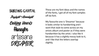
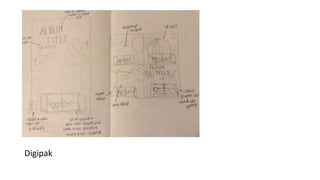
For Ariana Grande’s poster for her album
‘sweetener’, she is made to look quite innocent
and natural as we can see from the natural
makeup look and scraped back hair in a low
ponytail, showing minimal effort.
The light nude background, combined with her
thin nude straps of her top add to the natural,
minimal look also, showing that she doesn’t
want to be giving a fake forced image of herself
to her fans and followers.
The font used for ‘Ariana Grande’ above her
head, could be to replicate her signature, or
might be her actual writing that they have
transferred onto the poster to make it seem
more personal.
The CD cover for the album ‘sweetener’
is very similar to the poster. The photo
of her is upside down which could
symbolise confusion or unclearness.
It’s the same photo that replicates a
neutral image of herself and isn’t
anything flashy which almost makes
you drawn to listening to the music
more, as you’re intrigued to hear what
her music and message is based on the
cover
The poster for Billy Eilish’s album ‘don’t smile
at me’ she is in a peculiar position, hanging
off a step ladder. This demonstrates her wild
nature and gives an indication that her music
will quite alternative. The contrast of the red
ladder against the yellow background shows
that she wanted her and the ladder to stand
out as she’s in red as wanted to stand out
when people see the poster. The black bold
font really stands out and you immediately
know that it’s her album being advertised.
The album cover for her album ‘don’t
smile at me’, is very similar to the poster in
the sense that the set up for the
photograph is the same, this is so the
public can recognise them being for the
same album. With Billy Eilish being sat on
the floor on the album cover it again
shows that she’s not like everyone else.
She isn’t using the ladder she’s sat
underneath it, when we’d expect people
to be on the ladder. And similar to the
poster the yellow and red contrast.
These are my font ideas and the names
of the fonts, I got all of my font samples
off da font.
My favourite one is ‘Dreamer’ because
it looks similar to handwriting and I
want that style to come across on my
artists album and poster as if they were
handwritten by the artist. I also like it
because it has a slightly messy look to it,
and I like that the letters overlap
slightly.
Actress/model
For my actress I have chosen Hayley because she has a good
balance between and indie and pop look.
She is a model I can work with and be able to achieve the
look I want.
Costume
I want my model to wear casual but nice clothes. I want a
half way point between an indie and pop style. I’m thinking
some sort of loose fitting jeans/trousers and a bandeau or
strapless top.
Props + pose
I’m going to have Hayley on a sofa in the woods/forest to
show that she’s chilled out. She will look nice though so it’ll
show that she cares but at the same time doesn’t care.
I will have Hayley posed casually again to show that she’s
chilled out.
Digipak
Presentation1

Presentation1

  • 1.
    For Ariana Grande’sposter for her album ‘sweetener’, she is made to look quite innocent and natural as we can see from the natural makeup look and scraped back hair in a low ponytail, showing minimal effort. The light nude background, combined with her thin nude straps of her top add to the natural, minimal look also, showing that she doesn’t want to be giving a fake forced image of herself to her fans and followers. The font used for ‘Ariana Grande’ above her head, could be to replicate her signature, or might be her actual writing that they have transferred onto the poster to make it seem more personal.
  • 2.
    The CD coverfor the album ‘sweetener’ is very similar to the poster. The photo of her is upside down which could symbolise confusion or unclearness. It’s the same photo that replicates a neutral image of herself and isn’t anything flashy which almost makes you drawn to listening to the music more, as you’re intrigued to hear what her music and message is based on the cover
  • 3.
    The poster forBilly Eilish’s album ‘don’t smile at me’ she is in a peculiar position, hanging off a step ladder. This demonstrates her wild nature and gives an indication that her music will quite alternative. The contrast of the red ladder against the yellow background shows that she wanted her and the ladder to stand out as she’s in red as wanted to stand out when people see the poster. The black bold font really stands out and you immediately know that it’s her album being advertised.
  • 4.
    The album coverfor her album ‘don’t smile at me’, is very similar to the poster in the sense that the set up for the photograph is the same, this is so the public can recognise them being for the same album. With Billy Eilish being sat on the floor on the album cover it again shows that she’s not like everyone else. She isn’t using the ladder she’s sat underneath it, when we’d expect people to be on the ladder. And similar to the poster the yellow and red contrast.
  • 5.
    These are myfont ideas and the names of the fonts, I got all of my font samples off da font. My favourite one is ‘Dreamer’ because it looks similar to handwriting and I want that style to come across on my artists album and poster as if they were handwritten by the artist. I also like it because it has a slightly messy look to it, and I like that the letters overlap slightly.
  • 6.
    Actress/model For my actressI have chosen Hayley because she has a good balance between and indie and pop look. She is a model I can work with and be able to achieve the look I want. Costume I want my model to wear casual but nice clothes. I want a half way point between an indie and pop style. I’m thinking some sort of loose fitting jeans/trousers and a bandeau or strapless top. Props + pose I’m going to have Hayley on a sofa in the woods/forest to show that she’s chilled out. She will look nice though so it’ll show that she cares but at the same time doesn’t care. I will have Hayley posed casually again to show that she’s chilled out.
  • 7.