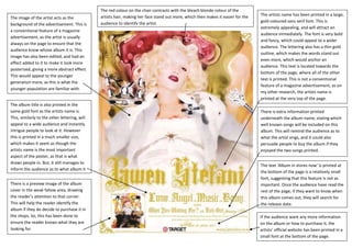
The red colour on the chair contrasts with the bleach blonde colour of the
                                               artists hair, making her face stand out more, which then makes it easier for the   The artists name has been printed in a large,
The image of the artist acts as the
                                               audience to identify the artist.                                                   gold coloured sans serif font. This is
background of the advertisement. This is
                                                                                                                                  extremely appealing, and will attract an
a conventional feature of a magazine
                                                                                                                                  audience immediately. The font is very bold
advertisement, as the artist is usually
                                                                                                                                  and fancy, which could appeal to a wider
always on the page to ensure that the
                                                                                                                                  audience. The lettering also has a thin gold
audience know whose album it is. This
                                                                                                                                  outline, which makes the words stand out
image has also been edited, and had an
                                                                                                                                  even more, which would anchor an
effect added to it to make it look more
                                                                                                                                  audience. This text is located towards the
posterized, giving a more abstract effect.
                                                                                                                                  bottom of the page, where all of the other
This would appeal to the younger
                                                                                                                                  text is printed. This is not a conventional
generation more, as this is what the
                                                                                                                                  feature of a magazine advertisement, as on
younger population are familiar with.
                                                                                                                                  my other research, the artists name is
                                                                                                                                  printed at the very top of the page.
The album title is also printed in the
same gold font as the artists name is.                                                                                            There is extra information printed
This, similarly to the other lettering, will                                                                                      underneath the album name, stating which
appeal to a wide audience and instantly                                                                                           well known songs will be included on this
intrigue people to look at it. However                                                                                            album. This will remind the audience as to
this is printed in a much smaller size,                                                                                           what the artist sings, and it could also
which makes it seem as though the                                                                                                 persuade people to buy the album if they
artists name is the most important                                                                                                enjoyed the two songs printed.
aspect of the poster, as that is what
draws people in. But, it still manages to
                                                                                                                                  The text ‘Album in stores now’ is printed at
inform the audience as to what album it
                                                                                                                                  the bottom of the page is a relatively small
is.
                                                                                                                                  font, suggesting that this feature is not as
There is a preview image of the album                                                                                             important. Once the audience have read the
cover in the weak fallow area, drawing                                                                                            rest of the page, if they want to know when
the reader’s attention to that corner.                                                                                            this album comes out, they will search for
This will help the reader identify the                                                                                            the release date.
album if they do decide to purchase it in
the shops. So, this has been done to                                                                                              If the audience want any more information
ensure the reader knows what they are                                                                                             on the album or how to purchase it, the
looking for.                                                                                                                      artists’ official website has been printed in a
                                                                                                                                  small font at the bottom of the page.

Gwen

  • 1.
    The red colouron the chair contrasts with the bleach blonde colour of the artists hair, making her face stand out more, which then makes it easier for the The artists name has been printed in a large, The image of the artist acts as the audience to identify the artist. gold coloured sans serif font. This is background of the advertisement. This is extremely appealing, and will attract an a conventional feature of a magazine audience immediately. The font is very bold advertisement, as the artist is usually and fancy, which could appeal to a wider always on the page to ensure that the audience. The lettering also has a thin gold audience know whose album it is. This outline, which makes the words stand out image has also been edited, and had an even more, which would anchor an effect added to it to make it look more audience. This text is located towards the posterized, giving a more abstract effect. bottom of the page, where all of the other This would appeal to the younger text is printed. This is not a conventional generation more, as this is what the feature of a magazine advertisement, as on younger population are familiar with. my other research, the artists name is printed at the very top of the page. The album title is also printed in the same gold font as the artists name is. There is extra information printed This, similarly to the other lettering, will underneath the album name, stating which appeal to a wide audience and instantly well known songs will be included on this intrigue people to look at it. However album. This will remind the audience as to this is printed in a much smaller size, what the artist sings, and it could also which makes it seem as though the persuade people to buy the album if they artists name is the most important enjoyed the two songs printed. aspect of the poster, as that is what draws people in. But, it still manages to The text ‘Album in stores now’ is printed at inform the audience as to what album it the bottom of the page is a relatively small is. font, suggesting that this feature is not as There is a preview image of the album important. Once the audience have read the cover in the weak fallow area, drawing rest of the page, if they want to know when the reader’s attention to that corner. this album comes out, they will search for This will help the reader identify the the release date. album if they do decide to purchase it in the shops. So, this has been done to If the audience want any more information ensure the reader knows what they are on the album or how to purchase it, the looking for. artists’ official website has been printed in a small font at the bottom of the page.