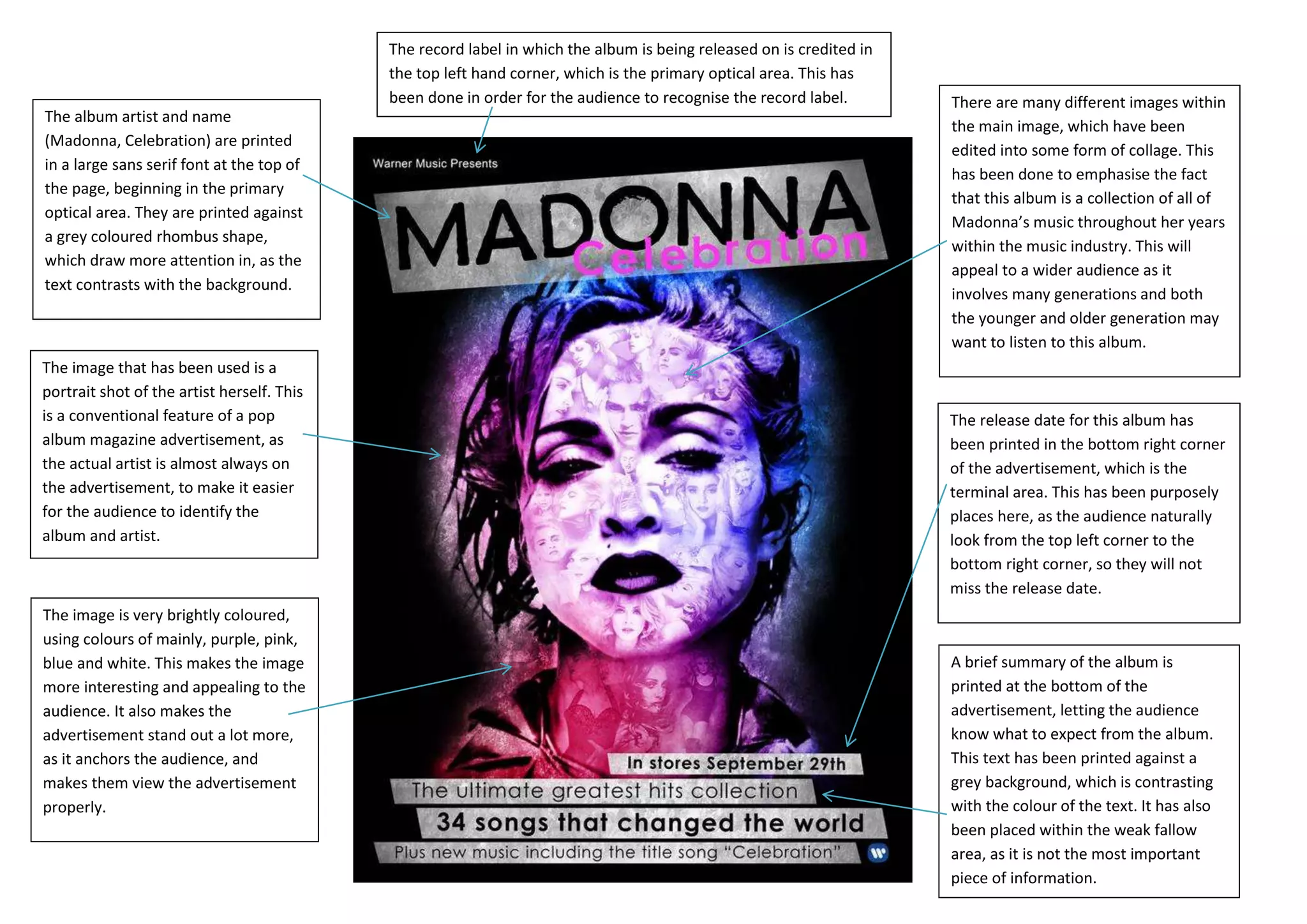
The record label in which the album is being released on is credited in
                                            the top left hand corner, which is the primary optical area. This has
                                            been done in order for the audience to recognise the record label.        There are many different images within
The album artist and name
                                                                                                                      the main image, which have been
(Madonna, Celebration) are printed
                                                                                                                      edited into some form of collage. This
in a large sans serif font at the top of
                                                                                                                      has been done to emphasise the fact
the page, beginning in the primary
                                                                                                                      that this album is a collection of all of
optical area. They are printed against
                                                                                                                      Madonna’s music throughout her years
a grey coloured rhombus shape,
                                                                                                                      within the music industry. This will
which draw more attention in, as the
                                                                                                                      appeal to a wider audience as it
text contrasts with the background.
                                                                                                                      involves many generations and both
                                                                                                                      the younger and older generation may
                                                                                                                      want to listen to this album.
The image that has been used is a
portrait shot of the artist herself. This
is a conventional feature of a pop                                                                                    The release date for this album has
album magazine advertisement, as                                                                                      been printed in the bottom right corner
the actual artist is almost always on                                                                                 of the advertisement, which is the
the advertisement, to make it easier                                                                                  terminal area. This has been purposely
for the audience to identify the                                                                                      places here, as the audience naturally
album and artist.                                                                                                     look from the top left corner to the
                                                                                                                      bottom right corner, so they will not
                                                                                                                      miss the release date.
The image is very brightly coloured,
using colours of mainly, purple, pink,
blue and white. This makes the image                                                                                  A brief summary of the album is
more interesting and appealing to the                                                                                 printed at the bottom of the
audience. It also makes the                                                                                           advertisement, letting the audience
advertisement stand out a lot more,                                                                                   know what to expect from the album.
as it anchors the audience, and                                                                                       This text has been printed against a
makes them view the advertisement                                                                                     grey background, which is contrasting
properly.                                                                                                             with the colour of the text. It has also
                                                                                                                      been placed within the weak fallow
                                                                                                                      area, as it is not the most important
                                                                                                                      piece of information.

Magazine ads

  • 1.
    The record labelin which the album is being released on is credited in the top left hand corner, which is the primary optical area. This has been done in order for the audience to recognise the record label. There are many different images within The album artist and name the main image, which have been (Madonna, Celebration) are printed edited into some form of collage. This in a large sans serif font at the top of has been done to emphasise the fact the page, beginning in the primary that this album is a collection of all of optical area. They are printed against Madonna’s music throughout her years a grey coloured rhombus shape, within the music industry. This will which draw more attention in, as the appeal to a wider audience as it text contrasts with the background. involves many generations and both the younger and older generation may want to listen to this album. The image that has been used is a portrait shot of the artist herself. This is a conventional feature of a pop The release date for this album has album magazine advertisement, as been printed in the bottom right corner the actual artist is almost always on of the advertisement, which is the the advertisement, to make it easier terminal area. This has been purposely for the audience to identify the places here, as the audience naturally album and artist. look from the top left corner to the bottom right corner, so they will not miss the release date. The image is very brightly coloured, using colours of mainly, purple, pink, blue and white. This makes the image A brief summary of the album is more interesting and appealing to the printed at the bottom of the audience. It also makes the advertisement, letting the audience advertisement stand out a lot more, know what to expect from the album. as it anchors the audience, and This text has been printed against a makes them view the advertisement grey background, which is contrasting properly. with the colour of the text. It has also been placed within the weak fallow area, as it is not the most important piece of information.