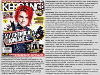
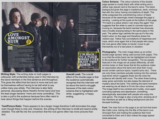
The document analyzes the cover and contents page of the rock magazine Kerrang. Some key points:
- The color scheme of black, red, and white is meant to appeal to Kerrang's target rock audience.
- Photos feature rock artists in poses associated with rebellion to signify the rock genre.
- Fonts are distressed and aggressive to match the rock aesthetic.
- Layouts are coordinated but messy, appealing to fans of alternative rock music.
- Imagery, language, and topics are aimed at older teenage and adult readers rather than children.


![Pitch[1]](https://cdn.slidesharecdn.com/ss_thumbnails/pitch1-121121074935-phpapp01-thumbnail.jpg?width=640&height=640&fit=bounds)


![As media analysis nme front cover [autosaved]](https://cdn.slidesharecdn.com/ss_thumbnails/asmediaanalysisnmefrontcoverautosaved-130317104942-phpapp01-thumbnail.jpg?width=640&height=640&fit=bounds)


