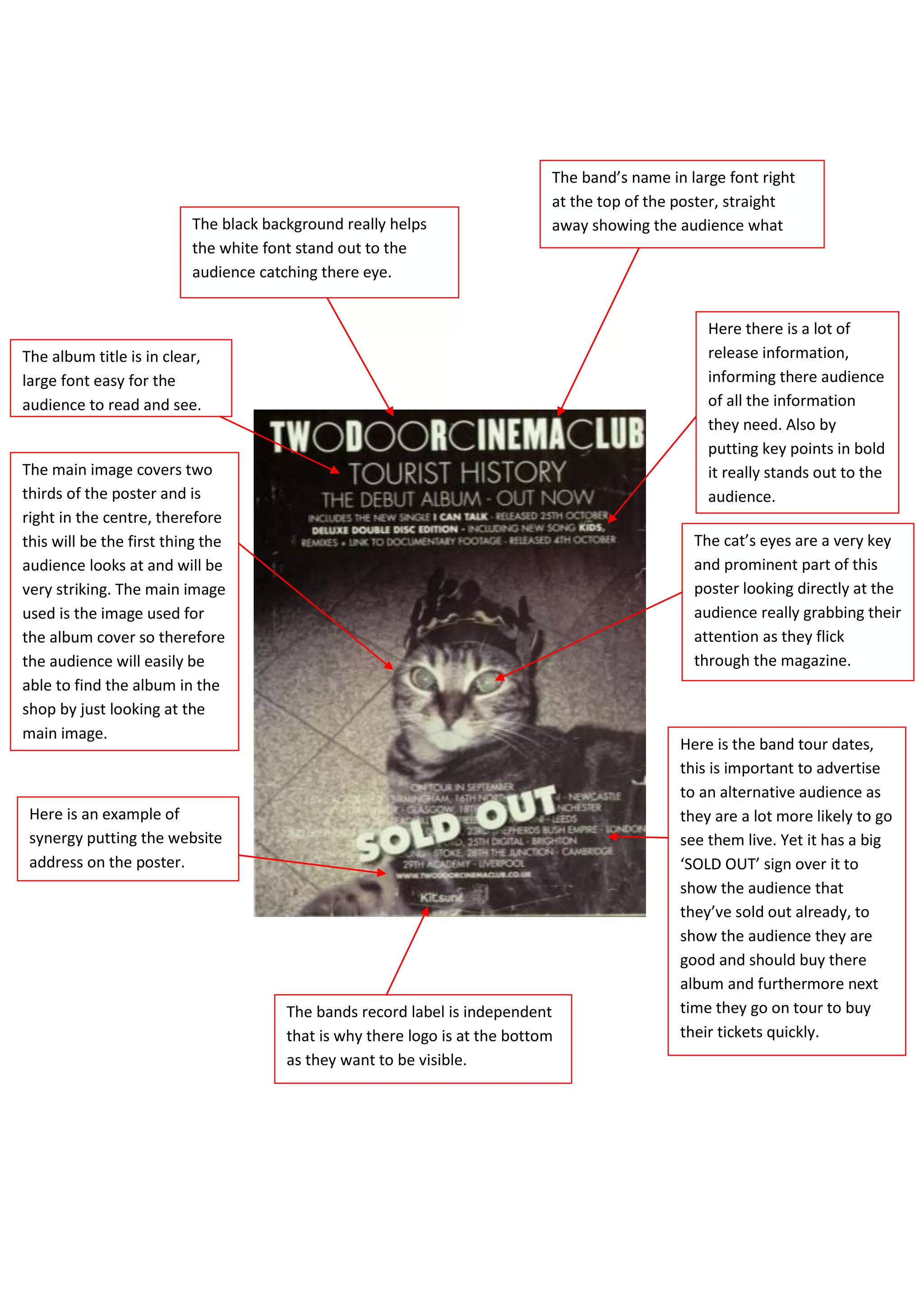
The band’s name in large font right
                                                                             at the top of the poster, straight
                          The black background really helps                  away showing the audience what
                          the white font stand out to the                    band is advertising.
                          audience catching there eye.


                                                                                                   Here there is a lot of
The album title is in clear,                                                                       release information,
large font easy for the                                                                            informing there audience
audience to read and see.                                                                          of all the information
                                                                                                   they need. Also by
                                                                                                   putting key points in bold
The main image covers two                                                                          it really stands out to the
thirds of the poster and is                                                                        audience.
right in the centre, therefore
this will be the first thing the                                                                 The cat’s eyes are a very key
audience looks at and will be                                                                    and prominent part of this
very striking. The main image                                                                    poster looking directly at the
used is the image used for                                                                       audience really grabbing their
the album cover so therefore                                                                     attention as they flick
the audience will easily be                                                                      through the magazine.
able to find the album in the
shop by just looking at the
main image.
                                                                                               Here is the band tour dates,
                                                                                               this is important to advertise
                                                                                               to an alternative audience as
 Here is an example of                                                                         they are a lot more likely to go
 synergy putting the website                                                                   see them live. Yet it has a big
 address on the poster.                                                                        ‘SOLD OUT’ sign over it to
                                                                                               show the audience that
                                                                                               they’ve sold out already, to
                                                                                               show the audience they are
                                                                                               good and should buy there
                                                                                               album and furthermore next
                                       The bands record label is independent                   time they go on tour to buy
                                       that is why there logo is at the bottom                 their tickets quickly.
                                       as they want to be visible.

Poster analysis 1

  • 1.
    The band’s namein large font right at the top of the poster, straight The black background really helps away showing the audience what the white font stand out to the band is advertising. audience catching there eye. Here there is a lot of The album title is in clear, release information, large font easy for the informing there audience audience to read and see. of all the information they need. Also by putting key points in bold The main image covers two it really stands out to the thirds of the poster and is audience. right in the centre, therefore this will be the first thing the The cat’s eyes are a very key audience looks at and will be and prominent part of this very striking. The main image poster looking directly at the used is the image used for audience really grabbing their the album cover so therefore attention as they flick the audience will easily be through the magazine. able to find the album in the shop by just looking at the main image. Here is the band tour dates, this is important to advertise to an alternative audience as Here is an example of they are a lot more likely to go synergy putting the website see them live. Yet it has a big address on the poster. ‘SOLD OUT’ sign over it to show the audience that they’ve sold out already, to show the audience they are good and should buy there album and furthermore next The bands record label is independent time they go on tour to buy that is why there logo is at the bottom their tickets quickly. as they want to be visible.