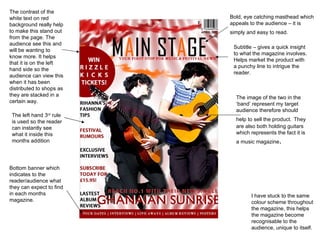
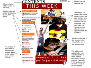
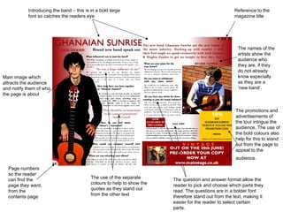
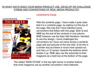
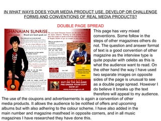
The document provides an evaluation of a music magazine created by the author. It discusses several design elements of the magazine, including the eye-catching masthead in red and white, subtitle that provides insight into the magazine's content, and images on the cover that represent the target audience. The contents page lists articles in a single column with accompanying images, and a double-page spread uses a question and answer format along with separate images on either side. Overall, the evaluation examines how the magazine's design both follows and challenges conventions of real music magazines.