This content page from a music magazine is designed to appeal to its target audience of 30-40 year olds. It uses a simple black and white design with minimal images and fonts to engage readers interested in facts about musicians rather than flashy graphics. The large central image and quote are meant to draw readers in while the varied text sizes prioritize important information. Overall, the straightforward layout and classic aesthetic aim to provide an informative experience for the magazine's sophisticated, music-focused demographic.
Music magazines provide information about musicians and artists. They have been published since the 1960s, with Billboard being the first in 1961. The top 5 music magazines currently are Billboard, Electronic Musician, Entertainment Weekly, Guitar Player, and M. The magazines utilize images, layouts, colors and fonts to effectively communicate information to readers in an appealing way.
The document summarizes the design elements of a music magazine content page. Large images and quotes are used under each musician to draw the reader in. Different fonts and layouts create an individual feel reflecting the intended indie audience. Bright colors highlight important information like the subscription box to increase readership. Overall, the design emphasizes musicians' images and grabs attention to feature important artists and articles.
The document provides analysis of magazine cover and content page design elements. It discusses how various visual elements are used to attract readers' attention and convey information about the musicians featured. Large images and a bold color scheme are used to draw the eye. Musician names and most important text are in red to make them stand out. Photograph placement and sizing are designed to associate images with corresponding articles. Font styles, eye contact and clothing choices in images aim to reflect musicians' personas and appeal to the intended audience. Overall the document examines how visual design strategically communicates information and brands to engage readers.
The document provides an evaluation of a music magazine product. Key details include:
- The magazine uses a bold masthead and prominent images of popular artists to draw attention.
- Interviews and articles about trending artists are included to attract readers interested in learning about new music.
- Consistent colors, fonts, and layouts are used throughout the magazine to provide continuity and familiarity for readers.
- Popular music genres and artists are featured to appeal to the target audience of teenagers and young adults. Consistent branding aims to clearly represent this social group.
Analysing contents pages prep for blog pptPotterM2
The document provides an analysis of the layout and design features of two magazine contents pages:
1) NME magazine from September 2009. Key features analyzed include the masthead, main image relating to the cover story, band listings in red with page numbers in black, and sections for previous/future editions and subscriptions.
2) Billboard magazine. Key features analyzed include the masthead, listings of album and song charts, a large main image of a female artist resembling the target audience, and subheadings in capitals separating content sections.
Overall, the analyses examine how visual and structural elements are used consistently across pages to clearly convey information to readers and promote reader engagement.
The document provides an analysis of the design elements of a dance music magazine cover and contents pages, including:
- The cover uses bright pink, white and black colours to target a younger audience for dance music. Bright colours make it stand out from other magazines.
- Photography on the cover and contents shows artists in a studio or posing casually to portray the dance music genre.
- Layout has a 50/50 text to image ratio to provide information to encourage sales while retaining a visual focus appropriate for the intended readers.
- Fonts, graphics and design elements like slanted text give the magazine an edgy, fun look fitting for its dance music audience.
Analysing contents pages prep for blog pptasmediag12
The contents page uses a large image of Kanye West, who reflects the interests of the target audience. Information such as artist profiles, music news and reviews are highlighted in bold text and positioning to easily catch the reader's attention. The overall simple yet stylish layout suggests the magazine carefully selects only the most relevant content for its target audience.
1) The front cover features Rihanna in a revealing outfit looking directly at the camera. Short descriptions highlight Rihanna's music career and influence.
2) Additional stories are listed behind Rihanna with quotes and images from other artists like Lil Wayne.
3) The masthead, cover lines, and limited color scheme in red, black, and white help the elements stand out against the white background.
The document discusses conventions used in pop music magazines. It analyzes conventions seen on magazine covers, contents pages, and double page spreads. Key conventions included are mastheads, coverlines, pull quotes, standfirsts, kickers, main images, and use of bold colors. The creator of the document incorporated these conventions into their own mock magazine to make it look professional and appeal to the target audience.
The magazine cover features a large, bold masthead in black font that stands out against the rest of the page. Below this is an image of a guitarist playing live, suggesting a link to the main article about the "100 Greatest Gigs Ever!" as voted on by readers. Additional band images and names in yellow boxes on the side also relate to the featured article. A secondary cover line in a differently colored text box promotes an article comparing two band tours. Together, the visual elements draw attention to and promote the key articles in the magazine.
This document analyzes the design of a magazine cover. It discusses several design elements including the masthead, main image, model credit, main cover line, and various coverlines. It notes that the largest coverlines on the left side are more likely to be read. The direct address of the main image and retro theme are meant to appeal to the target audience of music fans. Color, typefaces, photography lighting and house style create an informal yet consistent look to attract readers.
This document analyzes the design of a magazine cover. It discusses several design elements including the masthead, main image, model credit, main cover line, and coverlines. The analysis explains how these elements are used to attract the target audience of music fans. For example, the main cover line "Changed my life" in a bold font is intended to encourage readers. The variety of artists listed in the coverlines would appeal to different fans within the target genre of music. Overall, the cover uses photographic style and fonts associated with rock music to target its audience.
This document analyzes the design elements of music magazine covers and content pages. Key elements discussed include mastheads, headlines, images, colors, and layouts. Overall the document examines how various design choices work to attract readers and tie the magazine together visually as a cohesive brand. It provides comments on different magazine examples and which elements are effective at drawing in readers.
The document provides an evaluation by Ben Hope of his media music magazine. [1] Ben analyzes how his magazine uses and challenges conventions of real music magazines through elements like the front cover design, central images, color schemes, and layouts. [2] He represents a specific social group of young male musicians interested in rock music. [3] Bauer Media would be a suitable distributor as their magazines like Kerrang match the style of Ben's magazine, while audiences would include mainly young males aged 16-20 interested in bands featured and relating to the story of the band interviewed.
The magazine cover uses a simple yet professional design that appeals to its target audience of young adults. High key lighting is used on the main image to make the artist easily recognizable. The bold masthead stretches across the top to clearly display the magazine name. Cover lines down the left side briefly summarize additional articles to entice readers. The overall house style with plain colors and formal typefaces creates a serious yet appealing tone.
The document analyzes the layout and design features of contents pages from two music magazines, NME and Kerrang. Some key points made:
1) Both magazines use a consistent color scheme and branding to match the front cover and create a cohesive look. Images and brief summaries help highlight articles.
2) Subheadings, bold text sizes, and column formatting help organize information and make it easy for readers to find sections of interest.
3) The magazines employ techniques like editors' notes and highlighted interviews to pique readers' curiosity and encourage buying the issue.
The main image covers the entire left page to split up the double page spread and prevent boredom. It features the subject of the article to engage readers. The bold enlarged first letter indicates where the article begins. A heading above the image clearly states who the article is about. The double page uses a color scheme of black, blue and white that makes it look professional while maintaining interest. Captions are included to involve readers without requiring them to read the entire article. The page number is only on one side, which may make navigation difficult for some readers.
This magazine cover targets older teenagers and young adults interested in music and celebrity culture. The masthead uses contrasting colors and fonts to stand out. The main image features the popular singer Rihanna looking directly at the viewer, signaling she is the key selling point. Additional coverlines promote other featured articles. The photography, colors, and typefaces create a cohesive house style that appears serious yet entertaining to appeal to its target demographic.
The document summarizes how the student's music magazine front cover and content pages use, develop, or challenge conventions of real music magazines. For the front cover, the student followed conventions like using a band banner and center image but challenged conventions with text placement. For content pages, the student used a layout inspired by NME but challenged conventions with formal elements and rearranging some sections. The goal was to appeal to an intended audience of older indie/rock music fans.
The document discusses magazines focused on musical theater. It finds the market size for these magazines is small, with few existing products. It describes searching for and finding some magazines in this genre online, but being unable to find full issues. It then analyzes aspects of the covers, mastheads, images, and contents pages of these magazines, such as using colors that relate to the musicals featured and balancing text and images to attract readers.
The magazine cover features Elphaba from the musical Wicked. The masthead is large and green to match the musical's theme. Subheadings advertise the main article on Wicked and other features. Bright colors and a live photo draw in the audience while providing information without distraction. The contents page has an even mix of images and text to preview articles. Categories organize different pieces and color contrasts text for readability. A double page spread uses a posed shot from the musical for visual interest alongside a long article, suggesting an older target audience.
This document contains summaries of magazine content pages. The summaries describe the layout, use of images and text, and how design elements are used to engage the audience. Key details like headlines, captions and calls to action are called out. The summaries also suggest what type of readers may be targeted based on the content and visuals.
The document summarizes the key design elements of a magazine cover. It discusses the use of color schemes including red, yellow, pink, black and white. Fonts are used in different sizes with the artist's name in a brighter color and different font to make it stand out. Images of artists are featured and rhetorical questions are included to engage readers. Pull quotes, different text styles, colors and shapes are utilized to draw attention and emphasize content.
The document summarizes how a music magazine cover and content pages were designed to follow conventions of real music magazines like NME and MOJO, while also innovating in some ways. Key points:
- The cover uses a large bold font for the masthead, pull quotes, and varied font sizes/colors like NME. However, it places the banner across the top rather than bottom.
- Content pages follow NME's layout with a band index, subtitles in boxes, and repeating the magazine title. But it uses one large central image rather than many small ones.
- Formal elements like "This Week" were included to appeal to older student readers, going against conventions.
- The
This document analyzes the contents pages and front covers of a college magazine. It discusses design elements like fonts, colors, images and layouts used and how they appeal to the target audience of college students. Specific aspects summarized include the bold masthead logo, use of different font sizes and colors to highlight important content, inclusion of the publication date, natural front cover images that draw the reader in, and a neat table of contents layout that appeals to the demographic.
This contents page for a teenage magazine uses a bright colour scheme and scattered images to appear fun and interesting. The large banner at the top clearly identifies the page as the contents. Text boxes are used to organize different sections, with larger subheadings standing out. While the layout is busy, section numbers provide clear navigation. Overall the layout aims to attract its target audience of young teenage girls with its lively, colourful style.
Historical American Views - 1900 Free E-BookChuck Thompson
Historical American Views for 1900. Photo book. World's Largest electric plant, world's most powerful electric train, world's most powerful steam engine, all American and in photos. Gloucester, Virginia Links and News website. Visit us for more incredible content. Free downloads on this ebook.
Grafico diario del dax perfomance index para el 12 12-2011Experiencia Trading
Este documento presenta un análisis técnico del índice alemán DAX utilizando medias móviles simples. Indica que el DAX permanece bajista mientras no supere los 6.630 puntos, y podría volver a la zona de 5.400-5.000 puntos si pierde soporte en 5.700. Incluye explicaciones sobre cómo las medias móviles pueden orientar el comportamiento del mercado y definen tendencias de corto, medio y largo plazo.
Inspired by the enduring magic and importance of books, we create exceptional publishing that's instantly recognizable for its spirit, creativity, and value.
Pinocho es una historia que simboliza el viaje espiritual del alma humana. Pinocho es creado por Geppetto y dado vida por el Hada Azul. Aunque comete errores, Pinocho aprende lecciones con la ayuda de Pepe Grillo. Finalmente, Pinocho se sacrifica para salvar a Geppetto, convirtiéndose en un niño de verdad a través del amor desinteresado.
La bahía de Ha-Long en Vietnam, declarada Patrimonio de la Humanidad por la UNESCO, es una extensión de agua de 1,500 km2 con más de 1,969 islas de formas y tamaños variados que se extienden a lo largo de 120 km de costa, protegiendo un área de 150,000 hectáreas.
The document asks questions about where animals live, what they eat, how many legs and tails they have, and whether they can swim or fly. It repeats the questions and answer options multiple times, suggesting it is a quiz about different types of animals and their characteristics and abilities.
El documento contrasta el mito y el logos. Explica que el mito era una forma de explicar eventos en sociedades con tradición oral, mientras que el logos emergió en Grecia con el pensamiento crítico y la búsqueda de conocimiento a través de la razón y discusión. Factores como la escritura, educación y comercio contribuyeron al surgimiento del logos, el cual interpretó pero no eliminó los mitos.
El documento contrasta dos tipos de conciencia: una autocentrada que promueve el egoísmo y otra orientada hacia los demás que fomenta la compasión. La conciencia autocentrada genera emociones destructivas, nerviosismo y proyección mental, mientras que la conciencia orientada hacia los demás produce calma mental, cooperación y una visión holística. Practicar la compasión conduce a una vida más saludable y feliz al transformar los instintos y emociones destructivos en razón y emoción positivas.
The magazine cover uses design techniques to attract its target audience of students. It features the band Niki and the Dove using direct address to appeal to readers. Bright colors like pink, purple, and yellow are used to grab attention, as is black text that stands out on pale backgrounds. Informal fonts and scattered cover lines featuring other bands aim to interest fans. Strategic placement of design elements follows principles to guide the eye to key information.
The magazine cover uses bright colors and modern fonts to attract readers' attention. A large central image takes up most of the cover and advertises the main program. A smaller advertisement in the corner promotes other programs. The title is placed at the top so readers immediately know what magazine it is.
The magazine is aimed at an older generation of music fans. It uses a classic font style and layout with simple images to appeal to its mature audience. The overall tone is serious, aiming to inform readers about musicians. Large images and fonts are used for important elements, while other text is smaller to seem sophisticated.
The document discusses the layout of a magazine content page. It has chosen not to have a heading to distinguish it as a content page since other key elements are in bold. The intended audience is 19-year olds and the bright colors, upbeat music represented, and lively images are meant to reflect their personalities. However, the page layout is disorganized with many images and text, lacking a central focus and feeling clustered.
The document provides an analysis of the front cover of a music magazine. It analyzes various design elements including color, layout, images, and language. The main image is of a famous musician, Matthew Bellamy of Muse, which draws in readers through the male gaze theory. The cover uses contrasting colors and short, conversational text to attract and inform readers. Overall, the front cover is deemed an effective promotional tool for the magazine.
The document provides details about the cover of an NME magazine. It analyzes various design elements of the cover including the use of color, font, images and text placement. The red masthead is overlapped by the main image to portray the magazine's passion for music and place artists first. Black and red colors highlight the gothic genre targeted at rock fans. Multiple images and cover lines represent the variety of music and artists covered in the issue.
This magazine cover targets a young female audience aged 10-13 years old from a lower social class. This is evident through the use of bright pink and yellow colours, cartoon-like images of girls' clothes, and child-friendly themes. The magazine uses modern technology references like a heart to convey "love" to appeal to its target audience. The large bold fonts, bright colours, and overlapping images are used to grab attention and highlight the main story.
The magazine uses bold colors and fonts to attract readers' attention. The front cover features a close-up image of two musicians to highlight the main topic. Contents pages list subheadings in bold and red to draw the eye, and include advertisements. Double page spreads balance large band images with fitting text to engage the target teenage male audience with busy layouts and blues tones.
The contents page uses a space theme color scheme of yellow text on black background to match the magazine's genre. It provides preview images and brief summaries of the magazine's articles to entice readers while also listing the issue number, date, and page numbers for article locations. The layout is simple and straightforward, drawing attention to exclusive interviews and larger artist images to highlight key content without providing all details upfront.
This magazine cover uses bright colours like pink and yellow along with child-friendly themes and designs to appeal to its target audience of young females aged 10+. The large main story image and attention-grabbing masthead are used to draw readers in and promote the key articles. The consistent colour scheme, fonts, and layout create an aesthetically pleasing design that helps readers easily navigate to find content they want.
This magazine cover uses bright colours like pink and yellow along with child-friendly themes and designs to appeal to its target audience of young females aged 10+. The large masthead and attention-grabbing headlines help draw the reader's eyes to the main stories. The magazine's layout is cluttered but helps show there is a lot of content for readers.
The document provides an analysis of the front cover, contents, and a double page feature of a music magazine. It summarizes the key design elements like the color scheme, font sizes and styles, placement of images and text, and how these are used to effectively engage readers and promote stories and artists featured in the magazine. The color white is used prominently to make elements stand out, and bold colors, fonts, and headings are employed to draw the eye to important information. Larger images are featured to catch attention.
The magazine cover features a serious image of two male artists from a boy band facing away from each other. In three sentences or less:
The magazine cover features a serious image of two male artists from a boy band facing away from each other, their clothing and facial expressions intended to convey a serious dedication to their music industry. Brief text and a website address provide just enough information to intrigue readers without giving away too many details of the stories inside. Red coloring and fonts are used prominently to match the rock genre of the magazine.
The document describes the layout and design choices for a magazine double page spread. Key details include:
- Columns are used to keep a traditional magazine style.
- Questions and answers are in different colors to make them easy to read.
- There are three images of the artist from different angles to draw the eye and not make the page flat. One picture is bigger and abstract for contrast.
- The barcode is at the bottom so it is seen last and out of the way. The main headline is big at the bottom for emphasis.
This document contains a mock magazine layout with various pages including a masthead, front cover, contents page, and double page article spread. The masthead introduces the magazine name "PULSE" and motto. The front cover features an image and headline to grab attention. The contents page lists the stories and gives an overview of what to expect each month to appeal to a young audience. The double page spread focuses on an artist interview to introduce a new musician through images, a brief bio, and Q&A section using an informal tone.
The document summarizes the layout and design elements of a magazine double page spread. It notes that the spread uses limited color, mainly pink and yellow, to appeal to its target female audience. It also uses a large image of the featured artist on one side of the spread to draw attention. The text is laid out clearly in a conventional format without being cluttered so it appeals to an older readership than typical music magazines.
The magazine cover uses a simple layout with a medium shot of two artists facing away from each other to imply rivalry in the music industry. Red is prominently used to connote the rock genre. Questions are asked under subheadings to encourage reading the articles. The masthead is bright yellow to catch the eye, and the main image overlaps it for regular readers.
Magazine cover analysis worksheet the big cheeseadamtimms22
The masthead uses a tilted font to fit on one line and stand out against the dark blue background. The main image of the artist draws the reader in with its friendly appeal. The model credit and main cover line below relate the image to the story about the band. Cover lines are spread around the cover to make the reader view all elements. The design follows the Gutenberg principle with important elements in the optical area and less important in the fallow areas.
The document analyzes the cover of a music magazine. It summarizes that the masthead uses bold font and plain colors to suggest the magazine covers serious music while maintaining simplicity. High key lighting is used on the cover photo to make the artist easily recognizable and draw attention. The coverlines, credits, and fonts are designed to look professional and appeal to the target audience of young adults interested in the featured artists. The overall house style aims to look formal while using colors and design to engage readers and sell copies of the magazine.
Analysing contents pages prep for blog pptPotterM2
The document analyzes the contents page layout of the NME magazine from September 2009. It notes several key design elements, including the masthead matching the front cover for brand consistency, a large inviting cover image, section headings in bold black text for visibility, artist names in red for prominence, and a call-out to subscribe for future issues. Overall, the analysis finds the layout uses visual cues like color, size, and positioning of text and images to clearly guide readers to content and encourage ongoing subscription.
Technology played an important role in creating the trailer by enabling research on YouTube, high quality digital recording using a camera and tripod, editing footage and adding visual effects and text on a Mac using software like Final Cut Express and Photoshop, and including recorded sound effects by importing audio files into the trailer on Final Cut.
The document describes the development of a magazine front cover for a horror film. Key details include:
- The model is dressed in black to resemble death and horror.
- The background is white to make the image lighter and clearer for the cover.
- Effects like liquefying and burning were used to make the model look more sinister and evil.
- Text of varying sizes provides information about featured films and draws attention to important details like the magazine title and number 15.
The document provides details on the development of a horror film poster. Key points:
- The poster features a character's face illuminated by a book, to hint at the story's significance.
- Photoshop was used to edit the original photo, including darkening the background and eyes to create a darker, more ominous tone fitting for horror.
- Text elements like the title, tagline, and date were added in shades of blue and black to match the color scheme and draw attention to important information.
- Element placement aims to clearly present key details while creating intrigue about the character and story.
The document provides details on the development of a horror film poster. Key elements include:
- The main character's face is illuminated by a light shining through an open book, drawing the viewer into the story.
- Dark colors and an emotionless yet evil facial expression are used to represent the horror genre.
- Photoshop is used to edit the original photo, including darkening the background and eyes to create tension.
- Important text elements like the title, tagline, and release date are incorporated in a clear but unsettling style consistent with the color palette and theme.
The document describes the development of a horror film poster. The poster features the main character illuminated by a blue light from an open book. Photoshop was used to edit the original photo by darkening the background, eyes, and fingernails. Text elements were added including the film title above the book, the tagline above the character's head, and the release date below in blue to match the color scheme. A credit block at the bottom cites influences from other posters.
The document discusses three poster ideas for a horror film called "Deactivate". Idea 1 involves creating a puzzle-like poster with the film's tagline embedded amongst words related to horror. Idea 2 features a large knife with blood revealing the title. Idea 3 places a character's face in the middle with the title over her head and tagline on either side to imply her thoughts. The document then explores developing Idea 3 further with character posters showing half a face or lips whispering in an ear to generate mystery and intrigue for the audience.
The document provides an analysis of the creative choices made in developing the opening of a psychological horror film trailer. It examines elements like the title design, character introductions, settings, costumes, camera work, editing, story setup, genre cues, and special effects. The character introductions establish the villain as emotionless, the first victim as a typical teen, and the second victim as vulnerable. Flashbacks, mystery, and a sense of danger suggest the psychological genre.
The document discusses three poster ideas for a horror film called "Deactivate". Idea 1 involves embedding the film's tagline amongst other words to create a puzzle-like poster. Idea 2 shows a large knife with blood revealing the title. Idea 3 places a character's face in the middle with the title overhead and tagline on either side. It then explores developing Idea 3 further by showing only half the character's face to create mystery, or showing lips whispering in an ear to hint at a hidden secret.
The document discusses three poster ideas for a horror film called "Deactivate". Idea 1 involves creating a puzzle-like poster with the film's tagline embedded amongst words related to horror. Idea 2 features a large bloody knife with the title revealed by blood falling down the blade. Idea 3 presents a character's face with the title over their head and tagline on either side, to appear as the character's thoughts. Further development of Idea 3 explores positioning half a character's face or lips whispering in an ear to generate mystery and intrigue for the audience.
The document discusses three poster ideas for a horror film called "Deactivate". Idea 1 involves creating a puzzle-like poster with the film's tagline embedded amongst words related to horror. Idea 2 features a large bloody knife with the title revealed by blood falling down the blade. Idea 3 presents a character's face with the title over their head and tagline on either side, intended to look like their thoughts. Further development of Idea 3 explores positioning half a character's face or lips whispering in an ear to generate mystery and intrigue for the audience.
The document discusses three poster ideas for a horror film called "Deactivate". Idea 1 involves creating a puzzle-like poster with the film's tagline embedded amongst words related to horror. Idea 2 features a large bloody knife with the title revealed by blood falling down the blade. Idea 3 presents a character's face with the title over their head and tagline on either side, to appear as the character's thoughts. Further development of Idea 3 explores positioning half a character's face or lips whispering in an ear to generate mystery and intrigue for the audience.
The document describes the development of a horror film poster. The poster features the main character illuminated by a blue light from an open book. Photoshop was used to edit the original photo by darkening the background, eyes, and fingernails. Text elements were added including the film title above the book, the tagline above the character's head, and the release date and studio information. Color palettes and fonts were chosen to create consistency across elements and link the poster to the film's trailer.
The storyboard follows a teenage girl who finds an old yearbook triggering flashbacks to bullying she experienced, she becomes obsessed with deleting her past online which intensifies when she believes someone is stalking her, the storyboard uses various camera shots and editing techniques to build tension as the girl is terrorized and tries to escape her pursuer.
The document discusses key elements of the horror film "The Ring" including its narrative structure, characters, and use of technical film techniques. It notes that the film follows a typical structure of building crisis, disequilibrium, and resolution. It also explores the film's use of camera angles, editing, lighting, sound, and themes of good versus evil. Iconography, such as the appearance of the first victim, and props, namely the mysterious videotape, are highlighted as important narrative devices.
A new Scream movie is coming out in 2022 and this trailer gives viewers a sneak peek. Several young people receive threatening phone calls from a ghostface killer who is back to terrorize their town. The trailer teases intense scares and suspense as the new targets try to survive and discover the identity of the masked murderer haunting their community once again.
This urban legend trailer tells the story of a group of friends who go camping in the woods and encounter strange occurrences. Strange sounds are heard at night and mysterious lights are seen in the forest. The friends start to disappear one by one as an unknown threat stalks them in the dark woods.
The Texas Chainsaw Massacre trailer shows a group of young people taking a road trip to an isolated area where they encounter a family of cannibals led by a man with a chainsaw. Scenes of the cannibals killing and butchering the group are interspersed with shots of the masked man chasing them with his chainsaw. It previews the 1974 horror film about a family of murderers who kill young visitors to their secluded home.
Este video de YouTube muestra un tutorial de 5 minutos sobre cómo configurar una cuenta de correo electrónico en Gmail. Explica los pasos para crear una cuenta, incluida la elección de un nombre de usuario y una contraseña, y proporciona una demostración visual de cómo acceder a la bandeja de entrada, escribir y enviar un correo electrónico.
Halloween is a slasher film that follows common slasher conventions such as having an unknown killer, a sweet female hero who senses the killer, and uses suspense and a knife weapon throughout the film culminating in an ending that leaves room for a sequel.
Horror films typically involve an evil creature or serial killer that kills many victims, often ignoring warnings that lead to tragic consequences. Common themes include good versus evil, revenge, religion, science gone awry, and mental illness. These films take place in isolated locations like empty houses, woods, motels, and abandoned towns, and feature stock props like candles, skeletons, dead bodies, and weapons like axes and chainsaws.
Temple of Asclepius in Thrace. Excavation resultsKrassimira Luka
The temple and the sanctuary around were dedicated to Asklepios Zmidrenus. This name has been known since 1875 when an inscription dedicated to him was discovered in Rome. The inscription is dated in 227 AD and was left by soldiers originating from the city of Philippopolis (modern Plovdiv).
Beyond Degrees - Empowering the Workforce in the Context of Skills-First.pptxEduSkills OECD
Iván Bornacelly, Policy Analyst at the OECD Centre for Skills, OECD, presents at the webinar 'Tackling job market gaps with a skills-first approach' on 12 June 2024
LAND USE LAND COVER AND NDVI OF MIRZAPUR DISTRICT, UPRAHUL
This Dissertation explores the particular circumstances of Mirzapur, a region located in the
core of India. Mirzapur, with its varied terrains and abundant biodiversity, offers an optimal
environment for investigating the changes in vegetation cover dynamics. Our study utilizes
advanced technologies such as GIS (Geographic Information Systems) and Remote sensing to
analyze the transformations that have taken place over the course of a decade.
The complex relationship between human activities and the environment has been the focus
of extensive research and worry. As the global community grapples with swift urbanization,
population expansion, and economic progress, the effects on natural ecosystems are becoming
more evident. A crucial element of this impact is the alteration of vegetation cover, which plays a
significant role in maintaining the ecological equilibrium of our planet.Land serves as the foundation for all human activities and provides the necessary materials for
these activities. As the most crucial natural resource, its utilization by humans results in different
'Land uses,' which are determined by both human activities and the physical characteristics of the
land.
The utilization of land is impacted by human needs and environmental factors. In countries
like India, rapid population growth and the emphasis on extensive resource exploitation can lead
to significant land degradation, adversely affecting the region's land cover.
Therefore, human intervention has significantly influenced land use patterns over many
centuries, evolving its structure over time and space. In the present era, these changes have
accelerated due to factors such as agriculture and urbanization. Information regarding land use and
cover is essential for various planning and management tasks related to the Earth's surface,
providing crucial environmental data for scientific, resource management, policy purposes, and
diverse human activities.
Accurate understanding of land use and cover is imperative for the development planning
of any area. Consequently, a wide range of professionals, including earth system scientists, land
and water managers, and urban planners, are interested in obtaining data on land use and cover
changes, conversion trends, and other related patterns. The spatial dimensions of land use and
cover support policymakers and scientists in making well-informed decisions, as alterations in
these patterns indicate shifts in economic and social conditions. Monitoring such changes with the
help of Advanced technologies like Remote Sensing and Geographic Information Systems is
crucial for coordinated efforts across different administrative levels. Advanced technologies like
Remote Sensing and Geographic Information Systems
9
Changes in vegetation cover refer to variations in the distribution, composition, and overall
structure of plant communities across different temporal and spatial scales. These changes can
occur natural.
Main Java[All of the Base Concepts}.docxadhitya5119
This is part 1 of my Java Learning Journey. This Contains Custom methods, classes, constructors, packages, multithreading , try- catch block, finally block and more.
ISO/IEC 27001, ISO/IEC 42001, and GDPR: Best Practices for Implementation and...PECB
Denis is a dynamic and results-driven Chief Information Officer (CIO) with a distinguished career spanning information systems analysis and technical project management. With a proven track record of spearheading the design and delivery of cutting-edge Information Management solutions, he has consistently elevated business operations, streamlined reporting functions, and maximized process efficiency.
Certified as an ISO/IEC 27001: Information Security Management Systems (ISMS) Lead Implementer, Data Protection Officer, and Cyber Risks Analyst, Denis brings a heightened focus on data security, privacy, and cyber resilience to every endeavor.
His expertise extends across a diverse spectrum of reporting, database, and web development applications, underpinned by an exceptional grasp of data storage and virtualization technologies. His proficiency in application testing, database administration, and data cleansing ensures seamless execution of complex projects.
What sets Denis apart is his comprehensive understanding of Business and Systems Analysis technologies, honed through involvement in all phases of the Software Development Lifecycle (SDLC). From meticulous requirements gathering to precise analysis, innovative design, rigorous development, thorough testing, and successful implementation, he has consistently delivered exceptional results.
Throughout his career, he has taken on multifaceted roles, from leading technical project management teams to owning solutions that drive operational excellence. His conscientious and proactive approach is unwavering, whether he is working independently or collaboratively within a team. His ability to connect with colleagues on a personal level underscores his commitment to fostering a harmonious and productive workplace environment.
Date: May 29, 2024
Tags: Information Security, ISO/IEC 27001, ISO/IEC 42001, Artificial Intelligence, GDPR
-------------------------------------------------------------------------------
Find out more about ISO training and certification services
Training: ISO/IEC 27001 Information Security Management System - EN | PECB
ISO/IEC 42001 Artificial Intelligence Management System - EN | PECB
General Data Protection Regulation (GDPR) - Training Courses - EN | PECB
Webinars: https://pecb.com/webinars
Article: https://pecb.com/article
-------------------------------------------------------------------------------
For more information about PECB:
Website: https://pecb.com/
LinkedIn: https://www.linkedin.com/company/pecb/
Facebook: https://www.facebook.com/PECBInternational/
Slideshare: http://www.slideshare.net/PECBCERTIFICATION
This document provides an overview of wound healing, its functions, stages, mechanisms, factors affecting it, and complications.
A wound is a break in the integrity of the skin or tissues, which may be associated with disruption of the structure and function.
Healing is the body’s response to injury in an attempt to restore normal structure and functions.
Healing can occur in two ways: Regeneration and Repair
There are 4 phases of wound healing: hemostasis, inflammation, proliferation, and remodeling. This document also describes the mechanism of wound healing. Factors that affect healing include infection, uncontrolled diabetes, poor nutrition, age, anemia, the presence of foreign bodies, etc.
Complications of wound healing like infection, hyperpigmentation of scar, contractures, and keloid formation.
Gender and Mental Health - Counselling and Family Therapy Applications and In...PsychoTech Services
A proprietary approach developed by bringing together the best of learning theories from Psychology, design principles from the world of visualization, and pedagogical methods from over a decade of training experience, that enables you to: Learn better, faster!
Chapter wise All Notes of First year Basic Civil Engineering.pptxDenish Jangid
Chapter wise All Notes of First year Basic Civil Engineering
Syllabus
Chapter-1
Introduction to objective, scope and outcome the subject
Chapter 2
Introduction: Scope and Specialization of Civil Engineering, Role of civil Engineer in Society, Impact of infrastructural development on economy of country.
Chapter 3
Surveying: Object Principles & Types of Surveying; Site Plans, Plans & Maps; Scales & Unit of different Measurements.
Linear Measurements: Instruments used. Linear Measurement by Tape, Ranging out Survey Lines and overcoming Obstructions; Measurements on sloping ground; Tape corrections, conventional symbols. Angular Measurements: Instruments used; Introduction to Compass Surveying, Bearings and Longitude & Latitude of a Line, Introduction to total station.
Levelling: Instrument used Object of levelling, Methods of levelling in brief, and Contour maps.
Chapter 4
Buildings: Selection of site for Buildings, Layout of Building Plan, Types of buildings, Plinth area, carpet area, floor space index, Introduction to building byelaws, concept of sun light & ventilation. Components of Buildings & their functions, Basic concept of R.C.C., Introduction to types of foundation
Chapter 5
Transportation: Introduction to Transportation Engineering; Traffic and Road Safety: Types and Characteristics of Various Modes of Transportation; Various Road Traffic Signs, Causes of Accidents and Road Safety Measures.
Chapter 6
Environmental Engineering: Environmental Pollution, Environmental Acts and Regulations, Functional Concepts of Ecology, Basics of Species, Biodiversity, Ecosystem, Hydrological Cycle; Chemical Cycles: Carbon, Nitrogen & Phosphorus; Energy Flow in Ecosystems.
Water Pollution: Water Quality standards, Introduction to Treatment & Disposal of Waste Water. Reuse and Saving of Water, Rain Water Harvesting. Solid Waste Management: Classification of Solid Waste, Collection, Transportation and Disposal of Solid. Recycling of Solid Waste: Energy Recovery, Sanitary Landfill, On-Site Sanitation. Air & Noise Pollution: Primary and Secondary air pollutants, Harmful effects of Air Pollution, Control of Air Pollution. . Noise Pollution Harmful Effects of noise pollution, control of noise pollution, Global warming & Climate Change, Ozone depletion, Greenhouse effect
Text Books:
1. Palancharmy, Basic Civil Engineering, McGraw Hill publishers.
2. Satheesh Gopi, Basic Civil Engineering, Pearson Publishers.
3. Ketki Rangwala Dalal, Essentials of Civil Engineering, Charotar Publishing House.
4. BCP, Surveying volume 1
How to Setup Warehouse & Location in Odoo 17 InventoryCeline George
In this slide, we'll explore how to set up warehouses and locations in Odoo 17 Inventory. This will help us manage our stock effectively, track inventory levels, and streamline warehouse operations.
Leveraging Generative AI to Drive Nonprofit InnovationTechSoup
In this webinar, participants learned how to utilize Generative AI to streamline operations and elevate member engagement. Amazon Web Service experts provided a customer specific use cases and dived into low/no-code tools that are quick and easy to deploy through Amazon Web Service (AWS.)
Leveraging Generative AI to Drive Nonprofit Innovation
Mojo complete
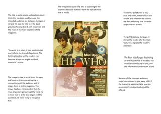
1. The image looks quite old; this is appealing to the
audience because it shows them the type of music
that is inside. The colour pallet used is red,
The title is quite simple and sophisticated; i blue and white, these colours are
think this has been used because the unisex, and however the colours
intended audience are between the ages of are dark indicating that the main
30 and 40. also the title is in the back target market is male.
ground, showing that it isn’t important and
the music is the main objective of the
magazine.
The puff breaks up the page, it
shows the reader who the main
feature is. It grabs the reader’s
attention
‘the who’ is in silver, it look sophisticated
and reflects the intended audience. The
font is attractive on the readers eye
The front size changes depending
because it isn’t too bright and bold,
on the importance of the text. The
instead it’s subtle.
musicians names are in bold, and
the information underneath it isn’t
The image in view is a mid shot, the eyes Because of the intended audience,
are focus on the camera creating a mojo have chosen to give away a CD. If
connection with the audience and it the magazine was aimed at a younger
draws them in to the magazine. The generation free downloads could be
image has been composed so that the
offered
most important person is at the front, he
is most likel to b the lead singer and the
audience are more likely to recognise
him.
2. The image used is purposely black The overall tone of the content page is The colour scheme used is clear and The banner is the title of the
and white to emphasis the simplicity, the tone is created, the simple to engage the reader in the magazine, this is because the page is
intended audience, the black a colours, page layout and the image used. important copy, instead of being so simple is doesn’t need to say
white image shows that the music This reflect the intended audience of distracted my bright colours. Each of the content page, it also reminds the
inside is from an older generation. whom are around the ages on 27 and page numbers are in red, this has been reader witch magazine their reading.
The image makes the audience just want to facts on the music they like. done to make them stand out to the The font used is easy to read and
think of classic songs because the The content page is easily to navigate reader, also the page numbers are large bold, this keep the simple theme
black and white reminds us of an around and it isn’t over crowded with to grab the reader’s attention and make constant and it also grabs the
older generation. images such as the NME content page. then notice what page the story is on. reader’s attention.
The content page has a quote that
anchors the image used, without The copy on this content page is in a formal style, the
the attached quote the image has font is small and simple. This shows that audience that
no meaning. The quote and the the articles inside are going to be formal and in
small amount of copy gives the informative, this compliment the audiences intentions.
reader an insight into the article Also the copy gives the reader information on the
inside. featured articles; there is a lot of text which highlights
the fact that the intended audience are interested in
information about musicians and not the images.
The image has been place on the
right side, this is because the
audience are more focused and The font is constantly Only one image has been
interested in the music so the copy changing size used, to carry the theme of
is on the left hand side which is depending on the simplicity throughout the
where the reader looks first. importance of the text, magazine. Also props have
mojo is the largest been added to the image,
.
piece of text because The guitar shows the type of
The model is looking directly the magazine want to music and it tell the
into the camera lenses to remind the reader audience that the magazine
make a connection with the which magazine their is about the music and not
audience, this is to draw reading. the musicians face
them in and encourage them
to keep reading the magazine
3. the intended audience for this magazine are of an older generation, this is The font used is a classic style, its sleek and simple to look
shown through colours, images, fonts and page layouts. The overall tone attractive to the audience. also the size of the font varies
of the magazine is serious because the aim is to get information across to depending on the importance of the text, the word ‘my’ is in
the reader. The layout of the page is extremely simple to draw in the the largest font because it’s the musician talking to the
reader, the typical reader likes to read facts on musicians and they don’t audience, the magazine are trying to engage the reader by
want to look at lots of brightly coloured images because they aren’t talking to them directly. The main article is written in a small
images conscience. size to make it look sophisticated and informative.
The image is extremely large to
show the importance of the
The colour pallet on this double musician featured, the image
page spread is black and white, takes up over half the page and
this is to represent the music is the back ground for the text.
inside which is form an older Because the image over spills
generation. it also reflects the onto the text it make the copy
audience who are an older have a connection to the
generation of music fans, featured musician. In the image
around the age of 30. The black the musician is looking directly
and white colour scheme straight into the camera and
makes the page look classic and making eye contact with the
sophisticated which looks audience, this makes the
appealing to the reader audience want to read about his
because they just want to know story. the musician has been
information on the featured position to look casual and
musician. relaxed, this is reflecting the
intended audience who aren’t
out at parties but instead are
indoors spending time with
loved ones.
The image is a cross between a mid shot and a three quarter shot the layout is very simple all of the text is on the left hand side, the
because we are close enough that the audience can see the magazine have chosen to have the text on the left hand side
musician’s facial expressions but we can also see what he is because this is where the audience look first and to the reader the
wearing and his torso. The mid shot works well because the reader text is the most important feature on the page. Whereas double
is close enough to the model to have a connection, but the three pages from magazines such as rock sound have the images on the
quarter shot means the reader is able see the musician stance. left hand side.