Magazine advert research
•Download as PPTX, PDF•
0 likes•136 views

These two advertisements show how an artist's promotional style changes as their popularity increases. The Laura Marling advertisement evolved from a homemade style to a more mainstream photo shoot style. Less popular artists like The May Dolls do not need to appeal to a wide audience, allowing more original advertisement designs. As bands like Mumford & Sons and Noah and the Whale became more mainstream, their advertisements adopted a larger size and more prominent font styles.

Recommended
More Related Content
What's hot
What's hot (20)
Viewers also liked
Similar to Magazine advert research
Similar to Magazine advert research (20)
Magazine advert research
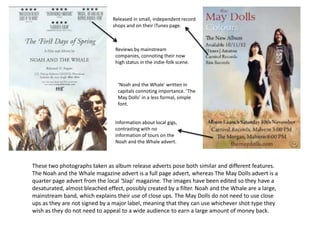
- 1. Released in small, independent record shops and on their iTunes page. Reviews by mainstream companies, connoting their now high status in the indie-folk scene. ‘Noah and the Whale’ written in capitals connoting importance. ‘The May Dolls’ in a less formal, simple font. Information about local gigs, contrasting with no information of tours on the Noah and the Whale advert. These two photographs taken as album release adverts pose both similar and different features. The Noah and the Whale magazine advert is a full page advert, whereas The May Dolls advert is a quarter page advert from the local ‘Slap’ magazine. The images have been edited so they have a desaturated, almost bleached effect, possibly created by a filter. Noah and the Whale are a large, mainstream band, which explains their use of close ups. The May Dolls do not need to use close ups as they are not signed by a major label, meaning that they can use whichever shot type they wish as they do not need to appeal to a wide audience to earn a large amount of money back.
- 2. Interesting, abstract print work includes no images of herself implying that at this time she was more about the music than her personal image. Plain, large and formal font with a slight splash of colour. Available on CD and DVD from Amazon and download from iTunes. Available on vinyl, includes free tabs and lyric book. These two magazine adverts are from the same artist but with a few years between them. I thought it was excellent example of how the success of a small, unheard of indie-folk artist has an effect on their advertising. The more mainstream the magazine, the more mainstream the adverts will appear. As Laura Marling has increased in popularity, her style has completely changed from a homemade, hand drawn style featuring interesting print work to mainstream photo shoots and fonts. This reinforces my ideas that mainstream indie-folk artists typically use capitals with bold, simple fonts while less mainstream indie-folk artists take a more original approach by making their fonts look as thought they are hand written and handmade alike their music.
- 3. In this advert we see Mumford and Sons using the same font to display their band name as they do in all mediums. This font and ‘&’ sign have become a logo for the band which is recognisable to anyone who has glanced at it before. This magazine advert is fairly unconventional within the indie-folk genre as the images used do not feature anywhere in the Sigh No More digipacks. Usually the images from the digipack will be the same, if not similar, to the ones used for advertising . The photographs taken for the CD advertisement for the Mumford and Sons display mid-shots of each of the band members with their instruments which is to imply that making music is what they are passionate about. Yet the review underneath by NME, a mainstream magazine, could connote that their music has also become more mainstream due to increasing popularity. In contrast with this, Ben Howard’s quarter page advert for his debut album includes no reviews or information about record labels but instead an iTunes symbol, implying that if people want to listen to his music then they should listen to and make up their own opinions of it themselves.