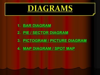
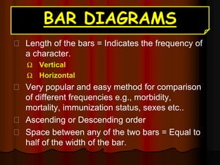
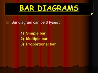
Dr. Kishor M. Sochaliya
Associate Professor
PSM Department
CUSMC
1. BAR DIAGRAM
2. PIE / SECTOR DIAGRAM
3. PICTOGRAM / PICTURE DIAGRAM
4. MAP DIAGRAM / SPOT MAP
BAR DIAGRAMS
Length of the bars = Indicates the frequency of
a character.
Ω Vertical
Ω Horizontal
Very popular and easy method for comparison
of different frequencies e.g., morbidity,
mortality, immunization status, sexes etc..
Ascending or Descending order
Space between any of the two bars = Equal to
half of the width of the bar.
BAR DIAGRAMS
Bar diagram can be 3 types :
1) Simple bar
2) Multiple bar
3) Proportional bar
SIMPLE BAR
Example 1:
The following table gives the birth rate per thousand of
different countries over a certain period of time. Draw a
simple bar diagram.
Country Birth rate (per 1000)
India 33
Germany 15
U.K. 20
China 40
New Zealand 30
Sweden 15
VERTICAL SIMPLE BAR
DIAGRAM
HORIZONTAL SIMPLE BAR DIAGRAM
SIMPLE BAR
Example 2:
The following table gives the reported cases of poliomyelitis
after Pulse Polio Immunization in Delhi state. Draw a
suitable diagram
Year
Reported cases of
Poliomyelitis
1994 585
1995 415
1996 272
MULTIPLE BAR
Example 3:
Present the following distribution on live birth by order of
birth (India) by bar chart.
Birth order 1972 1978
1 19.85 23.45
2 17.44 20.63
3 15.70 17.49
4 13.77 13.38
5 11.24 9.69
≥ 6 22.00 15.36
MULTIPLE BAR
MULTIPLE BAR
PROPORTIONAL / COMPONENT BAR
Example 4:
The table below shows the quantity in hundred kilograms of
Wheat, Barley and Oats produced on a certain form during the
years 1991 to 1994.
Years Wheat Barley Oats
1991 34 18 27
1992 43 14 24
1993 43 16 27
1994 45 13 34
PROPORTIONAL / COMPONENT BAR
34
43 43 45
18
14 16 13
27 24
27
34
0
10
20
30
40
50
60
70
80
90
100
1991 1992 1993 1994
Production
(kgs)
Year
Production of wheat, barley and oats in
kilograms from 1991 to 1994
Oats
Barley
Wheat
PIE DIAGRAMS
The frequencies of the group are shown in a
circle.
Degrees of angle denote the frequency and
area of sector.
Total area of the pie diagram should be 100%.
So, size of each angle is calculated by
multiplying the class percentage with 3.6.
E.g., so the formula is:
𝑪𝒍𝒂𝒔𝒔 𝒇𝒓𝒆𝒒𝒖𝒆𝒏𝒄𝒚
𝑻𝒐𝒕𝒂𝒍 𝒐𝒃𝒔𝒆𝒓𝒗𝒂𝒕𝒊𝒐𝒏𝒔
 𝟑𝟔𝟎
PIE / SECTOR DIAGRAM
Example 5:
Prepare sector diagram for the following table
Type of Leprosy No. of patients
Tuberculoid 148
Lepromatous 64
Indeterminate 18
Borderline 10
Total 240
PIE / SECTOR DIAGRAM
Tuberculoid = (148/240)  360
= 222
Lepromatous = (64/240)  360
= 96
Indeterminate = (18/240)  360
= 27
Borderline = (10/240)  360
= 15
Type of
Leprosy
No. of patients
Tuberculoid 148
Lepromatous 64
Indeterminate 18
Borderline 10
Total 240
PIE / SECTOR DIAGRAM
Example 5:
Prepare sector diagram for the following table
Type of
Leprosy
No. of patients
Tuberculoid 148
Lepromatous 64
Indeterminate 18
Borderline 10
Total 240
PIE / SECTOR DIAGRAM
Example 6:
Prepare pie chart for the following table
Blood group %
CVD 48
Infectious diseases 26
Accident 4
Cancer 22
Total 100
PICTOGRAM
This is the popular method of presenting
data to illiterate people (that is those who
can not understand the orthodox charts).
such as attacks, deaths, no. operated,
admitted, discharged, accidents et. in a
population.
PICTOGRAM
PICTOGRAM
MAP DIAGRAM
Prepared to
show
geographical
distribution of
frequencies of
characteristic.
E.g., Mortality
due to CVD in
different states
of India
GRAPHICAL PRESENTATION OF QUALITATIVE DATA.pptx

GRAPHICAL PRESENTATION OF QUALITATIVE DATA.pptx

  • 1.
    Dr. Kishor M.Sochaliya Associate Professor PSM Department CUSMC
  • 2.
    1. BAR DIAGRAM 2.PIE / SECTOR DIAGRAM 3. PICTOGRAM / PICTURE DIAGRAM 4. MAP DIAGRAM / SPOT MAP
  • 4.
    BAR DIAGRAMS Length ofthe bars = Indicates the frequency of a character. Ω Vertical Ω Horizontal Very popular and easy method for comparison of different frequencies e.g., morbidity, mortality, immunization status, sexes etc.. Ascending or Descending order Space between any of the two bars = Equal to half of the width of the bar.
  • 5.
    BAR DIAGRAMS Bar diagramcan be 3 types : 1) Simple bar 2) Multiple bar 3) Proportional bar
  • 6.
    SIMPLE BAR Example 1: Thefollowing table gives the birth rate per thousand of different countries over a certain period of time. Draw a simple bar diagram. Country Birth rate (per 1000) India 33 Germany 15 U.K. 20 China 40 New Zealand 30 Sweden 15
  • 7.
  • 8.
  • 9.
    SIMPLE BAR Example 2: Thefollowing table gives the reported cases of poliomyelitis after Pulse Polio Immunization in Delhi state. Draw a suitable diagram Year Reported cases of Poliomyelitis 1994 585 1995 415 1996 272
  • 10.
    MULTIPLE BAR Example 3: Presentthe following distribution on live birth by order of birth (India) by bar chart. Birth order 1972 1978 1 19.85 23.45 2 17.44 20.63 3 15.70 17.49 4 13.77 13.38 5 11.24 9.69 ≥ 6 22.00 15.36
  • 11.
  • 12.
  • 13.
    PROPORTIONAL / COMPONENTBAR Example 4: The table below shows the quantity in hundred kilograms of Wheat, Barley and Oats produced on a certain form during the years 1991 to 1994. Years Wheat Barley Oats 1991 34 18 27 1992 43 14 24 1993 43 16 27 1994 45 13 34
  • 14.
    PROPORTIONAL / COMPONENTBAR 34 43 43 45 18 14 16 13 27 24 27 34 0 10 20 30 40 50 60 70 80 90 100 1991 1992 1993 1994 Production (kgs) Year Production of wheat, barley and oats in kilograms from 1991 to 1994 Oats Barley Wheat
  • 16.
    PIE DIAGRAMS The frequenciesof the group are shown in a circle. Degrees of angle denote the frequency and area of sector. Total area of the pie diagram should be 100%. So, size of each angle is calculated by multiplying the class percentage with 3.6. E.g., so the formula is: 𝑪𝒍𝒂𝒔𝒔 𝒇𝒓𝒆𝒒𝒖𝒆𝒏𝒄𝒚 𝑻𝒐𝒕𝒂𝒍 𝒐𝒃𝒔𝒆𝒓𝒗𝒂𝒕𝒊𝒐𝒏𝒔  𝟑𝟔𝟎
  • 17.
    PIE / SECTORDIAGRAM Example 5: Prepare sector diagram for the following table Type of Leprosy No. of patients Tuberculoid 148 Lepromatous 64 Indeterminate 18 Borderline 10 Total 240
  • 18.
    PIE / SECTORDIAGRAM Tuberculoid = (148/240)  360 = 222 Lepromatous = (64/240)  360 = 96 Indeterminate = (18/240)  360 = 27 Borderline = (10/240)  360 = 15 Type of Leprosy No. of patients Tuberculoid 148 Lepromatous 64 Indeterminate 18 Borderline 10 Total 240
  • 19.
    PIE / SECTORDIAGRAM Example 5: Prepare sector diagram for the following table Type of Leprosy No. of patients Tuberculoid 148 Lepromatous 64 Indeterminate 18 Borderline 10 Total 240
  • 20.
    PIE / SECTORDIAGRAM Example 6: Prepare pie chart for the following table Blood group % CVD 48 Infectious diseases 26 Accident 4 Cancer 22 Total 100
  • 22.
    PICTOGRAM This is thepopular method of presenting data to illiterate people (that is those who can not understand the orthodox charts). such as attacks, deaths, no. operated, admitted, discharged, accidents et. in a population.
  • 23.
  • 24.
  • 26.
    MAP DIAGRAM Prepared to show geographical distributionof frequencies of characteristic. E.g., Mortality due to CVD in different states of India