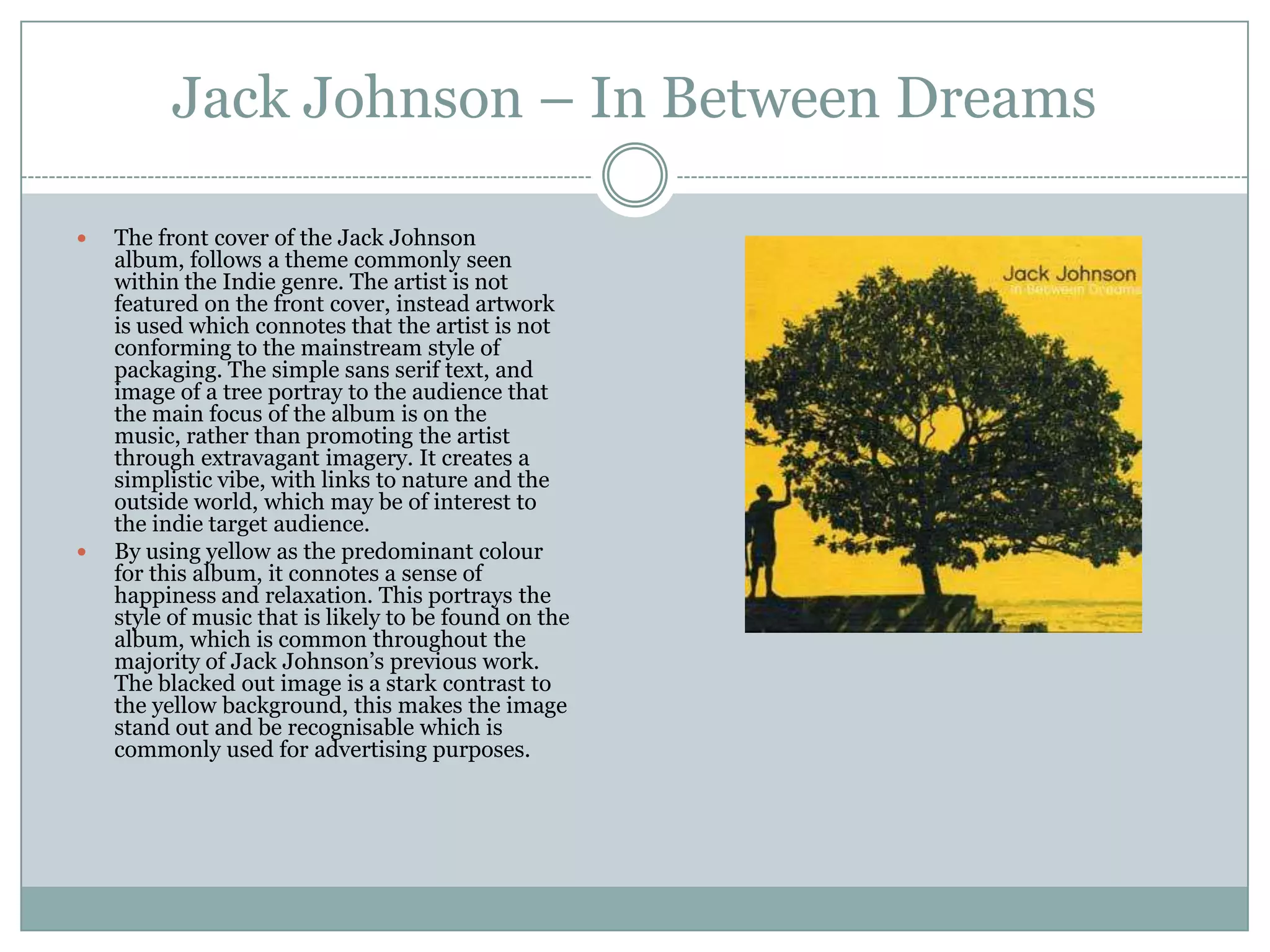
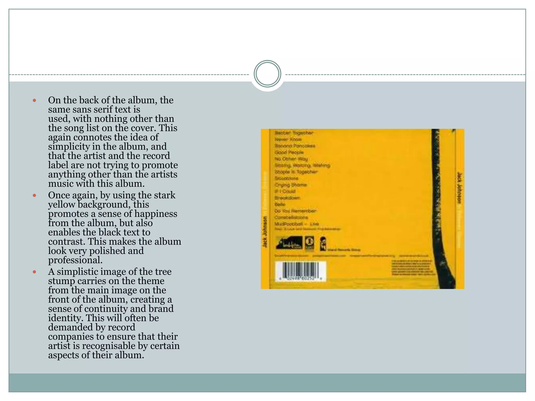
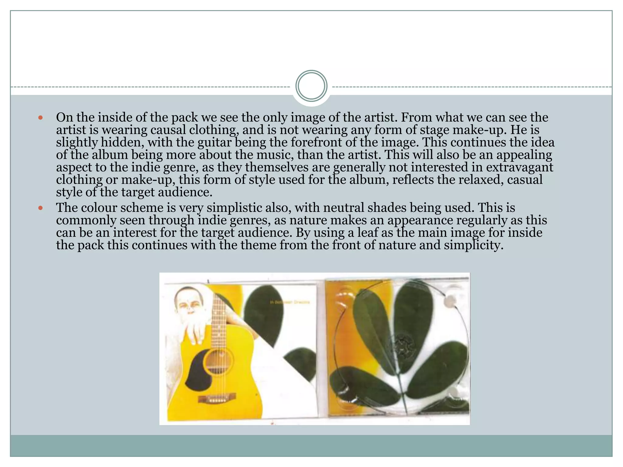
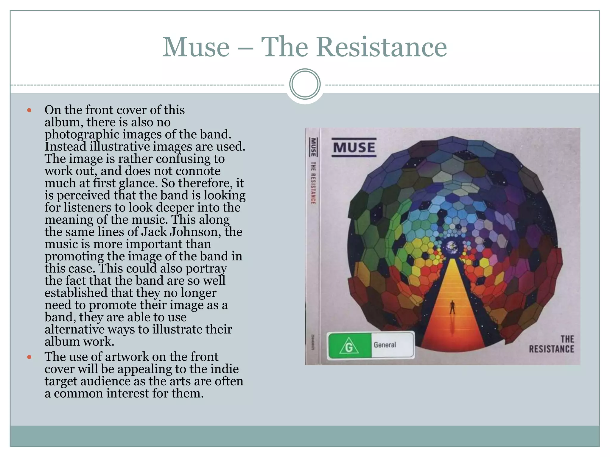
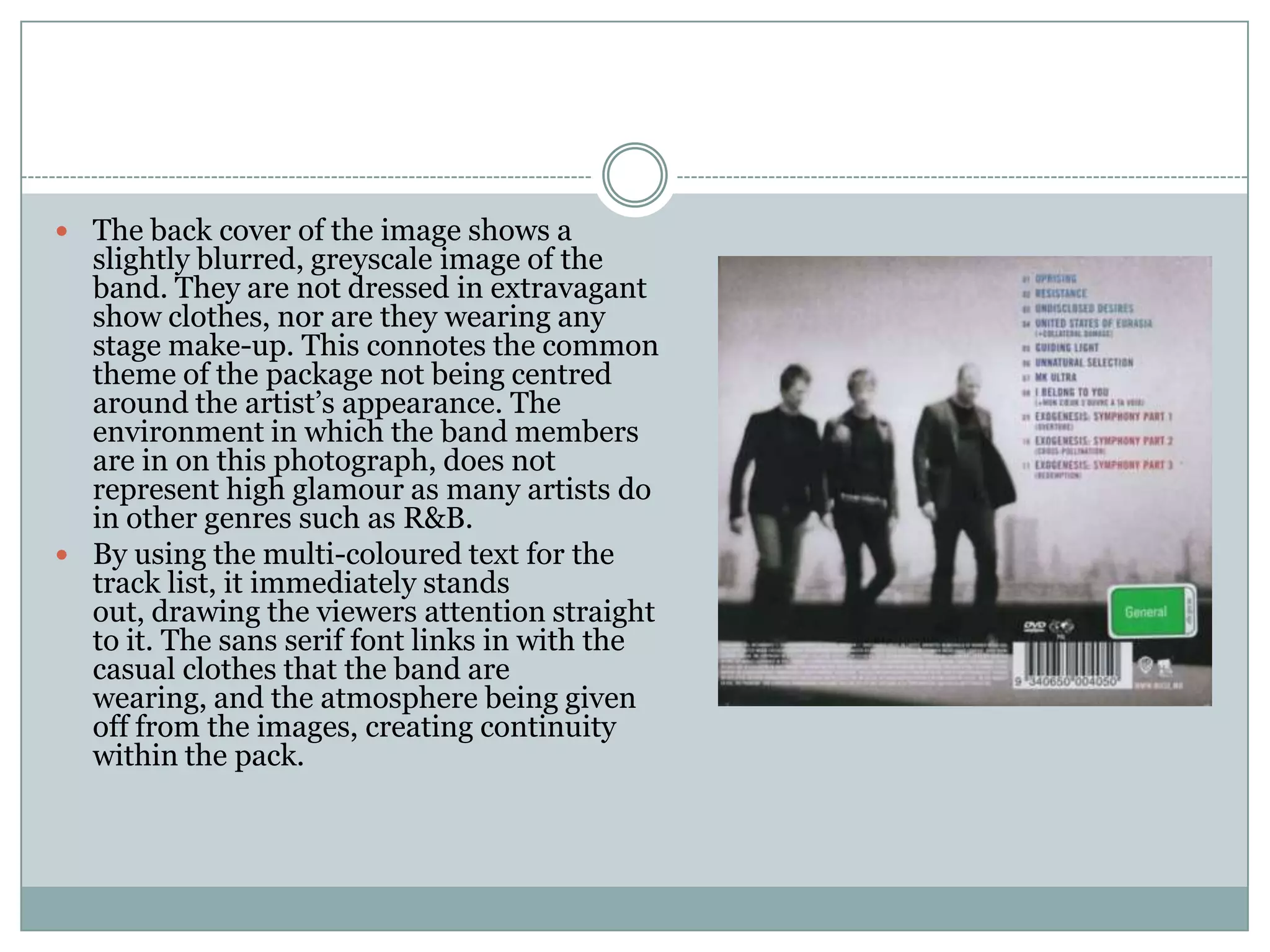
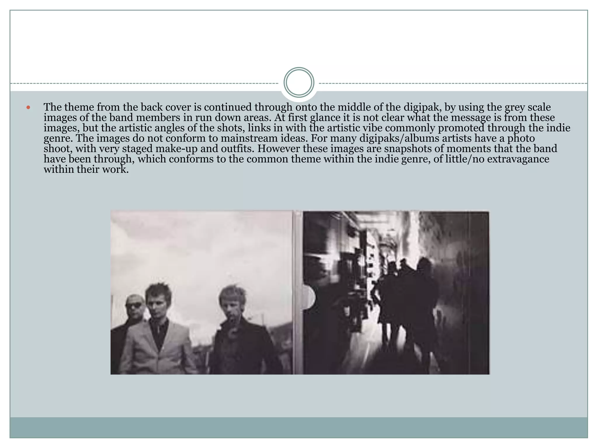
Digipak Analysis
Jack Johnson – In Between Dreams

   The front cover of the Jack Johnson
    album, follows a theme commonly seen
    within the Indie genre. The artist is not
    featured on the front cover, instead artwork
    is used which connotes that the artist is not
    conforming to the mainstream style of
    packaging. The simple sans serif text, and
    image of a tree portray to the audience that
    the main focus of the album is on the
    music, rather than promoting the artist
    through extravagant imagery. It creates a
    simplistic vibe, with links to nature and the
    outside world, which may be of interest to
    the indie target audience.
   By using yellow as the predominant colour
    for this album, it connotes a sense of
    happiness and relaxation. This portrays the
    style of music that is likely to be found on the
    album, which is common throughout the
    majority of Jack Johnson’s previous work.
    The blacked out image is a stark contrast to
    the yellow background, this makes the image
    stand out and be recognisable which is
    commonly used for advertising purposes.
   On the back of the album, the
    same sans serif text is
    used, with nothing other than
    the song list on the cover. This
    again connotes the idea of
    simplicity in the album, and
    that the artist and the record
    label are not trying to promote
    anything other than the artists
    music with this album.
   Once again, by using the stark
    yellow background, this
    promotes a sense of happiness
    from the album, but also
    enables the black text to
    contrast. This makes the album
    look very polished and
    professional.
   A simplistic image of the tree
    stump carries on the theme
    from the main image on the
    front of the album, creating a
    sense of continuity and brand
    identity. This will often be
    demanded by record
    companies to ensure that their
    artist is recognisable by certain
    aspects of their album.
 On the inside of the pack we see the only image of the artist. From what we can see the
  artist is wearing causal clothing, and is not wearing any form of stage make-up. He is
  slightly hidden, with the guitar being the forefront of the image. This continues the idea
  of the album being more about the music, than the artist. This will also be an appealing
  aspect to the indie genre, as they themselves are generally not interested in extravagant
  clothing or make-up, this form of style used for the album, reflects the relaxed, casual
  style of the target audience.
 The colour scheme is very simplistic also, with neutral shades being used. This is
  commonly seen through indie genres, as nature makes an appearance regularly as this
  can be an interest for the target audience. By using a leaf as the main image for inside
  the pack this continues with the theme from the front of nature and simplicity.
Muse – The Resistance

 On the front cover of this
  album, there is also no
  photographic images of the band.
  Instead illustrative images are used.
  The image is rather confusing to
  work out, and does not connote
  much at first glance. So therefore, it
  is perceived that the band is looking
  for listeners to look deeper into the
  meaning of the music. This along
  the same lines of Jack Johnson, the
  music is more important than
  promoting the image of the band in
  this case. This could also portray
  the fact that the band are so well
  established that they no longer
  need to promote their image as a
  band, they are able to use
  alternative ways to illustrate their
  album work.
 The use of artwork on the front
  cover will be appealing to the indie
  target audience as the arts are often
  a common interest for them.
 The back cover of the image shows a
  slightly blurred, greyscale image of the
  band. They are not dressed in extravagant
  show clothes, nor are they wearing any
  stage make-up. This connotes the common
  theme of the package not being centred
  around the artist’s appearance. The
  environment in which the band members
  are in on this photograph, does not
  represent high glamour as many artists do
  in other genres such as R&B.
 By using the multi-coloured text for the
  track list, it immediately stands
  out, drawing the viewers attention straight
  to it. The sans serif font links in with the
  casual clothes that the band are
  wearing, and the atmosphere being given
  off from the images, creating continuity
  within the pack.
   The theme from the back cover is continued through onto the middle of the digipak, by using the grey scale
    images of the band members in run down areas. At first glance it is not clear what the message is from these
    images, but the artistic angles of the shots, links in with the artistic vibe commonly promoted through the indie
    genre. The images do not conform to mainstream ideas. For many digipaks/albums artists have a photo
    shoot, with very staged make-up and outfits. However these images are snapshots of moments that the band
    have been through, which conforms to the common theme within the indie genre, of little/no extravagance
    within their work.

Digipak analysis

  • 1.
  • 2.
    Jack Johnson –In Between Dreams  The front cover of the Jack Johnson album, follows a theme commonly seen within the Indie genre. The artist is not featured on the front cover, instead artwork is used which connotes that the artist is not conforming to the mainstream style of packaging. The simple sans serif text, and image of a tree portray to the audience that the main focus of the album is on the music, rather than promoting the artist through extravagant imagery. It creates a simplistic vibe, with links to nature and the outside world, which may be of interest to the indie target audience.  By using yellow as the predominant colour for this album, it connotes a sense of happiness and relaxation. This portrays the style of music that is likely to be found on the album, which is common throughout the majority of Jack Johnson’s previous work. The blacked out image is a stark contrast to the yellow background, this makes the image stand out and be recognisable which is commonly used for advertising purposes.
  • 3.
    On the back of the album, the same sans serif text is used, with nothing other than the song list on the cover. This again connotes the idea of simplicity in the album, and that the artist and the record label are not trying to promote anything other than the artists music with this album.  Once again, by using the stark yellow background, this promotes a sense of happiness from the album, but also enables the black text to contrast. This makes the album look very polished and professional.  A simplistic image of the tree stump carries on the theme from the main image on the front of the album, creating a sense of continuity and brand identity. This will often be demanded by record companies to ensure that their artist is recognisable by certain aspects of their album.
  • 4.
     On theinside of the pack we see the only image of the artist. From what we can see the artist is wearing causal clothing, and is not wearing any form of stage make-up. He is slightly hidden, with the guitar being the forefront of the image. This continues the idea of the album being more about the music, than the artist. This will also be an appealing aspect to the indie genre, as they themselves are generally not interested in extravagant clothing or make-up, this form of style used for the album, reflects the relaxed, casual style of the target audience.  The colour scheme is very simplistic also, with neutral shades being used. This is commonly seen through indie genres, as nature makes an appearance regularly as this can be an interest for the target audience. By using a leaf as the main image for inside the pack this continues with the theme from the front of nature and simplicity.
  • 5.
    Muse – TheResistance  On the front cover of this album, there is also no photographic images of the band. Instead illustrative images are used. The image is rather confusing to work out, and does not connote much at first glance. So therefore, it is perceived that the band is looking for listeners to look deeper into the meaning of the music. This along the same lines of Jack Johnson, the music is more important than promoting the image of the band in this case. This could also portray the fact that the band are so well established that they no longer need to promote their image as a band, they are able to use alternative ways to illustrate their album work.  The use of artwork on the front cover will be appealing to the indie target audience as the arts are often a common interest for them.
  • 6.
     The backcover of the image shows a slightly blurred, greyscale image of the band. They are not dressed in extravagant show clothes, nor are they wearing any stage make-up. This connotes the common theme of the package not being centred around the artist’s appearance. The environment in which the band members are in on this photograph, does not represent high glamour as many artists do in other genres such as R&B.  By using the multi-coloured text for the track list, it immediately stands out, drawing the viewers attention straight to it. The sans serif font links in with the casual clothes that the band are wearing, and the atmosphere being given off from the images, creating continuity within the pack.
  • 7.
    The theme from the back cover is continued through onto the middle of the digipak, by using the grey scale images of the band members in run down areas. At first glance it is not clear what the message is from these images, but the artistic angles of the shots, links in with the artistic vibe commonly promoted through the indie genre. The images do not conform to mainstream ideas. For many digipaks/albums artists have a photo shoot, with very staged make-up and outfits. However these images are snapshots of moments that the band have been through, which conforms to the common theme within the indie genre, of little/no extravagance within their work.