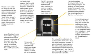
The colours used are
stereotypical to the band’s
style, clothing and genre. The
design of the album is quite
simple. The rectangle in the
middle could be a door where
the light is coming from and
that something is behind it
that they aren’t showing.
The 1975 have named
their album after the
band, this will help the
audience not to get
confused and also to
remember the album as
it’s the same name. Being
their first album, it could
suggest that they are
trying to show who they
are as they have self-
titled.
The unique font used attracts the
audience to the album as it is lit up
and stands out against the black. It
also helps people to identify them.
The letters are quite hard to read
which suggests that the fans should
recognise the band’s logo. The 1975’s
use of neon signwriting and a stencil-
like font links to a retro feel.
The 1975 commonly
use the rectangle on
the front of the
cover, this helps the
audience recognise
who they are as they
use it on t shirts,
music videos etc.
The album cover
suggests that The 1975
are a band who believe
they don’t need lots of
advertising to attract
an audience to listen to
their music. There are
no photos of the band
members on the cover,
this could suggest they
feel they should be
judged by their music
not their image.
The parental
advisory sign goes
along with the
album cover design
as it is black and
white. It has been
put on the left side.
Some of the band’s music
fits in with the pop genre,
the dark colour used on
the cover is interesting as
it contrasts with pop
music. This shows that
they do not produce
typical pop music and
they are different to other
bands.
There is a retro feel to
the design, it looks like
something from the late
sixties or early seventies.
This could link with the
name of the band.
‘Kooks’ is the name of a
Bowie song from 1971
for example. This is an
aspect of both designs
that you could make
more of.
On the back of the album
the band have used the
same image of the
rectangular box with the
songs clearly listed on it.
Some of the words reflect
onto the floor and appear
lit up. The way the songs
are listen on the black
board could be an old
fashioned way of showing
the songs that would be
played at a gig.
The legal information
and barcode have
been turned 90
degrees to fit in to the
design of the cover
and the writing is
white on a black
background which
goes along with the
theme of the design. It
states the year it was
made and the people
who own it. There is a
logo for the
distribution.
The image on the front is
black and white which
contrasts with the title in
bright red. The red stands out
against the monochrome
background so it draws your
attention to it. The colour red
links to rock, it could suggest
danger.
The picture shows the band members
playing their instruments. It is like
they didn’t know the photo was being
taken, they are in natural positions
and looks like they are concentrating
on playing their music. There are no
other photos to distract the audience
from the band’s simple image of them
playing music. This could suggest that
music is what’s most important to
them and that they are hard working
but enjoy it.
The lead singer is slightly isolated
from the band and the least
noticeable, however this suggest
that as he is the lead singer people
would know who he is anyway and
he doesn’t need to be put at the
front for people to recognise him.
The album cover has a
simple design and is in
black and white. This links
to the style of rock.
None of them are looking at the
camera, their hair is over their
faces. This could also show the
style of rock by having big/long
hair. The members are chilled
and comfortable which adds to
the indie rock image of them
being laid back. The album
cover conveys to the audience
that they are an indie band by
the image of them making
music together.
There is a retro feel to
the design, it looks like
something from the
late sixties or early
seventies. This could
link with the name of
the band. ‘Kooks’ is the
name of a Bowie song
from 1971.
Mise en scene
The Kooks have used a similar
monochrome photo on the back
that they used on the front, this
creates a sense of consistency. The
photo is very blurry and is a wide
shot taken from the drummers
view. This could suggest we see an
insight to what it’s like when the
band are creating music. By doing
this, The Kooks make the album
seem quite personal.
The songs are listed in
quite a simple, black text
which is the same font they
have used for the band
name on the front of the
cover. This connects the
band to the songs which
could suggest that the
songs are their own and
they have produced them.
There is a barcode, the
record label logo, name of
the producer, the band’s
website details and a
copyright notice. The text
used is the same
throughout the whole of
the album cover.
The difference between
the two photos used for
the cover is interesting
as it links to the name of
the album “Inside In
Inside Out”. It could be
showing the band from
two different
perspectives.

Media cd covers

  • 1.
    The colours usedare stereotypical to the band’s style, clothing and genre. The design of the album is quite simple. The rectangle in the middle could be a door where the light is coming from and that something is behind it that they aren’t showing. The 1975 have named their album after the band, this will help the audience not to get confused and also to remember the album as it’s the same name. Being their first album, it could suggest that they are trying to show who they are as they have self- titled. The unique font used attracts the audience to the album as it is lit up and stands out against the black. It also helps people to identify them. The letters are quite hard to read which suggests that the fans should recognise the band’s logo. The 1975’s use of neon signwriting and a stencil- like font links to a retro feel. The 1975 commonly use the rectangle on the front of the cover, this helps the audience recognise who they are as they use it on t shirts, music videos etc. The album cover suggests that The 1975 are a band who believe they don’t need lots of advertising to attract an audience to listen to their music. There are no photos of the band members on the cover, this could suggest they feel they should be judged by their music not their image. The parental advisory sign goes along with the album cover design as it is black and white. It has been put on the left side. Some of the band’s music fits in with the pop genre, the dark colour used on the cover is interesting as it contrasts with pop music. This shows that they do not produce typical pop music and they are different to other bands. There is a retro feel to the design, it looks like something from the late sixties or early seventies. This could link with the name of the band. ‘Kooks’ is the name of a Bowie song from 1971 for example. This is an aspect of both designs that you could make more of.
  • 2.
    On the backof the album the band have used the same image of the rectangular box with the songs clearly listed on it. Some of the words reflect onto the floor and appear lit up. The way the songs are listen on the black board could be an old fashioned way of showing the songs that would be played at a gig. The legal information and barcode have been turned 90 degrees to fit in to the design of the cover and the writing is white on a black background which goes along with the theme of the design. It states the year it was made and the people who own it. There is a logo for the distribution.
  • 3.
    The image onthe front is black and white which contrasts with the title in bright red. The red stands out against the monochrome background so it draws your attention to it. The colour red links to rock, it could suggest danger. The picture shows the band members playing their instruments. It is like they didn’t know the photo was being taken, they are in natural positions and looks like they are concentrating on playing their music. There are no other photos to distract the audience from the band’s simple image of them playing music. This could suggest that music is what’s most important to them and that they are hard working but enjoy it. The lead singer is slightly isolated from the band and the least noticeable, however this suggest that as he is the lead singer people would know who he is anyway and he doesn’t need to be put at the front for people to recognise him. The album cover has a simple design and is in black and white. This links to the style of rock. None of them are looking at the camera, their hair is over their faces. This could also show the style of rock by having big/long hair. The members are chilled and comfortable which adds to the indie rock image of them being laid back. The album cover conveys to the audience that they are an indie band by the image of them making music together. There is a retro feel to the design, it looks like something from the late sixties or early seventies. This could link with the name of the band. ‘Kooks’ is the name of a Bowie song from 1971.
  • 4.
    Mise en scene TheKooks have used a similar monochrome photo on the back that they used on the front, this creates a sense of consistency. The photo is very blurry and is a wide shot taken from the drummers view. This could suggest we see an insight to what it’s like when the band are creating music. By doing this, The Kooks make the album seem quite personal. The songs are listed in quite a simple, black text which is the same font they have used for the band name on the front of the cover. This connects the band to the songs which could suggest that the songs are their own and they have produced them. There is a barcode, the record label logo, name of the producer, the band’s website details and a copyright notice. The text used is the same throughout the whole of the album cover. The difference between the two photos used for the cover is interesting as it links to the name of the album “Inside In Inside Out”. It could be showing the band from two different perspectives.