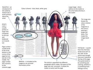
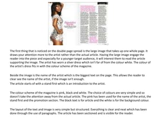
Conventions of a Double Page Article
• The artist/s tends to be either a well known or up and coming
• Name of the artist is written in a big font making it eye-catching for the
reader
• One big image of the artist/s is always featured but there may be other
small pictures supporting the interview
• Pull quote placed either on the supporting image or amongst the interview
• Title of the article tends to be a quote made by the artist/s
• At the end of the article, there tends to be a little promotion section where
the reader gets information about either the artist/s concerts, tour, album,
etc.
• Text is written in 2-4 columns
• By-lines under the image to give credit to the photographer and writer
• Interviews tend to be 1000 words or more
Stand first – an
introduction to
the celebrity.
Tends to be a
brief summary
about the
artist

Colour scheme – blue, black, white, grey

Large image – direct
address to the reader as
the artist looks directly at
the reader

The image also
breaks the
colour scheme
of the
magazine as
the artist is
wearing a
bright red
dress. This
makes the
image stand
out

Artist’s
name –
usually
written in
larger text
compared
to the rest
and
boldened
so it stands
out
Page number –
usually tends
to be at the
bottom in the
corner of the
page but can
also be in the
middle. The
page number
also connects
to the
contents page

Website – is included so the
magazine can promote
themselves online

The article is separated into different
paragraphs which makes the layout of the
page neat and consistent. It allows the
reader to easily read the page

Pull Quote – a quote
from the interview
tends to be seen as
the ‘title’ of the
article even though
they aren’t placed at
the top of the page.
The quote tends to
be something eyecatching; whether it
is something hardhitting or funny
The first thing that is noticed on the double page spread is the large image that takes up one whole page. It
draws your attention more to the artist rather than the actual article. Having the large image engage the
reader into the piece and especially for a younger target audience, it will interest them to read the article
supporting the image. The artist has worn a silver dress which isn’t far of from the colour white. The colour of
the artist’s dress fits in with the colour scheme of the magazine.
Beside the image is the name of the artist which is the biggest text on the page. This allows the reader to
clear see the name of the artist, if the image isn’t enough.
The article starts of with a stand first which is an introduction to the artist.
The colour scheme of the magazine is pink, black and white. The choice of colours are very simple and so
doesn’t take the attention away from the actual article. The pink has been used for the name of the artist, the
stand first and the promotion section. The black text is for article and the white is for the background colour.
The layout of the text and image is very simple but structured. Everything is clear and neat which has been
done through the use of paragraphs. The article has been sectioned and is visible for the reader.

Conventions of a Double Page Article

  • 2.
    Conventions of aDouble Page Article • The artist/s tends to be either a well known or up and coming • Name of the artist is written in a big font making it eye-catching for the reader • One big image of the artist/s is always featured but there may be other small pictures supporting the interview • Pull quote placed either on the supporting image or amongst the interview • Title of the article tends to be a quote made by the artist/s • At the end of the article, there tends to be a little promotion section where the reader gets information about either the artist/s concerts, tour, album, etc. • Text is written in 2-4 columns • By-lines under the image to give credit to the photographer and writer • Interviews tend to be 1000 words or more
  • 3.
    Stand first –an introduction to the celebrity. Tends to be a brief summary about the artist Colour scheme – blue, black, white, grey Large image – direct address to the reader as the artist looks directly at the reader The image also breaks the colour scheme of the magazine as the artist is wearing a bright red dress. This makes the image stand out Artist’s name – usually written in larger text compared to the rest and boldened so it stands out Page number – usually tends to be at the bottom in the corner of the page but can also be in the middle. The page number also connects to the contents page Website – is included so the magazine can promote themselves online The article is separated into different paragraphs which makes the layout of the page neat and consistent. It allows the reader to easily read the page Pull Quote – a quote from the interview tends to be seen as the ‘title’ of the article even though they aren’t placed at the top of the page. The quote tends to be something eyecatching; whether it is something hardhitting or funny
  • 4.
    The first thingthat is noticed on the double page spread is the large image that takes up one whole page. It draws your attention more to the artist rather than the actual article. Having the large image engage the reader into the piece and especially for a younger target audience, it will interest them to read the article supporting the image. The artist has worn a silver dress which isn’t far of from the colour white. The colour of the artist’s dress fits in with the colour scheme of the magazine. Beside the image is the name of the artist which is the biggest text on the page. This allows the reader to clear see the name of the artist, if the image isn’t enough. The article starts of with a stand first which is an introduction to the artist. The colour scheme of the magazine is pink, black and white. The choice of colours are very simple and so doesn’t take the attention away from the actual article. The pink has been used for the name of the artist, the stand first and the promotion section. The black text is for article and the white is for the background colour. The layout of the text and image is very simple but structured. Everything is clear and neat which has been done through the use of paragraphs. The article has been sectioned and is visible for the reader.