Download to read offline


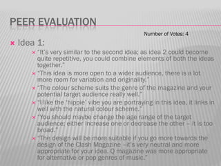
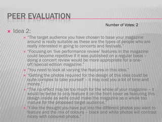
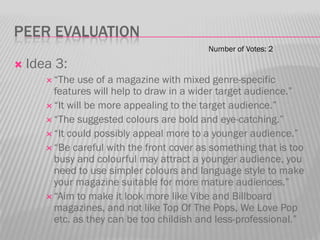
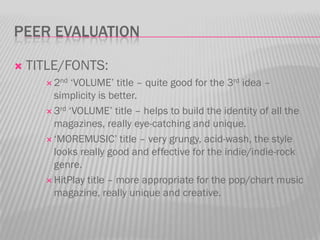

Lauren Barrett presented 3 initial ideas for a new music magazine. The purpose was to get feedback to help develop the ideas further. Ideas included an indie/indie-rock magazine, a live music magazine focused on concerts, and a mixed genre magazine about new music. Peers provided feedback, praising features of each but noting some ideas could be repetitive or appeal to too broad an audience. Based on the feedback, Lauren decided to combine elements of the first two ideas and focus on an indie/indie-rock magazine, seeing the most opportunity in the market.


