B Y A N D R E W T H O M A S - P E M A G B I
ANALYSIS OF ARTIST ALBUM
AND MAGAZINE ADVERTS
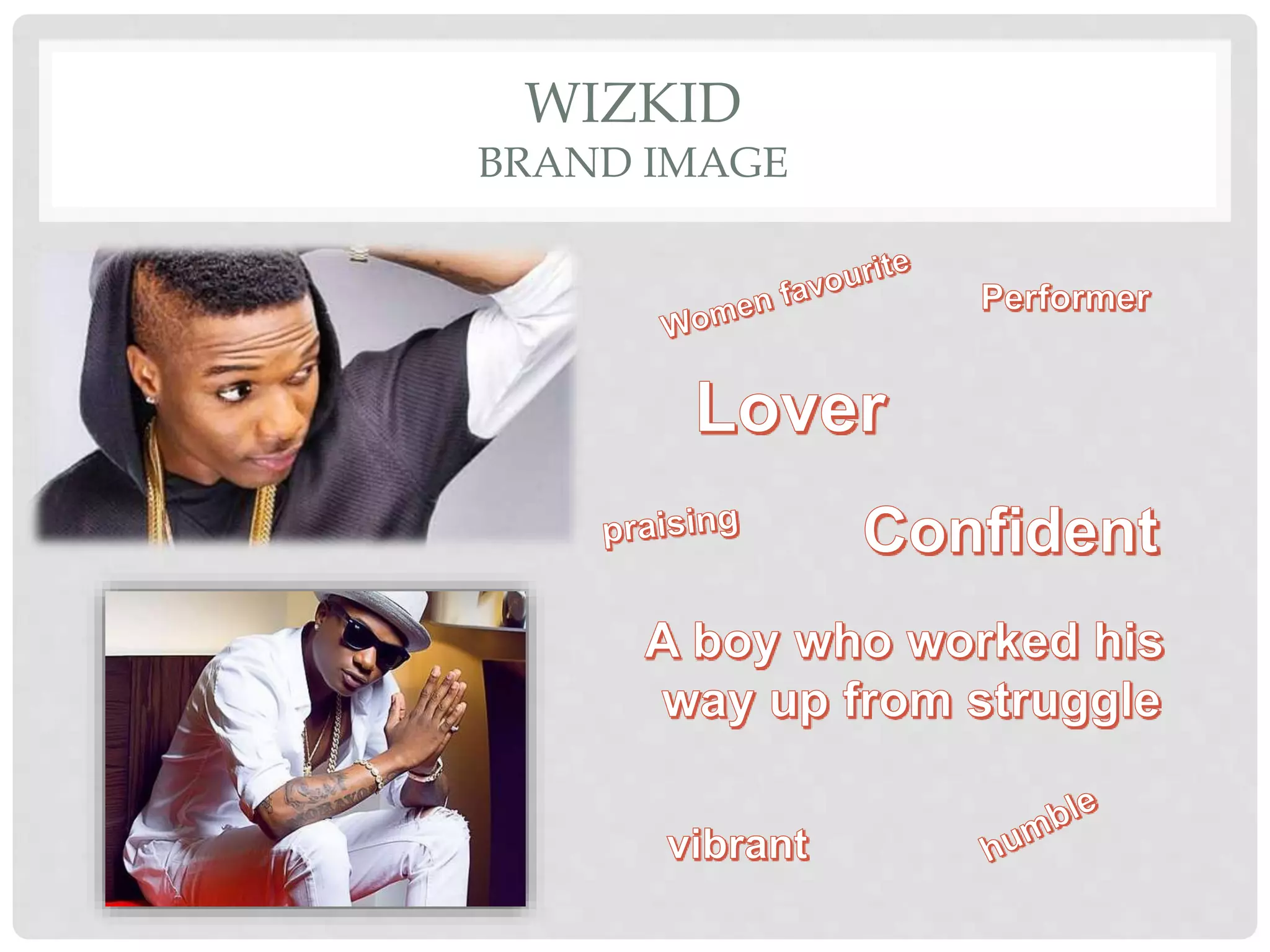
WIZKID
BRAND IMAGE
WIZKID
“AYO JOY”
The image on the album features the main artist, who will be
recognisable to fans and consumers. Being a solo artist, Wizkid is
the ‘brand’ so featuring him on the front cover of the album will help
the product to sell.
He is dressed (costume) in the traditional African clothing which
links to the genre of music as it is African based also presenting
that he is an international star. Perhaps this is a way that Wizkid
connects to his fans as he shows that he was once just like them.
The body language correlates well with the setting as it is set
behind a poor African home, him standing behind the girls
presumably suggests that he is a man of people so as you can see
a humble imagery is always being projected within this album.
In the album cover he is looking wistfully into the camera this direct
mode of address is very effective in catching and maintaining
audience attention. Where as in the poster he has more of a lustful
and teasing look towards him which would perhaps appeal more to
the female crowd.
The font used is effective as the artists name is clear and is in bold
which shows that he is the main focus of the product. In the poster
his name which is in a vibrant font links to his energetic persona.
I can see at the back of the able the tracks are done in a list form.
Furthermore the record labels are put clear at the bottom of the
album which creates a sense of professionalism which links to the
budget used as the pictures are of a very high quality.
WIZKID
SYNERGY
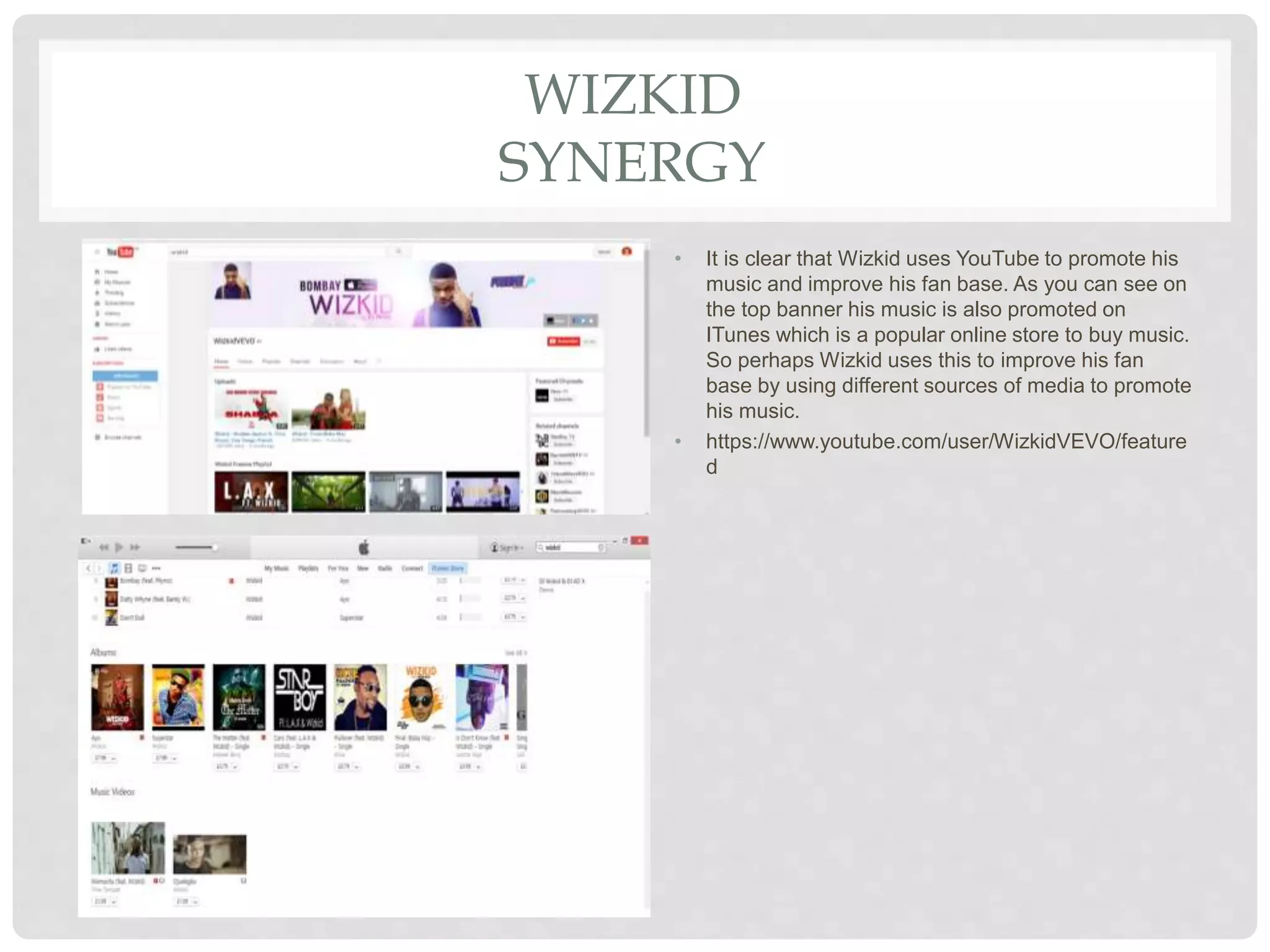
• It is clear that Wizkid uses YouTube to promote his
music and improve his fan base. As you can see on
the top banner his music is also promoted on
ITunes which is a popular online store to buy music.
So perhaps Wizkid uses this to improve his fan
base by using different sources of media to promote
his music.
• https://www.youtube.com/user/WizkidVEVO/feature
d
JAIJ HOLLANDS
BRAND IMAGE
JAIJ HOLLANDS X STONEBOY
“PINGA”
• The camera shot used on the album is at a midshot which helps the
audience engage in the costume used. As you can see through the
dress codes it shows Jaij Hollands wearing a more urban and
simplistic clothing which links to his music base as he is more of a
London based singer. Where as stoneboy has a more retro and
versitile clothing which links to him being an International star.
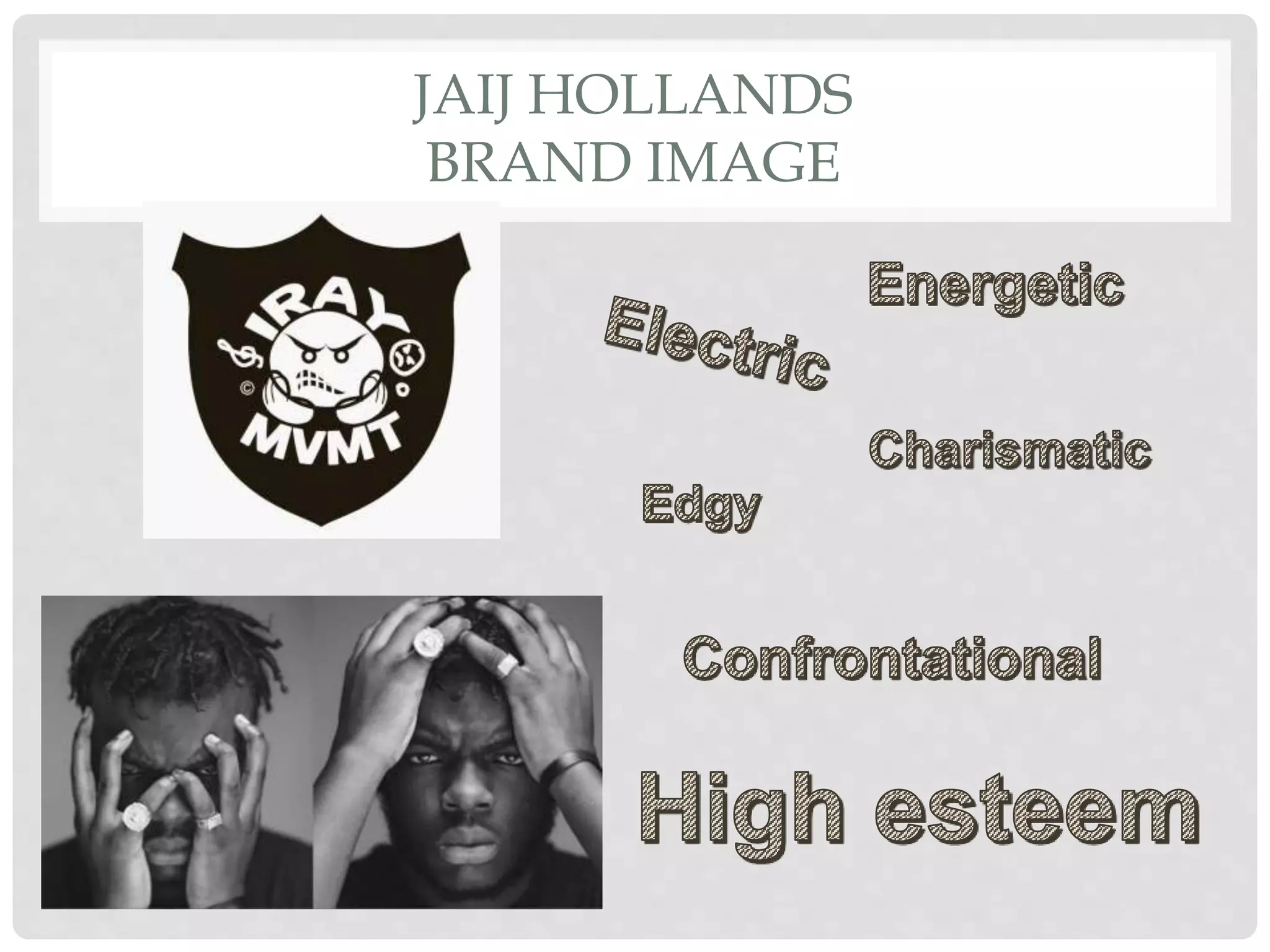
• Jaij Hollands star persona is highlighted here as he has a
confrontational look towards him’; which also links with his wild hair
style as the messy aspect of it creates an edgy look. The colour use is
dulled down to give more of a rockstar look which what I would say
links to the type of energy he performs with. The font is used
effectively as it goes well with the black and white theme as the ghetto
type font links to his afrobeat rock persona that he represents.
• Furthermore all the artists are signed to the record label Iray
movement as in the Ghanaian language “twi”:, Iray means high which
links to their star persona as they are energetic and charismatic
artists.
JAIJ HOLLANDS
SYNERGY
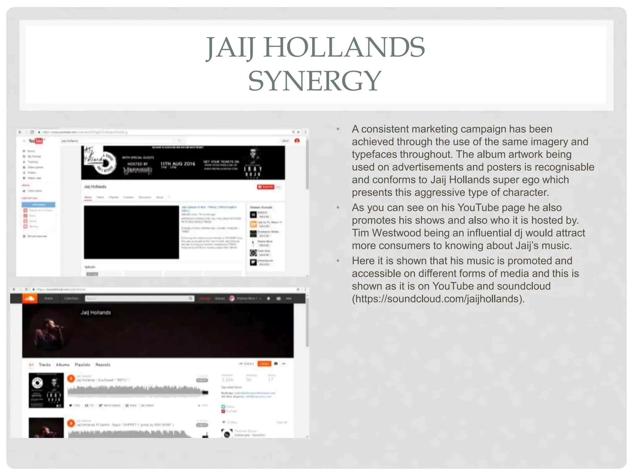
• A consistent marketing campaign has been
achieved through the use of the same imagery and
typefaces throughout. The album artwork being
used on advertisements and posters is recognisable
and conforms to Jaij Hollands super ego which
presents this aggressive type of character.
• As you can see on his YouTube page he also
promotes his shows and also who it is hosted by.
Tim Westwood being an influential dj would attract
more consumers to knowing about Jaij’s music.
• Here it is shown that his music is promoted and
accessible on different forms of media and this is
shown as it is on YouTube and soundcloud
(https://soundcloud.com/jaijhollands).
YEMI ALADE
BRAND IMAGE
YEMI ALADE
“MAMA AFRICA”
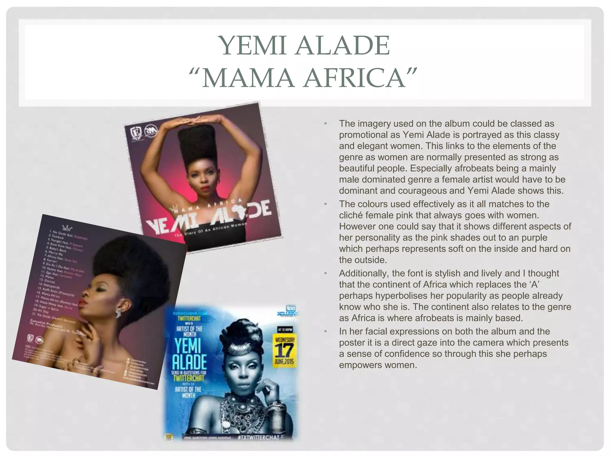
• The imagery used on the album could be classed as
promotional as Yemi Alade is portrayed as this classy
and elegant women. This links to the elements of the
genre as women are normally presented as strong as
beautiful people. Especially afrobeats being a mainly
male dominated genre a female artist would have to be
dominant and courageous and Yemi Alade shows this.
• The colours used effectively as it all matches to the
clichĂŠ female pink that always goes with women.
However one could say that it shows different aspects of
her personality as the pink shades out to an purple
which perhaps represents soft on the inside and hard on
the outside.
• Additionally, the font is stylish and lively and I thought
that the continent of Africa which replaces the ‘A’
perhaps hyperbolises her popularity as people already
know who she is. The continent also relates to the genre
as Africa is where afrobeats is mainly based.
• In her facial expressions on both the album and the
poster it is a direct gaze into the camera which presents
a sense of confidence so through this she perhaps
empowers women.
SHARED CONVENTIONS OF THE
ALBUMS
• I noticed that in these album covers they were mostly at mid-shots but however
could be at a long shot or close up shot. I would say that the mid-shots were
most effective to me as you got more of a gist of the dress codes of the star and
also it was close enough to capture the facial expression of the star which would
clearly give a depiction of the star’s persona.
• The star is normally the main image on the album and they usually have a direct
gaze to make the audience engage with the album.
• It contains the logo of the record label or any other company that has something
to do with the album. Through this you gain a sense of familiarity between the
two as when you perhaps to a specific record label you would always link it to
that star.
• At the back of the album is where all the tracks are presented and it is normally
in a list form and again you would presumably see a picture of the star which
consistently shows the importance the artist has to the album.
• Additionally I noticed that they had social media links which again engages the
audience with ways that they can keep on track with the artists lifestyle or
perhaps knew music to come.
CONVENTIONS OF A POSTER
• Posters always have the main artists as the main image (mostly in the centre).
Shows that they are the headline act, highlights their importance. This would
perhaps attract more fans as it is easier to know that their favourite artist will be
it. The stars facial expression and dress code would match their persona for
example in Yemi Alade’s poster she has a direct gaze which evokes her
confidence and she also where a lot of traditional African clothing. Here the
jewellery links to the genre of music as it shows her to be authentic to her origin.
• In terms of the colours used there is normally a strict code; the same colours
would be used throughout the whole poster. One colour would be used for the
more important text and others for lest important text.
• Has the dates of events.
• Other artist that will be there (however they would be in a smaller font and as
they may be opening acts or acts that lead up to the main act).
• Would present the logo or name of the organisation holding the event.

Analysis of artist digipak and magazine adverts

  • 1.
    B Y AN D R E W T H O M A S - P E M A G B I ANALYSIS OF ARTIST ALBUM AND MAGAZINE ADVERTS
  • 2.
  • 3.
    WIZKID “AYO JOY” The imageon the album features the main artist, who will be recognisable to fans and consumers. Being a solo artist, Wizkid is the ‘brand’ so featuring him on the front cover of the album will help the product to sell. He is dressed (costume) in the traditional African clothing which links to the genre of music as it is African based also presenting that he is an international star. Perhaps this is a way that Wizkid connects to his fans as he shows that he was once just like them. The body language correlates well with the setting as it is set behind a poor African home, him standing behind the girls presumably suggests that he is a man of people so as you can see a humble imagery is always being projected within this album. In the album cover he is looking wistfully into the camera this direct mode of address is very effective in catching and maintaining audience attention. Where as in the poster he has more of a lustful and teasing look towards him which would perhaps appeal more to the female crowd. The font used is effective as the artists name is clear and is in bold which shows that he is the main focus of the product. In the poster his name which is in a vibrant font links to his energetic persona. I can see at the back of the able the tracks are done in a list form. Furthermore the record labels are put clear at the bottom of the album which creates a sense of professionalism which links to the budget used as the pictures are of a very high quality.
  • 4.
    WIZKID SYNERGY • It isclear that Wizkid uses YouTube to promote his music and improve his fan base. As you can see on the top banner his music is also promoted on ITunes which is a popular online store to buy music. So perhaps Wizkid uses this to improve his fan base by using different sources of media to promote his music. • https://www.youtube.com/user/WizkidVEVO/feature d
  • 5.
  • 6.
    JAIJ HOLLANDS XSTONEBOY “PINGA” • The camera shot used on the album is at a midshot which helps the audience engage in the costume used. As you can see through the dress codes it shows Jaij Hollands wearing a more urban and simplistic clothing which links to his music base as he is more of a London based singer. Where as stoneboy has a more retro and versitile clothing which links to him being an International star. • Jaij Hollands star persona is highlighted here as he has a confrontational look towards him’; which also links with his wild hair style as the messy aspect of it creates an edgy look. The colour use is dulled down to give more of a rockstar look which what I would say links to the type of energy he performs with. The font is used effectively as it goes well with the black and white theme as the ghetto type font links to his afrobeat rock persona that he represents. • Furthermore all the artists are signed to the record label Iray movement as in the Ghanaian language “twi”:, Iray means high which links to their star persona as they are energetic and charismatic artists.
  • 7.
    JAIJ HOLLANDS SYNERGY • Aconsistent marketing campaign has been achieved through the use of the same imagery and typefaces throughout. The album artwork being used on advertisements and posters is recognisable and conforms to Jaij Hollands super ego which presents this aggressive type of character. • As you can see on his YouTube page he also promotes his shows and also who it is hosted by. Tim Westwood being an influential dj would attract more consumers to knowing about Jaij’s music. • Here it is shown that his music is promoted and accessible on different forms of media and this is shown as it is on YouTube and soundcloud (https://soundcloud.com/jaijhollands).
  • 8.
  • 9.
    YEMI ALADE “MAMA AFRICA” •The imagery used on the album could be classed as promotional as Yemi Alade is portrayed as this classy and elegant women. This links to the elements of the genre as women are normally presented as strong as beautiful people. Especially afrobeats being a mainly male dominated genre a female artist would have to be dominant and courageous and Yemi Alade shows this. • The colours used effectively as it all matches to the cliché female pink that always goes with women. However one could say that it shows different aspects of her personality as the pink shades out to an purple which perhaps represents soft on the inside and hard on the outside. • Additionally, the font is stylish and lively and I thought that the continent of Africa which replaces the ‘A’ perhaps hyperbolises her popularity as people already know who she is. The continent also relates to the genre as Africa is where afrobeats is mainly based. • In her facial expressions on both the album and the poster it is a direct gaze into the camera which presents a sense of confidence so through this she perhaps empowers women.
  • 10.
    SHARED CONVENTIONS OFTHE ALBUMS • I noticed that in these album covers they were mostly at mid-shots but however could be at a long shot or close up shot. I would say that the mid-shots were most effective to me as you got more of a gist of the dress codes of the star and also it was close enough to capture the facial expression of the star which would clearly give a depiction of the star’s persona. • The star is normally the main image on the album and they usually have a direct gaze to make the audience engage with the album. • It contains the logo of the record label or any other company that has something to do with the album. Through this you gain a sense of familiarity between the two as when you perhaps to a specific record label you would always link it to that star. • At the back of the album is where all the tracks are presented and it is normally in a list form and again you would presumably see a picture of the star which consistently shows the importance the artist has to the album. • Additionally I noticed that they had social media links which again engages the audience with ways that they can keep on track with the artists lifestyle or perhaps knew music to come.
  • 11.
    CONVENTIONS OF APOSTER • Posters always have the main artists as the main image (mostly in the centre). Shows that they are the headline act, highlights their importance. This would perhaps attract more fans as it is easier to know that their favourite artist will be it. The stars facial expression and dress code would match their persona for example in Yemi Alade’s poster she has a direct gaze which evokes her confidence and she also where a lot of traditional African clothing. Here the jewellery links to the genre of music as it shows her to be authentic to her origin. • In terms of the colours used there is normally a strict code; the same colours would be used throughout the whole poster. One colour would be used for the more important text and others for lest important text. • Has the dates of events. • Other artist that will be there (however they would be in a smaller font and as they may be opening acts or acts that lead up to the main act). • Would present the logo or name of the organisation holding the event.