
Recommended
More Related Content
What's hot
What's hot (20)
Similar to Front cover analysis
Similar to Front cover analysis (20)
Recently uploaded
Recently uploaded (20)
Front cover analysis
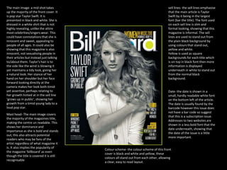
- 1. The main image- a mid shot takes up the majority of the front cover. It is pop star Taylor Swift. It is presented in black and white. She is dressed in a white shirt that is not highly revealing, unlike the attire most celebrities/singers wear. This could have connotations that she is innocent and sweet, appealing to people of all ages. It could also be showing that this magazine is also innocent, not sexualising people in their articles but instead just talking to/about them. Taylor's hair is to the side like the wind is blowing it yet maintains a tidy look, giving her a natural look. Her stance of her hand on her shoulder but her face forward looking directly at the camera makes her look both timid yet assertive, perhaps relating to her growth hinted at in the sell line ‘grows up in public’, showing her growth from a timid young lady to a loud pop star. sell lines- the sell lines emphasise that the main article is Taylor Swift by it being in the largest font (bar the title). The font used on each sell line is slim and formal looking, showing that this magazine is informal. The sell lines are used to stand out from the plain black background by using colours that stand out, yellow and white. Yellow is used as square backgrounds for each title which is on top in black font then more information is displayed underneath in white to stand out from the normal black background. Mast head- The main image covers the majority of the magazines title, making the centre un readable. This shows her dominance and importance as she is bold and stands out, this also attracts potential readers who may be fans of the artist regardless of what magazine it is. It also implies the popularity of the magazine ‘billboard’ as even though the title is covered it is still recognisable Date- the date is shown in a small, hardly readable white font on the bottom left of the article. The date is usually found by the barcode however this issue does not have a bar code so suggest that this is a subscription issue. Addresses to two websites are shown in a less bold font that the date underneath, showing that the date of the issue is a little more important. Colour scheme- the colour scheme of this front cover is black and white and yellow, these colours all stand out from each other, allowing a clear, easy to read layout.
- 2. sell lines- there are a lot of sell lines used on this front cover, the title of each is larger than the summary underneath, the summaries tend to only take up two lines of space. The large amount of sell lines have caused for them to have to over lap the main image of Ed Sheeran, this front page has an abnormally large amount of text on it, this is to highlight that this issue is the ‘awards special edition’. All the subheadings are in a bold font to stand out. But Ed Sheeran, represented to be the main article, gets a different font for his sell line presented in a more formal, hand written like text. The summary underneath is bold like the main sell lines headlines, using this even though it is the article summary shows its importance over the other article. The summary is also 3 lines long, longer than the majority of the other articles descriptions. Main image- the main and only image used on this front page is a mid shot of Ed Sheeran holding a guitar over his lap. The guitar is to highlight his musical abilities, it also links to the sell line description which references him and his guitar, an instrument he often uses when performing at gigs. He is dressed and presented very casually and looking off to the side to give him a more natural look, as if he is unaware he is being photographed. The background is black with a fade towards white the closer it is to him (fitting with the magazines colour scheme) This effect gives the artist a type of glow that further highlights his presence making him seem very important as he is in light whilst all other articles are in darkness so not as important. Also due to him being the only image on the page it causes him to gain the most attention immediately. Colour scheme- the colour scheme of the front cover follows the colour scheme used on the issues logo: red white and black. The majority of font on the page is black with a white fade surrounding the artist. Plug- there is a large plug in the top right hand corner pf the page in red, standing out from the black background. The text on the plug starts off very large with ‘50’ being shown then the font getting smaller explaining what the article is called. The article description is in black underneath in a much smaller front. This plug has been used to stand out as it may be important, this is further shown through the label above is saying ‘essential’. Furthermore to draws more attention to the plug the main image, Ed Sheeran, is looking forwards it, attracting the readers eye to it also. This could also be said to be hinting at a link between the two. Barcode- a barcode is present, showing that even though this has been stated to be a special edition it is still available for public consumption and is not a subscription issue. Even though the front page already has an large amount of text the bottom line of the page shows even more articles that are inside, further highlighting the large amount of content inside . The line sticks to colour scheme with red and white being used on the black background with fault alternating colour every other article. The logo is large and recognisable. The name of the magazine is ‘Q’. The logo is white on a red background. The simple one letter takes up a large majority of the cover compared to the other text, this Is to show off the magazine as it is well known and trusted for good quality articles. Also the logo has had a slight alternation with the text ‘Awards Special Edition’ being included in the logos box in black to clearly be distinct from the name., this is so as the readers eyes are drawn to the large logo they then immediately see it’s a special issue, making it seem more important