
Recommended
More Related Content
What's hot
What's hot (20)
Viewers also liked
Viewers also liked (20)
Similar to Q music magazine analysis
Similar to Q music magazine analysis (20)
Recently uploaded
Recently uploaded (20)
Q music magazine analysis
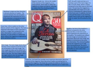
- 1. Puff- the puff is bold and clear as it overlaps a part of the main image. It is also a circular shape, which is unique compared to the other texts on the front cover. This portrays the magazine as unpredictable and unique as it is not afraid of challenging the original theme of the front cover. In addition, the font in the puff decreases in size meaning readers have to pick up the magazine in order to reader the full contents of the puff. Headline- the font of the headline is different compared to the other titles/sub-titles on the front cover, which emphasizes the importance of the headline. The headline also reflects the main image as it provides basic information about the main image, the headline is minimal but at the same time informative. This minimal headline portrays the magazine as of a high status and professional. The use of colour also reflects the importance of the headline as red is colour that attracts attention. Footer bar- the footer bar provides more important information about the contents of the magazine, these help attract readers prompting them to purchase the magazine. The footer bar consists of a white or red font on a black background, which helps to highlight its relevance as it is made more visible. Magazine header bar- informs the readers of the intention of the magazine, it is a unique phrase, which helps to reflect the magazine as unique and special, indicating to readers that they should purchase it due to their unique aspect. Masthead- simple and clear therefore it attracts attention of readers. The contrast between the red and white emphasizes the importance of ‘Q’ as al the attention is centered on it and makes it more eye grabbing. Cover lines- inform readers on the other feature contents of the magazine. The most important information of each cover line is written in a larger font compared to the other information in order to attract attention. It is also written in a white font which reflects the magazine as organized as white symbolizes tidiness. Main image- The main image clearly shows that the movie is based around due to the use of the guitar in the main image. The main image also takes up the whole front cover, this is effective as it leaves no dead space in the shot. The main image is also a low angle medium shot, the low angle portrays Ed Sheeran as superior.
- 2. The contents title is written in white on a black background, this extreme contrast between colours makes the title much clearer and bolder and easier for the audience to read. The page indicator challenges the conventions of a typical music magazine, such as, XXL which just consists of the page number next to the information provided about the article. In this magazine the page number is placed in a speech bubble ( each of a different colour). This is more likely to attract the attention of the readers. In addition, it portrays ‘Q’ as unique compared to other music magazines, making it more appealing for purchase. The colours used for each bubble are bright and secondary colours, bright colours symbolize a positive vibe, this helps to reflect the contents of the magazine. The layout of this contents page is quiet unusual and unique as it does not have a clearly indicated main image, instead there are multiple smaller images. Although, the layout of the page is much more complex the information is still clear. The layout is effective to attract younger audiences, aged 15-28 as the different colours and odd layout reflect the music as fun but at the same time informative. Magazine logo- The magazine logo is big and red making it clear to see, this reminds the reader what they are reading. It also reinforces the importance of the magazine name, which adds a sense of status to the magazine as audiences associate importance with status. Date- The date simply informs the reader of when the issue was published. Headings- the headings show a continuity in design as all of them consist of a black and bold font on a white background. This makes the magazine more professional as they are able to maintain the same design without it looking boring. Although there is no clear main image, the use of the different small images will attract a broader range of target audience, as each image reflects a different genre of music. For example, the image of Ed Sheer an is a low angle medium shoot, this makes him seem superior. He is also holding a guitar and wearing a unbuttoned flannel shirt this reinforces the Pop/Folk music he creates. The unbuttoned shirt would attract his young female fans as it has sexual connotations.Footer Bar- The footer bar provides extra information on the available contents of the magazine. The font used is quiet small, however, the page numbers are red on a white background, which makes them visible and attracts the attention of the readers making it more likely for them to look inside the magazine in order to get more information on the articles.
- 3. Headline-The font used is bold and simple therefore although its eye grabbing it does not take away from other aesthetic features of the magazine. Main image- the main image here although dominates the page is not as large as main images usually are, this is also seen on the contents page of this issue. This makes the magazine different compared to other magazines as it bends the codes and conventions of a music magazine. The image itself is is a medium long shot allowing the target audience to become familiar with the magazine, and build a relationship with in, encouraging them to continue purchasing other issues. Text grab- The text grab provides an insight to the article as it is brief and makes the target audience want to read more of the article. The font used is also larger and bolder making it more noticeable. The use of the phrase ‘life- or-death’ shows the colloquial and friendly aspect of the magazine, building trust between the reader and the magazine. 4 smaller images – The 4 smaller images attract target audiences as they are shots from a previous concert, which provides an exclusive insight for the readers, helping to build the relationship between the two, meaning readers will begin to trust the magazine. They also help to layout the double page spread. Here the celebrities name stands out, reinforcing their status and power within the music industry. Stand first- the stand first provides information on the celebrity featured in the article, allowing audiences to become familiar with the celebrity. This is a regular code and convention of a music magazine. By lines- these provide credit to the photographer of the image. Colour scheme- the colour pallet used on this double page spread is quiet simple, which means it does not overpower the article it self. It also follows the same colours that are displayed throughout the magazine. The colours used are solid and powerful providing the magazine with a sense of power and status within the print industry.