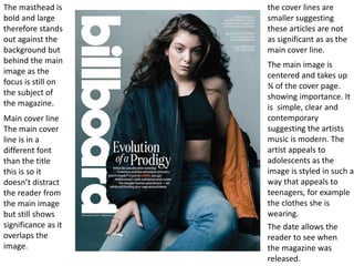
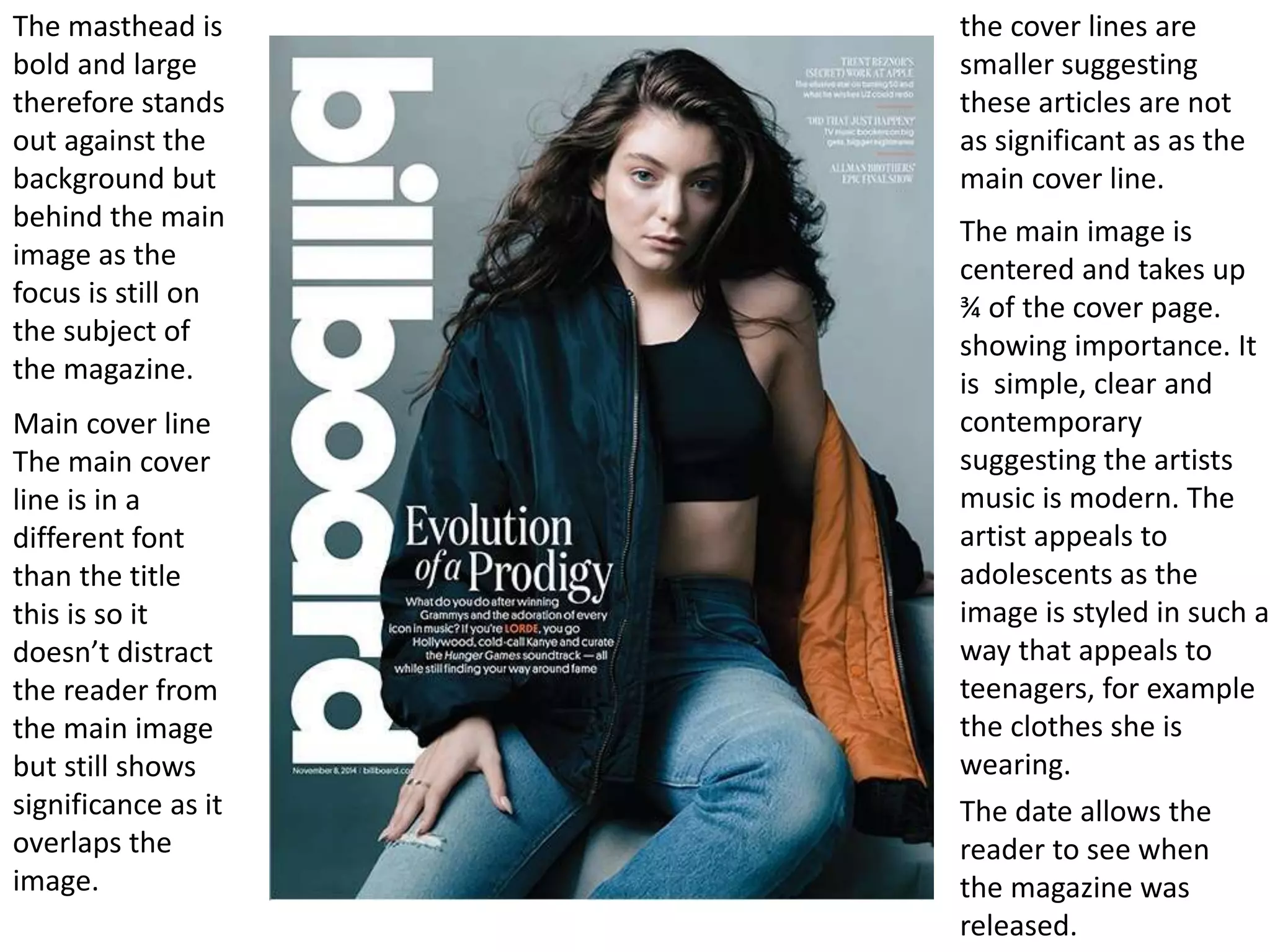
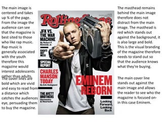
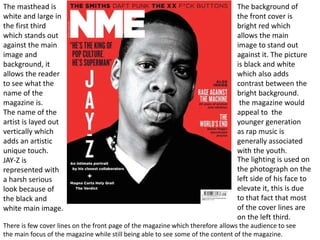
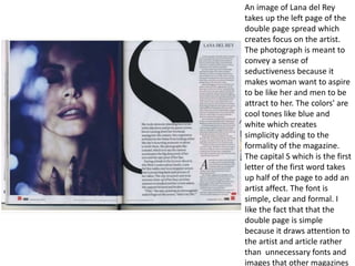
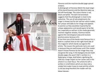
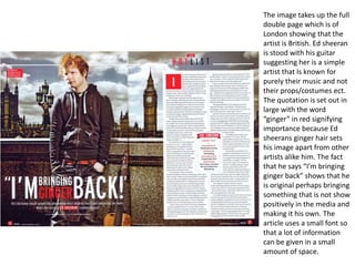
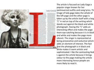
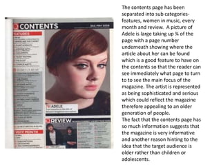
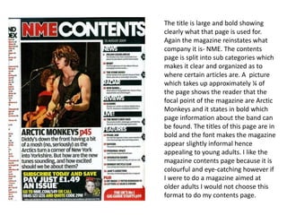
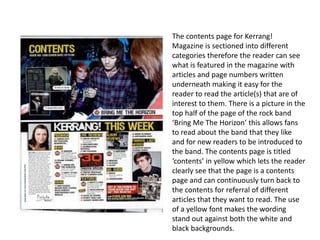
Incoming and Outgoing Shipments in 1 STEP Using Odoo 17
Task 3
1. The masthead is
bold and large
therefore stands
out against the
background but
behind the main
image as the
focus is still on
the subject of
the magazine.
The date allows the
reader to see when
the magazine was
released.
The main image is
centered and takes up
¾ of the cover page.
showing importance. It
is simple, clear and
contemporary
suggesting the artists
music is modern. The
artist appeals to
adolescents as the
image is styled in such a
way that appeals to
teenagers, for example
the clothes she is
wearing.
the cover lines are
smaller suggesting
these articles are not
as significant as as the
main cover line.
Main cover line
The main cover
line is in a
different font
than the title
this is so it
doesn’t distract
the reader from
the main image
but still shows
significance as it
overlaps the
image.
2. The masthead remains
behind the main image
therefore does not
distract from the main
image. The masthead is
red which stands out
against the background, it
is also large and bold.
This is the visual branding
of the magazine therefore
needs to stand out so
that the audience knows
what they're buying.
The main cover line
stands out against the
main image and allows
the reader to see who the
magazine is focused on-
in this case Eminem.
The main image is
centered and takes
up ¾ of the page.
From the image the
audience can see
that the magazine is
best sited to those
who like rap music.
Rap music is
generally associated
with the youth
therefore this
magazine would
interest adolescents
rather than adults.
The cover lines are
bold which are vivid
and easy to read from
a distance which
catches the audiences
eye, persuading them
to buy the magazine.
3. The masthead
is large and
bold in the left
third. The
background of
the masthead
is red which
contrasts with
the Q which is
white making it
stand out.
The main image of the
magazine is a photograph of
Ed sheeran and underneath
his face, in the middle of the
front cover is Ed sheerans
name in a different font to
the rest of the magazine.
The font looks as if it is hand
written which shows
informality therefore this
magazine would generally
apply to the youth. However
to the right third there are
various articles which would
appeal to the older
generation for example pink
Floyd which music is popular
with many adults therefore
this magazine would appeal
to people of all ages.
4. The background of
the front cover is
bright red which
allows the main
image to stand out
against it. The picture
is black and white
which also adds
contrast between the
bright background.
the magazine would
appeal to the
younger generation
as rap music is
generally associated
with the youth.
The masthead is
white and large in
the first third
which stands out
against the main
image and
background, it
allows the reader
to see what the
name of the
magazine is.
The name of the
artist is layed out
vertically which
adds an artistic
unique touch.
JAY-Z is
represented with
a harsh serious
look because of
the black and
white main image.
There is few cover lines on the front page of the magazine which therefore allows the audience to see
the main focus of the magazine while still being able to see some of the content of the magazine.
The lighting is used on
the photograph on the
left side of his face to
elevate it, this is due
to that fact that most
of the cover lines are
on the left third.
5. An image of Lana del Rey
takes up the left page of the
double page spread which
creates focus on the artist.
The photograph is meant to
convey a sense of
seductiveness because it
makes woman want to aspire
to be like her and men to be
attract to her. The colors' are
cool tones like blue and
white which creates
simplicity adding to the
formality of the magazine.
The capital S which is the first
letter of the first word takes
up half of the page to add an
artist affect. The font is
simple, clear and formal. I
like the fact that that the
double page is simple
because it draws attention to
the artist and article rather
than unnecessary fonts and
images that other magazines
6. Florence and the machine double page spread
analysis.
A photograph of Florence Welch the lead singer
of the band Florence and the Machine takes up
the left hand page. The colour theme is red,
black and white. The dark red and black
suggests that the photograph is mean to be
seductive. The use of red compliments the
singer is known too for her red hair which makes
her unique and adds to her image and appeals
to women as they would be inspired by her
unique appearance and would aspire to be like
her, especially as red hair in the media generally
receives negative reviews, Florence stands
against the stereotypical view and receives
positive praise because of it.
A line from one of the bands most famous hits is
bold in a stylistic font on the right hand side of
the magazine which stands out against the
article. The reason the particular lyrics are used
is because they are well known and if the reader
doesn’t know Florence by her image they may
recognize the song. In the background over both
double pages the word ‘USA’ is written in a
faded grey in large, bold letters signifying the
USA has a large impact on her career and in the
article it is a main focus. The article its self is
written in small letters which are clear and a
simple font make it easy to read and the article
is not too long therefore the reader will not
loose interest.
7. The image takes up the full
double page which is of
London showing that the
artist is British. Ed sheeran
is stood with his guitar
suggesting her is a simple
artist that Is known for
purely their music and not
their props/costumes ect.
The quotation is set out in
large with the word
“ginger” in red signifying
importance because Ed
sheerans ginger hair sets
his image apart from other
artists alike him. The fact
that he says “I’m bringing
ginger back” shows that he
is original perhaps bringing
something that is not show
positively in the media and
making it his own. The
article uses a small font so
that a lot of information
can be given in a small
amount of space.
8. The article is focused on Lady Gaga a
popular singer known for her
controversial outfits and song lyrics. The
image of lady gaga takes the whole of
the left page and the other page is
taken up by the article itself with a large
“L” in red on top of the writing which
stands out against the black and white
photograph. Having the “L” adds an
interesting effect and makes the page
more eye-catching because it is in black
and white and makes the page more
vibrant. The singer is represented at
being provocative and seductive which
adds an element of interest. The fact
that the photograph is in black and
white makes it seem artistic and
sophisticated. I like the contrasting Red
L against the article because it brings
colour to the page making the article
more interesting hence people are
more likely to read it.
9. The contents page has been
separated into sub categories-
features, women in music, every
month and review. A picture of
Adele is large taking up ¾ of the
page with a page number
underneath showing where the
article about her can be found
which is a good feature to have on
the contents so that the reader can
see immediately what page to turn
to to see the main focus of the
magazine. The artist is represented
as being sophisticated and serious
which could reflect the magazine
therefore appealing to an older
generation of people.
The fact that the contents page has
so much information suggests that
the magazine is very informative
and another reason hinting to the
idea that the target audience is
older rather than children or
adolescents.
10. The title is large and bold showing
clearly what that page is used for.
Again the magazine reinstates what
company it is- NME. The contents
page is split into sub categories which
makes it clear and organized as to
where certain articles are. A picture
which takes up approximately ¼ of
the page shows the reader that the
focal point of the magazine are Arctic
Monkeys and it states in bold which
page information about the band can
be found. The titles of this page are in
bold and the font makes the magazine
appear slightly informal hence
appealing to young adults. I like the
magazine contents page because it is
colourful and eye-catching however if
I were to do a magazine aimed at
older adults I would not choose this
format to do my contents page.
11. The contents page is split into three
different categories; features, Rock and
Roll and 2012 year in review. Personally I
like this layout because it allows the
reader to be able to clearly see what is in
the magazine and what will interest
them. The titles of each section are in
red which stands out against the back so
the reader is able to see which each
section is about. The list of articles
underneath have a black bold title so the
reader can easily see which article
interest them and they would like to
read further on. There is a quote at the
top of the page on the left hand side
which says “All the news that fits.” the
three words at the end are capitalized
which signify importance and make it
striking. The list of contents are on the
left hand side, however I would not pick
this feature for my magazine because
the contents are quite cramped and the
font is not very large but having a small
font allows more information to be
written.
12. The contents page for Kerrang!
Magazine is sectioned into different
categories therefore the reader can see
what is featured in the magazine with
articles and page numbers written
underneath making it easy for the
reader to read the article(s) that are of
interest to them. There is a picture in the
top half of the page of the rock band
‘Bring Me The Horizon’ this allows fans
to read about the band that they like
and for new readers to be introduced to
the band. The contents page is titled
‘contents’ in yellow which lets the reader
clearly see that the page is a contents
page and can continuously turn back to
the contents for referral of different
articles that they want to read. The use
of a yellow font makes the wording
stand out against both the white and
black backgrounds.