
Recommended
More Related Content
What's hot
What's hot (19)
Similar to DPS 1
Similar to DPS 1 (20)
More from zoetoase
More from zoetoase (20)
Recently uploaded
Recently uploaded (20)
DPS 1
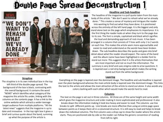
- 1. Headline and Sub-headline The headline of the magazine is a pull quote taken from the main body of the article. “ We don’t want to rehash what we’ve already done..” This creates a sense of mystery and intrigues the reader into wanting to find out what they have done. It is positioned across the entirety of the left hand page. It is the biggest and only stand alone text on the page which emphasizes its importance. It is the first thing the reader looks at when they turn to the page due to its size. The font is simple, capitalized and black which signifies the loud and demanding approach of rock music. It has been arranged in a column that consists of 7 lines with only 1 to 2 words on each line. This makes the article seem more approachable and easier to read and understand as the words have been broken down. The sub-headline describes the quote and goes into brief detail about what the reader should expect. The name of the band and the album name have been highlighted in a bolder font to stand out more. This suggests that it is the artists themselves that are most important and not so much the information. The summary is very brief and uses enigma code to arise questions. It is layered over a red strip background which makes the writing stand out from the white background. Strapline The strapline is in its own individual box in the top left third of the double page spread. The background of the box is black, contrasting with the overall background. It contains the word “NEWS” which identifies what category of the magazine this article fits under, linking with the columns on the contents page. It has a link to the online website which attracts a wider teenage target audience from multiple platforms. “All the latest news” suggests that the magazine is up to date and innovative. In the top right box it gives a brief and curious quote about the band, summing up what the purpose of the article is. Layering Everything on the page is layered over the dominant image. The headline and sub-headline is layered over the plain background whereas the main article body is layered over the dominant image. This links the text to the artists and allows the main attraction of the article to stand out alone. It also avoids any colors clashing with each other which would make the words hard to read. Columns The text on the page is set out in three columns. All three are of the same height and same width which gives the magazine structure and order making it more sophisticated and professional. It also breaks down the information making it look less heavy and easier to read. The columns use line breaks to split different points up. Line breaks are more effective than using an entire page space between points as it keeps them all in a columned structure. It is still easy to read and helps to break down the individual columns. The first column uses a drop cap to show the reader where the article starts. They are positioned side by side so the reader can follow the generic convention of reading from left to right.
- 2. Colour Scheme The colour scheme of the page is black white and red. These colours connote the rock/indie genre and create a very demanding and straight forward approach. These colours are used through out the entire magazine, including the contents and front cover. The design and colour is quite simple which fits the older and mature target audience. Images One dominant image has been used that covers the entire double page. It is a photograph image however effects have been addedto make it more appropriate. For example, extra attention is focused on the band members by blurring out the background and outer corners of the image. This shows the band are the main focus point and allows the audience to immediately draw attention to them. The image is of the famous band Linkin Park, which links directly to the article. They are famous celebrities therefore star power will entice the audience and allow the article to be more recognisable. All 6 members are male and have very masculine stances and poses. They are wearing grunge clothing which is black, grey, red and dark, linking in with the rock and magazine theme. Their skinny jeans and converse reflect the male audiences appearances which creates a sense of familiarity. The men have rugged hair, unshaven faces and piercings which connotes the rock appearance. The image is an extreme long shot so that it can fit all of the band members in and their entire bodies. The shot is at a slight low angle which makes them look more powerful and dominant so that the male audience can look up to them as role models and aspire to be them. The mode of address is direct which suggests the point of view of is direct from the artists. High key studio lighting has been used which gives the image a professional appearance. The bands appearance stands out from the bright white background emphasising their significance. The text overlaps the image however only at the unimportant parts where attention is not needed to be drawn to. The main headline text is what drags the readers attention however it can be seen as image led. The image being the biggest feature on the page and in the most noticeable position. Language The style of the font is very basic and straight to the point. It uses a white Arial font which is rather small to read in comparison to the headline which suggests the order of which things should be read is biggest to smallest font. The drop case is bigger and bolder to initiate the start of the article. Important information and a reference to a different page at the end of the article is capitalised and bolder so it can be identified separately. This specific article has no puns or humour to suggest that they take the music and artists seriously. It is mainly focused around quotes from the band which are shown through speech marks and facts that are given by kerrang! Direct address in the quotes have been used such as “you” which involves the audience and the use of “we” ties the links between celebrities and reality. Phrases such as “Linkin park have told Kerrang,” suggest that Kerrrang have inside information that no one else has access too, making the reader feel more exclusive. Important Information The page numbers and name of the magazine are located in the bottom corners of the page. Including the name gives us a constant reminder of the brand and their link to the artists. Horizontally positioned down the right hand side of the page is the name of the person who wrote the article and took the picture.