2. How does it use of media language create meaning?
The Magazine uses a few familiar genre conventions:
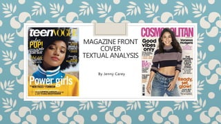
◦ Firstly the use of the Masthead. This can be seen at the top of the
magazine in a bold, familiar typography for the brand, making it
easily identifiable for the reader. As it’s at the top of the magazine,
it will be visible when stacked on the shelf.
◦ Secondly there is the main image. The main image is of Amandla
Stenberg, who is similar in age to the target audience of the
magazine, making it more relatable for the reader.
◦ Finally, Anchorage is used. Amandla’s name appears near her face,
helping to identify her to anyone who doesn’t recognise her face.
3. How does it use of media language create meaning? Continued
The magazine also includes a couple of Barthes codes:
◦ Firstly, enigma codes. Enigma codes are displayed across the
magazine within the cover lines, giving the reader many questions
that they want answers to, encouraging them to purchase the
magazine. A example of this would be ‘Who are the new faces of
feminism?’
◦ Secondly, cultural codes. As the main image is Amandla, its
expected that the audience of teen vogue should know who she is,
and want to support her opinion. The main association would be
her role as a child in The Hunger Games as Rue, however she has
some larger, more recent roles in Everything, Everything and The
Hate you Give.
4. How does it construct purposeful representations?
The front cover of teen vogue constructs a meaningful
representation:
- Femininity is portrayed in an empowering way, as they have
Amandla positioned in a powerful looking stance. The cover lines
also show verbal codes like ‘Power girls’ and ‘New faces of
Feminism’ connotating the same idea of empowerment.
- Ethnicity is also portrayed in a positive, progressive way due to
them having their main image on the cover being a black women
(Amandla Sternberg). This creates a powerful role model for
children of the same ethnicity to her.
- One of the key ideologies coming from this magazine cover would
be the idea that feminism is powerful.
5. How is it constructed to appeal to its target audience?
The publisher uses several ways to target their audience:
- Firstly, they use a similar aged, same gender celebrity on the front
cover, to create a stronger connection with the target audience (18-
24 year olds).
- Secondly, the magazines genre is lifestyle, which is often associated
with women. As this is a topic that most women enjoy, then having
the magazine tailored towards that means there will be a potential
growth in sales.
- When applying Young and Rubicans 4c’s to this magazine, I would
say that the magazine is most likely targeting the mainstream. This
is because the company is well know, potentially creating a sense of
‘security’ for the reader.
6. How does its construction reflect its industry context?
- The publisher of Teen vogue is Conde Nast, owned by the
horizontally integrated, global company, Advanced Publications.
- Due to Teen vogue being published by a large company, they can
afford to pay celebrities to appear and be featured within the
magazine.
- However the fact that it is owned by a big company may limit its
potential to be unique and the ideas within the magazine may be
biased.
- This edition of Teen vogue was released in February of 2016.
7. How does it use of media language create meaning?
The Magazine uses a few familiar genre conventions:
◦ Firstly the use of the Masthead. This can be seen at the top of the
magazine in a bold, familiar typography for the brand, making it
easily identifiable for the reader. As it’s at the top of the magazine,
it will be visible when staked on the shelf.
◦ Secondly, there are the Coverlines. The cover lines are seen around
the main image, giving the reader an idea of what will be included
within the magazine, as well as helping to create enigma codes.
◦ The magazine also uses the extra diegetic gaze of Vanessa to create
a connection with the audience. It also uses synthetic
personalisation, ‘You’, ‘your’ to make the audience feel as though
they are being addressed.
8. How does it construct purposeful representations?
The front cover of teen vogue constructs a meaningful
representation:
- Femininity is portrayed in an more stereotypical way. Vanessa is
stood, exposing her stomach, which may suggest an ‘ideal’ idea of
what women should look like. The cover lines on the front cover
also address the same theme of looking good.
- One of the key ideologies coming from this magazine cover would
be the idea that your looks are important.
9. How is it constructed to appeal to its target audience?
The publisher uses several ways to target their audience:
- Firstly, they use a similar aged, same gender celebrity on the front
cover, to create a stronger connection with the target audience (18-
34 year olds). Vanessa is also and easily identifiable celebrity for the
audience to relate with.
- Secondly, the magazines genre is lifestyle, which is often associated
with women. As this is a topic that most women enjoy, then having
the magazine tailored towards that means there will be a potential
growth in sales.
- When applying Young and Rubicans 4c’s to this magazine, I would
say that the magazine is most likely targeting the Aspirer. This is
because the magazine focuses on image, and having someone
successful on the cover, like Vanessa, gives them some to aspirer to
be like. It would also target the Mainstream as the company is well
known, creating a sense of ‘security’ for the reader.
10. How does its construction reflect its industry context?
- The publisher of Cosmopolitan is Hearst Communications.
- Due to Cosmopolitan being published by a large company, they can
afford to pay celebrities to appear and be featured within the
magazine.
- However the fact that it is owned by a big company may limit its
potential to be unique and the ideas within the magazine may be
biased.
- This edition of Cosmopolitan was released in February of 2020.