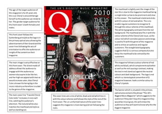
1. The mastheadis slightly overthe image of the
star thisis due to the magazine masthead being
a single lettersohasto be prominentand clear
to the viewer. The mastheadisboldandsticks
withQ’scolour of red andwhite.Thisisto
enable regularcustomerstorecognise Q
throughthe colour scheme of the masthead.
The white typographycontrastsfromthe red
background.The mastheadalsofitsinwiththe
colourscheme of the Cheryl Cole issue,asthe
colourred whichconnotes passionandenergy
isusedto fitwiththe genre of the magazine
and to entice anaudience andregular
customers. The straightboldtypography
suggeststhatQ is a seriouscompanybutalso
helpsthe mastheadtobe noticedbythe
customers.
The age of the targetaudience of
thismagazine isfor25 years old,
thisisas Cheryl isaroundthatage
herself sothe audience can relate to
her.The gendertargetaudience for
thisfrontcover isbothfemalesand
males.
The main image isveryeffective on
thisfrontcover.The directmode of
addressallowsthe audience to
engage withthe audience as
womenalsoaspire tobe like her,
and herhighsex appeal withmenso
wouldincrease sales.Also Cheryl
Cole isknownforbeingbiginthe
musicindustrysotherefore issuited
to the genre of the magazine.
The main coverline “3 wordsCheryl
Cole rocks”increasesinsize each
line,catchingthe audience’s
attention. The redandwhite also
matchesthe mastheadandstyle as
well asstandingout.
Thismagazine followsacolourscheme of red
white andblack,whichcomplementeachother
as well asthe red causinga contrast,making
the textinred standout againstthe neutral
coloursand dark background. The logoisred
whichisa stereotypical conventionof Q
magazine however,looks asimilarcolourto
Cheryl’slipstick.
Thisfront coverfollowsthe
Guttenbergprincipleasthe logoisin
the primaryoptical area allowingthe
advertisementof theirbrandandthe
coverlinesfollowingthe axisof
orientationtoofferthe audience an
insightof the contentontheir
magazine.
The cover lines are a mix of white,blackandredwhichtiesin
withthe colourscheme andfollowsthe style of the restof the
frontcover.The un-uniformednature of the coverlines
suggeststhismagazine ismore daringandnot followingthe
rules.
The bannerwhichis situatedinthe primary
optical areacontainsthe phrase “The UK’s
BiggestMusicMagazine”whichsuggeststo the
audience if theydon’tbuythismagazine they
wouldbe missingout,thiswill entice the
audience astheywill wanttoknowwhythisthe
biggestmagazine.