9990611130 Find & Book Russian Call Girls In Crossings Republik
Magazine progress screen shots
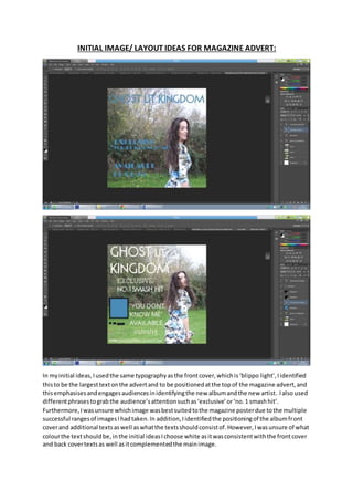
1. INITIAL IMAGE/ LAYOUT IDEAS FOR MAGAZINE ADVERT:
In myinitial ideas,Iusedthe same typographyasthe frontcover,whichis‘blippo light’,Iidentified
thisto be the largesttextonthe advertand to be positionedatthe topof the magazine advert,and
thisemphasisesandengagesaudiencesinidentifyingthe new albumandthe new artist. Ialso used
differentphrasestograbthe audience’sattentionsuchas‘exclusive’or‘no.1 smashhit’.
Furthermore,Iwasunsure whichimage wasbestsuitedtothe magazine posterdue tothe multiple
successful rangesof imagesIhadtaken.In addition,Iidentifiedthe positioningof the albumfront
coverand additional textsaswell aswhatthe textsshouldconsistof.However,Iwasunsure of what
colourthe textshouldbe,inthe initial ideasIchoose white asitwasconsistentwiththe frontcover
and back covertextsas well asitcomplementedthe mainimage.
2. MAGAZINE PROGRESS:
1-2) The firstprogressof the magazine poster the masteheadtypographyis‘bremcatcher’from
online website andthe size waschangedalsoanadditional featuresuchaslinesaddedtomake its
significance increased,alsothe release of the albumisthe same typographyasthe masteheadandit
ispositioneddirectlybellow,thisisbecause the advertsaimistosell the album.Therefore thisisan
importantfeature onthe advert,beingpositionedbellow the masteheadmakesthistextobviousto
3. the audience.Inaddition‘instores’waschangedto‘out’asthiscoversall the differentways
audiencesare nowable topurchase musicsuch as online andinstores. Furthermore,some words
was changedinorderto be more engagingsuchas ‘includes’to‘exclusive’,alsologoof placesto
purchase the productwas addedto allow audiencestoidentifywhere topurchase the productfrom.
An editingtechniqueusedonthe mainimage isbalance beingchangedthismade the imagescolours
become more vibrantincomparisontothe original image alsothe brightnessandcontrastwas
addedinorderto balance out the brightnessinthe original image, thiseditingeffectmakesthe
image more engagingandinteresting.Inaddition,editingtechniquesusediscroppingandresizing
the image inorder forthe main image (artist) tobe positionedonthe right.
4. 3-4-5) In these partsof the editingprogressaneditingtechnique usedisbackgroundblurring,this
effectwasusedasit furtherenhancesthe mainimage,whichconsistsof the artist,thiseffectalso
allowsthe textwhichisplacedontopto not be overwhelmedbythe texture andcolourof the
background.Inthese progressesfeaturesof the advertwasremovedsuchlogosof where to
purchase the productfrom, thiswasas a resultof thislimitingaudienceschoice of purchase andI
identifiedthisnottobe a commonfeature of existingmagazine adverts.Furthermore,the
productionlogowasaddedas thiswasidentifiedtobe animportant feature of musicmagazine
adverts.Inthese progressesIwasexperimentingwiththe textstypography,size,colourand
position.
5.
6. 6-7-8-9) In these progresses animportantmagazineadvertfeature wasadded,thisIsthe starrating
and a quote from newspaper,thisare bothfeaturesIidentifiedtobe animportantconventionsof
musicmagazine postersasthisisa wayof persuadingandseizingthe audience attention,whichwill
resultinthembeinginterestedinthe albumandwill thenpurchase the product.The textthat
includesinformationonthe albumiswhite,Ichoose thistexttobe differentcolourtothe other
textsas itenhancesthe emphasisof thistextbutalsoitmaintainsconsistencyasthe typography
fontis ‘blippolight’similartothe frontcovermastehead,inadditionthe frontcoverconsistsof a
white boarderthistiesthiswritingwiththe album, alsothe colourwhiteispresentonthe artistand
boardersare furtherusedinthe posterat the top andbottom, thismaintainsconsistencyaswell. In
these progressesIwasalsotryingoutdifferenteditingtechniquestoenhance the significance of
particularwordssuch as ‘1 HIT’ and ‘youdon’tknow me’,I didthisbyaddinginnerglow anddrop
shadowsas well asbyincreasingthe size of these words.
7.
8. 10-11-12-13) Inthese progressesIwasalteringthe positionof the textandthe colour,Ialso
attemptedtoadd shapesandbackgroundcoloursto thistext,inorderforit to be eye catchingand
target the audience. Inaddition,the productionlogoisincludedinthe rightbottomcorner,thiswas
a suitable size andpositionforthislogoasitdoesnot effectthe othertexts.
Final-
14) Thisisthe final progressforthe magazine poster,Ichoose to maintainthe typography‘blippo
light’onthe textto ensure consistency,Ialsokeptitall in caps lock inorder forits significancetobe
enhanced,howeverthe ‘±1’colourischangedto the same yellow colourfoundonthe frontcover
leaf,Iidentifiedaddingcolourusedinthe image tothe textsisa conventionusedonmusicposters,
thisalsoreinforcesconsistencyatthe same time itfurtheremphasise the word. The editingeffects
usedon the textof ‘hit’and ‘youdon’tknow me’iskeptas it enhancesthe wordsandmakesitmore
apparentthat theyare significant.The albumcoverimage ispositionedatthe top of the textas it
enablesthe audiencetoidentifyhowthe productappearswhichwill make iteasierforthemto
purchase,italsowill furtherenthuse theminpurchasingthe productasit will appeal the target
audience.