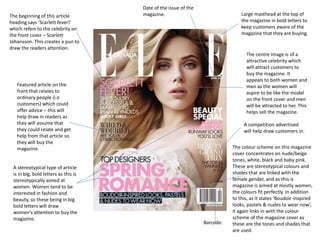
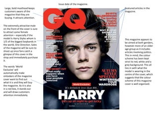
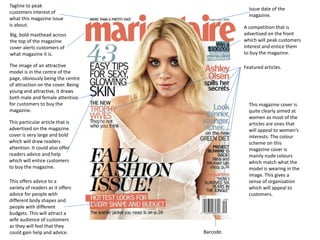
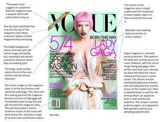
Magazine cover analysis!
By Taylor Johnston.
Large masthead at the top of
the magazine in bold letters to
keep customers aware of the
magazine that they are buying.
The centre image is of a
attractive celebrity which
will attract customers to
buy the magazine. It
appeals to both women and
men as the women will
aspire to be like the model
on the front cover and men
will be attracted to her. This
helps sell the magazine.
Date of the issue of the
magazine.The beginning of this article
heading says ‘Scarlett fever!’
which refers to the celebrity on
the front cover – Scarlett
Johansson. This creates a pun to
draw the readers attention.
Barcode.
Featured article on the
front that relates to
ordinary people (i.e
customers) which could
offer advice – this will
help draw in readers as
they will assume that
they could relate and get
help from that article so
they will buy the
magazine.
A stereotypical type of article
is in big, bold letters as this is
stereotypically aimed at
women. Women tend to be
interested in fashion and
beauty, so these being in big
bold letters will draw
women’s attention to buy the
magazine.
A competition advertised
will help draw customers in.
The colour scheme on this magazine
cover concentrates on nude/beige
tones, white, black and baby pink.
These are stereotypical colours and
shades that are linked with the
female gender, and as this is
magazine is aimed at mostly women,
the colours fit perfectly. In addition
to this, as it states ‘Boudoir-inspired
looks, pastels & nudes to wear now’,
it again links in with the colour
scheme of the magazine cover as
these are the tones and shades that
are used.
Large, bold masthead keeps
customers aware of the
magazine that they are
buying. It attracts attention.
The extremely attractive male
on the front of the cover is sure
to attract some female
attention – especially if the
model Is Harry Styles whom is
1/5 of the biggest boybands in
the world, One Direction. Sales
of the magazine will be sure to
shoot up once fans catch a
glimpse of this cover in the
shop and immediately purchase
it.
The words ‘World
Exclusive’ will
automatically make
onlookers of the magazine
cover want to find out
what it is and they will buy
the magazine. As it is also
in a red box, it stands out
and will draw customers
attention immediately.
Featured articles in the
magazine.
Issue date of the magazine.
This magazine appears to
be aimed at both genders,
however more of an older
age group as it includes
articles involving politics.
This in mind, the colour
scheme has been kept
strict to red, white and a
grey background. This all
ties in with what the
model is wearing in the
centre of the cover, which
suggests that the colour
scheme of this magazine
cover is well organised.
Tagline to peak
customers interest of
what this magazine issue
is about.
Issue date of the
magazine.
Big, bold masthead across
the top of the magazine
cover alerts customers of
what magazine it is.
The image of an attractive
model is in the centre of the
page, obviously being the centre
of attraction on the cover. Being
young and attractive, it draws
both male and female attention
for customers to buy the
magazine.
A competition that is
advertised on the front
which will peak customers
interest and entice them
to buy the magazine.
Barcode.
This particular article that is
advertised on the magazine
cover is very large and bold
which will draw readers
attention. It could also offer
readers advice and help
which will entice customers
to buy the magazine.
This offers advice to a
variety of readers as it offers
advice for people with
different body shapes and
people with different
budgets. This will attract a
wife audience of customers
as they will feel that they
could gain help and advice.
Featured articles.
This magazine cover is
quite clearly aimed at
women as most of the
articles are ones that
will appeal to women’s
interests. The colour
scheme on this
magazine cover is
mainly nude colours
which match what the
model is wearing in the
image. This gives a
sense of organisation
which will appeal to
customers.
‘The power issue’
suggests to customers
that this magazine issue
is popular which will
entice them to buy it.
The big, bold masthead that
is across the top of the
magazine cover keeps
customers aware of what
magazine they are buying.
The bright background
colour contrasts with the
centre image and stands
out, meaning it will attract
customers attention when
they are walking past.
Barcode.
The month of this
magazine issue is listed
underneath the masthead
to keep readers aware of
how recent/old this issue
is.
This large, bold number
starts of one of the main
articles and will attract
attention.
The centre image on this magazine
cover is of the very famous and
attractive Lady Gaga. This alone will
be a selling point on the magazine
because any fans of lady gaga will
immediately want to buy this and
will increase the magazine sales.
This will also create a varied
audience as fans of her music will
want to buy this, and also a range
of normal male and female readers.
Relatable and shocking
featured articles to
entice readers.
Vogue magazine is normally
aimed at women. This explains
the bold pink writing across the
cover. However, with the centre
image being lady gaga, there
will be more than just a female
fan base therefore the colour
scheme on this cover is quite
varied. The vibrant and eye
catching background contrasts
with the bold pink font and the
colour of the models hair. Then
a standard black is used for the
writing which can appeal to
both a male and female
audience. This creates a varied
audience again, as it appeals to
both genders and not just
stereotypically females.
All of these magazines are different from the next,
for reasons such as target audiences, featured
article types, centre images, magazine names etc.
However, they also have similarities such as
barcodes, large mastheads, specific colour schemes
and more. These make each and every magazine
different and unique from the next, which I guess is
the beauty of magazines themselves. Each factor
and part of the magazine cover is intended to
improve the selling point of the magazine, and is
intended to attract more customers in order for the
magazine to sell.

Magazine cover analysis!

  • 1.
  • 2.
    Large masthead atthe top of the magazine in bold letters to keep customers aware of the magazine that they are buying. The centre image is of a attractive celebrity which will attract customers to buy the magazine. It appeals to both women and men as the women will aspire to be like the model on the front cover and men will be attracted to her. This helps sell the magazine. Date of the issue of the magazine.The beginning of this article heading says ‘Scarlett fever!’ which refers to the celebrity on the front cover – Scarlett Johansson. This creates a pun to draw the readers attention. Barcode. Featured article on the front that relates to ordinary people (i.e customers) which could offer advice – this will help draw in readers as they will assume that they could relate and get help from that article so they will buy the magazine. A stereotypical type of article is in big, bold letters as this is stereotypically aimed at women. Women tend to be interested in fashion and beauty, so these being in big bold letters will draw women’s attention to buy the magazine. A competition advertised will help draw customers in. The colour scheme on this magazine cover concentrates on nude/beige tones, white, black and baby pink. These are stereotypical colours and shades that are linked with the female gender, and as this is magazine is aimed at mostly women, the colours fit perfectly. In addition to this, as it states ‘Boudoir-inspired looks, pastels & nudes to wear now’, it again links in with the colour scheme of the magazine cover as these are the tones and shades that are used.
  • 3.
    Large, bold mastheadkeeps customers aware of the magazine that they are buying. It attracts attention. The extremely attractive male on the front of the cover is sure to attract some female attention – especially if the model Is Harry Styles whom is 1/5 of the biggest boybands in the world, One Direction. Sales of the magazine will be sure to shoot up once fans catch a glimpse of this cover in the shop and immediately purchase it. The words ‘World Exclusive’ will automatically make onlookers of the magazine cover want to find out what it is and they will buy the magazine. As it is also in a red box, it stands out and will draw customers attention immediately. Featured articles in the magazine. Issue date of the magazine. This magazine appears to be aimed at both genders, however more of an older age group as it includes articles involving politics. This in mind, the colour scheme has been kept strict to red, white and a grey background. This all ties in with what the model is wearing in the centre of the cover, which suggests that the colour scheme of this magazine cover is well organised.
  • 4.
    Tagline to peak customersinterest of what this magazine issue is about. Issue date of the magazine. Big, bold masthead across the top of the magazine cover alerts customers of what magazine it is. The image of an attractive model is in the centre of the page, obviously being the centre of attraction on the cover. Being young and attractive, it draws both male and female attention for customers to buy the magazine. A competition that is advertised on the front which will peak customers interest and entice them to buy the magazine. Barcode. This particular article that is advertised on the magazine cover is very large and bold which will draw readers attention. It could also offer readers advice and help which will entice customers to buy the magazine. This offers advice to a variety of readers as it offers advice for people with different body shapes and people with different budgets. This will attract a wife audience of customers as they will feel that they could gain help and advice. Featured articles. This magazine cover is quite clearly aimed at women as most of the articles are ones that will appeal to women’s interests. The colour scheme on this magazine cover is mainly nude colours which match what the model is wearing in the image. This gives a sense of organisation which will appeal to customers.
  • 5.
    ‘The power issue’ suggeststo customers that this magazine issue is popular which will entice them to buy it. The big, bold masthead that is across the top of the magazine cover keeps customers aware of what magazine they are buying. The bright background colour contrasts with the centre image and stands out, meaning it will attract customers attention when they are walking past. Barcode. The month of this magazine issue is listed underneath the masthead to keep readers aware of how recent/old this issue is. This large, bold number starts of one of the main articles and will attract attention. The centre image on this magazine cover is of the very famous and attractive Lady Gaga. This alone will be a selling point on the magazine because any fans of lady gaga will immediately want to buy this and will increase the magazine sales. This will also create a varied audience as fans of her music will want to buy this, and also a range of normal male and female readers. Relatable and shocking featured articles to entice readers. Vogue magazine is normally aimed at women. This explains the bold pink writing across the cover. However, with the centre image being lady gaga, there will be more than just a female fan base therefore the colour scheme on this cover is quite varied. The vibrant and eye catching background contrasts with the bold pink font and the colour of the models hair. Then a standard black is used for the writing which can appeal to both a male and female audience. This creates a varied audience again, as it appeals to both genders and not just stereotypically females.
  • 6.
    All of thesemagazines are different from the next, for reasons such as target audiences, featured article types, centre images, magazine names etc. However, they also have similarities such as barcodes, large mastheads, specific colour schemes and more. These make each and every magazine different and unique from the next, which I guess is the beauty of magazines themselves. Each factor and part of the magazine cover is intended to improve the selling point of the magazine, and is intended to attract more customers in order for the magazine to sell.