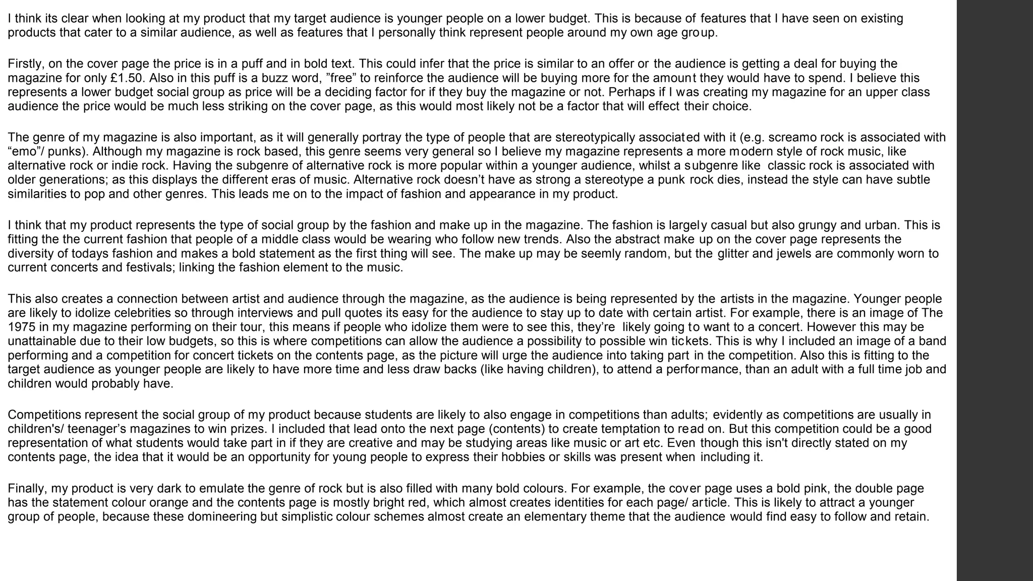
Evaluation Q1 & Q2
Ella Potton
Q1
In what ways does your media
product use, develop or challenging
forms and conventions of real media
products?
Masthead: placing at the top of the page so it
was clear that this was the name of the
magazine. The font I chose has a similar to
style to Kerrang as this smashed effect has
connotations for the recklessness associated
with rock.
Forms and conventions I
followed/ used: cover page
Main Headline: at the bottom of the page
underneath the artists face. By this being the
only text overlapping the artist and sat away
from the subheadings.
Background: on the majority of existing
magazine covers I looks at i was it was a
common contention for the images to have plain
backgrounds, which I used as I thought this would
make the text easier to read and not take away
from the face of the artist.
Mise en scene: for my cover page I wanted the
artists face to be the main focus, so I didn't’t
want props or costume to take away from the
artists face. But this left me thinking the page
would looking boring so instead using bold
makeup to give a glamorous, out-there look so
almost fit the persona of a rock star. After taking
this image I saw the photo of David Bowie and
decided I wanted the image to be in a similar
position rather than on one side. This made the
artist appear more important.
Barcode/ issue no./ date: informs audience.
Forms and conventions I developed and
challenged: cover page
• Puff & shapes: usually I see the puff on a page being a circle or a peel, but I wanted the puff to look
slightly different to other magazines so I made the edges of the circle ridged on Photoshop. This also
matches the star shape inside the Puff so this part is likely to be recognised as these are the only
unusual shapes on the page.
• Page numbers aren't usually on the cover pages of magazines however I thought that this would be
beneficial for somebody is they were looking at the magazine because of a name that was on the
page, they would be able to flick to that article to have an idea of what the article will be like, so this
could make them more likely to buy it.
• Abstract makeup was something that I didn't see a lot on the models of rock magazines, except for
dark eye makeup. I wanted to use bright pink and silver glitter with jewels to create a glam-rock style.
This would make the models face stand out even more and the colour of the make up set the whole
colour scheme for the rest of the page. This is one of my favorite parts of my product as I feel this isn't
as common in many rock magazines. I chose pink as it isn't a stereotypical colour associated with
rock, however I wanted a colour close to red with a warm tone to create a similar effect. This may end
up attracting a wider audience if the colours aren't just usual red and black.
• I think the times are coming more progressive as genres don’t seem as important anymore in terms of
music, so I think its refreshing for people to see a rock magazine that isn’t just black red and yellow,
with connotations for anger and danger. I like that my magazine has taken ideas form other genres
(colour schemes) and developed it into an almost contemporary version of a stereotypical ‘rock
magazine’.
• Rock isn't generally though of a a predominantly female genre (as much as a genre like pop) and
therefor having a female on the cover could attract more female members of my target audience,
which links back to my survey where females buying a magazines was more popular. This can make
the magazine stand out against other brands.
• I have used a close up image of the artist and still included subheadings around the artist which was
not on a lot of magazines, as close up portraits tended to be quite dramatic and fill most of the page.
This meant I didn't’t crop my image as much as I didn't want the page to look plain. I think this was
successful as there is room for the artists face as well as enough subheadings.
Forms and conventions I
followed/ used: contents
Dominant Images: using images of live
performances, which I think makes the page look
more realistic. Also I think this creates a new
concept, rather than if the page only had photos that
have been planned and are still shots.
Colour scheme: red, yellow, black and white colour
scheme to fit the theme of ‘rock’. The photographs
have mostly artificial lighting and this creates the
illusion that the colored lights are when is lighting up
the page. This is emphasised by the heavy shadows
behind the images.
Sub headings: the list of contents is in separated
into three sections. This is so the list is navigable
and is more likely to fit a younger audience as it isn't
set out as a bulk of text.
Advertisement: On the Kerrag and NME
magazines I saw that there was an ad in the corners
of the page, encouraging their audience to interact
wit the magazine on a regular basis. This is a
beneficial place for this ad, as this is a page that
everyone who buys the magazine will look at.
Arrow: the arrow in the corner of the page I wanted
to also use on my magazine because I thought this
is an interesting way to guide the reader on to read
the rest of the magazine. This is in a bold colour to
attract attention.
Forms and conventions I developed
and challenged: contents
• Having ‘contents’ as the main headline, rather than the masthead at the top of the
page like most magazines. This was because I though it was better to be very clear on
what page he audience is on so this isn't something that will have to thought about.
• Having covers/ album art and reflections of the current music, as well as photos from
live performances. I often see on real products that there is only of or two images of
live performances. I thought by having types of photographs on he page, the contents
would be better at encapsulating the magazine as a whole, on one page.
• By using more images than usual rock geared contents pages, I think this makes the
page look more enticing and corresponds to what a somebody from my target audience
would look for.
• Most contents pages I evaluated had a plain background, but I didn’t want this as a
risk because this can easily make the page look bare/ simple. Having a brighter
background brings the page to life and creates another layer so the page looks more
abstract. However, I was concerned that the images would be consumed by the
background, but this was fixed using a shadow my the image so they don’t look as
close to the background.
• The arrow idea was inspired by the NME cover page (previous slide), but instead of just
having another page that could be in the list, I used a competition with the buzz word
‘WIN!’. This will attract catch the eye of the audience as its so bold on the page and I
think a competition that leas onto the next page would be more effective than just
another article.
Forms and conventions I
followed/ used: double
page spread
Pull quote: After looking at the image on the
right from NME, I decided to use a pull quote
for the headline of this article. This was so the
audience can quickly understand the focus of the
article and gain a connection to the artist.
Colour scheme: From looking at the
double page I deconstructed, I wanted
to similarly use the costume to create
the colour scheme of entire
page. I feel that tis brings the page
together as there is orange features
all around the page but its clear that
this came from the costume as this is
the largest part that is orange.
Headline: I chose this to be at the
top of the page (following my flat
plan) as this is where the audience
will know where to look and largest
text looks like it should be onto of the
smaller text. However it is place
around the artist to indicate the
importance of the artist.
Columns: these are commonly used
because these split the text up so it
looks easier to read and makes the
page look well structured and neat.
Drop cap: this is so the audience is drawn to the
start of the article, and is orange o fit the colour
scheme of the page and stand out against the white
smaller text.
Forms and conventions I developed and
challenged: double page spread
• Having the text fit around the artist was not very typical from
the pages I saw. It was more common in genres like pop. This
was my way of developing the form by not letting certain
things be only for some genres. This makes her seem more
important as if the artist is controlling the article.
• The interview on the same page also was common to be on
the same page of the article. So I wanted by page to look
more interesting and have different sections to it. This was
because I didn’t just want the article to be an interview or an
article written by someone else.
• By having the interview a younger audience is more likely to
engage as there are the type of people who are more likely to
be fans of an artist and want to send in questions. Also the
use of questions in orange and answers in black makes the
interview very easy to follow.
• Using props like headphones are subtle in the photograph
and can look like part of the costume. Where as if I had used
a prop that was as common as an instrument or microphone
this could have taken away from the focus of the photo being
that article.
• Finally instead of one page with the photo of the artist and
one page of the article with a white background, I used the
photo as the background, because this makes the text easy
to read the text and links the image and text together.
Q2
How does your product
represent particular social
groups?
I think its clear when looking at my product that my target audience is younger people on a lower budget. This is because of features that I have seen on existing
products that cater to a similar audience, as well as features that I personally think represent people around my own age group.
Firstly, on the cover page the price is in a puff and in bold text. This could infer that the price is similar to an offer or the audience is getting a deal for buying the
magazine for only £1.50. Also in this puff is a buzz word, ”free” to reinforce the audience will be buying more for the amount they would have to spend. I believe this
represents a lower budget social group as price will be a deciding factor for if they buy the magazine or not. Perhaps if I was creating my magazine for an upper class
audience the price would be much less striking on the cover page, as this would most likely not be a factor that will effect their choice.
The genre of my magazine is also important, as it will generally portray the type of people that are stereotypically associated with it (e.g. screamo rock is associated with
“emo”/ punks). Although my magazine is rock based, this genre seems very general so I believe my magazine represents a more modern style of rock music, like
alternative rock or indie rock. Having the subgenre of alternative rock is more popular within a younger audience, whilst a subgenre like classic rock is associated with
older generations; as this displays the different eras of music. Alternative rock doesn’t have as strong a stereotype a punk rock dies, instead the style can have subtle
similarities to pop and other genres. This leads me on to the impact of fashion and appearance in my product.
I think that my product represents the type of social group by the fashion and make up in the magazine. The fashion is largely casual but also grungy and urban. This is
fitting the the current fashion that people of a middle class would be wearing who follow new trends. Also the abstract make up on the cover page represents the
diversity of todays fashion and makes a bold statement as the first thing will see. The make up may be seemly random, but the glitter and jewels are commonly worn to
current concerts and festivals; linking the fashion element to the music.
This also creates a connection between artist and audience through the magazine, as the audience is being represented by the artists in the magazine. Younger people
are likely to idolize celebrities so through interviews and pull quotes its easy for the audience to stay up to date with certain artist. For example, there is an image of The
1975 in my magazine performing on their tour, this means if people who idolize them were to see this, they’re likely going to want to a concert. However this may be
unattainable due to their low budgets, so this is where competitions can allow the audience a possibility to possible win tickets. This is why I included an image of a band
performing and a competition for concert tickets on the contents page, as the picture will urge the audience into taking part in the competition. Also this is fitting to the
target audience as younger people are likely to have more time and less draw backs (like having children), to attend a performance, than an adult with a full time job and
children would probably have.
Competitions represent the social group of my product because students are likely to also engage in competitions than adults; evidently as competitions are usually in
children's/ teenager’s magazines to win prizes. I included that lead onto the next page (contents) to create temptation to read on. But this competition could be a good
representation of what students would take part in if they are creative and may be studying areas like music or art etc. Even though this isn't directly stated on my
contents page, the idea that it would be an opportunity for young people to express their hobbies or skills was present when including it.
Finally, my product is very dark to emulate the genre of rock but is also filled with many bold colours. For example, the cover page uses a bold pink, the double page
has the statement colour orange and the contents page is mostly bright red, which almost creates identities for each page/ article. This is likely to attract a younger
group of people, because these domineering but simplistic colour schemes almost create an elementary theme that the audience would find easy to follow and retain.

Evaluation Q1 & Q2

  • 1.
    Evaluation Q1 &Q2 Ella Potton
  • 2.
    Q1 In what waysdoes your media product use, develop or challenging forms and conventions of real media products?
  • 3.
    Masthead: placing atthe top of the page so it was clear that this was the name of the magazine. The font I chose has a similar to style to Kerrang as this smashed effect has connotations for the recklessness associated with rock. Forms and conventions I followed/ used: cover page Main Headline: at the bottom of the page underneath the artists face. By this being the only text overlapping the artist and sat away from the subheadings. Background: on the majority of existing magazine covers I looks at i was it was a common contention for the images to have plain backgrounds, which I used as I thought this would make the text easier to read and not take away from the face of the artist. Mise en scene: for my cover page I wanted the artists face to be the main focus, so I didn't’t want props or costume to take away from the artists face. But this left me thinking the page would looking boring so instead using bold makeup to give a glamorous, out-there look so almost fit the persona of a rock star. After taking this image I saw the photo of David Bowie and decided I wanted the image to be in a similar position rather than on one side. This made the artist appear more important. Barcode/ issue no./ date: informs audience.
  • 4.
    Forms and conventionsI developed and challenged: cover page • Puff & shapes: usually I see the puff on a page being a circle or a peel, but I wanted the puff to look slightly different to other magazines so I made the edges of the circle ridged on Photoshop. This also matches the star shape inside the Puff so this part is likely to be recognised as these are the only unusual shapes on the page. • Page numbers aren't usually on the cover pages of magazines however I thought that this would be beneficial for somebody is they were looking at the magazine because of a name that was on the page, they would be able to flick to that article to have an idea of what the article will be like, so this could make them more likely to buy it. • Abstract makeup was something that I didn't see a lot on the models of rock magazines, except for dark eye makeup. I wanted to use bright pink and silver glitter with jewels to create a glam-rock style. This would make the models face stand out even more and the colour of the make up set the whole colour scheme for the rest of the page. This is one of my favorite parts of my product as I feel this isn't as common in many rock magazines. I chose pink as it isn't a stereotypical colour associated with rock, however I wanted a colour close to red with a warm tone to create a similar effect. This may end up attracting a wider audience if the colours aren't just usual red and black. • I think the times are coming more progressive as genres don’t seem as important anymore in terms of music, so I think its refreshing for people to see a rock magazine that isn’t just black red and yellow, with connotations for anger and danger. I like that my magazine has taken ideas form other genres (colour schemes) and developed it into an almost contemporary version of a stereotypical ‘rock magazine’. • Rock isn't generally though of a a predominantly female genre (as much as a genre like pop) and therefor having a female on the cover could attract more female members of my target audience, which links back to my survey where females buying a magazines was more popular. This can make the magazine stand out against other brands. • I have used a close up image of the artist and still included subheadings around the artist which was not on a lot of magazines, as close up portraits tended to be quite dramatic and fill most of the page. This meant I didn't’t crop my image as much as I didn't want the page to look plain. I think this was successful as there is room for the artists face as well as enough subheadings.
  • 5.
    Forms and conventionsI followed/ used: contents Dominant Images: using images of live performances, which I think makes the page look more realistic. Also I think this creates a new concept, rather than if the page only had photos that have been planned and are still shots. Colour scheme: red, yellow, black and white colour scheme to fit the theme of ‘rock’. The photographs have mostly artificial lighting and this creates the illusion that the colored lights are when is lighting up the page. This is emphasised by the heavy shadows behind the images. Sub headings: the list of contents is in separated into three sections. This is so the list is navigable and is more likely to fit a younger audience as it isn't set out as a bulk of text. Advertisement: On the Kerrag and NME magazines I saw that there was an ad in the corners of the page, encouraging their audience to interact wit the magazine on a regular basis. This is a beneficial place for this ad, as this is a page that everyone who buys the magazine will look at. Arrow: the arrow in the corner of the page I wanted to also use on my magazine because I thought this is an interesting way to guide the reader on to read the rest of the magazine. This is in a bold colour to attract attention.
  • 6.
    Forms and conventionsI developed and challenged: contents • Having ‘contents’ as the main headline, rather than the masthead at the top of the page like most magazines. This was because I though it was better to be very clear on what page he audience is on so this isn't something that will have to thought about. • Having covers/ album art and reflections of the current music, as well as photos from live performances. I often see on real products that there is only of or two images of live performances. I thought by having types of photographs on he page, the contents would be better at encapsulating the magazine as a whole, on one page. • By using more images than usual rock geared contents pages, I think this makes the page look more enticing and corresponds to what a somebody from my target audience would look for. • Most contents pages I evaluated had a plain background, but I didn’t want this as a risk because this can easily make the page look bare/ simple. Having a brighter background brings the page to life and creates another layer so the page looks more abstract. However, I was concerned that the images would be consumed by the background, but this was fixed using a shadow my the image so they don’t look as close to the background. • The arrow idea was inspired by the NME cover page (previous slide), but instead of just having another page that could be in the list, I used a competition with the buzz word ‘WIN!’. This will attract catch the eye of the audience as its so bold on the page and I think a competition that leas onto the next page would be more effective than just another article.
  • 7.
    Forms and conventionsI followed/ used: double page spread Pull quote: After looking at the image on the right from NME, I decided to use a pull quote for the headline of this article. This was so the audience can quickly understand the focus of the article and gain a connection to the artist. Colour scheme: From looking at the double page I deconstructed, I wanted to similarly use the costume to create the colour scheme of entire page. I feel that tis brings the page together as there is orange features all around the page but its clear that this came from the costume as this is the largest part that is orange. Headline: I chose this to be at the top of the page (following my flat plan) as this is where the audience will know where to look and largest text looks like it should be onto of the smaller text. However it is place around the artist to indicate the importance of the artist. Columns: these are commonly used because these split the text up so it looks easier to read and makes the page look well structured and neat. Drop cap: this is so the audience is drawn to the start of the article, and is orange o fit the colour scheme of the page and stand out against the white smaller text.
  • 8.
    Forms and conventionsI developed and challenged: double page spread • Having the text fit around the artist was not very typical from the pages I saw. It was more common in genres like pop. This was my way of developing the form by not letting certain things be only for some genres. This makes her seem more important as if the artist is controlling the article. • The interview on the same page also was common to be on the same page of the article. So I wanted by page to look more interesting and have different sections to it. This was because I didn’t just want the article to be an interview or an article written by someone else. • By having the interview a younger audience is more likely to engage as there are the type of people who are more likely to be fans of an artist and want to send in questions. Also the use of questions in orange and answers in black makes the interview very easy to follow. • Using props like headphones are subtle in the photograph and can look like part of the costume. Where as if I had used a prop that was as common as an instrument or microphone this could have taken away from the focus of the photo being that article. • Finally instead of one page with the photo of the artist and one page of the article with a white background, I used the photo as the background, because this makes the text easy to read the text and links the image and text together.
  • 9.
    Q2 How does yourproduct represent particular social groups?
  • 10.
    I think itsclear when looking at my product that my target audience is younger people on a lower budget. This is because of features that I have seen on existing products that cater to a similar audience, as well as features that I personally think represent people around my own age group. Firstly, on the cover page the price is in a puff and in bold text. This could infer that the price is similar to an offer or the audience is getting a deal for buying the magazine for only £1.50. Also in this puff is a buzz word, ”free” to reinforce the audience will be buying more for the amount they would have to spend. I believe this represents a lower budget social group as price will be a deciding factor for if they buy the magazine or not. Perhaps if I was creating my magazine for an upper class audience the price would be much less striking on the cover page, as this would most likely not be a factor that will effect their choice. The genre of my magazine is also important, as it will generally portray the type of people that are stereotypically associated with it (e.g. screamo rock is associated with “emo”/ punks). Although my magazine is rock based, this genre seems very general so I believe my magazine represents a more modern style of rock music, like alternative rock or indie rock. Having the subgenre of alternative rock is more popular within a younger audience, whilst a subgenre like classic rock is associated with older generations; as this displays the different eras of music. Alternative rock doesn’t have as strong a stereotype a punk rock dies, instead the style can have subtle similarities to pop and other genres. This leads me on to the impact of fashion and appearance in my product. I think that my product represents the type of social group by the fashion and make up in the magazine. The fashion is largely casual but also grungy and urban. This is fitting the the current fashion that people of a middle class would be wearing who follow new trends. Also the abstract make up on the cover page represents the diversity of todays fashion and makes a bold statement as the first thing will see. The make up may be seemly random, but the glitter and jewels are commonly worn to current concerts and festivals; linking the fashion element to the music. This also creates a connection between artist and audience through the magazine, as the audience is being represented by the artists in the magazine. Younger people are likely to idolize celebrities so through interviews and pull quotes its easy for the audience to stay up to date with certain artist. For example, there is an image of The 1975 in my magazine performing on their tour, this means if people who idolize them were to see this, they’re likely going to want to a concert. However this may be unattainable due to their low budgets, so this is where competitions can allow the audience a possibility to possible win tickets. This is why I included an image of a band performing and a competition for concert tickets on the contents page, as the picture will urge the audience into taking part in the competition. Also this is fitting to the target audience as younger people are likely to have more time and less draw backs (like having children), to attend a performance, than an adult with a full time job and children would probably have. Competitions represent the social group of my product because students are likely to also engage in competitions than adults; evidently as competitions are usually in children's/ teenager’s magazines to win prizes. I included that lead onto the next page (contents) to create temptation to read on. But this competition could be a good representation of what students would take part in if they are creative and may be studying areas like music or art etc. Even though this isn't directly stated on my contents page, the idea that it would be an opportunity for young people to express their hobbies or skills was present when including it. Finally, my product is very dark to emulate the genre of rock but is also filled with many bold colours. For example, the cover page uses a bold pink, the double page has the statement colour orange and the contents page is mostly bright red, which almost creates identities for each page/ article. This is likely to attract a younger group of people, because these domineering but simplistic colour schemes almost create an elementary theme that the audience would find easy to follow and retain.