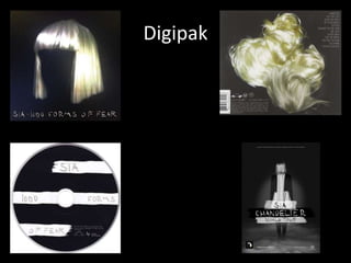
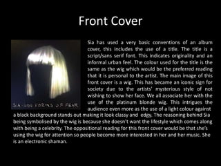
Analysing Music Promotional
Material - Sia
By Ava and Caitlin
Digipak
Front Cover
Sia has used a very basic conventions of an album
cover, this includes the use of a title. The title is a
script/sans serif font. This indicates originality and an
informal urban feel. The colour used for the title is the
same as the wig which would be the preferred reading
that it is personal to the artist. The main image of this
front cover is a wig. This has became an iconic sign for
society due to the artists’ mysterious style of not
wishing to show her face. We all associate her with the
use of the platinum blonde wig. This intrigues the
audience even more as the use of a light colour against
a black background stands out making it look classy and edgy. The reasoning behind Sia
being symbolised by the wig is because she doesn’t want the lifestyle which comes along
with being a celebrity. The oppositional reading for this front cover would be that she’s
using the wig for attention so people become more interested in her and her music. She
is an electronic shaman.
CD
The typography used on this CD is in a script (hand
written) font. The handwriting is almost juvenile like.
The preferred reading would be that it’s cool and edgy.
An indexical sign may be that the content of ‘1000
forms of fear’, the fear is reflected in the handwriting.
We associate celebrities with having fancy and
decorative handwriting. An oppositional reading may
be that Sia doesn't’t fit in with the celebrity lifestyle.
The colours used are black and white, a running house
style throughout the digipak. This may suggest that Sia.
This may suggest that Sia is simplistic and classy and doesn’t need fancy decoration to
advertise herself. The white strips, the same colour as her hair, are torn. The preferred
reading would be that this may signify that Sia is modern and rebellious. An indexical
sign may be that the white represents Sia and how she is torn inside due to her past, not
a very pretty one.
Back Cover
The track listing used on this back cover is very small,
drawing the focus to the main image; her hair. The
writing is again the same throughout, a scripts/sans
serif font. It is a continuous house style. Instead of one
image, like of the front cover, there are four. This may
signify that there are more people like Sia and that
she’s not alone. The indexical sign would be that these
are four different parts to sia and she has multiple
personalities. The wig on the front is clean and pristine.
The wigs are now messy and dirty would could suggest
that Sia goes on a journey throughout her album and this is how she starts and finishes.
The house style is consistent throughout and symbolic.
Touring Poster
The overall feel/theme of this touring poster and the
digipack as a whole is quite gloomy and mysterious,
emphasising the use of black and white and the wig.
The idea of having a torn effect has reoccured which
may have the same connotations. The image is a long
shot this time rather than a close up. This may imply
that she is opening up a bit more now due to her going
on tour. But, she is still wearing her wig suggesting that
she won’t full open up to her audience just yet. The
house style is the same as the CD so her audience can
recognise that it is her going on tour. They can relate it
back to her album as well.

Analysing Digipaks - Sia

  • 1.
    Analysing Music Promotional Material- Sia By Ava and Caitlin
  • 2.
  • 3.
    Front Cover Sia hasused a very basic conventions of an album cover, this includes the use of a title. The title is a script/sans serif font. This indicates originality and an informal urban feel. The colour used for the title is the same as the wig which would be the preferred reading that it is personal to the artist. The main image of this front cover is a wig. This has became an iconic sign for society due to the artists’ mysterious style of not wishing to show her face. We all associate her with the use of the platinum blonde wig. This intrigues the audience even more as the use of a light colour against a black background stands out making it look classy and edgy. The reasoning behind Sia being symbolised by the wig is because she doesn’t want the lifestyle which comes along with being a celebrity. The oppositional reading for this front cover would be that she’s using the wig for attention so people become more interested in her and her music. She is an electronic shaman.
  • 4.
    CD The typography usedon this CD is in a script (hand written) font. The handwriting is almost juvenile like. The preferred reading would be that it’s cool and edgy. An indexical sign may be that the content of ‘1000 forms of fear’, the fear is reflected in the handwriting. We associate celebrities with having fancy and decorative handwriting. An oppositional reading may be that Sia doesn't’t fit in with the celebrity lifestyle. The colours used are black and white, a running house style throughout the digipak. This may suggest that Sia. This may suggest that Sia is simplistic and classy and doesn’t need fancy decoration to advertise herself. The white strips, the same colour as her hair, are torn. The preferred reading would be that this may signify that Sia is modern and rebellious. An indexical sign may be that the white represents Sia and how she is torn inside due to her past, not a very pretty one.
  • 5.
    Back Cover The tracklisting used on this back cover is very small, drawing the focus to the main image; her hair. The writing is again the same throughout, a scripts/sans serif font. It is a continuous house style. Instead of one image, like of the front cover, there are four. This may signify that there are more people like Sia and that she’s not alone. The indexical sign would be that these are four different parts to sia and she has multiple personalities. The wig on the front is clean and pristine. The wigs are now messy and dirty would could suggest that Sia goes on a journey throughout her album and this is how she starts and finishes. The house style is consistent throughout and symbolic.
  • 6.
    Touring Poster The overallfeel/theme of this touring poster and the digipack as a whole is quite gloomy and mysterious, emphasising the use of black and white and the wig. The idea of having a torn effect has reoccured which may have the same connotations. The image is a long shot this time rather than a close up. This may imply that she is opening up a bit more now due to her going on tour. But, she is still wearing her wig suggesting that she won’t full open up to her audience just yet. The house style is the same as the CD so her audience can recognise that it is her going on tour. They can relate it back to her album as well.