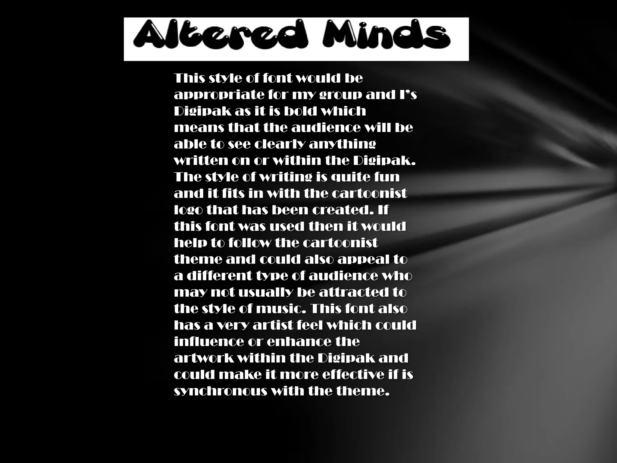
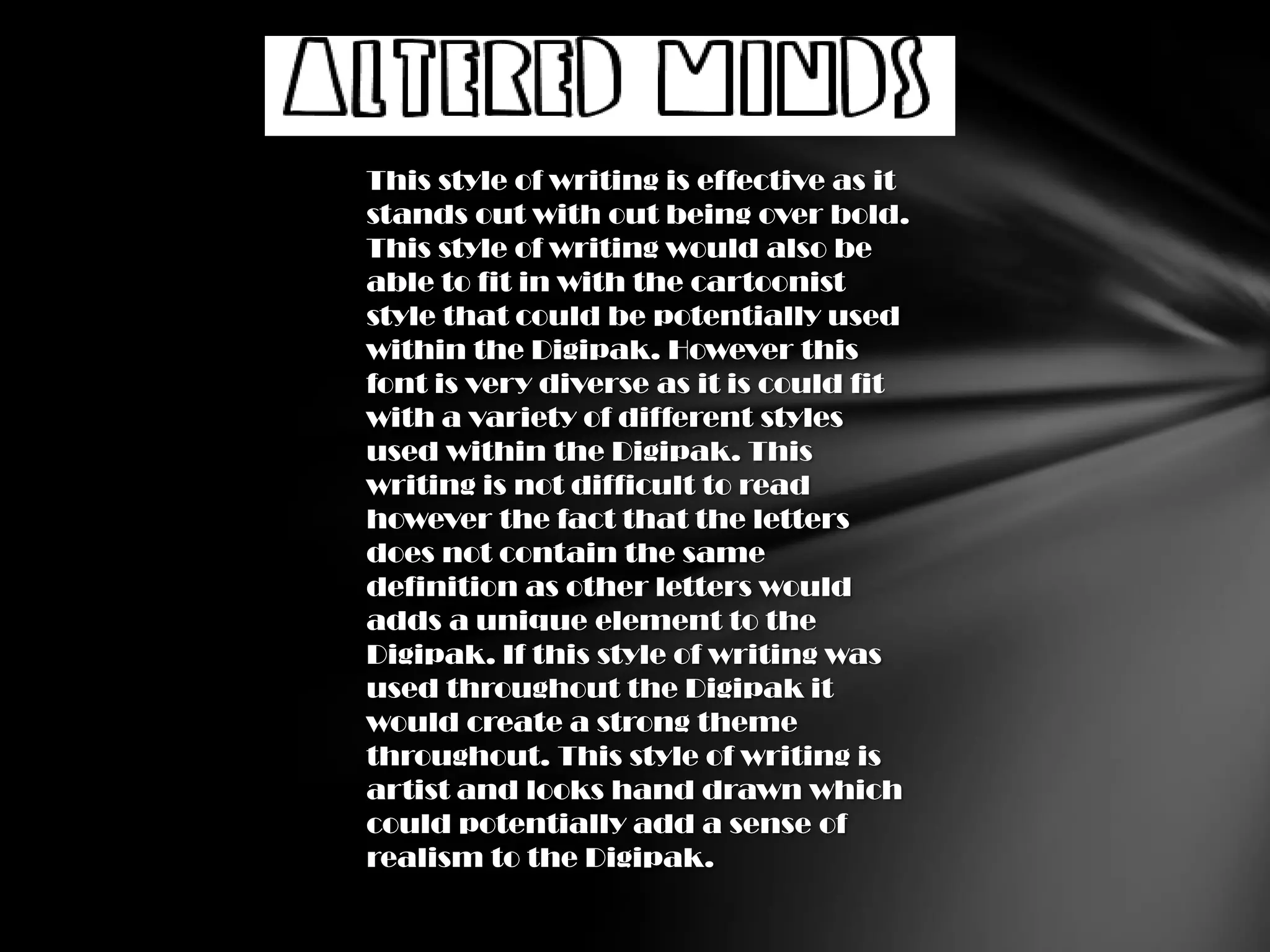
Font Ideas.
       When choosing a font for an album cover
       many aspects have to be considered such
       as the genre of the album, the album
       artwork, how clear the font needs to be
       for the audience and how it is or is not
       going to stand out to the audience
       depending on the style of the album.

       The font has to be clear and be seen, this
       is essential so that audiences can
       immediately recognise who the artist is
       and what the album is called, this alone
       could attract an audience into buying
       the album.

       I think it is vital that the font is able to fit
       in with the genre of music, the style of the
       album, the artists and be able to reach
       out/appeal to its target audience.

       For my group and I’s Digipak the font will
       have to stand out and be clear to the
       audience as the audience may recognise
       the artist by the name and not the image
       on the Digipak. Also our genre is Hip Hop
       so essential it should follow a similar style
       or incorporate the genre into the font as
       this will help audiences immediately
       recognise the genre.
This style of font would be
appropriate for my group and I’s
Digipak as it is bold which
means that the audience will be
able to see clearly anything
written on or within the Digipak.
The style of writing is quite fun
and it fits in with the cartoonist
logo that has been created. If
this font was used then it would
help to follow the cartoonist
theme and could also appeal to
a different type of audience who
may not usually be attracted to
the style of music. This font also
has a very artist feel which could
influence or enhance the
artwork within the Digipak and
could make it more effective if is
synchronous with the theme.
This style of writing is effective as it
stands out with out being over bold.
This style of writing would also be
able to fit in with the cartoonist
style that could be potentially used
within the Digipak. However this
font is very diverse as it is could fit
with a variety of different styles
used within the Digipak. This
writing is not difficult to read
however the fact that the letters
does not contain the same
definition as other letters would
adds a unique element to the
Digipak. If this style of writing was
used throughout the Digipak it
would create a strong theme
throughout. This style of writing is
artist and looks hand drawn which
could potentially add a sense of
realism to the Digipak.
This cartoonist style of writing is
effective as not only is it letters but
the lines around each add an
element of action with the font. This
is not usually created with the font
however the fact that this style of
writing is able to do this would add
an element of motion to the Digipak
and the writing would not be so
simple as styles of writing that are
commonly used. I like that this font
is rough and looks hand crafted
rather than designed as this could
show an artistic characteristic
about the artist himself as though
he drew the writing himself. This
style of writing is not conventional to
the genre so may not appeal to the
target audiences so this may not be
the most appropriate style of
writing to be used for the genre of
Digipak my group and I are
creating.
This graffiti style of writing is the
best suited to my group and I’s
Digipak as it the style of writing is
commonly associated with the
genre of hip hop which means that
it will automatically reach out to
that target audience. Even though
the writing is graffiti styled it is
legible and clear so it follows a
theme and is still able to be read by
all audiences. This style of writing
is also very well suited to out
Digipak because the DVD of the
music video features scenes where
graffiti is heavy in the background
which means there will be an
automatic link between the music
video, the Digipak and the genre of
music, this theme is very
conventional but most importantly
it will be recognised by the target
audience.

Font ideas

  • 1.
    Font Ideas. When choosing a font for an album cover many aspects have to be considered such as the genre of the album, the album artwork, how clear the font needs to be for the audience and how it is or is not going to stand out to the audience depending on the style of the album. The font has to be clear and be seen, this is essential so that audiences can immediately recognise who the artist is and what the album is called, this alone could attract an audience into buying the album. I think it is vital that the font is able to fit in with the genre of music, the style of the album, the artists and be able to reach out/appeal to its target audience. For my group and I’s Digipak the font will have to stand out and be clear to the audience as the audience may recognise the artist by the name and not the image on the Digipak. Also our genre is Hip Hop so essential it should follow a similar style or incorporate the genre into the font as this will help audiences immediately recognise the genre.
  • 2.
    This style offont would be appropriate for my group and I’s Digipak as it is bold which means that the audience will be able to see clearly anything written on or within the Digipak. The style of writing is quite fun and it fits in with the cartoonist logo that has been created. If this font was used then it would help to follow the cartoonist theme and could also appeal to a different type of audience who may not usually be attracted to the style of music. This font also has a very artist feel which could influence or enhance the artwork within the Digipak and could make it more effective if is synchronous with the theme.
  • 3.
    This style ofwriting is effective as it stands out with out being over bold. This style of writing would also be able to fit in with the cartoonist style that could be potentially used within the Digipak. However this font is very diverse as it is could fit with a variety of different styles used within the Digipak. This writing is not difficult to read however the fact that the letters does not contain the same definition as other letters would adds a unique element to the Digipak. If this style of writing was used throughout the Digipak it would create a strong theme throughout. This style of writing is artist and looks hand drawn which could potentially add a sense of realism to the Digipak.
  • 4.
    This cartoonist styleof writing is effective as not only is it letters but the lines around each add an element of action with the font. This is not usually created with the font however the fact that this style of writing is able to do this would add an element of motion to the Digipak and the writing would not be so simple as styles of writing that are commonly used. I like that this font is rough and looks hand crafted rather than designed as this could show an artistic characteristic about the artist himself as though he drew the writing himself. This style of writing is not conventional to the genre so may not appeal to the target audiences so this may not be the most appropriate style of writing to be used for the genre of Digipak my group and I are creating.
  • 5.
    This graffiti styleof writing is the best suited to my group and I’s Digipak as it the style of writing is commonly associated with the genre of hip hop which means that it will automatically reach out to that target audience. Even though the writing is graffiti styled it is legible and clear so it follows a theme and is still able to be read by all audiences. This style of writing is also very well suited to out Digipak because the DVD of the music video features scenes where graffiti is heavy in the background which means there will be an automatic link between the music video, the Digipak and the genre of music, this theme is very conventional but most importantly it will be recognised by the target audience.