This document analyzes the results of Ella Potton's second audience survey about preferences for music videos, album artwork, and advertising. Some key findings include:
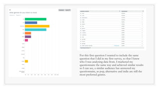
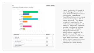
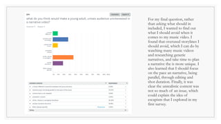
1) Pop, alternative, and indie remain the most preferred genres of music. Respondents preferred a retrospective visual style and specific lighting/color schemes for music videos.
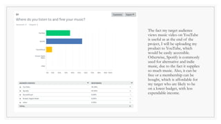
2) YouTube and Spotify are the primary platforms for viewing music videos and listening to alternative/indie music.
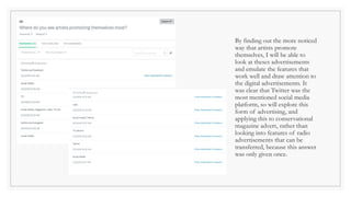
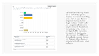
3) NME magazine was seen as more relevant than Rolling Stone for advertising due to targeting a younger audience.
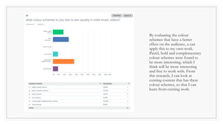
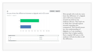
4) Pastel, bold, and complementary color schemes were found to be more interesting for album artwork and advertisements.