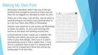
The document discusses font design for an indie pop album cover. It explains that the title font needs to stand out and match the genre. A messy, unfinished style is considered to convey a relaxed feel. Both asymmetry and geometric shapes are mentioned as design elements. Several preexisting fonts are evaluated but deemed unsuitable. The document concludes that creating a custom font by hand drawing letters or modifying an existing outline in Photoshop would best achieve the desired style.