LOGO EXPERIMENTATION


                       Media Studies
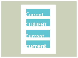
LOGO COMPOSITION


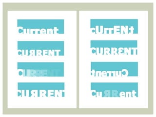
   All of the logos contain the name
   of the music magazine, in a font
    that is appropriate to the target
    audience. In some of the logos
      that I have seen some of the
     letters were backwards, which
     makes it more interesting and
      making more of a corporate
       identity, instead of a name.
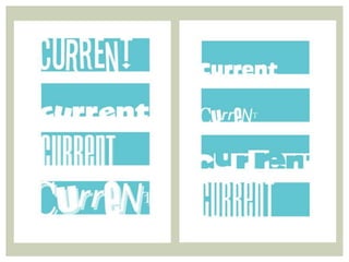
OPACIT Y

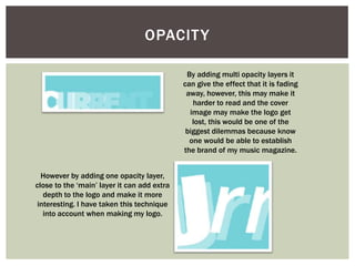
                                              By adding multi opacity layers it
                                             can give the effect that it is fading
                                              away, however, this may make it
                                                harder to read and the cover
                                               image may make the logo get
                                                lost, this would be one of the
                                              biggest dilemmas because know
                                               one would be able to establish
                                             the brand of my music magazine.


  However by adding one opacity layer,
close to the ‘main’ layer it can add extra
   depth to the logo and make it more
 interesting. I have taken this technique
   into account when making my logo.
SIZE


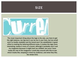
 The most important thing about the logo is the size, you have to get
the right balance, too big and it can be too in your face, but too small
and it is hardly readable and the brand won’t be established. A good
 effect is making the lettering different sizes, it makes the logo more
interesting, makes it more of a brand, although it probably won’t suit
   my magazine because it might look too childish, but once I have
  made the rest of the magazine I could play around with this to see
 what it looks like, keeping in mind my audience, and what they like,
                             the whole time.
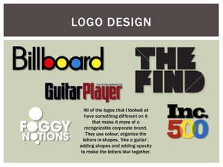
LOGO DESIGN


  All of the logos that I looked at
   have something different on it
       that make it more of a
   recognizable corporate brand.
    They use colour, organize the
  letters in shapes, ‘like a guitar’,
 adding shapes and adding opacity
 to make the letters blur together.
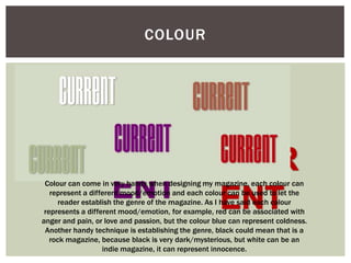
COLOUR


 Colour can come in very handy when designing my magazine, each colour can
   represent a different mood/emotion and each colour can be used to let the
      reader establish the genre of the magazine. As I have said each colour
 represents a different mood/emotion, for example, red can be associated with
anger and pain, or love and passion, but the colour blue can represent coldness.
 Another handy technique is establishing the genre, black could mean that is a
   rock magazine, because black is very dark/mysterious, but white can be an
                   indie magazine, it can represent innocence.
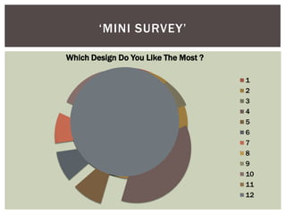
‘MINI SURVEY’

Which Design Do You Like The Most ?

                                      1
                                      2
                                      3
                                      4
                                      5
                                      6
                                      7
                                      8
                                      9
                                      10
                                      11
                                      12
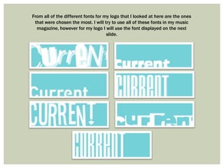
From all of the different fonts for my logo that I looked at here are the ones
 that were chosen the most. I will try to use all of these fonts in my music
  magazine, however for my logo I will use the font displayed on the next
                                     slide.
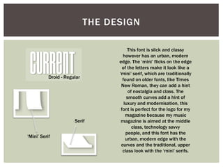
THE DESIGN

                                        This font is slick and classy
                                     however has an urban, modern
                                   edge. The ‘mini’ flicks on the edge
                                     of the letters make it look like a
                                   ‘mini’ serif, which are traditionally
           Droid - Regular           found on older fonts, like Times
                                    New Roman, they can add a hint
                                         of nostalgia and class. The
                                        smooth curves add a hint of
                                      luxury and modernisation, this
                                    font is perfect for the logo for my
                                       magazine because my music
                       Serif        magazine is aimed at the middle
                                           class, technology savvy
                                       people, and this font has the
‘Mini’ Serif
                                       urban, modern edge with the
                                    curves and the traditional, upper
                                     class look with the ‘mini’ serifs.
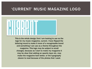
‘CURRENT’ MUSIC MAGAZINE LOGO


 This is the whole design/font I am looking to use as the
 logo for my music magazine, current. I have flipped the
 lettering round to make it more of a recognisable brand
   and something I can use as a theme throughout the
        magazine. This logo may be subject to small
   changes, because as I start to make my magazine it
    may be clear that adding an opacity layer etc. may
    make the magazine look better, or the typography
     clearer to read because of the photos that I used.

Logo Experimentation

  • 1.
    LOGO EXPERIMENTATION Media Studies
  • 2.
    LOGO COMPOSITION All of the logos contain the name of the music magazine, in a font that is appropriate to the target audience. In some of the logos that I have seen some of the letters were backwards, which makes it more interesting and making more of a corporate identity, instead of a name.
  • 4.
    OPACIT Y By adding multi opacity layers it can give the effect that it is fading away, however, this may make it harder to read and the cover image may make the logo get lost, this would be one of the biggest dilemmas because know one would be able to establish the brand of my music magazine. However by adding one opacity layer, close to the ‘main’ layer it can add extra depth to the logo and make it more interesting. I have taken this technique into account when making my logo.
  • 5.
    SIZE The mostimportant thing about the logo is the size, you have to get the right balance, too big and it can be too in your face, but too small and it is hardly readable and the brand won’t be established. A good effect is making the lettering different sizes, it makes the logo more interesting, makes it more of a brand, although it probably won’t suit my magazine because it might look too childish, but once I have made the rest of the magazine I could play around with this to see what it looks like, keeping in mind my audience, and what they like, the whole time.
  • 6.
    LOGO DESIGN All of the logos that I looked at have something different on it that make it more of a recognizable corporate brand. They use colour, organize the letters in shapes, ‘like a guitar’, adding shapes and adding opacity to make the letters blur together.
  • 9.
    COLOUR Colour cancome in very handy when designing my magazine, each colour can represent a different mood/emotion and each colour can be used to let the reader establish the genre of the magazine. As I have said each colour represents a different mood/emotion, for example, red can be associated with anger and pain, or love and passion, but the colour blue can represent coldness. Another handy technique is establishing the genre, black could mean that is a rock magazine, because black is very dark/mysterious, but white can be an indie magazine, it can represent innocence.
  • 10.
    ‘MINI SURVEY’ Which DesignDo You Like The Most ? 1 2 3 4 5 6 7 8 9 10 11 12
  • 11.
    From all ofthe different fonts for my logo that I looked at here are the ones that were chosen the most. I will try to use all of these fonts in my music magazine, however for my logo I will use the font displayed on the next slide.
  • 12.
    THE DESIGN This font is slick and classy however has an urban, modern edge. The ‘mini’ flicks on the edge of the letters make it look like a ‘mini’ serif, which are traditionally Droid - Regular found on older fonts, like Times New Roman, they can add a hint of nostalgia and class. The smooth curves add a hint of luxury and modernisation, this font is perfect for the logo for my magazine because my music Serif magazine is aimed at the middle class, technology savvy people, and this font has the ‘Mini’ Serif urban, modern edge with the curves and the traditional, upper class look with the ‘mini’ serifs.
  • 13.
    ‘CURRENT’ MUSIC MAGAZINELOGO This is the whole design/font I am looking to use as the logo for my music magazine, current. I have flipped the lettering round to make it more of a recognisable brand and something I can use as a theme throughout the magazine. This logo may be subject to small changes, because as I start to make my magazine it may be clear that adding an opacity layer etc. may make the magazine look better, or the typography clearer to read because of the photos that I used.