IAC 2024 - IA Fast Track to Search Focused AI Solutions
1st draft feedback
1. Feedback on my first draft of the
front cover!
I used this website www.usabilityhub.com to let
people give me feedback on the first draft of my
front cover.
The website gives you five seconds to look at the
picture, and then they can answer the five questions
I uploaded afterwards.
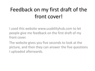
2. This was the photo
they were given to
look at for the five
seconds
3. What was the title of the magazine?
•
•
•
•
•
•
•
•
•
•
•
•
•
Unplugged
No Idea
Folk Music Magazine
Unplugged
Unplugged
Unplugged
Unplugged
Don’t know
Unplugged
Ohh… ummmm
Indie Folk
Unplugged
Unplugged? I can’t remember
4. Do you think it was eye-catching?
•
•
•
•
•
•
•
•
•
•
•
•
•
Yes, especially with how the girl is looking straight at you.
Yes
No
The photo was good
Yes
Needed to be more obvious I think
Yes, I would defiantly pick it up in a shop
Not really
Nice picture but font looks a bit “word art”
No
Yes
No
It looked pretty amateur, mostly due to the font.
5. Did the colour scheme suit the genre?
•
•
•
•
•
•
•
•
•
•
•
•
•
•
•
•
No
I think so. I’m not really sure what the colour scheme for indie folk is
Totally!
To an Extent
Yes
Yes
Sort of
Yes, the picture on the front was quite indie which really suited the whole theme and the colours
were really quirky.
All I saw was ‘whisper or scream’
Perhaps have a more acoustic oaky feel, brown/wood textured text
I don’t know
I guess
Yes
Sort of
I don’t know what colour Indie Folk is suppose tp be, but the colors and cover photo looked like an
environmental magazine
Choose more professional fonts, don’t use glow esp. Colored glows around text. Choose a photo
that relates to listening to music
6. How could I improve it?
•
•
•
•
•
•
•
•
•
•
•
•
•
The font
The title font should be change. It’s not really ‘Folk-y’
Change the font
At first glance, it’s hard to see the name of the artist on the front cover. Maybe
make the name stand out more?
Maybe not have so much info in the headlines, leave the person looking wanting
to find out more
Make the writing more eyecatching/ brighter colours
I would need to see it for more time
Bigger title, less wordy
Image is good, fonts look far to rounded and modern. Go for some folky browns
with sharper edged, not rounded.
Brighter
Model could look a LOT happier. Text on either side. Text different colours. Less
writing
I missed the title, so maybe change the font/ style of that.
Title bigger maybe? Less text, more eye catching.
7. Any other comments?
• No
• Nope
• I love the colour scheme, and think that the main cover image stands our
very well. I also like the chose of fonts
• Maybe have the magazine title in capsitals going all the way across the
page so it stands out more?
• Good picture
• It’s really good! I would defiantly buy it
• No
• Looks 10 times better than most other peoples
• No
• Main strap line shouldn’t overlap the photo
• Don’t use lined fonts because it can look quite childish.
• The light blue doesn’t suit indie