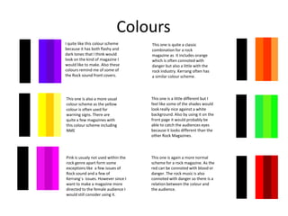
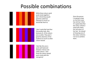
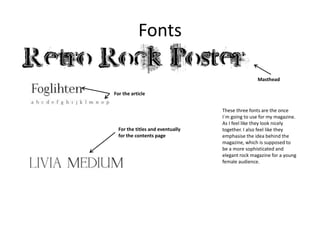
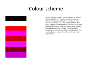
Style sheet
Birte G. Barsch
Colours
I quite like this colour scheme
because it has both flashy and
dark tones that I think would
look on the kind of magazine I
would like to make. Also these
colours remind me of some of
the Rock sound front covers.

This one is quite a classic
combination for a rock
magazine as it includes orange
which is often connoted with
danger but also a little with the
rock industry. Kerrang often has
a similar colour scheme.

This one is also a more usual
colour scheme as the yellow
colour is often used for
warning signs. There are
quite a few magazines with
this colour scheme including
NME

This one is a little different but I
feel like some of the shades would
look really nice against a white
background. Also by using it on the
front page it would probably be
able to catch the audiences eyes
because it looks different than the
other Rock Magazines.

Pink is usualy not used within the
rock genre apart form some
exceptions like a few issues of
Rock sound and a few of
Kerrang`s issues. However since I
want to make a magazine more
directed to the female audience I
would still consider using it.

This one is again a more normal
scheme for a rock magazine. As the
red can be connoted with blood or
danger. The rock music is also
connoted with danger so there is a
relation between the colour and
the audience.
Possible combinations
While these colours work
quite nicely together I
don`t think they would
grab the audiences
attention as much as I
would like them to.

I don`t quite like how blue
the purples look. Also
because all of the colours
are so settle. They won`t
grab the attention of the
audience as much as other
colours would.

I feel like this one is
quite well balanced
between intense and
settle colours. I also
think the colours would
work nicely with the
rock genre/

Since the person
I`m going to have
on my front cover
has red hair I think
it’s a good idea that
the colour scheme I
chose will match
the red colour of
her hair. So instead
of choosing one of
the colour schemes
I to try to combine
them.
Fonts
Masthead
For the article

For the titles and eventually
for the contents page

These three fonts are the once
I`m going to use for my magazine.
As I feel like they look nicely
together. I also feel like they
emphasise the idea behind the
magazine, which is supposed to
be a more sophisticated and
elegant rock magazine for a young
female audience.
Colour scheme
This the one I think is going to work the most on the front
cover. I also think they are going to grab the audiences
attention the quickest as they are a mix of usual and
unusual colours to use on a rock magazine. I think these
colour are going to compliment the hair colour of my front
cover model the most. Since this colour scheme includes
quite a girly colour, pink, I think it`s good that it also
includes some darker shades like the wine/blood red. This
creates a balance between the girly and the more rock
inspired style.

Stylesheet2

  • 1.
  • 2.
    Colours I quite likethis colour scheme because it has both flashy and dark tones that I think would look on the kind of magazine I would like to make. Also these colours remind me of some of the Rock sound front covers. This one is quite a classic combination for a rock magazine as it includes orange which is often connoted with danger but also a little with the rock industry. Kerrang often has a similar colour scheme. This one is also a more usual colour scheme as the yellow colour is often used for warning signs. There are quite a few magazines with this colour scheme including NME This one is a little different but I feel like some of the shades would look really nice against a white background. Also by using it on the front page it would probably be able to catch the audiences eyes because it looks different than the other Rock Magazines. Pink is usualy not used within the rock genre apart form some exceptions like a few issues of Rock sound and a few of Kerrang`s issues. However since I want to make a magazine more directed to the female audience I would still consider using it. This one is again a more normal scheme for a rock magazine. As the red can be connoted with blood or danger. The rock music is also connoted with danger so there is a relation between the colour and the audience.
  • 3.
    Possible combinations While thesecolours work quite nicely together I don`t think they would grab the audiences attention as much as I would like them to. I don`t quite like how blue the purples look. Also because all of the colours are so settle. They won`t grab the attention of the audience as much as other colours would. I feel like this one is quite well balanced between intense and settle colours. I also think the colours would work nicely with the rock genre/ Since the person I`m going to have on my front cover has red hair I think it’s a good idea that the colour scheme I chose will match the red colour of her hair. So instead of choosing one of the colour schemes I to try to combine them.
  • 4.
    Fonts Masthead For the article Forthe titles and eventually for the contents page These three fonts are the once I`m going to use for my magazine. As I feel like they look nicely together. I also feel like they emphasise the idea behind the magazine, which is supposed to be a more sophisticated and elegant rock magazine for a young female audience.
  • 5.
    Colour scheme This theone I think is going to work the most on the front cover. I also think they are going to grab the audiences attention the quickest as they are a mix of usual and unusual colours to use on a rock magazine. I think these colour are going to compliment the hair colour of my front cover model the most. Since this colour scheme includes quite a girly colour, pink, I think it`s good that it also includes some darker shades like the wine/blood red. This creates a balance between the girly and the more rock inspired style.