
Recommended
More Related Content
What's hot
What's hot (19)
Viewers also liked
Viewers also liked (20)
More from charlie_99Xx
More from charlie_99Xx (20)
Recently uploaded
Recently uploaded (20)
Masthead and analysis
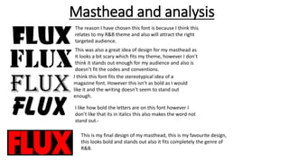
- 1. Masthead and analysis The reason I have chosen this font is because I think this relates to my R&B theme and also will attract the right targeted audience. This was also a great idea of design for my masthead as it looks a bit scary which fits my theme, however I don’t think it stands out enough for my audience and also is doesn’t fit the codes and conventions. I think this font fits the stereotypical idea of a magazine font. However this isn’t as bold as I would like it and the writing doesn’t seem to stand out enough. I like how bold the letters are on this font however I don’t like that its in italics this also makes the word not stand out.- This is my final design of my masthead, this is my favourite design, this looks bold and stands out also it fits completely the genre of R&B.