
Recommended
More Related Content
What's hot
What's hot (20)
Viewers also liked
Viewers also liked (16)
Similar to Font design & analysis
Similar to Font design & analysis (20)
Recently uploaded
Recently uploaded (20)
Font design & analysis
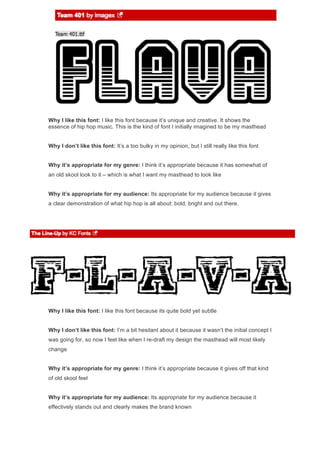
- 1. Why I like this font: I like this font because it’s unique and creative. It shows the essence of hip hop music. This is the kind of font I initially imagined to be my masthead Why I don’t like this font: It’s a too bulky in my opinion, but I still really like this font Why it’s appropriate for my genre: I think it’s appropriate because it has somewhat of an old skool look to it – which is what I want my masthead to look like Why it’s appropriate for my audience: Its appropriate for my audience because it gives a clear demonstration of what hip hop is all about: bold, bright and out there. Why I like this font: I like this font because its quite bold yet subtle Why I don’t like this font: I’m a bit hesitant about it because it wasn’t the initial concept I was going for, so now I feel like when I re-draft my design the masthead will most likely change Why it’s appropriate for my genre: I think it’s appropriate because it gives off that kind of old skool feel Why it’s appropriate for my audience: Its appropriate for my audience because it effectively stands out and clearly makes the brand known
- 2. Why I like this font: I like this font because it seems fun therefore appears exciting and free Why I don’t like this font: I don’t like this font because it’s not in capital letters - which is what my original design included Why it’s appropriate for my genre: I think it’s appropriate because bubble writing s commonly used in hip hop magazines Why it’s appropriate for my audience: Its appropriate for my audience because it doesn’t specify to a specific gender or age: it appeals to everyone Why I like this font: I like this font because it seems quite edgy yet as a sense of elegance as it is italic Why I don’t like this font: I don’t like this font because I don’t feel like it’s bold enough, as I imagined something more in your face Why it’s appropriate for my genre: I think it’s appropriate because it’s different and I’ve seen in other hip hop magazines that similar fonts have been used Why it’s appropriate for my audience: It’s appropriate for my audience because its easy to comprehend as the font is easy to read
- 3. Why I like this font: I like this font because its very simple yet is so unique Why I don’t like this font: I don’t like this font because for me it doesn’t stand out as much as I had hoped Why it’s appropriate for my genre: I think it’s appropriate because it effectively creates the look I was going for – as its simplistic creates such elegance yet it still displays a classical hip hop look Why it’s appropriate for my audience: Its appropriate for my audience because it is readable as well as appears interesting Why I like this font: I like this font because I think it’s very unique and is something different Why I don’t like this font: I don’t like this font because I feel like the extra detail in the background may clash with the rest of the background features
- 4. Why it’s appropriate for my genre: I think it’s appropriate because it represents hip hop well and during my research I found that this font is often used Why it’s appropriate for my audience: Its appropriate for my audience because