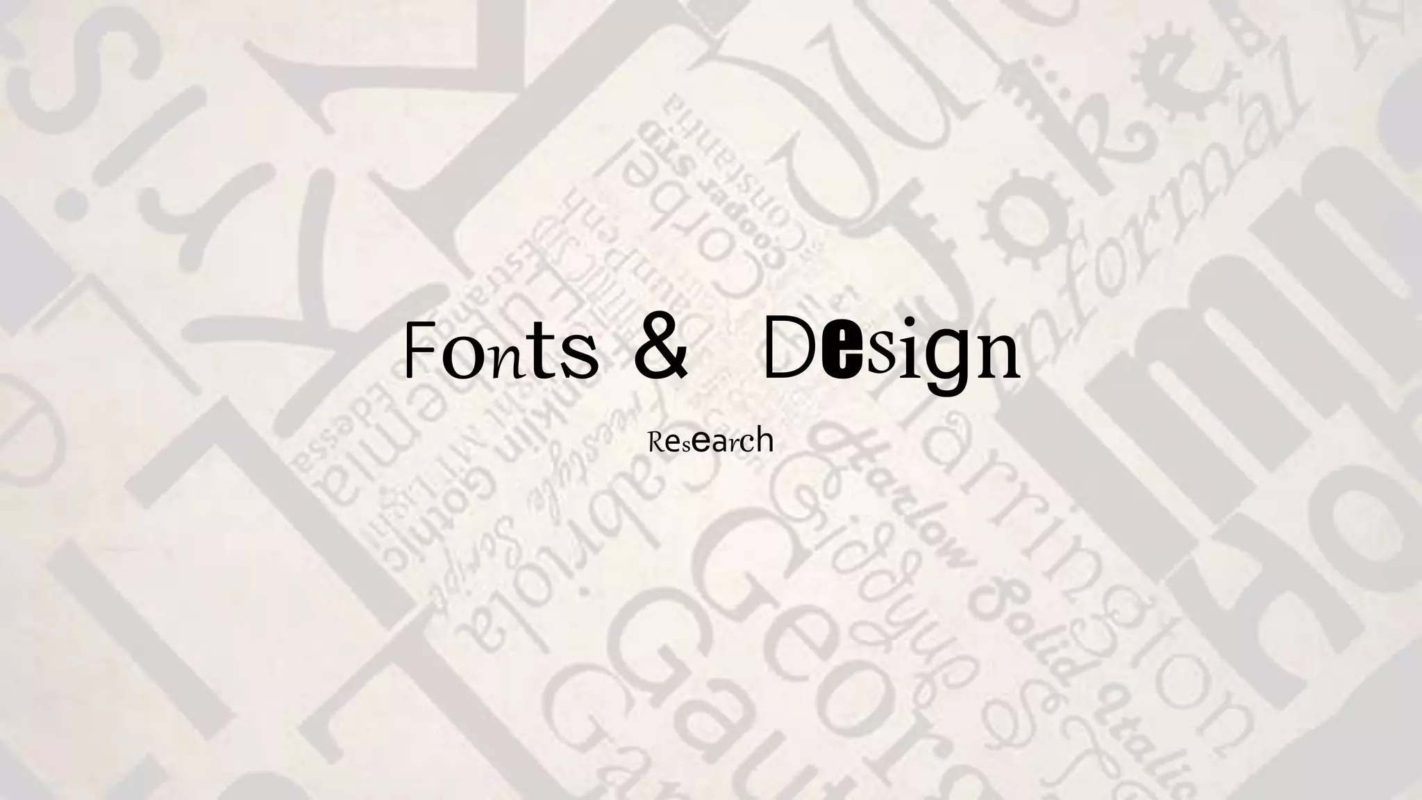
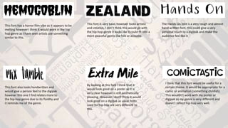
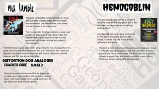
Fonts & Design
Research
This font has a horror film vibe as it appears to be
melting however I think it would work in the hip
hop genre as I have seen artists use something
similar to this.
This font is very basic however looks artistic
and creative, I don’t think this would go with
the hip-hop genre it looks like it could fit into a
more peaceful genre like folk or acoustic.
The Hands On font is a very rough and almost
hand written font, this could give a very
personal touch to a digipak and make the
audience feel like it.
This font also looks handwritten and
would give a person feel to the digipak
however this one I find relates more to
the hip-hop genre due to its fluidity and
it reminds me of the genre.
I think that this font would be useful for a
certain theme. It would be appropriate for a
comic or animation (something childish).
This wouldn’t work with my poster or
digipak as my genre is very different and
doesn’t reflect hip-hop very well.
By looking at this font I think that it
would look good on a poster as it is
very clear however is still aesthetically
pleasing. However I don’t think it would
look good on a digipak as usual fonts
used for hip-hop are very different to
this.
The ‘mix tumble’ font from DaFont is what I will
use for my digipak as it has a very rough and
original look. It also represents the hip-hop
genre well as it looks creative and makes it
more personal.
The NWA album cover used a font very similar to this showing that it’s a
good choice for my album however this is an old album and I want my
digipak to be more modern therefore will look at other fonts as well
however use this one as my main idea.
These fonts could also be used for my digipak as
my ideas are a very modern and electrical looking
cover. I will make rough covers using both fonts to
see which one best suits the genre.
This font would work well on a poster, it
not only suits the hip-hop genre but is also
very eye catching down to its melting
looking effect.
Joey Bada$$ has used a very similar font
to this and it looks very good on the
poster, it stands out and makes it look
relevant to the genre.
This font is from DaFont and I have chosen it because I found
it reflected the hip-hop genre well and I had seen previous
posters that had a similar style. The font suits my artist as it
shows the genre they are linked to and the music reflects
them as a person making the font relevant.
This font reflects the artist and helps to show
the audience that the songs are meaningful
and emotional, the handwritten style shows
this as it makes it more personal.

Fonts and design

  • 1.
  • 2.
    This font hasa horror film vibe as it appears to be melting however I think it would work in the hip hop genre as I have seen artists use something similar to this. This font is very basic however looks artistic and creative, I don’t think this would go with the hip-hop genre it looks like it could fit into a more peaceful genre like folk or acoustic. The Hands On font is a very rough and almost hand written font, this could give a very personal touch to a digipak and make the audience feel like it. This font also looks handwritten and would give a person feel to the digipak however this one I find relates more to the hip-hop genre due to its fluidity and it reminds me of the genre. I think that this font would be useful for a certain theme. It would be appropriate for a comic or animation (something childish). This wouldn’t work with my poster or digipak as my genre is very different and doesn’t reflect hip-hop very well. By looking at this font I think that it would look good on a poster as it is very clear however is still aesthetically pleasing. However I don’t think it would look good on a digipak as usual fonts used for hip-hop are very different to this.
  • 3.
    The ‘mix tumble’font from DaFont is what I will use for my digipak as it has a very rough and original look. It also represents the hip-hop genre well as it looks creative and makes it more personal. The NWA album cover used a font very similar to this showing that it’s a good choice for my album however this is an old album and I want my digipak to be more modern therefore will look at other fonts as well however use this one as my main idea. These fonts could also be used for my digipak as my ideas are a very modern and electrical looking cover. I will make rough covers using both fonts to see which one best suits the genre. This font would work well on a poster, it not only suits the hip-hop genre but is also very eye catching down to its melting looking effect. Joey Bada$$ has used a very similar font to this and it looks very good on the poster, it stands out and makes it look relevant to the genre. This font is from DaFont and I have chosen it because I found it reflected the hip-hop genre well and I had seen previous posters that had a similar style. The font suits my artist as it shows the genre they are linked to and the music reflects them as a person making the font relevant. This font reflects the artist and helps to show the audience that the songs are meaningful and emotional, the handwritten style shows this as it makes it more personal.