COLOUR
The natural, the religious and cultural, the
political to the purely emotional.
In order to design a successful collection,
colour must be strongly considered.
It is fundamental to feel the collection
through its colour(s).
COLOURTHEORY
It is important to understand the basic relationships of colour that can create maximum
results, particularly when it comes to selecting fabrics and placing prints
PRIMARY COLOURS
These are colours that
cannot be created by
combining other
hues.
SECONDARY COLOURS
These are created
from 2 combination
of primary colours.
TERTIARY COLOURS
These are formed by
mixing a primary and
secondary colour
COMPLEMENTARY COLOURS
Two colours that are
opposite each other
on the wheel.
Complementary
colours offers
maximum vibrancy
ANALOGOUS COLOURS
Colours that are next
to each other on the
wheel.
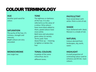
COLOURTERMINOLOGY
HUE
Another posh word for
colour.
SATURATION
The purity of the hue, it’s
richness, strength and
intensity.
Bright colours are very
saturated.
TONE
The lightness or darkness
of the hue. It is also
referred to as the value of
a colour. Dirty colours
have more black added to
them, pastel colours have
more white.
Both tone and saturation
gives colour its variety.
Terms used: Tone
down/Tone up. – meaning
to lighten or darken the
hue
HIGHLIGHT
A small proportion of
contrasting colour used to
enhance and lift the main
colours.
TONAL COLOURS
A palette of the same
colour/hue, but in
different tones.
MONOCHROME
one single hue
NATURAL
Colours derived from
landscapes, sky, earth,
water.
PASTELS/TINT
Hues toned down with
white. Pink is a tint of red.
SHADE
Hues darkened with black.
Maroon is a shade of red.
Whatterminologyof colouris
JenniferHudson’sJumpsuit?
M O N O C H R O M E
M i c h a e l K o r s
R e s o r t 2 0 1 3
Emma Stone is wearing a two-piece
number of different pink ____________ ?T O N E S
T h a k o o n 2 0 1 4
COLOURS AND THEIR FREQUENTLY ASSOCIATED MEANINGS
WHITE
Purity, surrender, truth,
peace, innocence,
simplicity, coldness, death,
marriage, birth, virginity
BLACK
Intelligence, rebellion,
mystery, modernity,
power, sophistication,
formality, elegance, evil,
death, slimming quality.
GREY
Elegance, conservatism,
respect, wisdom, old,
boredom, dullness,
pollution, neutral, formal,
decay, military, education
RED
passion, strength, energy,
sex, love, romance, speed,
danger, anger, wealth,
luck, marriage
ORANGE
Happiness, energy,
balance, heat, enthusiasm,
playfulness, warning,
optimism, abundance
Yellow
Joy, happiness, summer,
cowardice, illness, hazards,
greed, femininity,
friendship
BLUE
Water, ocean, peace,
unity, calmness, coolness,
confidence, conserved,
loyalty, depression,
sadness, idealism,
dependability.
GREEN
Nature, fertility, youth,
inexperience,
environment, wealth,
generosity, jealousy,
growth, health, calming.
PURPLE
Nobility, envy, spirituality,
creativity, mystery,
wisdom, gaudy, confusion,
pride, instability.
COLOURS & SEASONS
Colours help sets the ambience of the season that a designer wants to create for it’s
enticing consumers.
The pallete of a season could vary from delivery to delivery, collection to collection.
Colour is closely related to its season, although it may vary according to the designer’s
concept.
SPRING/SUMMER
Bright colours such as yellow, green, coral, purple,
turquoise. They help set the mood for the coming
season of summer, warmer climates and generally a
fun vibe.
Peter Jensen Spring 2014 collection
Mary Katrantzou Spring 2014 collection
FALL/WINTER
A transition period of the season where darker, deeper and richer
colours are favoured such as browns, olives, mustard, maroon, grey
and navy.
Balenciaga Fall 2014 collection
Polo Ralph Lauren Fall 2014 collection
HOLIDAY
Holiday usually refers to the Christmas period, so festivity colours are in favour for this
season. Complementary colours of ruby red and emerald green, jewel tones of sapphire
blue, metallic such as silver, gold or bronze, and even pure colours such as champagne
and ivory that represents the winter.
Holiday collections are mostly done by high-streets.
Rihanna for River Island Holiday 2013 collection
RESORT/CRUISE
This season is launched in the midst of Spring/Summer.
As the name suggests, it represents fashion during the high summer holidays. The hues
of this season are mainly soft pastels, whites, and bright colours.
Dior 2014 Resort collection
COLOUR
RESEARCH
COLOURCONTEXTS
When reviewing your research and mood board, analyse the colour contexts. The colours
extrapolated from your research and mood boards will provide the collection not only with colour
references, but also the proportions in which they are used
• Which colours serve as the mood board’s foundation, and which provide accents?
• How are the foundation and accent colours proportionate to one another?
• How many base colours can be extracted?
• How many accent colours are used?
Are they used equally or in varying percentages?
• What moods and emotions do the colours produce and how do they relate to your
theme?
• How can you accentuate this through fabric and silhouette development later on?
• How can the tonal differences of an image provide reference for a design
development?
- such as prints, fabric colours, layering of fabrics, and other dress-making
techniques?
• What textures are present and how can they inform my textile selection?
And what are the proportions of the textures?
.
TOSTARTYOURCOLOURRESEARCH…
1. REVIEW YOUR CONCEPT BOARD
What colors can you extract from there?
2. CREATE A COLOR PALETTE
How many colors should there be in a collection of 6 pieces? What is the base color
and what is the accent/highlight colors?
3. REVIEW YOUR PRIMARY RESEARCH
Lay out all of your research, determine where the colors you have selected for your
color palette comes from.
4. DRAW, COLOUR, CREATE AN ART USING THOSE COLORS
Once you have determined the source of your colors, Explore different tones by
extracting the colors out.
USE the colors from your color palette to draw, create, collage or paint a picture that
Is inspired by your CONCEPT.
5. SECONDARY RESEARCH
Look at paint color cards and catalogues, Pantone website, Other designer’s collection,
Art work, Paintings etc… which uses the same color palatte as yours.
COLOURCONSIDERATIONS
To develop colour palettes based in relations in the mood board, there are a number of
processes you can follow.
DEFINE THE COLOUR RELATIONSHIP
Defining the colours and
tones of your collection helps
set a foundation for all others.
Whether it is pure,
authentic, energetic,
colour helps you create
the mood for your
collection.
Define your colour
references by looking at
your point of research,
and whether there are
any references related to
colours in your design
influence.
Tata-Naka A/w 2012
CONSIDER THE COLOUR
SCALE
A bright yellow may be
appropriate in a large
silhouette, such as
trench coat, for one
designer, but another
may find it appropriate
only in a small accent in
a print of lining,
sometimes it isn’t the
colour that seems
inappropriate, but the
contexts surrounding it.
Gucci Pre-fall 2014
CONSIDER THE CUSTOMER
A colour may look good in your research e.g a photo or a painting, but
may not necessarily translate the same way on to the body. Colour that is
worn becomes part of the wearer’s personality and physical appearance
(aesthetic).
Leutton Postle Spring/Summer 2014
THE ‘MIDDLE’ COLOUR
When a palette of solid color that are
unrelated and disjointed come together, it is
essential to create a middleman to unify
them and create a harmonious colour story.
This could be a neutral colour, such as black,
white, beige, navy or grey added into the
palette as a highlight.
Using or adding textures are also a great
way to unite two disjointed colours together.
Prints, woven or printed stripes. Multi-
colored embroideries, jersey knits with
various colours and beadings can all serve as
an axis to bring unrelated colours together
and harmonize the palette.
COLOUR TREND FORECAST
Fashion designers must constantly exercise their
sixth sense to know how consumers behavior will
evolve and what the customer’s needs will be.
Apart from the usual seasonal colours, being aware
of the following is crucial:
- What season have you picked for your
collection?
- What were the colours of the previous years’
seasons?
To assist designers in their own observation and
speculations, fortunately, forecasting services have
developed a well-formulated research that
examines global changes, often through contexts
that will affect fashion such as historical, cultural,
societal, political and economic contexts.
SOME OF THE MOST INFLUENTIAL
TREND-FORECASTING AGENCIES
WORLD GLOBAL STYLE NETWORK
PANTONE INC
COLOUR
MOOD BOARD
Fashion & Colours
Fashion & Colours
Fashion & Colours
Fashion & Colours
Fashion & Colours

Fashion & Colours

  • 1.
    COLOUR The natural, thereligious and cultural, the political to the purely emotional. In order to design a successful collection, colour must be strongly considered. It is fundamental to feel the collection through its colour(s).
  • 2.
    COLOURTHEORY It is importantto understand the basic relationships of colour that can create maximum results, particularly when it comes to selecting fabrics and placing prints PRIMARY COLOURS These are colours that cannot be created by combining other hues. SECONDARY COLOURS These are created from 2 combination of primary colours. TERTIARY COLOURS These are formed by mixing a primary and secondary colour COMPLEMENTARY COLOURS Two colours that are opposite each other on the wheel. Complementary colours offers maximum vibrancy ANALOGOUS COLOURS Colours that are next to each other on the wheel.
  • 3.
    COLOURTERMINOLOGY HUE Another posh wordfor colour. SATURATION The purity of the hue, it’s richness, strength and intensity. Bright colours are very saturated. TONE The lightness or darkness of the hue. It is also referred to as the value of a colour. Dirty colours have more black added to them, pastel colours have more white. Both tone and saturation gives colour its variety. Terms used: Tone down/Tone up. – meaning to lighten or darken the hue HIGHLIGHT A small proportion of contrasting colour used to enhance and lift the main colours. TONAL COLOURS A palette of the same colour/hue, but in different tones. MONOCHROME one single hue NATURAL Colours derived from landscapes, sky, earth, water. PASTELS/TINT Hues toned down with white. Pink is a tint of red. SHADE Hues darkened with black. Maroon is a shade of red.
  • 4.
    Whatterminologyof colouris JenniferHudson’sJumpsuit? M ON O C H R O M E M i c h a e l K o r s R e s o r t 2 0 1 3
  • 5.
    Emma Stone iswearing a two-piece number of different pink ____________ ?T O N E S T h a k o o n 2 0 1 4
  • 6.
    COLOURS AND THEIRFREQUENTLY ASSOCIATED MEANINGS WHITE Purity, surrender, truth, peace, innocence, simplicity, coldness, death, marriage, birth, virginity BLACK Intelligence, rebellion, mystery, modernity, power, sophistication, formality, elegance, evil, death, slimming quality. GREY Elegance, conservatism, respect, wisdom, old, boredom, dullness, pollution, neutral, formal, decay, military, education RED passion, strength, energy, sex, love, romance, speed, danger, anger, wealth, luck, marriage ORANGE Happiness, energy, balance, heat, enthusiasm, playfulness, warning, optimism, abundance Yellow Joy, happiness, summer, cowardice, illness, hazards, greed, femininity, friendship BLUE Water, ocean, peace, unity, calmness, coolness, confidence, conserved, loyalty, depression, sadness, idealism, dependability. GREEN Nature, fertility, youth, inexperience, environment, wealth, generosity, jealousy, growth, health, calming. PURPLE Nobility, envy, spirituality, creativity, mystery, wisdom, gaudy, confusion, pride, instability.
  • 7.
    COLOURS & SEASONS Colourshelp sets the ambience of the season that a designer wants to create for it’s enticing consumers. The pallete of a season could vary from delivery to delivery, collection to collection. Colour is closely related to its season, although it may vary according to the designer’s concept.
  • 8.
    SPRING/SUMMER Bright colours suchas yellow, green, coral, purple, turquoise. They help set the mood for the coming season of summer, warmer climates and generally a fun vibe. Peter Jensen Spring 2014 collection Mary Katrantzou Spring 2014 collection
  • 9.
    FALL/WINTER A transition periodof the season where darker, deeper and richer colours are favoured such as browns, olives, mustard, maroon, grey and navy. Balenciaga Fall 2014 collection Polo Ralph Lauren Fall 2014 collection
  • 10.
    HOLIDAY Holiday usually refersto the Christmas period, so festivity colours are in favour for this season. Complementary colours of ruby red and emerald green, jewel tones of sapphire blue, metallic such as silver, gold or bronze, and even pure colours such as champagne and ivory that represents the winter. Holiday collections are mostly done by high-streets. Rihanna for River Island Holiday 2013 collection
  • 11.
    RESORT/CRUISE This season islaunched in the midst of Spring/Summer. As the name suggests, it represents fashion during the high summer holidays. The hues of this season are mainly soft pastels, whites, and bright colours. Dior 2014 Resort collection
  • 12.
  • 13.
    COLOURCONTEXTS When reviewing yourresearch and mood board, analyse the colour contexts. The colours extrapolated from your research and mood boards will provide the collection not only with colour references, but also the proportions in which they are used • Which colours serve as the mood board’s foundation, and which provide accents? • How are the foundation and accent colours proportionate to one another? • How many base colours can be extracted? • How many accent colours are used? Are they used equally or in varying percentages? • What moods and emotions do the colours produce and how do they relate to your theme? • How can you accentuate this through fabric and silhouette development later on? • How can the tonal differences of an image provide reference for a design development? - such as prints, fabric colours, layering of fabrics, and other dress-making techniques? • What textures are present and how can they inform my textile selection? And what are the proportions of the textures? .
  • 14.
    TOSTARTYOURCOLOURRESEARCH… 1. REVIEW YOURCONCEPT BOARD What colors can you extract from there? 2. CREATE A COLOR PALETTE How many colors should there be in a collection of 6 pieces? What is the base color and what is the accent/highlight colors? 3. REVIEW YOUR PRIMARY RESEARCH Lay out all of your research, determine where the colors you have selected for your color palette comes from. 4. DRAW, COLOUR, CREATE AN ART USING THOSE COLORS Once you have determined the source of your colors, Explore different tones by extracting the colors out. USE the colors from your color palette to draw, create, collage or paint a picture that Is inspired by your CONCEPT. 5. SECONDARY RESEARCH Look at paint color cards and catalogues, Pantone website, Other designer’s collection, Art work, Paintings etc… which uses the same color palatte as yours.
  • 15.
    COLOURCONSIDERATIONS To develop colourpalettes based in relations in the mood board, there are a number of processes you can follow. DEFINE THE COLOUR RELATIONSHIP Defining the colours and tones of your collection helps set a foundation for all others. Whether it is pure, authentic, energetic, colour helps you create the mood for your collection. Define your colour references by looking at your point of research, and whether there are any references related to colours in your design influence. Tata-Naka A/w 2012
  • 16.
    CONSIDER THE COLOUR SCALE Abright yellow may be appropriate in a large silhouette, such as trench coat, for one designer, but another may find it appropriate only in a small accent in a print of lining, sometimes it isn’t the colour that seems inappropriate, but the contexts surrounding it. Gucci Pre-fall 2014
  • 17.
    CONSIDER THE CUSTOMER Acolour may look good in your research e.g a photo or a painting, but may not necessarily translate the same way on to the body. Colour that is worn becomes part of the wearer’s personality and physical appearance (aesthetic). Leutton Postle Spring/Summer 2014
  • 18.
    THE ‘MIDDLE’ COLOUR Whena palette of solid color that are unrelated and disjointed come together, it is essential to create a middleman to unify them and create a harmonious colour story. This could be a neutral colour, such as black, white, beige, navy or grey added into the palette as a highlight. Using or adding textures are also a great way to unite two disjointed colours together. Prints, woven or printed stripes. Multi- colored embroideries, jersey knits with various colours and beadings can all serve as an axis to bring unrelated colours together and harmonize the palette.
  • 19.
    COLOUR TREND FORECAST Fashiondesigners must constantly exercise their sixth sense to know how consumers behavior will evolve and what the customer’s needs will be. Apart from the usual seasonal colours, being aware of the following is crucial: - What season have you picked for your collection? - What were the colours of the previous years’ seasons? To assist designers in their own observation and speculations, fortunately, forecasting services have developed a well-formulated research that examines global changes, often through contexts that will affect fashion such as historical, cultural, societal, political and economic contexts. SOME OF THE MOST INFLUENTIAL TREND-FORECASTING AGENCIES WORLD GLOBAL STYLE NETWORK PANTONE INC
  • 20.