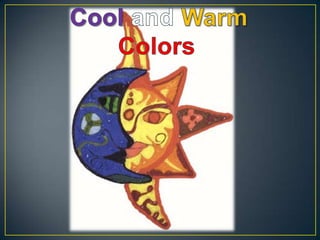
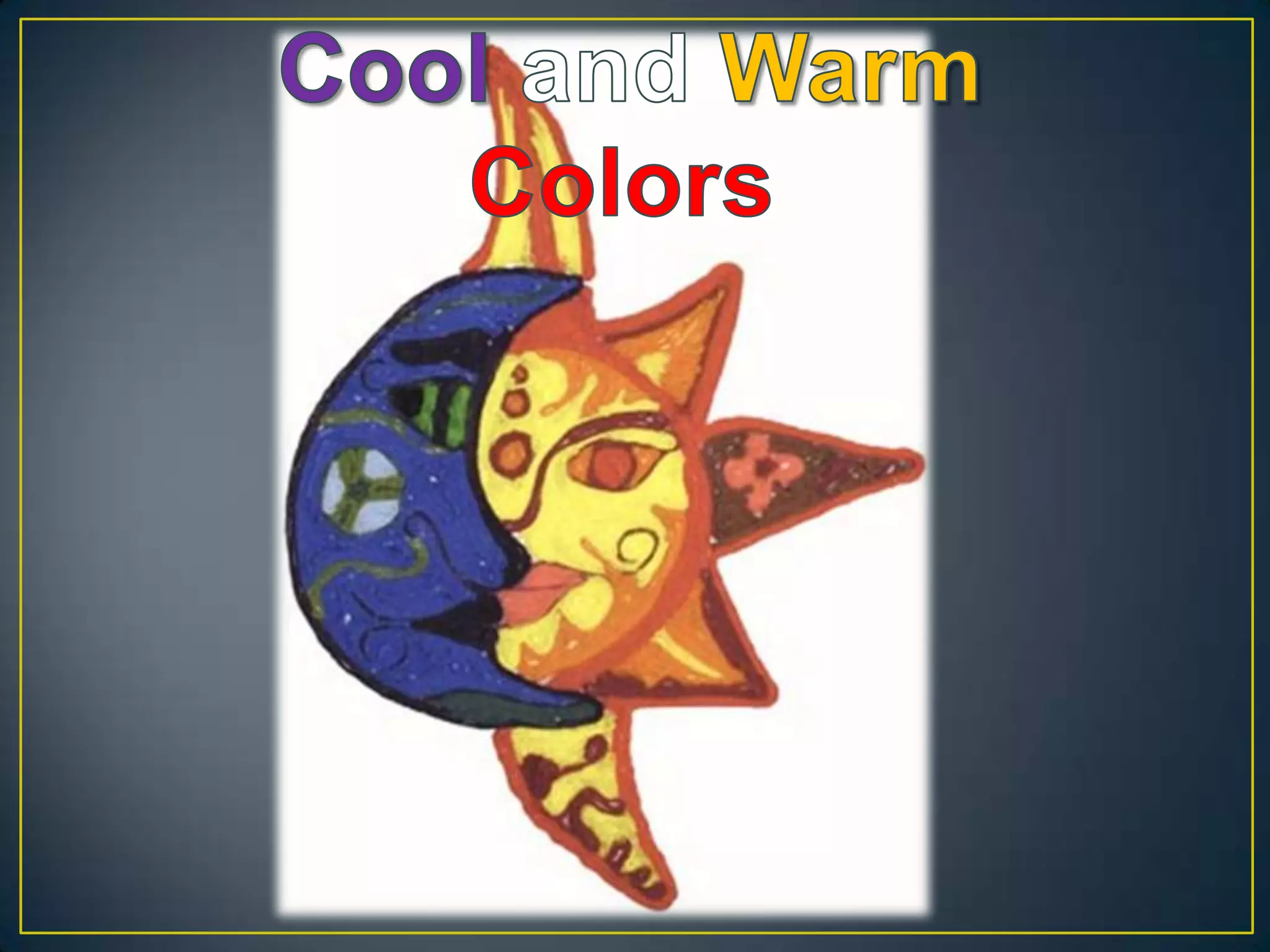
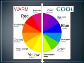
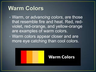
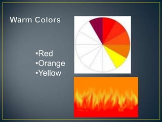
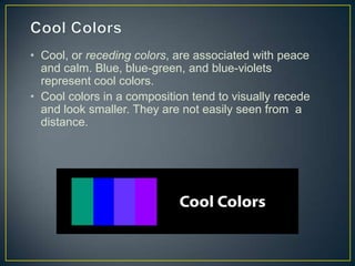
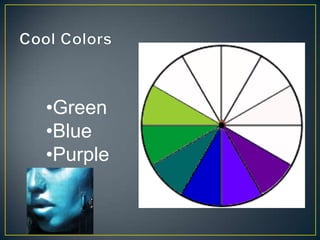
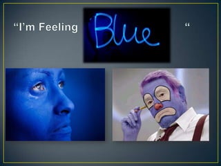
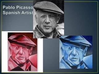
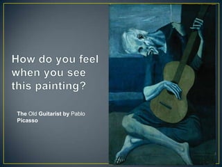
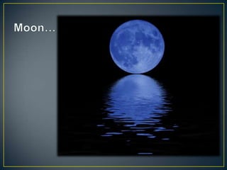
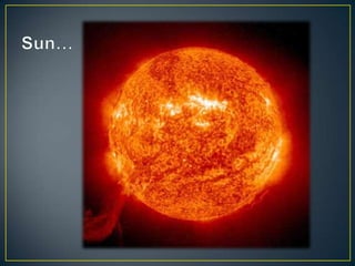
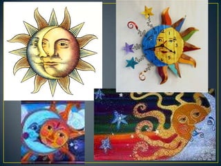
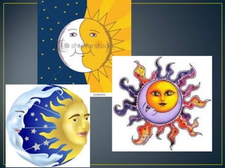
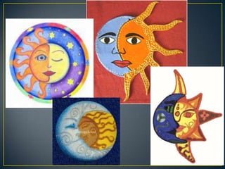
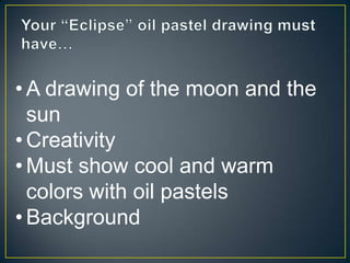
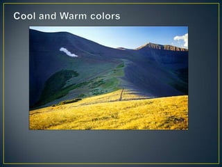
The document discusses warm and cool colors. Warm colors like red, orange, and yellow are associated with fire and heat, appear closer, and are more eye-catching. Cool colors like blue, blue-green, and purple are associated with peace and calm and tend to visually recede. The document also provides examples of assignments involving using warm and cool colors, including drawing the moon and sun or recreating Picasso's painting with oil pastels on a background.
How to use the color wheel to create colorful presentations Presentitude
The 12 colors in the color wheel can be combined in different ways when you create presentations. Some of the colors are considered warm, and some cold. Some are considered be complimentary in different ways. Colors next to each other are called analogous and using the same color and its tints tones and shades is called monochromatic. We can use these color combinations in the color wheel to create beautiful color schemes for presentations.
This is Part II in our series about color presentations. Part I (http://www.slideshare.net/Presentitude/basic-color-theoryforpresentationdesignpart1) covered basic color theory.
Color is one of the most expressive elements because
its quality affects our emotions directly and immediately.
This presentation has all about the colors & it's theory includes about the colors, history, Physiological Principles of Color etc.
Fashion Design Portfolio By Shafali Bohra, B.Sc. Fashion Design Studentdezyneecole
This is the Work Compiled by the Student of B.Sc.-Fashion Design of Dezyne E'cole College.The Portfolio of Fashion Design is Developed by the Student …
Shafali Bohra
B.Sc. FashionDesign
4. Warm Colors
Warm, or advancing colors, are those
that resemble fire and heat. Red, red-
violet, red-orange, and yellow-orange
are examples of warm colors.
Warm colors appear closer and are
more eye catching than cool colors.
10. • Cool, or receding colors, are associated with peace
and calm. Blue, blue-green, and blue-violets
represent cool colors.
• Cool colors in a composition tend to visually recede
and look smaller. They are not easily seen from a
distance.
29. afterimage demonstration of visual complementary hues
Stare at the center of the colored square for 20 seconds,
then look at the black dot on the right.