

Recommended
More Related Content
Recently uploaded
Recently uploaded (20)
Featured
Featured (20)
Colour futures 2009
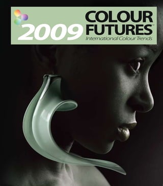
- 1. COLOUR 2009 FUTURES TM International ColourTrends
- 2. CONTENTS OVERVIEW WELCOME 02 TheColourFutures™ team introduces you INTERNATIONAL COLOUR TRENDS 04 to forecasted colour trends for 2009 TREND MOVEMENTS 06 COLOUR FUTURES™ TEAM 08 COLOUR THEMES ECOTECTURE 12 These five key lifestyle themes have been WHITE DIMENSIONS 18 submitted by the ColourFutures™ teamfor 2009: LIVING LEGACY 24 EQUILIBRIUM 30 PLAY HOUSE 36 COLOUR OF THE YEAR 2009 COLOUR OF THE YEAR 2009 42 COLOUR TRANSITIONS 46 COLOUR FAMILIES REDS 50 ColourFutures™displays a palette of 76 colours ORANGES 52 for 2009. All are from the ICI Paints Global Colour YELLOWS 54 System with a unique notation number. WARM NEUTRALS 56 These colours are divided into eight families: GREENS 58 BLUES 60 VIOLETS 62 COOL NEUTRALS 64 REFERENCE THE SCIENCE BEHIND COLOUR 66 An understanding of the science behind colour and useful colour reference details for the 2009 palette COLOUR INDEX 2009 68
- 3. WELCOME ColourFutures™isthecolourcommunicationtool fromourinternationalteamofcolourexperts. ColourFutures™istheresultofongoingworldwide colourtrendresearch,forecastinganddevelopment. Weprideourselvesontheknowledgeofcolourand colourformulations inpaint.ColourFutures™ providesthereaderwith internationaltrendsin colourandlifestyleoneyearinadvance. 02
- 4. INTERNATIONAL COLOUR TRENDS The ColourFutures™ team draws on a varietyof sources: from research groups, colour marketing and trade and retail exhibitions, to design influences from the worlds of fashion, technology, architecture, music, nature and popular culture. This results in a contemporary colour palette which is driven by society’s changing moods and interests. Trends can emerge out of every possible cornerof society. Some can emerge rapidly; others evolve over several years– or even decades. Some may be slow in evolving and 09 then a sudden major influence can either speed them up or slow them down. 04
- 5. TREND MOVEMENTS Over the past six years we have seen a significant shift in the Colour of theYear – the colour that best represents the prevailing mood and fashion of the time. The soothing turquoise of 2004 which best summed up our interest in a balance between mind and body, gave way in 2005 to a more life enhancing orange that symbolised a sense of vitality and optimism. 2006 featured a restorative yellow-green with a strong ecological bias which, in turn in 2007 became a more masculine pink which symbolised a new urban regeneration in design and architecture. The yellow of 2008 linked the East to the West and illustrated respect for the past and optimism for the future. The calm and soothing cool green that best sums up 2009 can be found in many of this year’s trend stories but at slightly different colour levels – it represents a sense of natural stillness, healing and balance. To clarify what a trend is, it is helpful to look at HYPE the difference between a hype, a fashion and a trend FASHION (seeopposite). A hype is something that emerges suddenly, TREND MAINSTREAM takes a group of people by storm – and then dissipates rapidly. Hypes are generally born unconsciously and come from some inner drive to be accepted by one’s peers, to belong. A fashion is more current and is usually followed IMPACT consciously– through clothes, toys, food and certain aspects of lifestyle. Trends, on the other hand, are drifts, inclinations and movements in a prevailing direction. TIME 06
- 6. KrimDanzinger NickiBarton LatikaKhosla SeniorColourConsultant, Head of Colour, AkzoNobel ConsultanttoDulux,Asia GliddenPaints, USA DecorativePaints Background: Design Director of Freedom Background:12 years in the Colour/ Background: 5 years’ marketing Tree Design, a colour and trend studio Design of Wallcovering, 8years experience for Dulux UK, 6 years in based in India. Chairholder with the with ICI Paints as Colour Consultant. a global role working across the Colour Marketing Group and the India Member of Colour Marketing Group, ICI Paints portfolio around the world. Director for the PPFCC. and member of American Society Chairperson of ColourFutures since 2003. TM of Interior Designers. Education: Alumni of the National Education: BSc from University Institute of Design, Ahmedabad, India. Education: BFA Graphics and Applied College, Cardiff. Design, Miami University. Specialisms: Design and colour Specialisms: Colour trends, systems and strategies for manufactured products Specialisms: Colour and design trends, collateral,brand communication and media. and retail collections. faux finishes and mural painting. COLOUR FUTURES TM TEAM CatherineFiloche MaryWard CreativeDirector, The ColourFutures™ team is a group Consultantto DuluxValentine, AnnevanderZwaag DuluxUK&Ireland of international colour consultants, France ManagerAkzoNobel Background: Head of Dulux Creative AestheticCenter Board since 2003, working with media, both internal and external, to our Background: Consultant for ICI since1997 . architects and homeowners. 7years’ Design for companies such as Saint Gobain Background: Curator, author and tutor in marketing experience in UK and globally, company. They are the recognised Glass, Gerflor, Kohler France. Founded own the field of art, design, architecture and creating award winning innovations, experts within our organisation, design office in Montmartre,Parisin1997 . fashion. Head of the AkzoNobel Aesthetic new colour ranges, merchandising and Education: École Supérieure d’Arts Center since 2007. colour cards. responsible for watching and Appliqués Duperré, Paris. BTS Textiles and Education: Master Modern Art and Design, Education: MSc Materials, Cranfield, UK ; scanning a wide range of industries DSAA Fashion and Environment. University Utrecht, the Netherlands. BSc Chemistry,Trinity, Dublin, Ireland. Specialisms: Colour, trends and design Specialisms: Colour trends, concepts and Specialisms: Trends, Innovation, and environments in order to plan for textiles, floor and wallcoverings. communication. colour communication and design. and forecast colour trends. PaolaVieira ColourMarketingManager, Their work culminates in TintasCoral,Brazil BarbaraRichardson comprehensive collections Director, ColourMarketing, JenniLittle Background: 5 years’experience in the Marketing department of Whirpool and concepts illustrating their GliddenPaints, USA Consultant to Dulux,Europe Corporation, Bang & Olufsen and Merloni Elettrodomestici. 3years’experience in selections – it is published Background: 21years as Colour Consultant, Background: MD of Jenni Little Associates decorative paints in Brazil and 5 years as Colour Design Studio Manager. design and colour consultancy with one year ahead in ColourFutures.™ Chairholder in The Colour Marketing over 35 years’experience, including 25 international roles. Group;member of American Society of with ICI Paints in UK and Europe. Founder Education: Graduate in Business Interior Designers. member and Chairperson of The Colour Administration from Fundação Getulio Group in the UK. Vargas; graduate in Mathematics from Education: Graduate in Commercial Universidade de São Paulo. Masters in and Fine Arts from Cooper School of Art; Education: Graduate of Manchester Marketing from Università Commerciale Interior Design Certificate from College of Art and Design– BA in Luigi Bocconi in Milan, Italy. the New York School of Interior Design. printed textiles. Specialisms: Colour strategy and Specialisms: Colour and design trends, Specialisms: Colour and design trends for initiatives for Latin America, including merchandising colour, colour restoration. paints, textiles, tiles and floor coverings. colour communication. 08
- 7. 76 colourshavebeenusedtoform whattheColourFutures™ teamconsiderstobethefivemainlifestyletrendsfor2009. Some colours appearinmorethanonetheme. S 10
- 8. 13 WHITE DIMENSIONS LIVING LEGACY EQUILIBRIUM PLAY HOUSE ECOTECTURE
- 9. Innovative design and architecture practices are pursuing concepts such as vertical landscaping, sky gardens and ECOTECTURE integrated community facilities as part of many new office and domestic projects. Green energy and global citizenship are driving issues that will inform much of this debate. Aesthetic ambience and sustainable systems will ensure buildings create both a quality of life experience and a strong sense of community as opposed to the ‘islands in the sky’ so familiar to us now — where little attention is paid either to the lives of the residents within these structures or the impact of WHITE DIMENSIONS the building itself on the ecosystem. LIVING LEGACY The elements of air, water and earth are also being regarded as an inherent component of any new building both in terms of its environmental impact but also because of our improved understanding of the human need to inter-react with the natural world in a way that brings self fulfilment and an integrated lifestyle. The palette reflects this new challenging approach to the built environment and the natural world. Soft natural colours such as straw, olive, willow and aqua are enlivened and offset by techno greens, marine blues and deeper architectural tones — a community of colours for EQUILIBRIUM the basic bio bodies of the future. PLAY HOUSE Sustainable, environmentally friendly building is now going mainstream whether domestic or commercial, rural or urban. Leaving its hippy, alternative roots behind, the relationship of a building and inhabitants to its environment is now a critical issue for all new build projects. This clean green attitude regards a piece of architecture as a living organism that has the need to breathe, feed and dispose of waste in a responsible, non harmful way. Ultra high technology and ‘smart’ systems are being utilised to deliver effective eco solutions as seen in new projects such as the Hearst Tower in New York City. 15
- 10. ECOTECTURE COLOUR PALETTE IMAGERY Tableandchairs,www.twentytwentyone.com WHITE DIMENSIONS 40 YY 49/408 30 YY 58/178 70 YY 72/041 90 GG 30/195 LIVING LEGACY 20YY 57/060 30 RR 30/103 70 YY 55/613 70 YY 25/200 EQUILIBRIUM PLAY HOUSE 70BB 55/044 70 BB 15/081 10 BB 17/269 10 GG 51/125 30 YY 14/070 20 YY 39/130 10 GY 40/296 70 GG 13/323 43 25 17
- 11. 39 9 ECOTEC TURE LIVING LEGACY EQUILIBRIUM P L AY H O U S E 1 WHITE DIMENSIONS
- 12. ECOTEC TURE WHITE DIMENSIONS LIVING LEGACY EQUILIBRIUM P L AY H O U S E Thisthemebringsatouchofmodernmagic,futuristicbutethereal,anewdawnofsyntheticdevelopment.Herewe findhighlyengineeredmaterialsandconstructionsmadeinawaythatdelightstheeyeandintriguesthesenseswith aplayofdimensionandshadow. Surfacesaresculpturedandgeometric,layeredandorganic,facetedandfiltered.Lightisalwaysthemostimportant ingredient,allowingforasubtleinterplayoftoneandcontrast,reflectionandtranslucence,transparencyandsolidity. Ultracontemporarymaterialsaremouldedandfoldedseamlesslylikeapieceofhi-techorigami; surfacesappearfluid andcontinuousbutareconstructedfromrigidmodularunits.Technologycreatesasenseof‘aliveness’oranimation– seeminglysimplesurfacesandobjectsareshapedinwaysthatbeliethetechnicalcomplexityoftheirconstruction. Theappearanceislightandairywithanemphasisondelicatefretwork,achievedbymeansoflasercuttingthatallows lighttopassthrough,castingetherealandmoodyshadows.Nosurfacesaretrulyflatbutaretexturedandmanipulated inordertocreatefascinatingspatialinterplays.CuttingedgedesignersanddesigncompaniessuchasTordBoontje, MarcelWanders,RonArad,DroogandMoooiarepushingcreativityintocyberspacewiththesehi-techmaterials andrapidprototyping.Yetinspiteofthefuturisticaspectofthistheme,averypoeticandmagicaldimensionisstillretained. Thepalettecombinesnewsoftandchalkywhiteswithmutedandsubtleshadowyshadesoffsetbythestronger ‘construction’coloursofrust,clayanddarkslate–coloursthatdrawusbacktoamorehumanaesthetic–anew21st centurydawnofsoftwhite. 21
- 13. ECOTEC TURE Faceted WHITE DIMENSIONS 10YY 44/215 50YR 23/365 Futuristic CO LO U R PA L E T T E I MAG E RY Synthetic Intriguing 30YY 71/073 70YR 68/102 70YR 45/261 Complex Engineered LIVING LEGACY 44YY 84/042 10YR 40/054 60YR 73/015 EQUILIBRIUM www.annekyyroquinn.com 00NN 72/000 00NN 83/000 10GG 72/022 P L AY H O U S E 10BB 40/090 98YR 78/041 50GG 55/049 70BG 07/086 30YY 22/059 AndrewTyeScreen,www.tye3d.com 43 25 23
- 14. 25 ECOTECTURE WHITE DIMENSIONS EQUILIBRIUM PLAY HOUSE LIVING LEGACY
- 15. This theme sets the tone for a new aesthetic approach to design and craft that both embraces sustainability and is a counterbalance to the worst of mass production. ECOTECTURE Micro production and limited editions are being created in sustainable communities, drawing on ongoing traditions combined with unique and valued craft skills. WHITE DIMENSIONS LIVING LEGACY Objects are unique – they flaunt and celebrate their workmanship,construction and materials whether made of metal,textile,ceramic, glass or wood. Every piece has its own story and can be seen as part of an ongoing dialogue from maker to user through customisation. This new dialogue between manufacture and marketing ensures a greater opportunity for the world’s developing countries and regions, for which artisanship, aided by good design, can be a realistic way of attracting foreign currency,enabling communities to continue. EQUILIBRIUM This, in turn, creates valuable links between makers and the real commercial world,and acts as a much needed alternative to the polarisation between discount and luxury. In a more and more impersonal world where people risk loosing touch with local crafts,it is essential that we preserve direct connections between the mind,eye and hand by valuing the human intervention in an object that gives it its sensuality. Pride,integrity and respect are qualities that can be ascribed to both the object and its creator, remixing influences and moving to the future whilst always respecting what has been done in the past. PLAY HOUSE The desire to rediscover functional beauty, to fit the object to the user,enables each item to tell its own story in a way that will combat standardisation and banality – the living craft memories of yesterday will create the new design horizons of tomorrow. The palette combines a rich and varied range of botanical shades such as mustard,aloe, grape and cactus, enlivened by more vibrant and contemporary techno tones – alive yet calming, a palette to nourish the senses and feast the eyes. 27
- 16. LIVING ECOTECTURE LEGACY WHITE DIMENSIONS Beatlights,www.tomdixon.net 30YR 25/463 00YY 19/261 30YR 07/157 50YR 23/365 LIVING LEGACY CONTINUITY COLOUR PALETTE INTEGRITY IMAGERY PRIDE REDISCOVERY GENUINE 70YR 45/261 30YR 31/154 20YY 57/060 CUSTOMISATION 10RR 24/061 EQUILIBRIUM Glassvases,www.parici.com 70BG 56/061 PLAY HOUSE 70RR 16/116 30YY 49/562 44YY 70/110 30YY 38/370 60YY 67/251 30BB10/112 23YR 10/308 Leather,RolfordLtd+44(0)1933461324 43 25 29
- 17. 31 ECOTEC TURE WHITE DIMENSIONS LIVING LEGACY P L AY H O U S E EQUILIBRIUM
- 18. ECOTEC TURE WHITE DIMENSIONS LIVING LEGACY This theme exemplifies a new attitude to life In a world where financial and political turbulence is rife, we and leisure, friends and family, work and play, activity move towards values that are eternal and sustaining; the need and rest. In short, we are re-evaluating our human to nurture and care for our world in order to create a better relationships to one another, our communities and tomorrow for the old and young alike. A time to be sociable but EQUILIBRIUM the rigours of modern living. still,active but rested,human but spiritual. It is both introspective and contemplative but is The palette is inspired by the tones of tea and skin like nevertheless inclusive and integrated into our daily life – a jasmine,rose,linden,moss and mint– calming and far cry from the selfish and self absorbed attitude of satisfying colours that speak of our inherent similarities the not too distant past. A‘we not me’attitude pervades no matter how culturally diverse we are. Sociable and acts as a healing balm for the senses,a time to and reassuring shades of great delicacy, like an infusion regenerate ourselves and reclaim our reason. of pastel flowers,put over a mood of serenity and P L AY H O U S E peace,of comfort and security. Sharing tea with friends and family characterises the social and human aspects of this theme– a slow This soft and gentle palette represents all that fix within our daily lives. A feeling for winding is warming and human– colours to wrap yourself down rather than gearing up allows us to in,not in order to retreat from the world but rebalance and rediscover a calmer quality of life to embrace it together with friends and family– that is centred on care and community. a re-centring of the priorities of life. 33
- 19. ECOTEC TURE 60YY 33/130 10YR 50/101 WHITE DIMENSIONS 70YY 65/090 00YY 83/046 LIVING LEGACY 50GY 66/111 50YR 68/114 90YY 62/264 80YR 67/085 NURTURING EQUILIBRIUM REFRESHING CO LO U R PA L E T T E I MAG E RY BALANCED 60YY 67/251 30YY 80/088 SUSTAINING INFUSION HEALING P L AY H O U S E 10YY 61/136 90YR 51/109 80YR 40/148 10YY 60/224 80YR 17/129 00YY 43/304 43 25 35
- 20. 37 ECOTEC TURE WHITE DIMENSIONS LIVING LEGACY EQUILIBRIUM P L AY H O U S E
- 21. 39 ECOTEC TURE WHITE DIMENSIONS LIVING LEGACY EQUILIBRIUM P L AY H O U S E
- 22. ECOTEC TURE WHITE DIMENSIONS 30BB 16/031 30YY 72/018 LIVING LEGACY 90YY 48/500 LaBohemestools,www.icone.co.uk 30YY 47/145 50BG 55/241 EQUILIBRIUM 50YY 65/454 70YY 46/160 ENERGETIC P L AY H O U S E 30YR 53/188 CO LO U R PA L E T T E 70GG 39/303 OPTIMISTIC I MAG E RY 08YY 56/528 WITTY FUN ADVENTUROUS 70YY 63/326 30RR 15/375 PLAYFUL 10BG 14/296 25YR 34/473 04YR 11/537 43 25 70YY 12/167 41
- 23. 10GG 51/125 COLOUR OF THE YEAR 43
- 24. SOOTHING REVIVING PROGRESSIVE SOCIABLE RESPONSIBLE TECHNICAL COLOUR OF Green is a highly emotive colour that speaks to us symbolically on many levels – culturally, socially, naturally and futuristically. We have seen a huge growth of importance of all greens in recent years – from soft citrus tints, attention THE YEAR 2009 grabbing natural tones to hi-tech futuristic shades. Green represents the close alignment of nature and science in order to create a sense of harmonious and sustainable living. It reminds us of the critical importance of fresh water on our fragile planet, the technology of LED lights and the complex monitoring equipment of the laboratory – all essential to our wellbeing and progress. 10GG 51/125 Currently and in the past, cool jades have been associated with healing and natural protection. Celadon and the ceramic greens popular in the East, put over a sense of beauty, peace and calmness whilst similar tones were much used in the West for clinics, hospitals and ‘green rooms’– where actors and musicians rested before performances. The psychological acceptance of cool green comes from its association with the herbs and plants used in both culinary and medicinal contexts. Green tea, eucalyptus, mint, aloe and willow have calming, healing and reviving aspects that we seek out when under stress or in the midst of emotional trauma – they have the ability to work in harmony with the body’s own healing mechanisms. In both exterior and interior decoration, jade green has an important part to play. In modernist terms it works with glass, steel, concrete and combines with a cool palette of grey, soft blues, taupe and chocolate whilst for a softer and more domestic look it can be combined with warmer tones like plum, terracotta, peach and nude pink. This green is balanced and wholesome – a contemplative and soothing shade that speaks of community care and social responsibility– a nurturing colour for an emotionally hungry world. 45
- 25. COLOUR TRANSITIONS Thisyearweseeamovetowardscoloursthataresofterandmoreunderstatedbutwhichhavevery stronglinkstothebuiltenvironment,thelandscapeandnaturalcraftmaterials. Eachcolourfamilyiswelldefinedwithlittleambiguity–‘easyontheeye’and‘easytolivewith’quiet shadesdominate. Brighter,futuristiccolours,inspiredbytechnology,arealsoevidentinmanypalettes. Wherecolourisstrongeritstilltendstowardssubtletyandcomplexity–weseemtohavetiredof manyofthestridentshadesofpastyearsinfavourofsomethingsofterbutmuchmoresophisticated. Warmmid-tonesare,likelastyear, stillthemostpopularcolourlevelwithpalerneutralscontinuingto behighlydesirableeitherintheirownrightortocomplementstrongerandmorecomplexcolours. Reds are far softer and neutralised with nude and skin shades predominating over the rich and regal ones so popular in recent years. Oranges still retain their earthy, organic bias overall but are now more influenced by beaten, burnished and crafted metals. Yellows are more subtle with a greater array of tones and the inclusion of more sophisticated mustards, bronzes and golds. WarmNeutrals are less contrasting and have returned to a heartland of environmentally based shades like clay, ecru, bark and timber. Greens reflect the environment with many botanical hues but the palette is tempered by stronger colours inspired by technology and the laboratory. Blues are either strongly linked to earth and space or shadowy and more industrial. A new greener area is emerging that creates a more futuristic image. Violets have now become so understated and subtle that they can almost be regarded as warm neutrals – gone entirely are the vibrant mauves and pretty lilacs. CoolNeutrals have a very soft, shadowy aspect to them which can create delicate layering effects – not quite as neutral as last year. 46
- 26. ColourFutures™displays a palette of 76 colours for 2009. All are from our global colour system with a unique notation number. These colours are divided into eight families: Reds, Oranges, Yellows, Warm Neutrals, Greens, Blues, Violets, Cool Neutrals. COLOUR FAMILIES 48
- 27. REDS ORANGES 14YR 10/434 90BG 17/090 YELLOWS KEY COLOUR 2009 WARM NEUTRALS 50RR 11/286 10YR 50/101 50YR 68/114 80YR 67/085 80RR 07/260 30YR 53/188 30YR 31/154 70YR 68/102 SOFT GREENS SUBTLE BLUES SKINLIKE 30RR 15/375 04YR 11/537 30YR 07/157 VIOLETS REDS TRANSITION reds COOL NEUTRALS 2005 2006 2007 2008 2009 A radical move away from stronger and more saturated shades towards a softer skin-like neutral pink with warm coffee overtones. The influence of yellow creates brown–toned shades that are highly usable but The key colour,10YR 50/101, is a subtle neutral – a nurturing and warming shade that sophisticated – colours that are refined, natural and add a touch of understated luxury. is both ultra chic and relaxing. Skin tones add a level of softness and subtlety that is warming, delicate and puts over a more caring and nurturing image. Bolder colours are honest and true – fun shades to enliven what is a very restrained palette. A radical change from a few years ago where stronger shades predominated. 51
- 28. REDS ORANGES 14YR 10/434 00YY 83/046 30YY 80/088 YELLOWS KEY COLOUR 2009 WARM NEUTRALS 25YR 34/473 30YR 25/463 70YR 45/261 90YR 67/085 23YR 10/308 50YR 23/365 99YR 82/029 GREENS BURNT BURNISHED BLUES RUSTED 90RR 08/129 10YR 27/323 30YR 49/097 VIOLETS ORANGES TRANSITION oranges COOL NEUTRALS 2005 2006 2007 2008 2009 A move towards a stronger deep coral strongly influenced by red – although deep and saturated, this colour is still warm and comforting. Beaten and rusted metals are the inspiration for the majority of this palette – The key colour,30YR 25/463, is a muted and burnt red orange – a softly glowing shade that captures robust colours that have an eternal sense of strength and beauty. the magic of molten metal. Ultra pale apricots and vanillas lit by the soft afternoon sun – warm shadows to create relaxing and reassuring interiors. Bright and vivid coral has an engaging and sunny energy– a fun colour which can enliven the neutral palettes. 53
- 29. CRAFTED REDS CREATIVE COMFORTING ORANGES YELLOWS WARM NEUTRALS 00YY 43/304 10YY 44/215 30YY 58 /178 60YY 67/251 10YY 60/224 30YY 38/370 50YY 65/454 GREENS BLUES KEY COLOUR 2009 08YY 56/528 00YY 19/261 30YY 49/562 40YY 49/408 VIOLETS YELLOWS TRANSITION yellows COOL NEUTRALS 2005 2006 2007 2008 2009 A gentle move towards smart and fashionable mustard– a sophisticated colour that puts over an image of craftwork and creativity. A palette of great character and beauty– crafted colours that put The key colour,40YY 49/408, is an elegant and crafted mustard that works well in modernist settings over an image of soft refinement and attention to detail. with cooler neutrals. New mustards predominate – artistic shades that work alone or with cooler neutrals – a new high fashion favourite. Warmer golds and tans bring elements of the natural world inside and give a look of comforting and calming radiance. 55
- 30. REDS ORANGES YELLOWS WARM NEUTRALS 90YR 51/109 98YR 78/041 30YY 71/073 44YY 84/042 KEY COLOUR 2009 80YR 40/148 10YY 61/136 30YY 47/145 44YY 70/110 GREENS NURTURING NATURALISTIC BLUES ARBOREAL 80YR 17/129 20YY 57/060 20YY 39/130 99YR 82/029 VIOLETS warm WARM NEUTRALS TRANSITION COOL NEUTRALS 2005 2006 2007 2008 2009 A very subtle move from last year that exemplifies the enduring popularity of this soft but characterful, mid-toned level of colour. neutrals Orange and yellow based neutrals with an abundance of wood, bark The key colour,10YY 61/136, is an environmental neutral reminiscent of cut timber and cork – a gentle colour and twig colours reflect our concerns for the environment. that combines beautifully with warm and cool palettes. Clay and earth tones allude to the natural environment and sustainable craftwork materials for communities across all cultures. Luminous pales create lightness with warmth, calmness with character and softness with neutrality. 57
- 31. REDS ORANGES 70YY 65/090 70YY 25/200 10GY 40/296 50GY 66/111 YELLOWS KEY COLOUR 2009 WARM NEUTRALS 70YY 46/160 70YY 63/326 90YY 62/264 10 GG 51/125 60YY 33/130 70YY 55/613 90YY 48/500 50GG 55/049 GREENS ECOLOGICAL HEALING BLUES REVIVING 30YY 14/070 70YY 12/167 70GG 13/323 VIOLETS GREENS TRANSITION greens COOL NEUTRALS 2005 2006 2007 2008 2009 A move towards calming and cooler greens reflects our concern for family and the environment – this soft jade is both serene and sophisticated. Botanical yellow–based greens add a touch of futuristic energy– they are The key colour,10GG 51/125, is a soothing shade inspired by jade, willow and aloe – it represents issues reminiscent of both the jungle and the laboratory. such as wellbeing, healing and nurturing. Cooler jades and tea greens are creative colours loved by the East and West alike – calming, thoughtful shades for refreshment of mind and body. Subtle, architectural greens remind us of the earth’s natural building materials – clay, timber, stone and thatch– eco-friendly materials for modern living. 59
- 32. REDS ORANGES 70BG 56/061 10BB 40/090 70BB 55/044 YELLOWS KEY COLOUR 2009 WARM NEUTRALS 90GG 30/195 50BG 55/241 14YR 10/434 70BB 15/081 70GG 39/303 10BG 14/296 10BB 17/269 GREENS ARCHITECTURAL TECHNOLOGICAL BLUES AIRY 70BG 07/086 30BB 10/112 30YR 49/097 VIOLETS BLUES TRANSITION blues COOL NEUTRALS 2005 2006 2007 2008 2009 A move towards new environmental aquas and turquoises, strongly influenced by green – these shades have both an earthly and aquatic quality to them. The futuristic view of the earth seen from space inspires much of this palette – The key colour,90GG 30/195, is a deep but soft aqua that conveys a strong sense of the natural environment when used the growing link between technology and our natural world. with both warm and cool neutrals. Balanced and beautiful turquoise and teal allude to both the past and the future – creative colours used for centuries are now centre stage in fashion terms. Smoky and shadowy shades add an airy sense of dimension and definition – structured tones that create depth and interest. 61
- 33. DUSTY REDS DEGRADED DELICATE ORANGES 60YR 73/ 015 90BG 17/090 YELLOWS WARM NEUTRALS 60YR 73/015 90YR 67/085 KEY COLOUR 2009 10RR 24/ 061 30RR 30/103 10YR 40/054 99YR 82/029 GREENS BLUES 70RR 16/116 10YR 27/323 30YR 49/097 VIOLETS VIOLETS TRANSITION violets COOL NEUTRALS 2005 2006 2007 2008 2009 A move to almost total neutrality and subtlety – very understated shades that are inspired by dust, ash and shadows. A level of neutrality, never seen before in this palette, creates shades that The key colour,10YR 40/054, is the most subtle of violets – a dusted neutral that exhibits a sophisticated are highly elegant but with an understated sense of luxury. sense of luxury and refinement. Both traditional and ultra contemporary interiors benefit from this new subtle neutrality– ethereal, shadowy and delicate. The natural world is evoked via an array of ash, cinder and dust– whether ultra pale or deeper in tone, softness is always the key attribute. 63
- 34. LAYERED REDS CONSTRUCTED SUBTLE ORANGES 30RR 08/044 90BG 17/090 YELLOWS WARM NEUTRALS 70YY 72/041 00NN 72/000 90YR 67/085 KEY COLOUR 2009 30YY 72/018 00NN 83/000 10GG 72/022 99YR 82/029 GREENS BLUES 30YY 22/059 90RR 28/245 30BB 16/031 30YR 49/097 VIOLETS cool COOL NEUTRALS TRANSITION COOL NEUTRALS 2005 2006 2007 2008 2009 A move towards pale greys so discreet that they are almost pure white – this renaissance of white influences all hue areas. neutrals A series of ultra subtle greys and off whites create a layered look – The key colour, 00NN 83/000, is an off white which lends the merest hint of subtlety and shadow– tiny shifts of colour that create dimension and optical interest. an ethereal pale, a whisper away from white. Understated pale greys allow for maximum combination possibilities with hues from other palettes – intriguing but never bland. Architectural light and dark mixes put over a mood of contemporary chic – elegant when used alone, both indoors and out, or with subtle natural accents like slate and rust. 65
- 35. We understand both the ‘art’ and ‘science’ of colour. The ‘art’ part of our work relates to the aesthetics of colour, while the ‘science’ is about its technology. The purpose of ColourFutures™ is to marry the art and science in one reference manual. THE SCIENCE BEHIND COLOUR B WHITE A What is colour? In order to give a more precise indication, there is a scale from 00 to 99 that will Colour is a sensation that we experience through our eyes with our brain. locate a specific hue within a colour group. The numbers run anti-clockwise, 00 Colour is all around us, used on a variety of forms and shapes and we all interact as shown opposite. For example, 50YY is a pure yellow and is found in the with it. It adds spice to our lives and can affect the way we behave, feel, perceive middle of YY; 90GY is more green than10GY. or orientate ourselves in a given space. Research has shown that colour can compensate vision deficiency– visually impaired people can navigate with LRV (see‘C’opposite) 99 more confidence in strong colour-contrasted environments as their sense of Another aspect that we are all familiar with is how dark or light a colour is. space and orientation is recreated by contrasting colours. LRV HUE In our notation system, this is described as the Light Reflectance Value (LRV). The colour we perceive is influenced by the context in which we see that colour. It is a measure of how much light is reflected by a surface of that colour. CHROMA Lighting affects the appearance of a coloured wall, for example. A small patch It is represented in the second part of the notation and consists of a two-digit of colour in a given wallpaper will look different from an entire room painted in number between 00 and 99. that colour. Although we are all familiar with darkness and lightness, the actual amount We use our understanding of colour to describe it in a more user-friendly way. of light we perceive is affected by lighting, shadows and sheen level within Colour, as perceived by the human brain through the eye, is tri-dimensional. a room. This is why our notation system describes this component as the One way of describing these three components is in terms of hue, Light proportion of light reflected by the surface. Reflectance Value (LRV) and chroma (see'A'opposite). LRV works on a black to white axis – the higher the LRV, the lighter the colour – How we use colour hence the lower the number, the darker the colour. In a room painted with We have developed a unique proprietary colour notation system. It is the result colours of a low LRV (darker colours), more light will be required than in a room of extensive research and consultation with an international team of experts. painted with high LRV colours (lighter colours). BLACK The role of our notation system is to make every colour we produce precisely Chroma (see‘D’opposite) identifiable across the world. Each has a unique reference number made up of The remaining component of colour is chroma. It is this that makes a colour C three distinct parts: a hue reference, a Light Reflectance Value (LRV) and a either intense or subtle. The higher the number, the more intense the chroma value. colour will be. The scale runs from 000 to 999. Our objective is to offer the most comprehensive range of colours in the widest range of high-quality interior and exterior finishes. Examples (see‘E’opposite) The colour reference 30BB 08/263 is a strong blue. This can be attributed to Hue (see‘B’opposite) its position in the left of the violet to blue group (30BB), combined with a low It is this aspect of colour that we see in a rainbow. Most colours have a clear LRV (08) and a medium chroma value (263). hue associated with them – for example, pink has a red hue. The only colours D that have no hue are white, black and the pure greys that lie in between. However, 30BB 72/034 is a really pale blue. It is still positioned in the left side of the violet to blue group (30BB) but is combined with a high LRV (72) In our notation system, the first part describes this aspect of colour by using two and a low chroma value (034). digits and two letters. Illustrated opposite in ‘B’, the colour spectrum has been divided into eight groups as follows: YY yellow YR orange to red RR red to magenta RB magenta to violet BB violet to blue BG blue to turquoise E 30BB 08 / 263 GG turquoise to green GY green to lime HUE LRV CHROMA 67