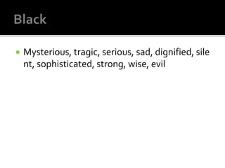
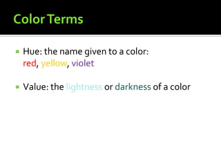
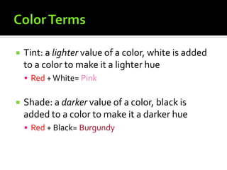
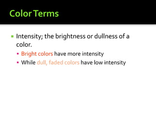
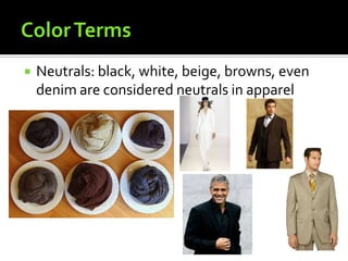
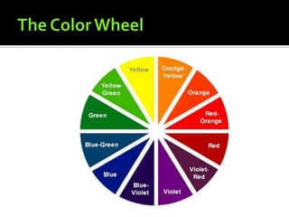
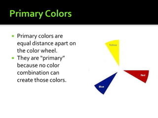
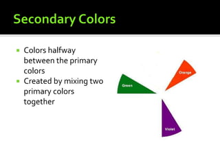
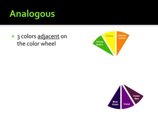
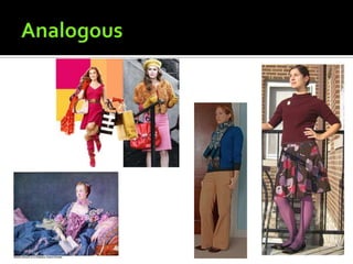
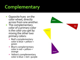
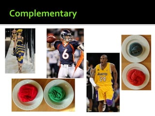
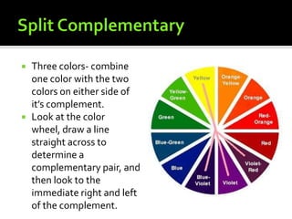
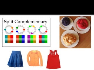
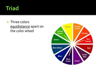
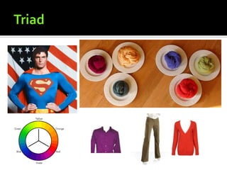
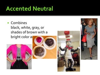
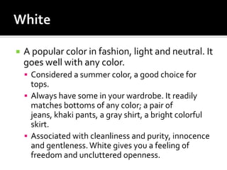
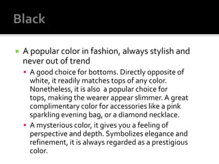
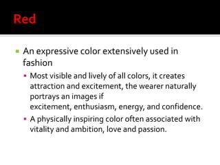
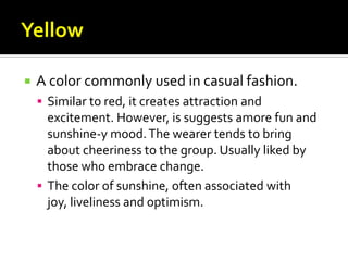
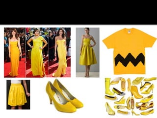
Part One
   It can make clothes seem warm or
    cool, bright or drab.
   It can create illusions of making you look
    taller or shorter, larger or smaller
   It can emphasize or play down your features
   The apparel industries stress new colors and
    color combinations each season. When they
    become popular, designers and promoters
    give them fashionable names.
   These new names are to convince you to need
    to wear these colors to be in fashion, because
    the colors are new and fresh on the fashion
    scene.
   Different colors invoke different emotions or
    thoughts in people


   What do the following colors make you feel?
   Hot, dangerous, angry, passionate, sentiment
    al, exciting, aggressive, vibrant and powerful
   Lively, cheerful, joyful, warm, energetic, hope
    ful, hospitable
   Bright, sunny, cheerful, warm, prosperous, co
    wardly, deceitful
   Calm, cool, fresh, friendly, pleasant,
    balanced, restful, lucky, envious
   Peaceful, calm, restful, serene, tranquil, sad,
    depressed, formal
   Royal, dignified, powerful, rich, dramatic, my
    sterious, wise, passionate
   Innocent, youthful, faithful, peaceful, pure
   Mysterious, tragic, serious, sad, dignified, sile
    nt, sophisticated, strong, wise, evil
   Modest, sad, old
   Hue: the name given to a color:
    red, yellow, violet

   Value: the lightness or darkness of a color
   Tint: a lighter value of a color, white is added
    to a color to make it a lighter hue
     Red + White= Pink


   Shade: a darker value of a color, black is
    added to a color to make it a darker hue
     Red + Black= Burgundy
   Intensity; the brightness or dullness of a
    color.
     Bright colors have more intensity
     While dull, faded colors have low intensity
   Neutrals: black, white, beige, browns, even
    denim are considered neutrals in apparel
 Primary colors are
  equal distance apart on
  the color wheel.
 They are “primary”
  because no color
  combination can
  create those colors.
 Colors halfway
  between the primary
  colors
 Created by mixing two
  primary colors
  together
 In between a primary
  and secondary colors.
 Created by mixing one
  primary with one
  secondary.
 Red, yellow, and
  orange
 They appear to
  advance, which makes
  they body look bigger
 Creates a
  lively, outgoing
  impression
   Green, blue, violet
   They appear to
    recede, which makes the
    body look smaller
   Gives the feeling of
    quietness and
    restfulness
   Many plus size designers
    use cool colors because
    it makes people wearing
    them look smaller
Part Two
   Different
    intensities, shades, and
    tints of one color.
     It is restful to the eye
     Neutrals can be added
      for contrast
   3 colors adjacent on
    the color wheel
   Opposite hues on the
    color wheel, directly
    across from one another.
   The complementary
    color of a primary color
    is the color you get by
    mixing the other two
    primary colors:
     Red's complementary
      color is blue + yellow =
      green
     Blue's complementary
      color is red + yellow =
      orange
     Yellow's complementary
      color is blue + red = purple
   Three colors- combine
    one color with the two
    colors on either side of
    it’s complement.
   Look at the color
    wheel, draw a line
    straight across to
    determine a
    complementary pair, and
    then look to the
    immediate right and left
    of the complement.
   Three colors
    equidistance apart on
    the color wheel
   Combines
    black, white, gray, or
    shades of brown with a
    bright color accent
   According to Rick Valens, a freelance writer
    for Fashion-In Style, brings to you new
    fashion and lifestyle ideas …
   A popular color in fashion, light and neutral. It
    goes well with any color.
     Considered a summer color, a good choice for
      tops.
     Always have some in your wardrobe. It readily
      matches bottoms of any color; a pair of
      jeans, khaki pants, a gray shirt, a bright colorful
      skirt.
     Associated with cleanliness and purity, innocence
      and gentleness. White gives you a feeling of
      freedom and uncluttered openness.
   A popular color in fashion, always stylish and
    never out of trend
     A good choice for bottoms. Directly opposite of
      white, it readily matches tops of any color.
      Nonetheless, it is also a popular choice for
      tops, making the wearer appear slimmer. A great
      complimentary color for accessories like a pink
      sparkling evening bag, or a diamond necklace.
     A mysterious color, it gives you a feeling of
      perspective and depth. Symbolizes elegance and
      refinement, it is always regarded as a prestigious
      color.
   An expressive color extensively used in
    fashion
     Most visible and lively of all colors, it creates
      attraction and excitement, the wearer naturally
      portrays an images if
      excitement, enthusiasm, energy, and confidence.
     A physically inspiring color often associated with
      vitality and ambition, love and passion.
   A color commonly used in casual fashion.
     Similar to red, it creates attraction and
      excitement. However, is suggests amore fun and
      sunshine-y mood. The wearer tends to bring
      about cheeriness to the group. Usually liked by
      those who embrace change.
     The color of sunshine, often associated with
      joy, liveliness and optimism.
   A popular color liked by most.
     Emotionally opposite to red and yellow, it brings
      about a soothing and relaxed feeling; pleasant to
      the eyes. Naturally refreshing in mood, it’s a good
      choice for daytime wear.
     The color of summer skies and seas, often
      associated with calmness, affection, idealism and
      inspiration.
   A feminine color
     Similar to blue, it’s soothing to and pleasant to the
      eyes. Naturally sweet in moon, it has a lasting
      girly appeal. Girls in pink tend to portray a very
      sweet and pleasant image, always attractive to
      the guys.
     The color of cotton candy, often associated with
      warm, everlasting affection and tender love.
   Brown tends to be casual and informal
Colors- fashion design

Colors- fashion design

  • 1.
  • 2.
    It can make clothes seem warm or cool, bright or drab.  It can create illusions of making you look taller or shorter, larger or smaller  It can emphasize or play down your features
  • 3.
    The apparel industries stress new colors and color combinations each season. When they become popular, designers and promoters give them fashionable names.  These new names are to convince you to need to wear these colors to be in fashion, because the colors are new and fresh on the fashion scene.
  • 4.
    Different colors invoke different emotions or thoughts in people  What do the following colors make you feel?
  • 6.
    Hot, dangerous, angry, passionate, sentiment al, exciting, aggressive, vibrant and powerful
  • 8.
    Lively, cheerful, joyful, warm, energetic, hope ful, hospitable
  • 10.
    Bright, sunny, cheerful, warm, prosperous, co wardly, deceitful
  • 12.
    Calm, cool, fresh, friendly, pleasant, balanced, restful, lucky, envious
  • 14.
    Peaceful, calm, restful, serene, tranquil, sad, depressed, formal
  • 16.
    Royal, dignified, powerful, rich, dramatic, my sterious, wise, passionate
  • 18.
    Innocent, youthful, faithful, peaceful, pure
  • 20.
    Mysterious, tragic, serious, sad, dignified, sile nt, sophisticated, strong, wise, evil
  • 22.
    Modest, sad, old
  • 23.
    Hue: the name given to a color: red, yellow, violet  Value: the lightness or darkness of a color
  • 24.
    Tint: a lighter value of a color, white is added to a color to make it a lighter hue  Red + White= Pink  Shade: a darker value of a color, black is added to a color to make it a darker hue  Red + Black= Burgundy
  • 25.
    Intensity; the brightness or dullness of a color.  Bright colors have more intensity  While dull, faded colors have low intensity
  • 26.
    Neutrals: black, white, beige, browns, even denim are considered neutrals in apparel
  • 28.
     Primary colorsare equal distance apart on the color wheel.  They are “primary” because no color combination can create those colors.
  • 29.
     Colors halfway between the primary colors  Created by mixing two primary colors together
  • 30.
     In betweena primary and secondary colors.  Created by mixing one primary with one secondary.
  • 31.
     Red, yellow,and orange  They appear to advance, which makes they body look bigger  Creates a lively, outgoing impression
  • 32.
    Green, blue, violet  They appear to recede, which makes the body look smaller  Gives the feeling of quietness and restfulness  Many plus size designers use cool colors because it makes people wearing them look smaller
  • 33.
  • 34.
    Different intensities, shades, and tints of one color.  It is restful to the eye  Neutrals can be added for contrast
  • 36.
    3 colors adjacent on the color wheel
  • 38.
    Opposite hues on the color wheel, directly across from one another.  The complementary color of a primary color is the color you get by mixing the other two primary colors:  Red's complementary color is blue + yellow = green  Blue's complementary color is red + yellow = orange  Yellow's complementary color is blue + red = purple
  • 40.
    Three colors- combine one color with the two colors on either side of it’s complement.  Look at the color wheel, draw a line straight across to determine a complementary pair, and then look to the immediate right and left of the complement.
  • 42.
    Three colors equidistance apart on the color wheel
  • 44.
    Combines black, white, gray, or shades of brown with a bright color accent
  • 45.
    According to Rick Valens, a freelance writer for Fashion-In Style, brings to you new fashion and lifestyle ideas …
  • 46.
    A popular color in fashion, light and neutral. It goes well with any color.  Considered a summer color, a good choice for tops.  Always have some in your wardrobe. It readily matches bottoms of any color; a pair of jeans, khaki pants, a gray shirt, a bright colorful skirt.  Associated with cleanliness and purity, innocence and gentleness. White gives you a feeling of freedom and uncluttered openness.
  • 48.
    A popular color in fashion, always stylish and never out of trend  A good choice for bottoms. Directly opposite of white, it readily matches tops of any color. Nonetheless, it is also a popular choice for tops, making the wearer appear slimmer. A great complimentary color for accessories like a pink sparkling evening bag, or a diamond necklace.  A mysterious color, it gives you a feeling of perspective and depth. Symbolizes elegance and refinement, it is always regarded as a prestigious color.
  • 50.
    An expressive color extensively used in fashion  Most visible and lively of all colors, it creates attraction and excitement, the wearer naturally portrays an images if excitement, enthusiasm, energy, and confidence.  A physically inspiring color often associated with vitality and ambition, love and passion.
  • 52.
    A color commonly used in casual fashion.  Similar to red, it creates attraction and excitement. However, is suggests amore fun and sunshine-y mood. The wearer tends to bring about cheeriness to the group. Usually liked by those who embrace change.  The color of sunshine, often associated with joy, liveliness and optimism.
  • 54.
    A popular color liked by most.  Emotionally opposite to red and yellow, it brings about a soothing and relaxed feeling; pleasant to the eyes. Naturally refreshing in mood, it’s a good choice for daytime wear.  The color of summer skies and seas, often associated with calmness, affection, idealism and inspiration.
  • 56.
    A feminine color  Similar to blue, it’s soothing to and pleasant to the eyes. Naturally sweet in moon, it has a lasting girly appeal. Girls in pink tend to portray a very sweet and pleasant image, always attractive to the guys.  The color of cotton candy, often associated with warm, everlasting affection and tender love.
  • 58.
    Brown tends to be casual and informal