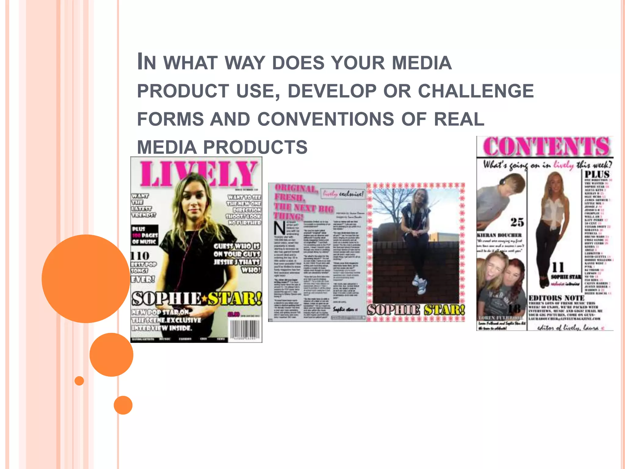
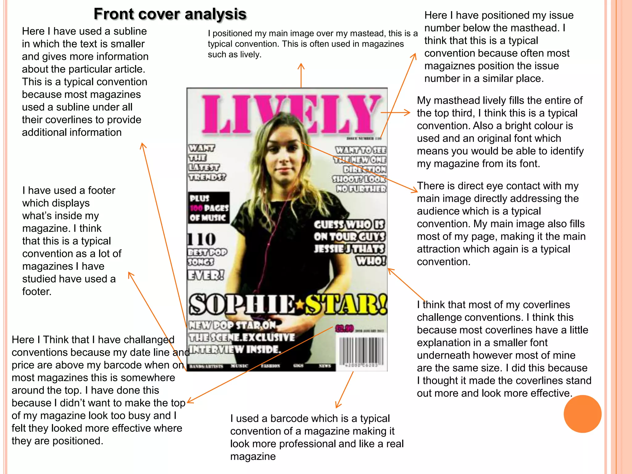
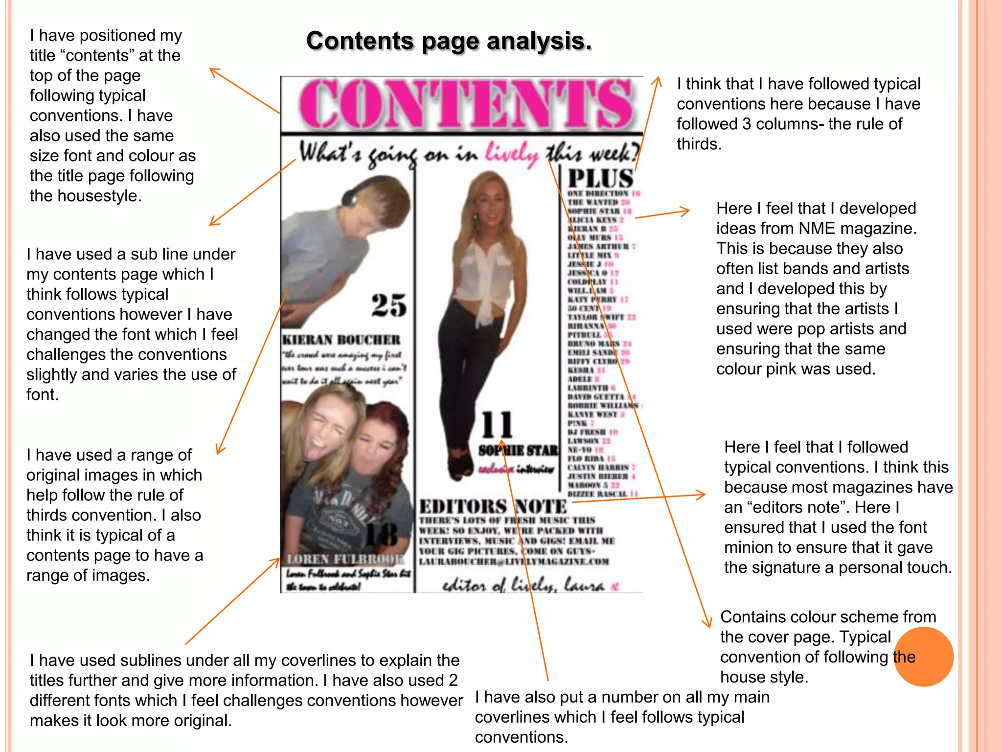
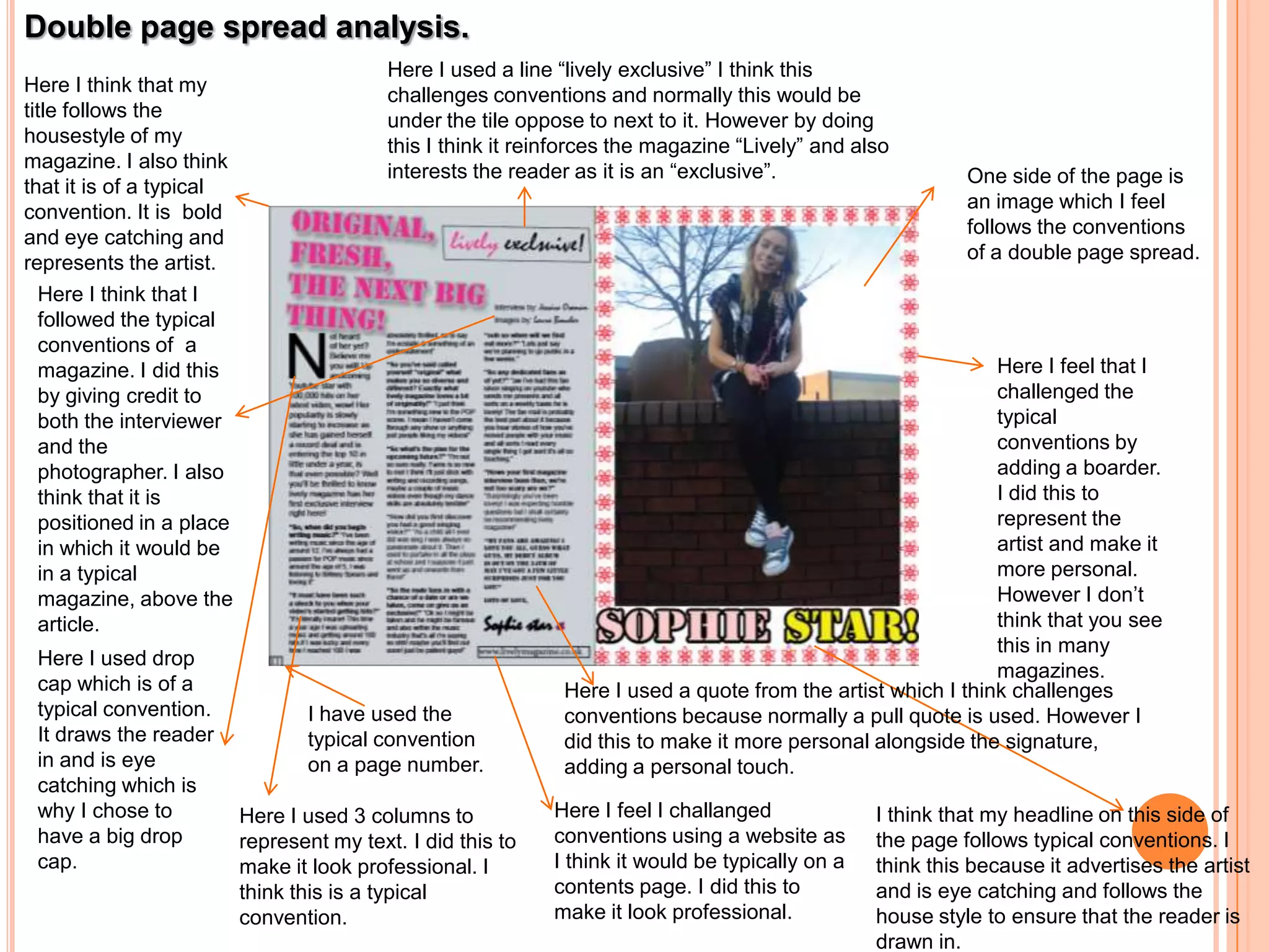
IN WHAT WAY DOES YOUR MEDIA
PRODUCT USE, DEVELOP OR CHALLENGE
FORMS AND CONVENTIONS OF REAL
MEDIA PRODUCTS
Front cover analysis                                                        Here I have positioned my issue
  Here I have used a subline            I positioned my main image over my mastead, this is a
                                                                                              number below the masthead. I
  in which the text is smaller          typical convention. This is often used in magazines   think that this is a typical
  and gives more information            such as lively.                                       convention because often most
  about the particular article.                                                               magaiznes position the issue
  This is a typical convention                                                                number in a similar place.
  because most magazines
                                                                                        My masthead lively fills the entire of
  used a subline under all
                                                                                        the top third, I think this is a typical
  their coverlines to provide
                                                                                        convention. Also a bright colour is
  additional information
                                                                                        used and an original font which
                                                                                        means you would be able to identify
                                                                                        my magazine from its font.

  I have used a footer                                                                  There is direct eye contact with my
  which displays                                                                        main image directly addressing the
  what’s inside my                                                                      audience which is a typical
  magazine. I think                                                                     convention. My main image also fills
  that this is a typical                                                                most of my page, making it the main
  convention as a lot of                                                                attraction which again is a typical
  magazines I have                                                                      convention.
  studied have used a
  footer.
                                                                                        I think that most of my coverlines
                                                                                        challenge conventions. I think this
                                                                                        because most coverlines have a little
Here I Think that I have challanged                                                     explanation in a smaller font
conventions because my date line and                                                    underneath however most of mine
price are above my barcode when on                                                      are the same size. I did this because
most magazines this is somewhere                                                        I thought it made the coverlines stand
around the top. I have done this                                                        out more and look more effective.
because I didn’t want to make the top
of my magazine look too busy and I           I used a barcode which is a typical
felt they looked more effective where        convention of a magazine making it
they are positioned.                         look more professional and like a real
                                             magazine
I have positioned my                 Contents page analysis.
title “contents” at the
top of the page
                                                                                       I think that I have followed typical
following typical
                                                                                       conventions here because I have
conventions. I have
                                                                                       followed 3 columns- the rule of
also used the same
                                                                                       thirds.
size font and colour as
the title page following
the housestyle.
                                                                                             Here I feel that I developed
                                                                                             ideas from NME magazine.
I have used a sub line under                                                                 This is because they also
my contents page which I                                                                     often list bands and artists
think follows typical                                                                        and I developed this by
conventions however I have                                                                   ensuring that the artists I
changed the font which I feel                                                                used were pop artists and
challenges the conventions                                                                   ensuring that the same
slightly and varies the use of                                                               colour pink was used.
font.


I have used a range of                                                                        Here I feel that I followed
original images in which                                                                      typical conventions. I think this
help follow the rule of                                                                       because most magazines have
thirds convention. I also                                                                     an “editors note”. Here I
think it is typical of a                                                                      ensured that I used the font
contents page to have a                                                                       minion to ensure that it gave
range of images.                                                                              the signature a personal touch.

                                                                                                Contains colour scheme from
                                                                                                the cover page. Typical
I have used sublines under all my coverlines to explain the                                     convention of following the
titles further and give more information. I have also used 2                                    house style.
different fonts which I feel challenges conventions however I have also put a number on all my main
makes it look more original.                                 coverlines which I feel follows typical
                                                             conventions.
Double page spread analysis.
                                            Here I used a line “lively exclusive” I think this
Here I think that my                        challenges conventions and normally this would be
title follows the                           under the tile oppose to next to it. However by doing
housestyle of my                            this I think it reinforces the magazine “Lively” and also
magazine. I also think                      interests the reader as it is an “exclusive”.
that it is of a typical                                                                                      One side of the page is
convention. It is bold                                                                                       an image which I feel
and eye catching and                                                                                         follows the conventions
represents the artist.                                                                                       of a double page spread.
   Here I think that I
   followed the typical
   conventions of a
   magazine. I did this                                                                                         Here I feel that I
   by giving credit to                                                                                          challenged the
   both the interviewer                                                                                         typical
   and the                                                                                                      conventions by
   photographer. I also                                                                                         adding a boarder.
   think that it is                                                                                             I did this to
   positioned in a place                                                                                        represent the
   in which it would be                                                                                         artist and make it
   in a typical                                                                                                 more personal.
   magazine, above the                                                                                          However I don’t
   article.                                                                                                     think that you see
                                                                                                                this in many
 Here I used drop
                                                                                                                magazines.
 cap which is of a                                              Here I used a quote from the artist which I think challenges
 typical convention.              I have used the               conventions because normally a pull quote is used. However I
 It draws the reader              typical convention            did this to make it more personal alongside the signature,
 in and is eye                    on a page number.             adding a personal touch.
 catching which is
 why I chose to            Here I used 3 columns to           Here I feel I challanged             I think that my headline on this side of
 have a big drop           represent my text. I did this to   conventions using a website as       the page follows typical conventions. I
 cap.                      make it look professional. I       I think it would be typically on a   think this because it advertises the artist
                           think this is a typical            contents page. I did this to         and is eye catching and follows the
                           convention.                        make it look professional.           house style to ensure that the reader is
                                                                                                   drawn in.

Evaluation question number 1.

  • 1.
    IN WHAT WAYDOES YOUR MEDIA PRODUCT USE, DEVELOP OR CHALLENGE FORMS AND CONVENTIONS OF REAL MEDIA PRODUCTS
  • 2.
    Front cover analysis Here I have positioned my issue Here I have used a subline I positioned my main image over my mastead, this is a number below the masthead. I in which the text is smaller typical convention. This is often used in magazines think that this is a typical and gives more information such as lively. convention because often most about the particular article. magaiznes position the issue This is a typical convention number in a similar place. because most magazines My masthead lively fills the entire of used a subline under all the top third, I think this is a typical their coverlines to provide convention. Also a bright colour is additional information used and an original font which means you would be able to identify my magazine from its font. I have used a footer There is direct eye contact with my which displays main image directly addressing the what’s inside my audience which is a typical magazine. I think convention. My main image also fills that this is a typical most of my page, making it the main convention as a lot of attraction which again is a typical magazines I have convention. studied have used a footer. I think that most of my coverlines challenge conventions. I think this because most coverlines have a little Here I Think that I have challanged explanation in a smaller font conventions because my date line and underneath however most of mine price are above my barcode when on are the same size. I did this because most magazines this is somewhere I thought it made the coverlines stand around the top. I have done this out more and look more effective. because I didn’t want to make the top of my magazine look too busy and I I used a barcode which is a typical felt they looked more effective where convention of a magazine making it they are positioned. look more professional and like a real magazine
  • 3.
    I have positionedmy Contents page analysis. title “contents” at the top of the page I think that I have followed typical following typical conventions here because I have conventions. I have followed 3 columns- the rule of also used the same thirds. size font and colour as the title page following the housestyle. Here I feel that I developed ideas from NME magazine. I have used a sub line under This is because they also my contents page which I often list bands and artists think follows typical and I developed this by conventions however I have ensuring that the artists I changed the font which I feel used were pop artists and challenges the conventions ensuring that the same slightly and varies the use of colour pink was used. font. I have used a range of Here I feel that I followed original images in which typical conventions. I think this help follow the rule of because most magazines have thirds convention. I also an “editors note”. Here I think it is typical of a ensured that I used the font contents page to have a minion to ensure that it gave range of images. the signature a personal touch. Contains colour scheme from the cover page. Typical I have used sublines under all my coverlines to explain the convention of following the titles further and give more information. I have also used 2 house style. different fonts which I feel challenges conventions however I have also put a number on all my main makes it look more original. coverlines which I feel follows typical conventions.
  • 4.
    Double page spreadanalysis. Here I used a line “lively exclusive” I think this Here I think that my challenges conventions and normally this would be title follows the under the tile oppose to next to it. However by doing housestyle of my this I think it reinforces the magazine “Lively” and also magazine. I also think interests the reader as it is an “exclusive”. that it is of a typical One side of the page is convention. It is bold an image which I feel and eye catching and follows the conventions represents the artist. of a double page spread. Here I think that I followed the typical conventions of a magazine. I did this Here I feel that I by giving credit to challenged the both the interviewer typical and the conventions by photographer. I also adding a boarder. think that it is I did this to positioned in a place represent the in which it would be artist and make it in a typical more personal. magazine, above the However I don’t article. think that you see this in many Here I used drop magazines. cap which is of a Here I used a quote from the artist which I think challenges typical convention. I have used the conventions because normally a pull quote is used. However I It draws the reader typical convention did this to make it more personal alongside the signature, in and is eye on a page number. adding a personal touch. catching which is why I chose to Here I used 3 columns to Here I feel I challanged I think that my headline on this side of have a big drop represent my text. I did this to conventions using a website as the page follows typical conventions. I cap. make it look professional. I I think it would be typically on a think this because it advertises the artist think this is a typical contents page. I did this to and is eye catching and follows the convention. make it look professional. house style to ensure that the reader is drawn in.