
Recommended
More Related Content
What's hot
What's hot (17)
Viewers also liked
Similar to Part 1 questions 1,2,3,4
Similar to Part 1 questions 1,2,3,4 (20)
Recently uploaded
Recently uploaded (20)
Part 1 questions 1,2,3,4
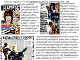
- 1. 1. In what ways does your media product use, develop and challenge forms and As the contents page has to conventions of real media products? generically represent all the Generically the masthead and the subgenres that you could expect main image have to be carefully to find within the magazine. I chosen to match and set of the challenged the conventions and I style and genre of the magazine. made it look like a track list from a My image is powerful and looks as CD. As this is not a gossip though she is shouting which magazine I didn’t see it necessary would equate to a loud rock to include an editors letter. The magazine as would that of the title actual content of the pages is all that is distressed or broken. I used music related to show that my eye contact which draws in the magazine does not stray from the readers attention. To also reinforce conventions. There is a clear the fact that is a loud rock division between the text and the magazine that is up to date I have image to make the text easy to used iconography in the forms of read and in black and white so it is tattoos and paint splats which easy to understand, this also helps represent mess and ‘rebellion’. The for the readers that browse to find connotations of the word rebellion the familiar sections that they suggests that the magazine is want to read. different. The conventions of a double page spread show that the title is normally at the top of the two pages and to this I didn't break the convention. The actual language of the text is less formal than an article you may find in a news paper or some music magazines but it had to contain technical terms that would interest the intended audience. The images had to be of the band featured and they also followed the conventions of using images that would normally been found in a live performance, I challenged the conventions in this instance by layering the photos instead of it being all of one straight image from one shoot. Conventionally there is clearly a division between the text and images, I challenged this convention by using different shapes such as staircase shaping of the text. To fill the spaces I added in images and icons that give the band an identity and are supposed to give them some age to the iconography in using written titles that show they could still be in school. It is a generic convention to make sure that the title on the double page spread has had more thought put into it than other titles on less significant pages.
- 2. 2. What have you learnt about the technologies from the process of creating this product? Blogger.com is a blogging website that I had not used before, I learnt a lot from it for example how to blog and a new modern way to present work. I found this to be the most important technology in the production of my media magazine. I posted all of my work onto this website. Microsoft publisher was the second most important technological device that I used as it was the programme that I created my final outcome on. This version of 2011 is the most recent and I had to learn the new options I could use that would generate the best outcome. After learning all I could from this programme I made all three of my final pieces on it. ‘dafont.com’ is another website and was one of the key technologies I used for the image and design of my magazine. From this website I selected all the fonts for the titles, subheadings, and in some cases such as the contents page I used it for the main text. The reason I used this was because it contained the most original and creative fonts this would help to make my magazine individual and stand out against competing magazines. Surveymonkey was the 4th most important and the second technology that was new to me. This website was useful as I could use it to gather research and general opinions as to what to include in the magazine. From this I have discovered a new way of collating useful data that is relevant for my product and also how to gain ideas on what to make. Macromedia fireworks I use frequently when editing any images and I found this technology to be particularly useful within this product. I learnt about some of the newer features and experimented with some of the optional techniques of editing such as that of the ‘blur’ tool that can give the illusion of an airbrushed outcome and a professional finish. I edited most of my images on this programme such as that of the contents pages. Photoshop I had not previously used before because most of the features were already available on fireworks, this technology is more advanced than that of fireworks so it was more difficult to understand. The editing options are also more advanced and I could manipulate an image in anyway necessary. Google is one of the most used technologies readily available. I have used it many times before so there was not much more I could learn from this. I did learn how to find information in different formats such as searching intentionally for a PDF file specifically and it was also used to research existing products.
- 3. How does your media product represent a particular social group ? Representation of indie rock artists: Representation of my indie rock music fans: •The front cover shows •My music readers are represented through the use of the typical indie rock language within the text passages. The texts show that the artist. readers are intelligent because of the technical music •The image itself is large terminology. and fills the whole page •The music terminology can also be used to show that the to represent confidence. reader has a passion for music, it can also show that they •The artist has tattoos may play in a band themselves. and a contempory hair •In my reader profile I disclosed that my readers were cut that show an creative which I have shown through iconography and in my expressionist nature. space filling images. •Even the language of the text can be used to represent the •My readers have also been social group, for example the artists name that is bannered represented through the across the page is written with one capital instead of two that artists because of the music can represent how the artist is different and unique. they represent themselves. •The artist on the front cover is shown with her mouth open to •The language of the text suggest that she may be shouting, this can be seen by a is chatty in places and consumer to suggest that it is a loud music magazine i.e. indie slightly informal which rock. represents the reader as •The font has been selected to represent this social group of someone that is following indie rockers also because it is distorted and quirky which there music idol. represents something different to the normal everyday music •The contents on the contents page represents the topics that is available such as pop. that the readers could be interested in or have a passion for •A reader can also distinguish the social group by suggesting that the social group is musically orientated. the clothes that they are wearing mostly recognisable by the bands clothes.
- 4. 4.What kind of media institution might distribute you media product? and why ? IPC media would be a good distributor for my particular music magazine. This is because IPC media currently distribute some of the magazines that gave me inspiration for mine, magazines such as NME and UNCUT. Another reason for IPC media would be that their company distribute niche market magazines, and a indie /rock magazine is not categorised as a niche market magazine giving IPC a different opportunity in sales. IPC media does not produce many music magazines currently which would give my magazine an edge and unique selling point in comparison. IPC media’s current magazines distribute to major supermarkets such as ASDA, Morrisons, and Tesco. These supermarkets being of a large industrial size, would help to get my magazine recognised and distributed in the most efficient and cost effective manor. As I would like my magazine to be distributed into a mainstream audience these supermarkets being nationwide would help the magazine to be purchased all over the UK and not specifically available in certain areas such as many London music magazines.