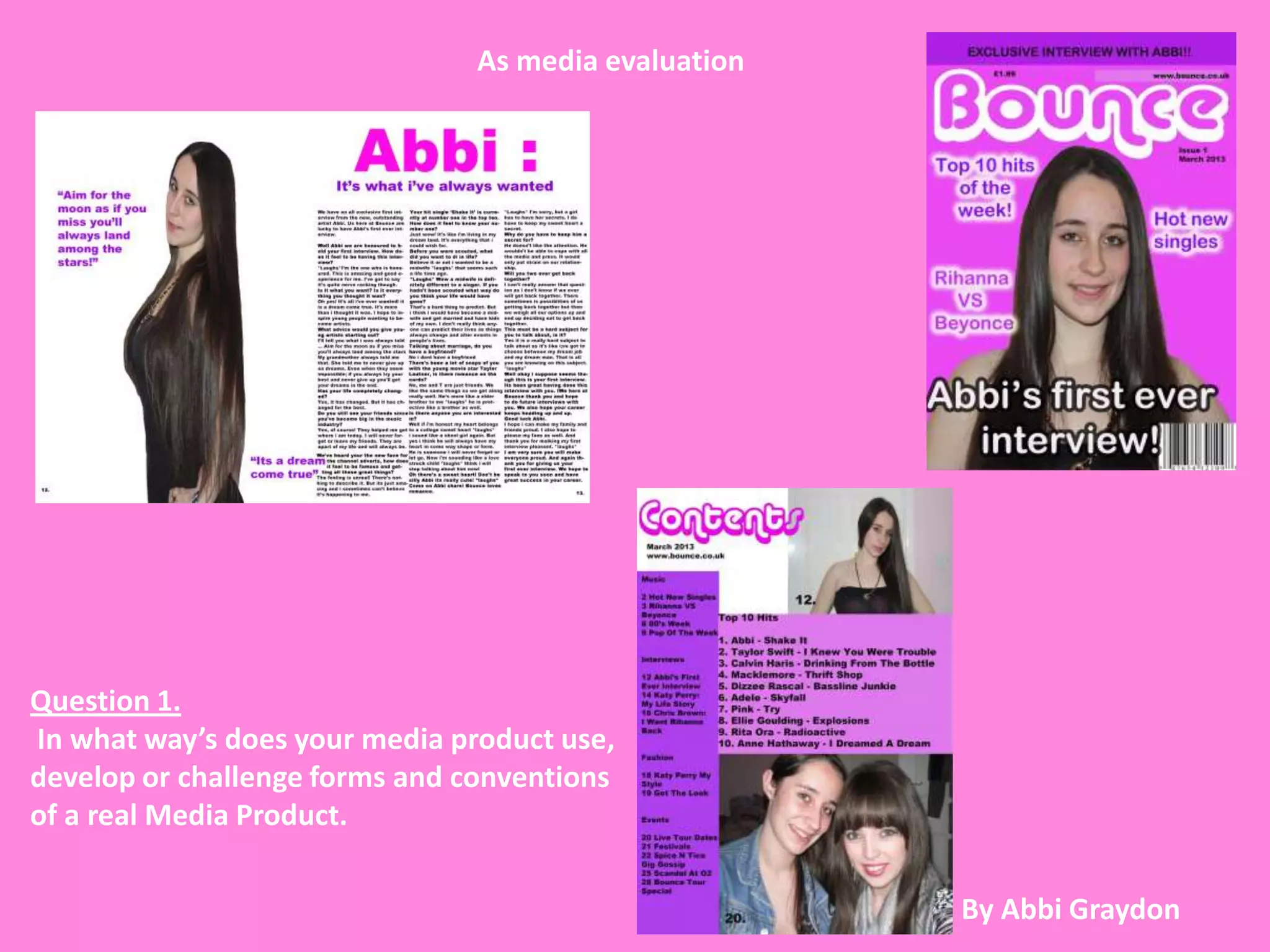
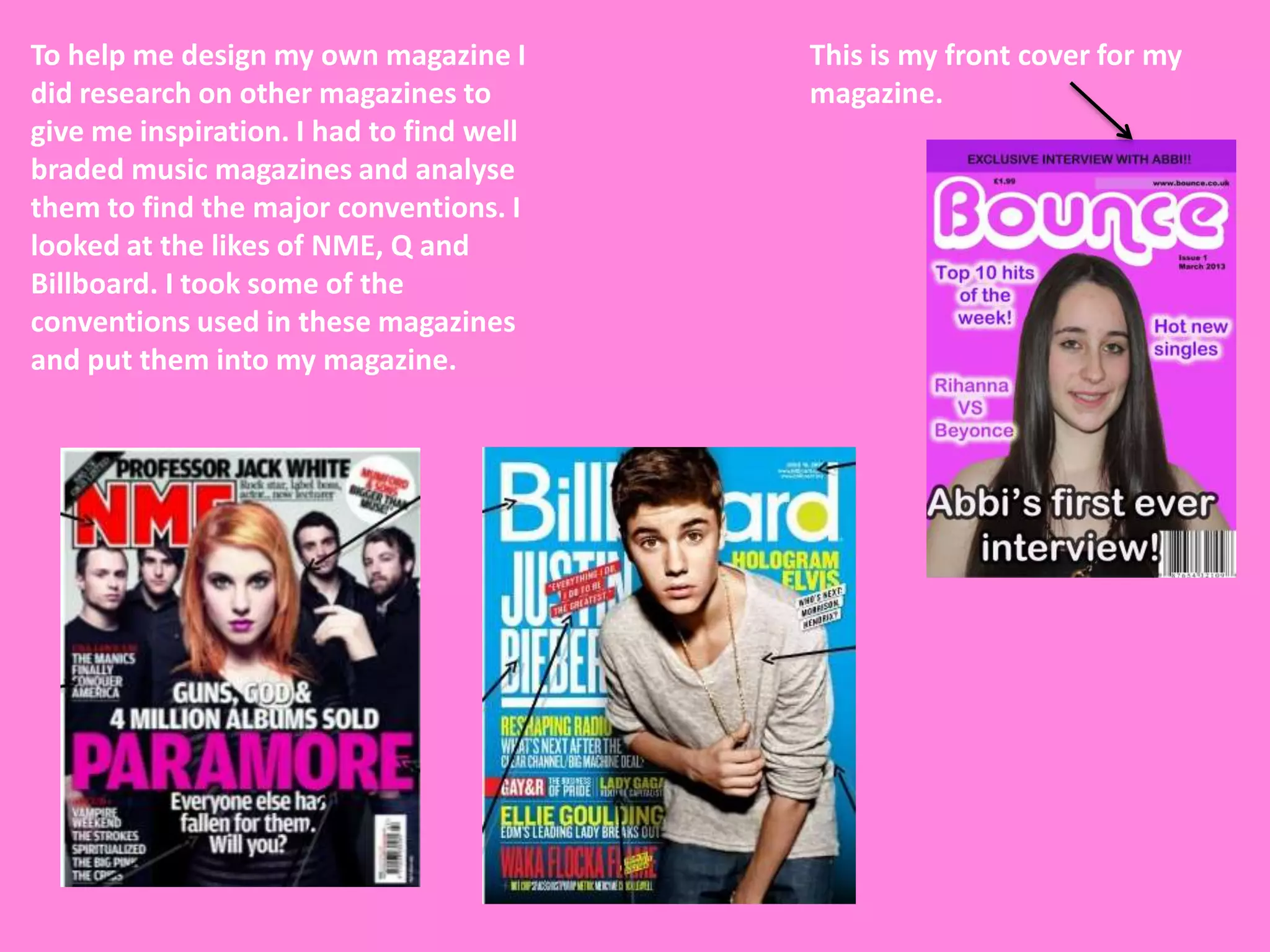
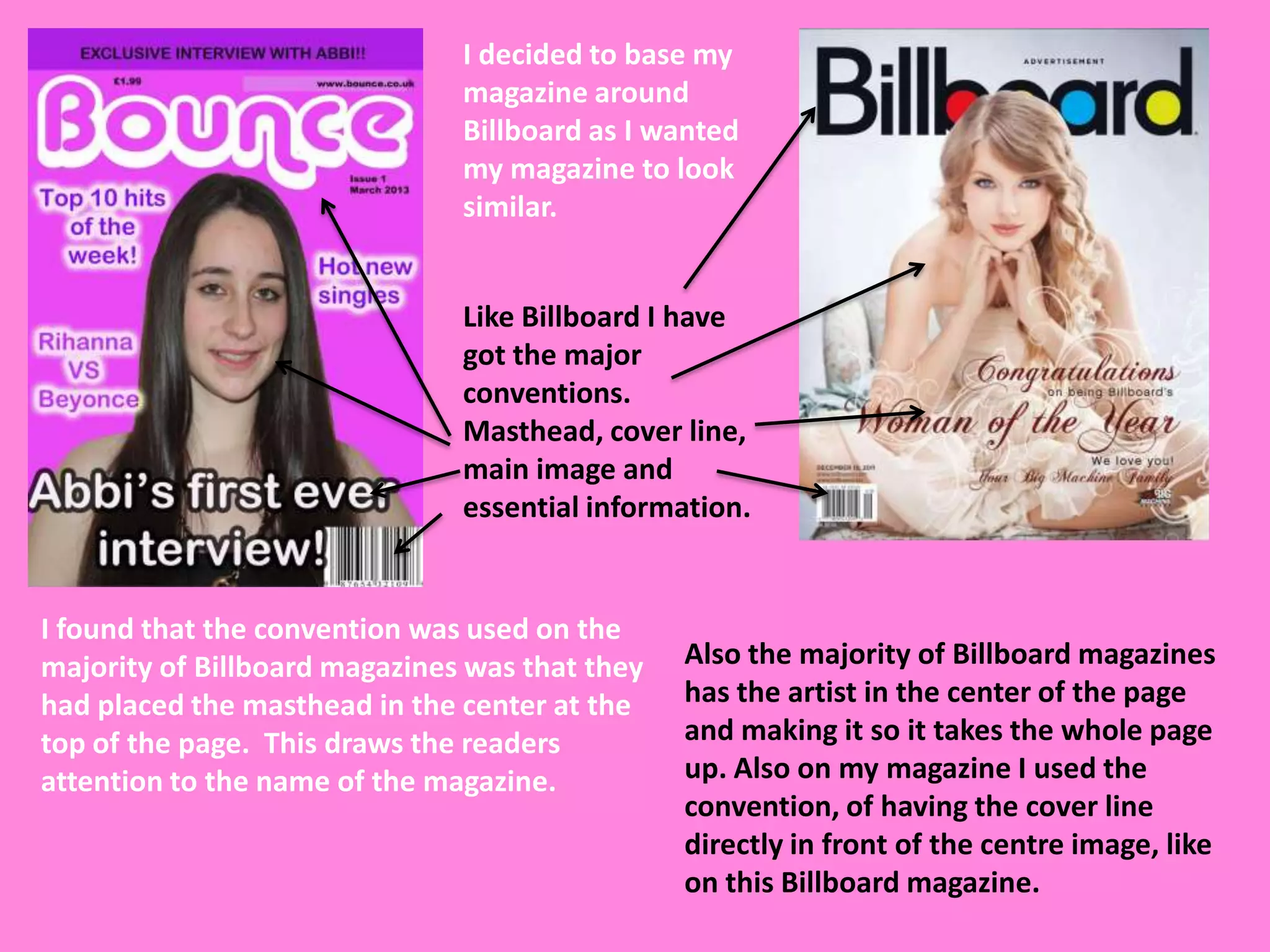
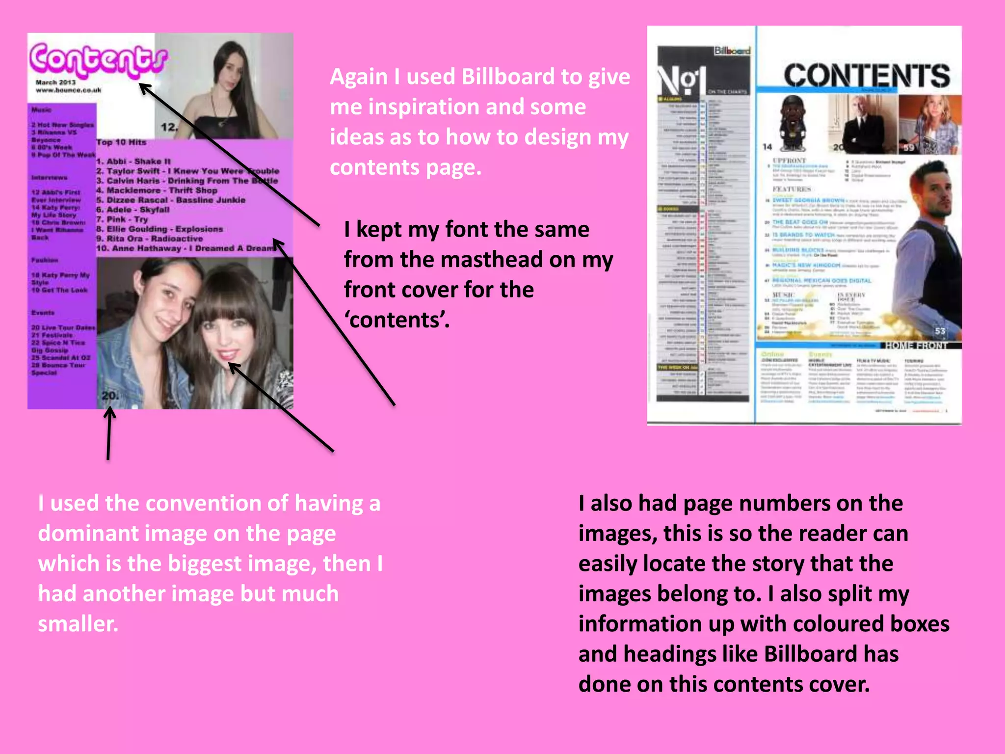
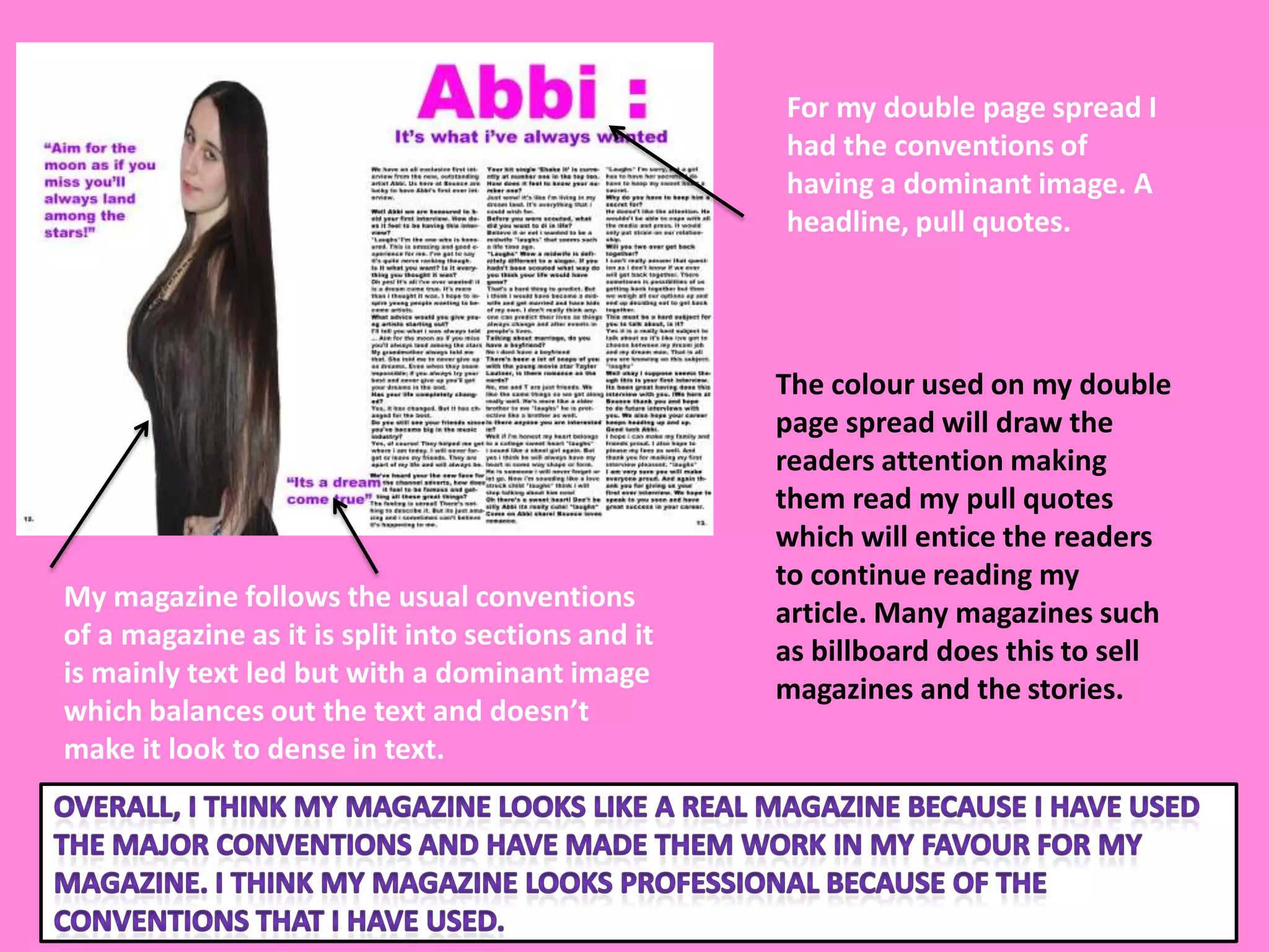
As media evaluation


Question 1.
In what way’s does your media product use,
develop or challenge forms and conventions
of a real Media Product.

                                                      By Abbi Graydon
To help me design my own magazine I       This is my front cover for my
did research on other magazines to        magazine.
give me inspiration. I had to find well
braded music magazines and analyse
them to find the major conventions. I
looked at the likes of NME, Q and
Billboard. I took some of the
conventions used in these magazines
and put them into my magazine.
I decided to base my
                               magazine around
                               Billboard as I wanted
                               my magazine to look
                               similar.


                               Like Billboard I have
                               got the major
                               conventions.
                               Masthead, cover line,
                               main image and
                               essential information.


I found that the convention was used on the
majority of Billboard magazines was that they   Also the majority of Billboard magazines
had placed the masthead in the center at the    has the artist in the center of the page
top of the page. This draws the readers         and making it so it takes the whole page
attention to the name of the magazine.          up. Also on my magazine I used the
                                                convention, of having the cover line
                                                directly in front of the centre image, like
                                                on this Billboard magazine.
Again I used Billboard to give
                            me inspiration and some
                            ideas as to how to design my
                            contents page.

                              I kept my font the same
                              from the masthead on my
                              front cover for the
                              ‘contents’.


I used the convention of having a                   I also had page numbers on the
dominant image on the page                          images, this is so the reader can
which is the biggest image, then I                  easily locate the story that the
had another image but much                          images belong to. I also split my
smaller.                                            information up with coloured boxes
                                                    and headings like Billboard has
                                                    done on this contents cover.
For my double page spread I
                                                    had the conventions of
                                                    having a dominant image. A
                                                    headline, pull quotes.


                                                    The colour used on my double
                                                    page spread will draw the
                                                    readers attention making
                                                    them read my pull quotes
                                                    which will entice the readers
                                                    to continue reading my
My magazine follows the usual conventions
                                                    article. Many magazines such
of a magazine as it is split into sections and it
                                                    as billboard does this to sell
is mainly text led but with a dominant image
                                                    magazines and the stories.
which balances out the text and doesn’t
make it look to dense in text.

As media evaluation for magazine question 1

  • 1.
    As media evaluation Question1. In what way’s does your media product use, develop or challenge forms and conventions of a real Media Product. By Abbi Graydon
  • 2.
    To help medesign my own magazine I This is my front cover for my did research on other magazines to magazine. give me inspiration. I had to find well braded music magazines and analyse them to find the major conventions. I looked at the likes of NME, Q and Billboard. I took some of the conventions used in these magazines and put them into my magazine.
  • 3.
    I decided tobase my magazine around Billboard as I wanted my magazine to look similar. Like Billboard I have got the major conventions. Masthead, cover line, main image and essential information. I found that the convention was used on the majority of Billboard magazines was that they Also the majority of Billboard magazines had placed the masthead in the center at the has the artist in the center of the page top of the page. This draws the readers and making it so it takes the whole page attention to the name of the magazine. up. Also on my magazine I used the convention, of having the cover line directly in front of the centre image, like on this Billboard magazine.
  • 4.
    Again I usedBillboard to give me inspiration and some ideas as to how to design my contents page. I kept my font the same from the masthead on my front cover for the ‘contents’. I used the convention of having a I also had page numbers on the dominant image on the page images, this is so the reader can which is the biggest image, then I easily locate the story that the had another image but much images belong to. I also split my smaller. information up with coloured boxes and headings like Billboard has done on this contents cover.
  • 5.
    For my doublepage spread I had the conventions of having a dominant image. A headline, pull quotes. The colour used on my double page spread will draw the readers attention making them read my pull quotes which will entice the readers to continue reading my My magazine follows the usual conventions article. Many magazines such of a magazine as it is split into sections and it as billboard does this to sell is mainly text led but with a dominant image magazines and the stories. which balances out the text and doesn’t make it look to dense in text.