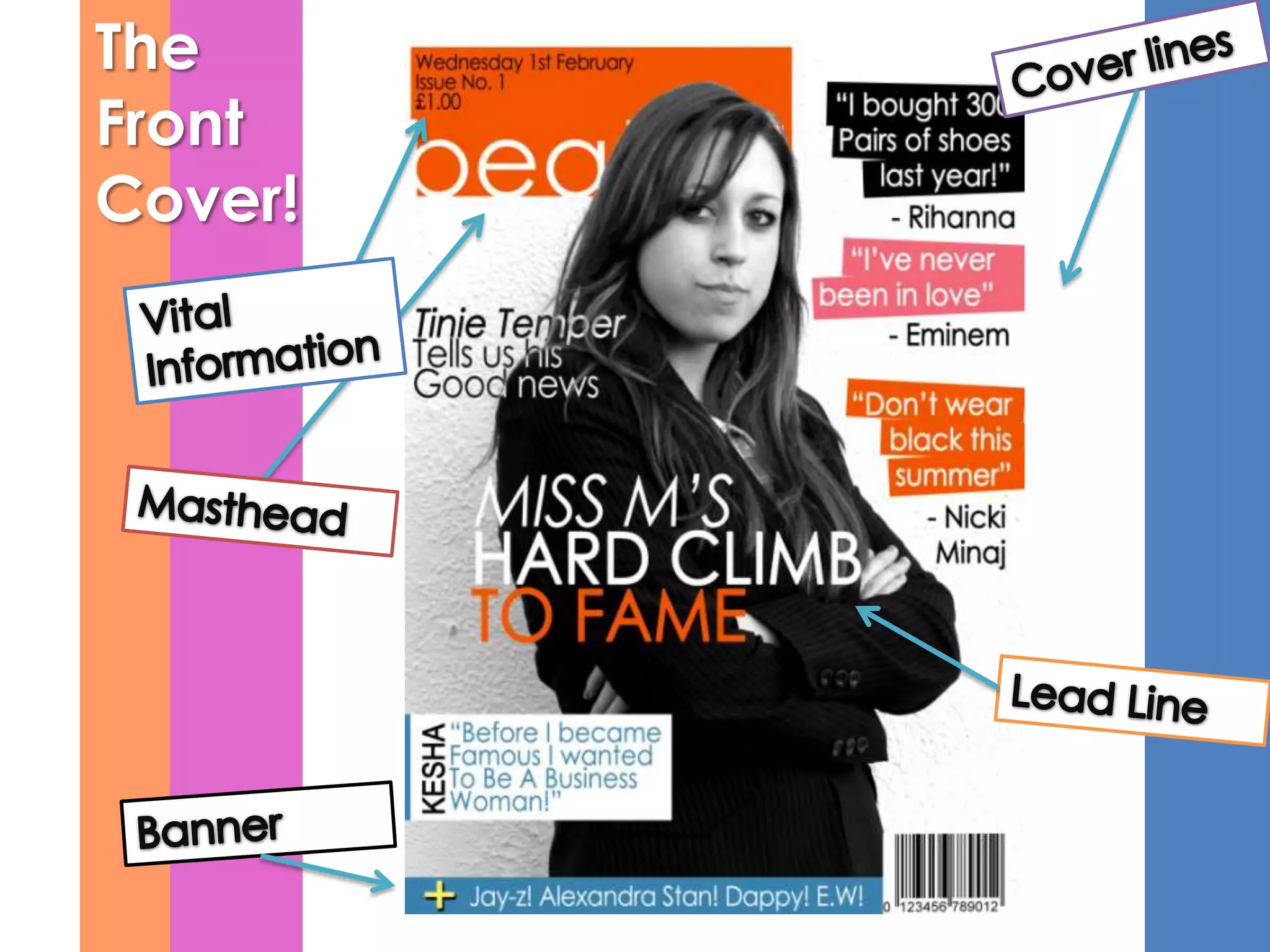
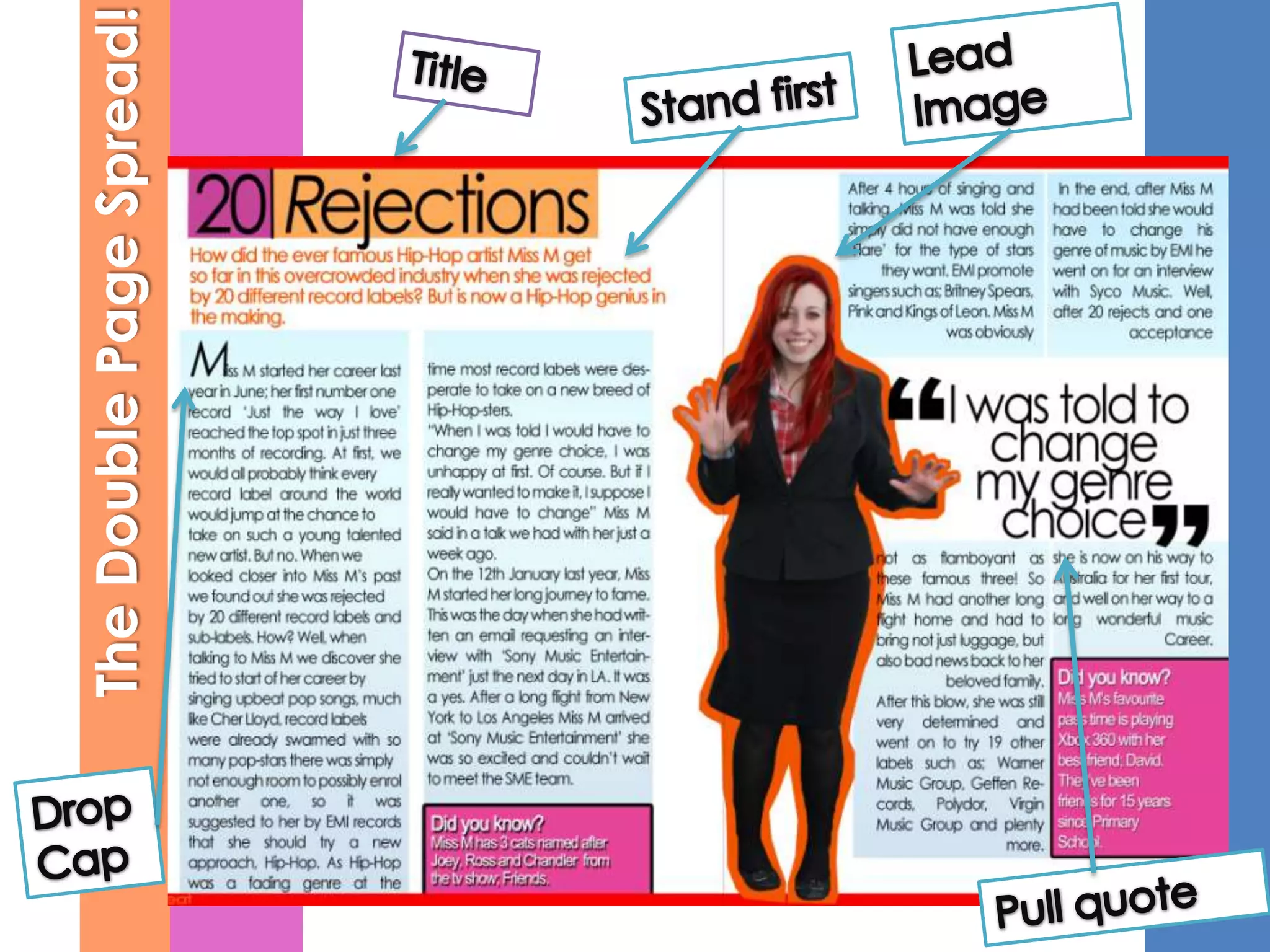
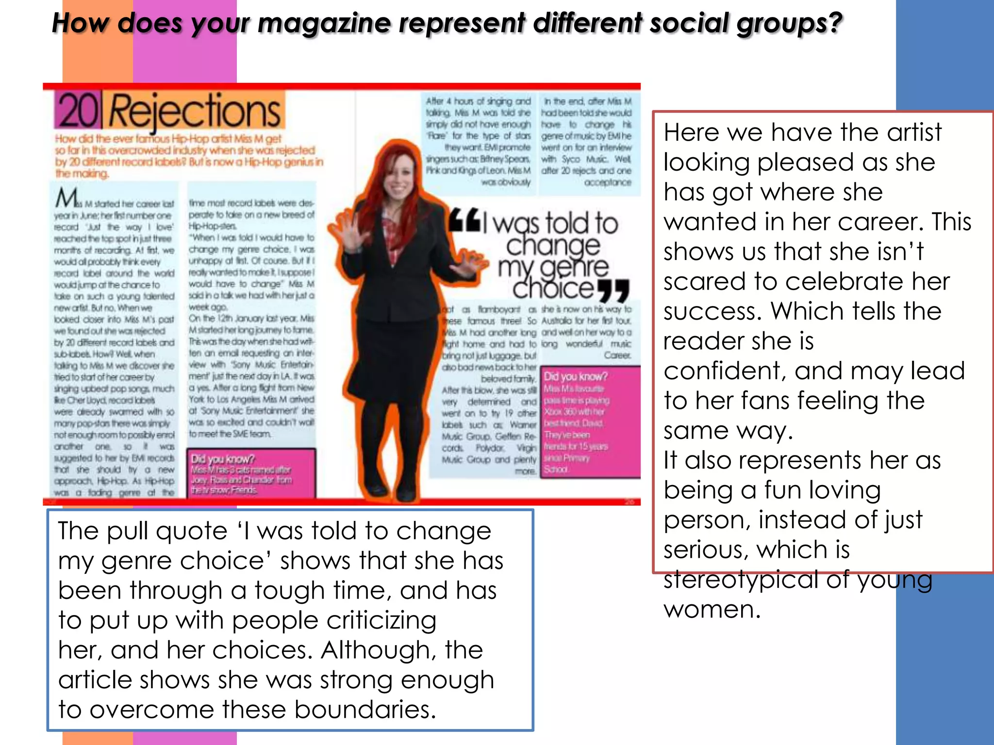
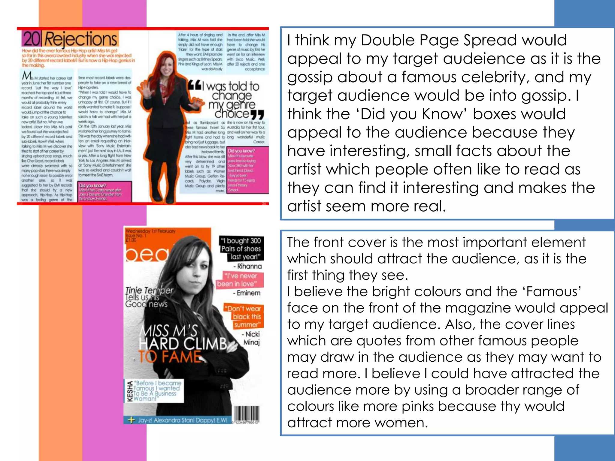
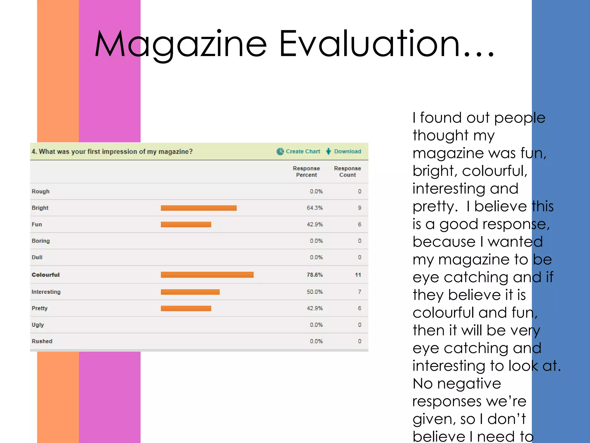
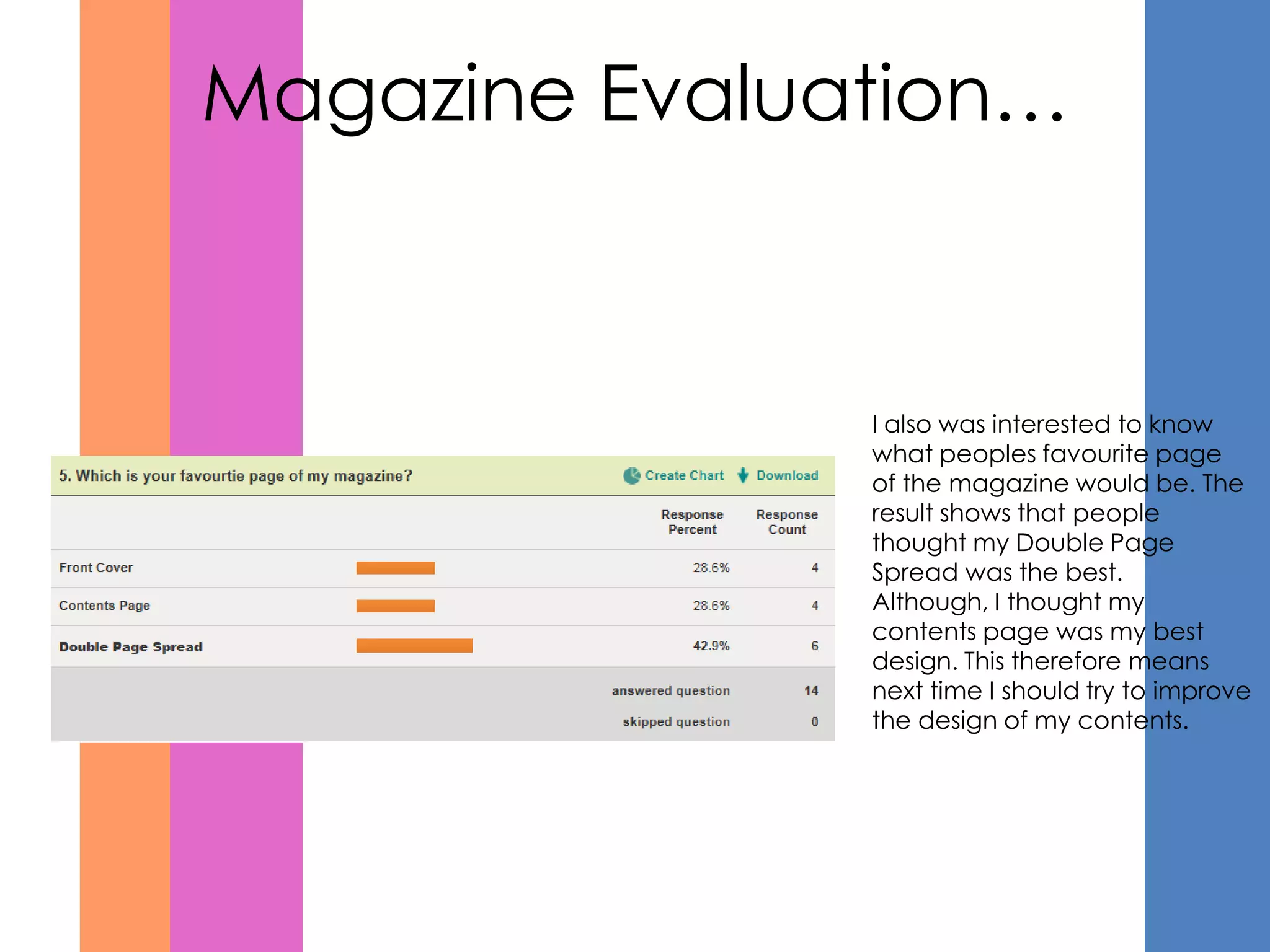
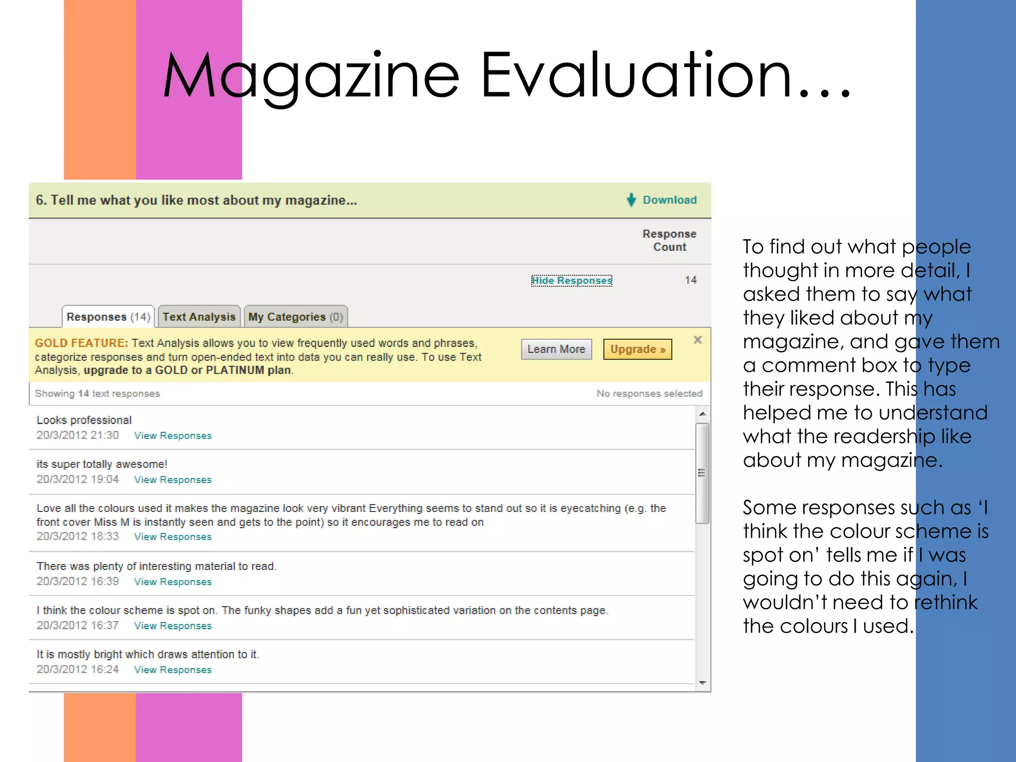
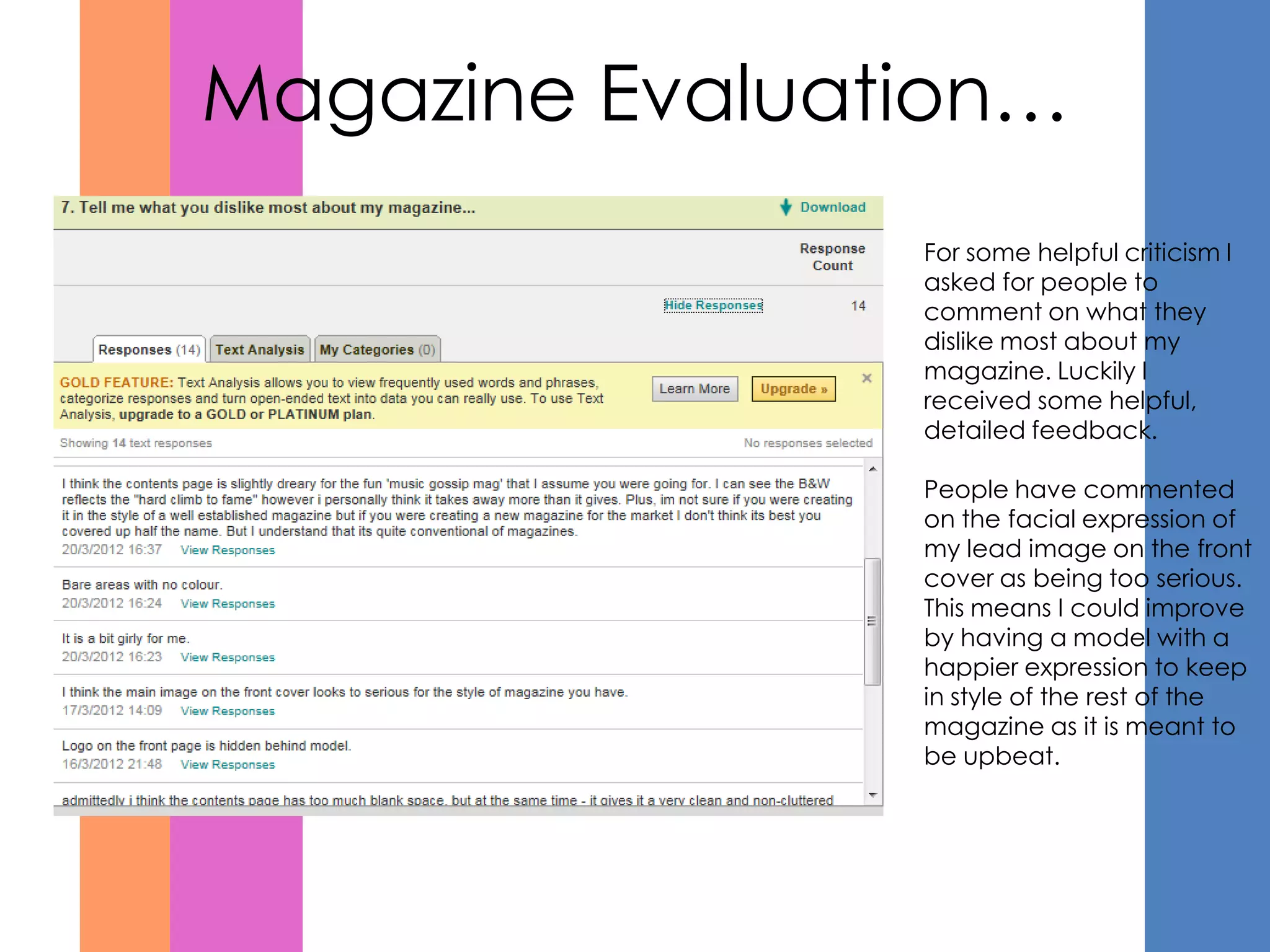
In what ways does your
magazine use, develop or
challenge forms and
conventions of real media
products?
The
Front
Cover!
The
Contents!
The Double Page Spread!
My magazine uses forms from current media, I have
done this by including basic conventions such as:
                        These are all the features on the front page which
                        are very similar to other magazines, I based my
The Masthead
                        design on different magazines which I researched
                        in order to plan a design for my own magazine.
                        One of these magazines was ‘VIBE’ because the
                        genre of music I wanted to base my magazine
                        on, was very similar. I have also used similar colour
Cover Lines             schemes, and similar text throughout the magazine
                        to retain ‘House Style’ which is often found in other
                        magazines. On the front cover I used a lead line
                        and a lead image that are related to each other
                        as it is the main article within my magazine. Lead
                        lines are also used as another way to draw in
                        readers, I have used coloured boxes around the
Lead Line               writing as it gives a more upbeat, exciting look.


                        Although, because my magazine is a new product,
                        I have done some things differently and
Cover Image             challenged the conventions, I have done this by
                        using the colour Orange which is not very often
(Medium
                        found on magazines of this genre because it can
Close Up)               be bright. I have also changed the lead image to
                        black and white as magazines often have coloured
                        photos.
Front Cover Comparison
    Here I have used the idea of a
    black and white photograph         When looking for magazine
    which connotes                     design, I mainly used ideas
    seriousness, because the lead      from some of these front
    line talks about having a          covers. As you can see I
    challenge.                         have mixed up many of the
                                       ideas to create my
                                       layout/design.


   My overall layout is very similar   I used a very similar design for
   to this front cover because of      my cover lines as Rap Up’s
   the positioning on the main         because I thought they were
   image and the cover lines. It       fun and funky. It also helped
   also follows a strict colour        me because I didn’t want my
   scheme much like my                 magazine to be too serious and
   magazine.                           boring.
My magazine uses forms from current media, I have
done this by including basic conventions such as:

Title
                        These are all the features I believe are
                        conventional to a magazine. I have kept the
                        colour scheme of the magazine very well as
                        it has maintained the house style, I have also
                        used the same font as the front page and
Feature Stories         throughout the contents page. Although, for
                        the editors not I have used a ‘Script’ font
                        because this often seen in magazines
                        because it wants to feel like the editor has
                        handwritten their message. I have also
                        included the page numbers and a short
Regulars                introduction to the features, because these
                        are exclusive therefore their importance
                        needs to be emphasised. I have also placed
                        the regulars on the other side of the contents
                        page, but these have less emphasis because
                        people who often buy the magazine know
                        they are there anyway.
Editors Note
Contents Page Comparison
                                 The colour scheme, I believe is
                                 very similar to the We Love Pop
                                 magazine because of the
                                 bright colours.


My title for my contents I
believe is very similar to the
contents title in rap up. This
shows that I have used current
magazine conventions.


                                                          When I was looking at ideas
                                                          for a contents page, I have
                                                          done the same as I did for
                                                          my front cover and used
                                                          many different design ideas
                                                          from similar magazines to
                                                          create a unique design.
My magazine uses forms from current media, I have
done this by including basic conventions such as:
                        These are all the features on my Double Page
Stand first             Spread that I believe are conventional to
                        magazines. I have tried to keep with my house
                        style by using very similar colours. Although to add
                        a bit of variety I use light blue for my columns to
                        make the article stand out on the page. I have also
                        put a border around the lead image to make it
Pull Quote              more fun and upbeat, which goes well with the rest
                        of the magazine. I have also included a pull
                        quote, which is very common in magazines and if
                        the pull quote is interesting enough it will draw the
                        audience in and they will want to read the entire
                        article.
Lead Image              At the beginning of the article I used a drop cap to
                        put emphasis on the beginning of the article. To
                        introduce the article, I used a standfirst which gives
                        the reader a brief introduction into what the text is
                        about, it also let’s the reader decide weather or
                        not they wish to read the article/interview.

                        Although, I have also made my own features such
                        as the ‘Did you know’ boxes because this will make
Drop Cap                the reader believe they know more about the
                        person featured. Therefore it’s more personal.
Double Page Spread Comparison
                                    My double page spread was
                                    hard to design as not many
                                    of the magazines I analysed
                                    had design features which
                                    stood out for me.


Columns are very conventional
within all magazines, therefore I
decided to use them to create
a more professional look to the
DPS. The colour scheme and
way the page is laid out is
slightly similar to Rap up.
How does your
magazine represent
different social
groups?
To me the image of my artist is very important and I wanted her to represented in
a way which is appealing for the target audience. On the main page she is in
black and white and looking serious, this links in with her lead line ‘Miss M’s hard
climb to fame’. The black and white is quite a dull, but strong contrast between
the other bright colours on the page, this makes her stand out in a way. Her
serious emotion connotes her as being hard working and serious about her work,
which could make her a decent role model for readers. On her DPS, the picture is
in colour and her expression and pose is much happier, this tells the reader that
something good has happened, and links in with the whole idea of her reaching
her goal after a long fight to get a record deal.

The target audience of my magazine is mainly female, and therefore seeing a
strong independent female featured in the magazine may help them to relate to
her, or look up to her. This tells the audience that women are becoming stronger
within the music industry and in many other areas. It also represents young
women, as my magazine average reader age would be 17 and over, this means
they can relate to the artist because she is of a similar age.
How does your magazine represent different social groups?


                                            Here we have the artist
                                            looking pleased as she
                                            has got where she
                                            wanted in her career. This
                                            shows us that she isn’t
                                            scared to celebrate her
                                            success. Which tells the
                                            reader she is
                                            confident, and may lead
                                            to her fans feeling the
                                            same way.
                                            It also represents her as
                                            being a fun loving
The pull quote ‘I was told to change        person, instead of just
my genre choice’ shows that she has         serious, which is
been through a tough time, and has          stereotypical of young
to put up with people criticizing           women.
her, and her choices. Although, the
article shows she was strong enough
to overcome these boundaries.
What kind of media
intuitions might
distribute your
magazine?
I believe my magazine could be distributed by
Bauer media, because they associated with
women's gossip magazines, as my magazine is
mainly gossip, but within music, it would be very
similar.

Bauer media magazines include:
More
Heat
GRAZIA
Pop

They may want to distribute my magazine
because it is also a gossip magazine, but because
it is a music magazine also, they might draw in
even more consumers as they currently don’t sell
any music magazines aimed at women.

I also found the media group IPC, although I
don’t believe my magazine would be
distributed by them as they distribute
magazines such as; Uncut and NME which
are very different from my type of magazine.
Although they also distribute gossip
magazines which are similar to my magazine
type.
Who would be the
audience for your
magazine?
My target audience is women
     aged from 17 and over.
       They would be into
   fashion, mainstream music
      and celebrity gossip.

    This is my reader profile

They also love to party and go
     out, wear makeup and
    dye their hair. Typical girly
                girls.

I don’t believe men would buy
    or read my magazine as it
     is brightly coloured, and
        often men read car
        magazines or music
    magazines such as kerrang
             and NME.
I think my Double Page Spread would
appeal to my target audeience as it is the
gossip about a famous celebrity, and my
target audience would be into gossip. I
think the ‘Did you Know’ boxes would
appeal to the audience because they
have interesting, small facts about the
artist which people often like to read as
they can find it interesting and makes the
artist seem more real.

The front cover is the most important element
which should attract the audience, as it is the
first thing they see.
I believe the bright colours and the ‘Famous’
face on the front of the magazine would appeal
to my target audience. Also, the cover lines
which are quotes from other famous people
may draw in the audience as they may want to
read more. I believe I could have attracted the
audience more by using a broader range of
colours like more pinks because thy would
attract more women.
Survey Responses
            I conducted a survey on
 www.surveymonkey.com so that I could find
out what people thought about my magazine
  and what I could do to improve next time,
 overall I only managed to get 14 responses.
    Although, some of the responses we’re
   detailed enough so that enabled me to
     understand what I need to improve.
Readership…
        The highest amount of
        people that reviewed
        my magazine were
        between the ages of 17
        and 20. This is very similar
        to the readership I was
        aiming my magazine at.


        50% of people are male
        and the other 50% are
        female. Although, this
        magazine is mainly
        aimed at females. I
        believe it is good that
        also Males have taken
        an interest.
Readership…


        I also asked what other sort
        of magazines people read,
        according to my survey the
        most popular was the high
        end fashion magazine;
        Vogue at 44.4%. Which is
        good, because on my
        reader profile I said people
        who read my magazine
        are into fashion.
Magazine Evaluation…
               I found out people
               thought my
               magazine was fun,
               bright, colourful,
               interesting and
               pretty. I believe this
               is a good response,
               because I wanted
               my magazine to be
               eye catching and if
               they believe it is
               colourful and fun,
               then it will be very
               eye catching and
               interesting to look at.
               No negative
               responses we’re
               given, so I don’t
               believe I need to
Magazine Evaluation…


               I also was interested to know
               what peoples favourite page
               of the magazine would be. The
               result shows that people
               thought my Double Page
               Spread was the best.
               Although, I thought my
               contents page was my best
               design. This therefore means
               next time I should try to improve
               the design of my contents.
Magazine Evaluation…

                To find out what people
                thought in more detail, I
                asked them to say what
                they liked about my
                magazine, and gave them
                a comment box to type
                their response. This has
                helped me to understand
                what the readership like
                about my magazine.

                Some responses such as ‘I
                think the colour scheme is
                spot on’ tells me if I was
                going to do this again, I
                wouldn’t need to rethink
                the colours I used.
Magazine Evaluation…
                For some helpful criticism I
                asked for people to
                comment on what they
                dislike most about my
                magazine. Luckily I
                received some helpful,
                detailed feedback.

                People have commented
                on the facial expression of
                my lead image on the front
                cover as being too serious.
                This means I could improve
                by having a model with a
                happier expression to keep
                in style of the rest of the
                magazine as it is meant to
                be upbeat.
Magazine Evaluation…

                As well as asking people
                what they dislike, I also ask
                them to comment what I
                could do to improve the
                overall look of my
                magazine so they would
                like it more. Again, I have
                gained some good advice.
                Such as; You could use
                more photos. I agreed with
                the comment as I believe
                my magazine lacks variety
                of photos.
What have I learnt
about technologies?
Photoshop
I used Photoshop to design and make my magazine. I already had a
    good understanding of Photoshop, but I also learnt new things.
I learnt how to use a grid so that I could align all my elements on my
    page to make it look more neat. Although, if I wanted something in a
    specific place I could press Ctrl whilst moving the object which
    makes it ignore the grid and gives me more freedom of choice
    about where to put the object.
I made a skills development
Journal to show in depth what I
Have learnt on Photoshop.
 http://emmarobinsonmediastudies1.blogspot.co.uk/2012/01/skills-development-
    journal.html
Blog
To upload my work I used a blog so that my work could be
   displayed electronically, which made it easier than printing
   everything out.
I had never used BlogSpot before so I learnt how to use it. I learnt
   how to insert photos into a post, change text, change the
   theme of my blog, and the colours on my blog. I found this
   useful because I can now upload my work easily.
For my survey questions I made a post which included all y
   magazine and a link to my survey monkey which I then posted
   on Facebook for people to complete. I did this because the
   majority of my ‘Friends’ are the right age for my target
   audience.
Overall I think my magazine was successful, but I believe there
 are areas in which I could improve such as using more photos
 and taking more time on the overall layout of the magazine. I
     could do this by taking more time on Photoshop, and
concentrate less on the content and more on what people see. I
 would also take more time to research other magazines which
                     would be similar to mine.
   Again, I think I have kept the conventions of Professional
    magazines by using different elements, and creating my
                   own, new, unique magazine.

Evaluation Complete

  • 1.
    In what waysdoes your magazine use, develop or challenge forms and conventions of real media products?
  • 2.
  • 3.
  • 4.
  • 5.
    My magazine usesforms from current media, I have done this by including basic conventions such as: These are all the features on the front page which are very similar to other magazines, I based my The Masthead design on different magazines which I researched in order to plan a design for my own magazine. One of these magazines was ‘VIBE’ because the genre of music I wanted to base my magazine on, was very similar. I have also used similar colour Cover Lines schemes, and similar text throughout the magazine to retain ‘House Style’ which is often found in other magazines. On the front cover I used a lead line and a lead image that are related to each other as it is the main article within my magazine. Lead lines are also used as another way to draw in readers, I have used coloured boxes around the Lead Line writing as it gives a more upbeat, exciting look. Although, because my magazine is a new product, I have done some things differently and Cover Image challenged the conventions, I have done this by using the colour Orange which is not very often (Medium found on magazines of this genre because it can Close Up) be bright. I have also changed the lead image to black and white as magazines often have coloured photos.
  • 6.
    Front Cover Comparison Here I have used the idea of a black and white photograph When looking for magazine which connotes design, I mainly used ideas seriousness, because the lead from some of these front line talks about having a covers. As you can see I challenge. have mixed up many of the ideas to create my layout/design. My overall layout is very similar I used a very similar design for to this front cover because of my cover lines as Rap Up’s the positioning on the main because I thought they were image and the cover lines. It fun and funky. It also helped also follows a strict colour me because I didn’t want my scheme much like my magazine to be too serious and magazine. boring.
  • 7.
    My magazine usesforms from current media, I have done this by including basic conventions such as: Title These are all the features I believe are conventional to a magazine. I have kept the colour scheme of the magazine very well as it has maintained the house style, I have also used the same font as the front page and Feature Stories throughout the contents page. Although, for the editors not I have used a ‘Script’ font because this often seen in magazines because it wants to feel like the editor has handwritten their message. I have also included the page numbers and a short Regulars introduction to the features, because these are exclusive therefore their importance needs to be emphasised. I have also placed the regulars on the other side of the contents page, but these have less emphasis because people who often buy the magazine know they are there anyway. Editors Note
  • 8.
    Contents Page Comparison The colour scheme, I believe is very similar to the We Love Pop magazine because of the bright colours. My title for my contents I believe is very similar to the contents title in rap up. This shows that I have used current magazine conventions. When I was looking at ideas for a contents page, I have done the same as I did for my front cover and used many different design ideas from similar magazines to create a unique design.
  • 9.
    My magazine usesforms from current media, I have done this by including basic conventions such as: These are all the features on my Double Page Stand first Spread that I believe are conventional to magazines. I have tried to keep with my house style by using very similar colours. Although to add a bit of variety I use light blue for my columns to make the article stand out on the page. I have also put a border around the lead image to make it Pull Quote more fun and upbeat, which goes well with the rest of the magazine. I have also included a pull quote, which is very common in magazines and if the pull quote is interesting enough it will draw the audience in and they will want to read the entire article. Lead Image At the beginning of the article I used a drop cap to put emphasis on the beginning of the article. To introduce the article, I used a standfirst which gives the reader a brief introduction into what the text is about, it also let’s the reader decide weather or not they wish to read the article/interview. Although, I have also made my own features such as the ‘Did you know’ boxes because this will make Drop Cap the reader believe they know more about the person featured. Therefore it’s more personal.
  • 10.
    Double Page SpreadComparison My double page spread was hard to design as not many of the magazines I analysed had design features which stood out for me. Columns are very conventional within all magazines, therefore I decided to use them to create a more professional look to the DPS. The colour scheme and way the page is laid out is slightly similar to Rap up.
  • 11.
    How does your magazinerepresent different social groups?
  • 12.
    To me theimage of my artist is very important and I wanted her to represented in a way which is appealing for the target audience. On the main page she is in black and white and looking serious, this links in with her lead line ‘Miss M’s hard climb to fame’. The black and white is quite a dull, but strong contrast between the other bright colours on the page, this makes her stand out in a way. Her serious emotion connotes her as being hard working and serious about her work, which could make her a decent role model for readers. On her DPS, the picture is in colour and her expression and pose is much happier, this tells the reader that something good has happened, and links in with the whole idea of her reaching her goal after a long fight to get a record deal. The target audience of my magazine is mainly female, and therefore seeing a strong independent female featured in the magazine may help them to relate to her, or look up to her. This tells the audience that women are becoming stronger within the music industry and in many other areas. It also represents young women, as my magazine average reader age would be 17 and over, this means they can relate to the artist because she is of a similar age.
  • 13.
    How does yourmagazine represent different social groups? Here we have the artist looking pleased as she has got where she wanted in her career. This shows us that she isn’t scared to celebrate her success. Which tells the reader she is confident, and may lead to her fans feeling the same way. It also represents her as being a fun loving The pull quote ‘I was told to change person, instead of just my genre choice’ shows that she has serious, which is been through a tough time, and has stereotypical of young to put up with people criticizing women. her, and her choices. Although, the article shows she was strong enough to overcome these boundaries.
  • 14.
    What kind ofmedia intuitions might distribute your magazine?
  • 15.
    I believe mymagazine could be distributed by Bauer media, because they associated with women's gossip magazines, as my magazine is mainly gossip, but within music, it would be very similar. Bauer media magazines include: More Heat GRAZIA Pop They may want to distribute my magazine because it is also a gossip magazine, but because it is a music magazine also, they might draw in even more consumers as they currently don’t sell any music magazines aimed at women. I also found the media group IPC, although I don’t believe my magazine would be distributed by them as they distribute magazines such as; Uncut and NME which are very different from my type of magazine. Although they also distribute gossip magazines which are similar to my magazine type.
  • 16.
    Who would bethe audience for your magazine?
  • 17.
    My target audienceis women aged from 17 and over. They would be into fashion, mainstream music and celebrity gossip. This is my reader profile They also love to party and go out, wear makeup and dye their hair. Typical girly girls. I don’t believe men would buy or read my magazine as it is brightly coloured, and often men read car magazines or music magazines such as kerrang and NME.
  • 18.
    I think myDouble Page Spread would appeal to my target audeience as it is the gossip about a famous celebrity, and my target audience would be into gossip. I think the ‘Did you Know’ boxes would appeal to the audience because they have interesting, small facts about the artist which people often like to read as they can find it interesting and makes the artist seem more real. The front cover is the most important element which should attract the audience, as it is the first thing they see. I believe the bright colours and the ‘Famous’ face on the front of the magazine would appeal to my target audience. Also, the cover lines which are quotes from other famous people may draw in the audience as they may want to read more. I believe I could have attracted the audience more by using a broader range of colours like more pinks because thy would attract more women.
  • 19.
    Survey Responses I conducted a survey on www.surveymonkey.com so that I could find out what people thought about my magazine and what I could do to improve next time, overall I only managed to get 14 responses. Although, some of the responses we’re detailed enough so that enabled me to understand what I need to improve.
  • 20.
    Readership… The highest amount of people that reviewed my magazine were between the ages of 17 and 20. This is very similar to the readership I was aiming my magazine at. 50% of people are male and the other 50% are female. Although, this magazine is mainly aimed at females. I believe it is good that also Males have taken an interest.
  • 21.
    Readership… I also asked what other sort of magazines people read, according to my survey the most popular was the high end fashion magazine; Vogue at 44.4%. Which is good, because on my reader profile I said people who read my magazine are into fashion.
  • 22.
    Magazine Evaluation… I found out people thought my magazine was fun, bright, colourful, interesting and pretty. I believe this is a good response, because I wanted my magazine to be eye catching and if they believe it is colourful and fun, then it will be very eye catching and interesting to look at. No negative responses we’re given, so I don’t believe I need to
  • 23.
    Magazine Evaluation… I also was interested to know what peoples favourite page of the magazine would be. The result shows that people thought my Double Page Spread was the best. Although, I thought my contents page was my best design. This therefore means next time I should try to improve the design of my contents.
  • 24.
    Magazine Evaluation… To find out what people thought in more detail, I asked them to say what they liked about my magazine, and gave them a comment box to type their response. This has helped me to understand what the readership like about my magazine. Some responses such as ‘I think the colour scheme is spot on’ tells me if I was going to do this again, I wouldn’t need to rethink the colours I used.
  • 25.
    Magazine Evaluation… For some helpful criticism I asked for people to comment on what they dislike most about my magazine. Luckily I received some helpful, detailed feedback. People have commented on the facial expression of my lead image on the front cover as being too serious. This means I could improve by having a model with a happier expression to keep in style of the rest of the magazine as it is meant to be upbeat.
  • 26.
    Magazine Evaluation… As well as asking people what they dislike, I also ask them to comment what I could do to improve the overall look of my magazine so they would like it more. Again, I have gained some good advice. Such as; You could use more photos. I agreed with the comment as I believe my magazine lacks variety of photos.
  • 27.
    What have Ilearnt about technologies?
  • 28.
    Photoshop I used Photoshopto design and make my magazine. I already had a good understanding of Photoshop, but I also learnt new things. I learnt how to use a grid so that I could align all my elements on my page to make it look more neat. Although, if I wanted something in a specific place I could press Ctrl whilst moving the object which makes it ignore the grid and gives me more freedom of choice about where to put the object. I made a skills development Journal to show in depth what I Have learnt on Photoshop. http://emmarobinsonmediastudies1.blogspot.co.uk/2012/01/skills-development- journal.html
  • 29.
    Blog To upload mywork I used a blog so that my work could be displayed electronically, which made it easier than printing everything out. I had never used BlogSpot before so I learnt how to use it. I learnt how to insert photos into a post, change text, change the theme of my blog, and the colours on my blog. I found this useful because I can now upload my work easily. For my survey questions I made a post which included all y magazine and a link to my survey monkey which I then posted on Facebook for people to complete. I did this because the majority of my ‘Friends’ are the right age for my target audience.
  • 30.
    Overall I thinkmy magazine was successful, but I believe there are areas in which I could improve such as using more photos and taking more time on the overall layout of the magazine. I could do this by taking more time on Photoshop, and concentrate less on the content and more on what people see. I would also take more time to research other magazines which would be similar to mine. Again, I think I have kept the conventions of Professional magazines by using different elements, and creating my own, new, unique magazine.