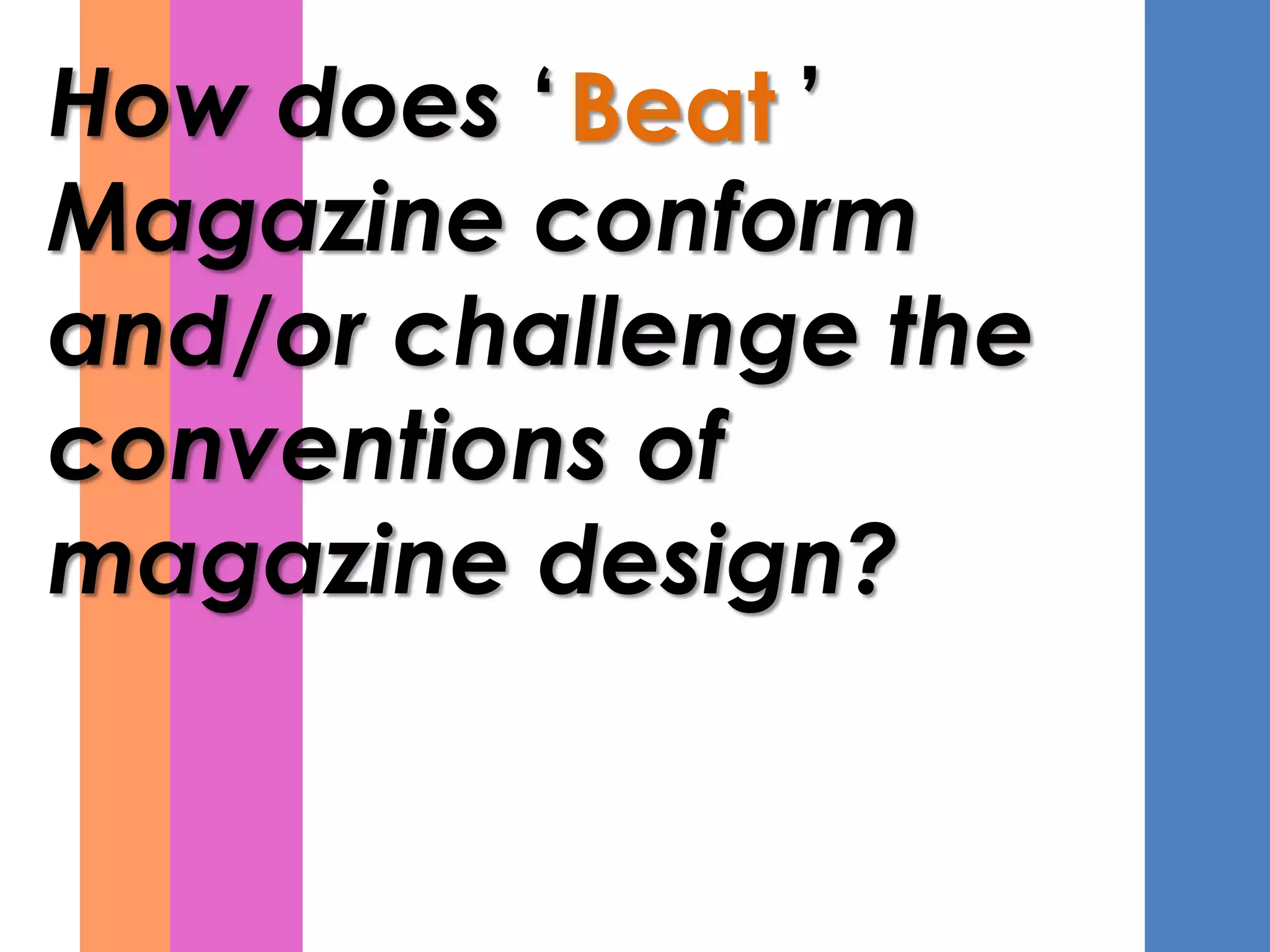
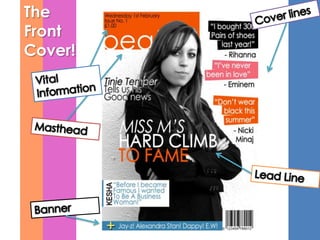
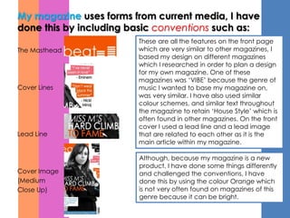
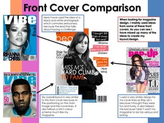
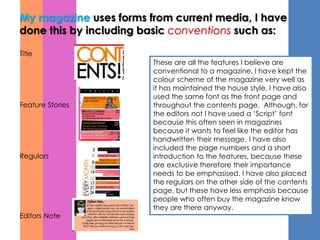
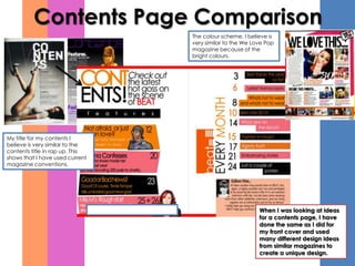
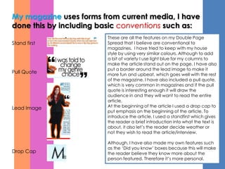
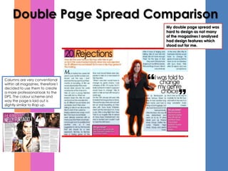
The document discusses how the author's magazine both conforms to and challenges conventions of magazine design. It conforms by including standard features like a masthead, cover lines, and contents page with page numbers. However, it challenges conventions by using the unconventional color orange and a script font for the editor's note. The author analyzed design elements from other magazines to develop their magazine's visual style. A survey found the magazine was viewed as fun and colorful by readers mainly ages 17-20 who also read magazines like Vogue. Respondents favored the double-page spread design most.


![Evaluation[1]](https://cdn.slidesharecdn.com/ss_thumbnails/evaluation1-120305073155-phpapp01-thumbnail.jpg?width=640&height=640&fit=bounds)


