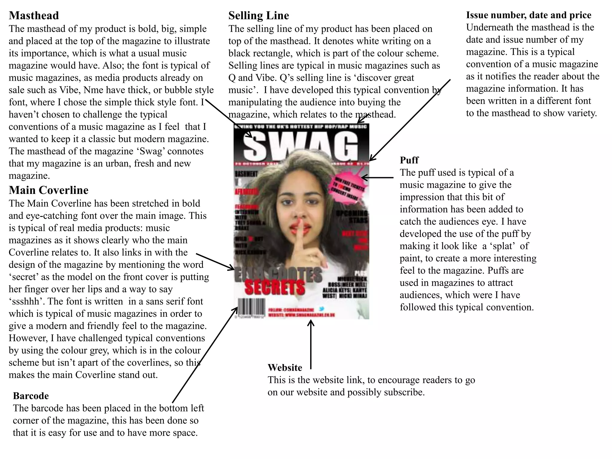
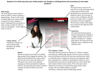
Masthead                                              Selling Line                                              Issue number, date and price
The masthead of my product is bold, big, simple       The selling line of my product has been placed on         Underneath the masthead is the
and placed at the top of the magazine to illustrate   top of the masthead. It denotes white writing on a        date and issue number of my
its importance, which is what a usual music           black rectangle, which is part of the colour scheme.      magazine. This is a typical
magazine would have. Also; the font is typical of     Selling lines are typical in music magazines such as      convention of a music magazine
music magazines, as media products already on         Q and Vibe. Q’s selling line is ‘discover great           as it notifies the reader about the
sale such as Vibe, Nme have thick, or bubble style    music’. I have developed this typical convention by       magazine information. It has
font, where I chose the simple thick style font. I    manipulating the audience into buying the                 been written in a different font
haven’t chosen to challenge the typical               magazine, which relates to the masthead.                  to the masthead to show variety.
conventions of a music magazine as I feel that I
wanted to keep it a classic but modern magazine.
The masthead of the magazine ‘Swag’ connotes
that my magazine is an urban, fresh and new                                                     Puff
magazine.                                                                                       The puff used is typical of a
                                                                                                music magazine to give the
Main Coverline
                                                                                                impression that this bit of
The Main Coverline has been stretched in bold
                                                                                                information has been added to
and eye-catching font over the main image. This
                                                                                                catch the audiences eye. I have
is typical of real media products: music
                                                                                                developed the use of the puff by
magazines as it shows clearly who the main
                                                                                                making it look like a ‘splat’ of
Coverline relates to. It also links in with the
                                                                                                paint, to create a more interesting
design of the magazine by mentioning the word
                                                                                                feel to the magazine. Puffs are
‘secret’ as the model on the front cover is putting
                                                                                                used in magazines to attract
her finger over her lips and a way to say
                                                                                                audiences, which were I have
‘ssshhh’. The font is written in a sans serif font
                                                                                                followed this typical convention.
which is typical of music magazines in order to
give a modern and friendly feel to the magazine.
However, I have challenged typical conventions
by using the colour grey, which is in the colour
scheme but isn’t apart of the coverlines, so this
                                                               Website
makes the main Coverline stand out.
                                                               This is the website link, to encourage readers to go
 Barcode                                                       on our website and possibly subscribe.
 The barcode has been placed in the bottom left
 corner of the magazine, this has been done so
 that it is easy for use and to have more space.
Question 1) In what ways does your media product use, develop or challenge forms and conventions of real
                                                media products?
 Title
 The title has been written in the top
                                                                                    Sub-Images
 left hand corner of the contents
                                                                                    The sub-images spread over the right side of
 page in order to show importance. I
                                                                                    the contents page to create structure and an
 have developed this convention of
                                                                                    exciting magazine. These are usually used on
 having a title by also incorporating
                                                                                    contents page sin order to create an eye
 the mast head name in bold writing
                                                                                    catching page and encourage the reader to
 next to it to create a memorable
                                                                                    read on. I have developed this convention by
 brand.
                                                                                    editing my sub-images to look like real life
Colour scheme                                                                       by using the quick selection tool and not like
I have chosen to use typical                                                        I’ve just taken a picture and stuck it on. It
conventions of a contents page by                                                   could also connote a more professional look
continuing on my colour scheme from                                                 to the magazine. These are typical
the front page, by using the gradient                                               conventions, as the page number is at the
tool. I have done this throughout my                                                bottom and top of the sub-images.
magazine in order to project to the
target audience that we are consistent.
Which is also eye-catching.

List of contents                                                                   Editors note
The list of contents complies with the                                             Editors note is a typical convention found in
rule of thirds to create a professional look                                       contents pages. My editors challenges this
to the magazine. Te list of contents has                                           convention as I have placed my editors note in the
been split into different sub categories                                           bottom right corner of the contents page. I have
which is a typical convention of a             Left third                          used a small image of the editor to create a
contents page. I have developed this, by       The contents page has been          relationship between the reader and the
making them stand out to catch the eye         divided into left third as this a   editor, connoting a more personalised magazine.
of the audience. The list of contents has      typical convention of contents      The editors note gets straight to the point by
been numbered which is a typical               pages as it creates a               introducing the magazine. This has been written in
convention. The colour scheme is still         professional look to the            white font, on top of a black background, this was
consistent.                                    magazine. I have also chosen        done to catch the eye of the reader whilst keeping
                                               to show the difference              with the colour scheme. The language used is
                                               between the editors note and        colloquial, to relate to my target audience and give
                                               the list of contents.               a friendly feel to the magazine.
Question 1) In what ways does your media product use, develop or challenge forms and conventions of real media
                                                           products?
                                                                                                             Title
                                                                                                             The title has been written in the
                                                                                                             same font as on the front page which
Main Image                                                                                                   is large sans serif font. I have
The main image has been edited to                                                                            developed this convention by using
create an effect in order to produce a                                                                       different colours, this was done to
unique design. However, the model                                                                            create a sense of ambience that this
is looking right at the camera which                                                                         interview is major. This is a typical
is typical of a music magazine. I                                                                            convention of a music magazine.
haven’t challenged this convention in                                                                        This has been written in the largest
order to keep it simple but effect to                                                                        font is paced on the right top of the
create an atmosphere so the reader                                                                           contents page.
wants to read on
                                                                                                              Stand first
                                                                                                              The stand first has been placed
                                                                                                              directly underneath the heading in
                                                                                                              a slightly smaller font as this is a
                                                                                                              typical; convention of a double
        Colour scheme                                                                                         page spread. The font used for the
        I decided to continue my                                                                              magazine name is different to the
        colour scheme right                                                                                   stand first font.
        through to my double
        page spread.
                                                                           Text columns- Article
                          Quotes                                           The article has been written in columns of 3, which is a typical
                          Quotes are typical conventions of a double       convention of a double page spreads. The text varies in colour to
                          page spread as they engage the audience. My      show the difference between the interviewer and the artist which
                          quote has been placed in the centre column       is commonly done in magazines, however most magazines that I
                          between the text to attract the readers eye.     have researched use variation on the boldness of the text. I have
                          The quote uses emotive and colloquial            developed this convention by matching the text colours black and
                          language in order to persuade the reader to      red to match with the colour scheme. This is the same colour
                          read on. The quote has been written in bold so   scheme for my front cover and contents page which creates
                          it stands out and still follows the colour       synergy, The use of Drop capital is a typical
                          scheme.                                          convention, commonly used in double page spreads.

Question 1)

  • 1.
    Masthead Selling Line Issue number, date and price The masthead of my product is bold, big, simple The selling line of my product has been placed on Underneath the masthead is the and placed at the top of the magazine to illustrate top of the masthead. It denotes white writing on a date and issue number of my its importance, which is what a usual music black rectangle, which is part of the colour scheme. magazine. This is a typical magazine would have. Also; the font is typical of Selling lines are typical in music magazines such as convention of a music magazine music magazines, as media products already on Q and Vibe. Q’s selling line is ‘discover great as it notifies the reader about the sale such as Vibe, Nme have thick, or bubble style music’. I have developed this typical convention by magazine information. It has font, where I chose the simple thick style font. I manipulating the audience into buying the been written in a different font haven’t chosen to challenge the typical magazine, which relates to the masthead. to the masthead to show variety. conventions of a music magazine as I feel that I wanted to keep it a classic but modern magazine. The masthead of the magazine ‘Swag’ connotes that my magazine is an urban, fresh and new Puff magazine. The puff used is typical of a music magazine to give the Main Coverline impression that this bit of The Main Coverline has been stretched in bold information has been added to and eye-catching font over the main image. This catch the audiences eye. I have is typical of real media products: music developed the use of the puff by magazines as it shows clearly who the main making it look like a ‘splat’ of Coverline relates to. It also links in with the paint, to create a more interesting design of the magazine by mentioning the word feel to the magazine. Puffs are ‘secret’ as the model on the front cover is putting used in magazines to attract her finger over her lips and a way to say audiences, which were I have ‘ssshhh’. The font is written in a sans serif font followed this typical convention. which is typical of music magazines in order to give a modern and friendly feel to the magazine. However, I have challenged typical conventions by using the colour grey, which is in the colour scheme but isn’t apart of the coverlines, so this Website makes the main Coverline stand out. This is the website link, to encourage readers to go Barcode on our website and possibly subscribe. The barcode has been placed in the bottom left corner of the magazine, this has been done so that it is easy for use and to have more space.
  • 2.
    Question 1) Inwhat ways does your media product use, develop or challenge forms and conventions of real media products? Title The title has been written in the top Sub-Images left hand corner of the contents The sub-images spread over the right side of page in order to show importance. I the contents page to create structure and an have developed this convention of exciting magazine. These are usually used on having a title by also incorporating contents page sin order to create an eye the mast head name in bold writing catching page and encourage the reader to next to it to create a memorable read on. I have developed this convention by brand. editing my sub-images to look like real life Colour scheme by using the quick selection tool and not like I have chosen to use typical I’ve just taken a picture and stuck it on. It conventions of a contents page by could also connote a more professional look continuing on my colour scheme from to the magazine. These are typical the front page, by using the gradient conventions, as the page number is at the tool. I have done this throughout my bottom and top of the sub-images. magazine in order to project to the target audience that we are consistent. Which is also eye-catching. List of contents Editors note The list of contents complies with the Editors note is a typical convention found in rule of thirds to create a professional look contents pages. My editors challenges this to the magazine. Te list of contents has convention as I have placed my editors note in the been split into different sub categories bottom right corner of the contents page. I have which is a typical convention of a Left third used a small image of the editor to create a contents page. I have developed this, by The contents page has been relationship between the reader and the making them stand out to catch the eye divided into left third as this a editor, connoting a more personalised magazine. of the audience. The list of contents has typical convention of contents The editors note gets straight to the point by been numbered which is a typical pages as it creates a introducing the magazine. This has been written in convention. The colour scheme is still professional look to the white font, on top of a black background, this was consistent. magazine. I have also chosen done to catch the eye of the reader whilst keeping to show the difference with the colour scheme. The language used is between the editors note and colloquial, to relate to my target audience and give the list of contents. a friendly feel to the magazine.
  • 3.
    Question 1) Inwhat ways does your media product use, develop or challenge forms and conventions of real media products? Title The title has been written in the same font as on the front page which Main Image is large sans serif font. I have The main image has been edited to developed this convention by using create an effect in order to produce a different colours, this was done to unique design. However, the model create a sense of ambience that this is looking right at the camera which interview is major. This is a typical is typical of a music magazine. I convention of a music magazine. haven’t challenged this convention in This has been written in the largest order to keep it simple but effect to font is paced on the right top of the create an atmosphere so the reader contents page. wants to read on Stand first The stand first has been placed directly underneath the heading in a slightly smaller font as this is a typical; convention of a double Colour scheme page spread. The font used for the I decided to continue my magazine name is different to the colour scheme right stand first font. through to my double page spread. Text columns- Article Quotes The article has been written in columns of 3, which is a typical Quotes are typical conventions of a double convention of a double page spreads. The text varies in colour to page spread as they engage the audience. My show the difference between the interviewer and the artist which quote has been placed in the centre column is commonly done in magazines, however most magazines that I between the text to attract the readers eye. have researched use variation on the boldness of the text. I have The quote uses emotive and colloquial developed this convention by matching the text colours black and language in order to persuade the reader to red to match with the colour scheme. This is the same colour read on. The quote has been written in bold so scheme for my front cover and contents page which creates it stands out and still follows the colour synergy, The use of Drop capital is a typical scheme. convention, commonly used in double page spreads.